Hand Painting Obsidian Texture in Photoshop. NEED HELP
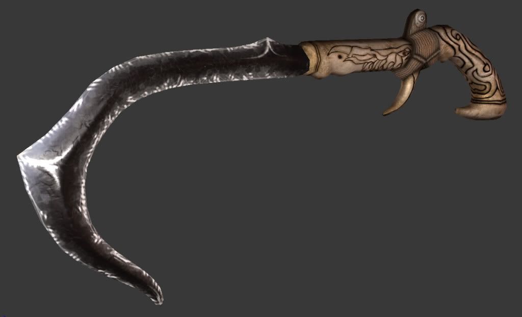
Alright, I'll back it up a bit. For our game production class I had to texture one of the weapons this week.

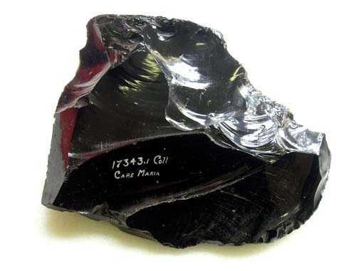
It's supposed to be a multi-purpose tool meant for climbing, trapping animals, whatever. Right now I'm trying to paint the blade to look more like obsidian rock instead of a dark metal. As well as adjusting the specular map to include more blues, greens, and purples, and adding a gloss map, I need help making the normals look more, well, like obsidian. So far I've had no success. Here's some quick reference I picked off of google.
Any help or critique would be great.


Thanks a bunch.

It's supposed to be a multi-purpose tool meant for climbing, trapping animals, whatever. Right now I'm trying to paint the blade to look more like obsidian rock instead of a dark metal. As well as adjusting the specular map to include more blues, greens, and purples, and adding a gloss map, I need help making the normals look more, well, like obsidian. So far I've had no success. Here's some quick reference I picked off of google.
Any help or critique would be great.


Thanks a bunch.
Replies
I thought you were asking how to do it as a hand painted texture. I didn't realize you had a normal and spec.
To truly pull off Obsidian, you have put a lot of love in the spec map and be more subtle in the diffuse map. Actually doing a spec similar to how I painted it above will start you along the right direction. Just blow it out a lot more and have a dark diffuse map that only has subtle shading.
- BoBo
Then overlay the stepping and dings using CrazyBump or whatever.
I did something like this one for this one texture.
Save out an image as a gif with limited colors. Use "Save for Web" in Photoshop. This used 8 colors. It's a bit different than running a cut-out filter.
I run that image through CrazyBump and stuff.
helpful thread
http://www.polycount.com/forum/showthread.php?t=49920
as for the normal map, you may do something like taking a bunch of random cubes/rectangles, putting them together in zbrush along with some elongated cubes that are bent into curves... composite them in photoshop and blammo... obsidian.
good luck
Deady - I'll put more sharp edges in and see how it turns out. Before I had just slapped a few custom brushes overtop just to see how it'd look lol.
BoBo - Wow, that is wonderful. That will actually really help when doing the spec values. Thanks man
killnpc - I've never tried that approach before. I'll give it a shot.
iniside - yeah, i'll fiddle with the specular highlights and see that I get.
nfrrtycmplx - I'm hoping I can just get away with a gloss map for this one, but if I need to do a reflection map it shouldn't be too hard to compensate. Zbrush might honestly be easier at this point so I can give that a shot as well.
you gotta really look at the properties of what you're trying to mimic... not on the ineternet but in your hands and move it around in the light...
anyone who's seen obsidian will look at your thing and be like , "woah, nice plastic hose...
if it's not supposed to reflect and refract light then something bobo has put up is probably one of your better options...
if you ever find yourself thinking, "i can just get away with..." while doing anything, you should reconsider your approach. cause if not, people looking at your portfolio will be like, "I could get away with not hiring this guy"
good luck
every piece you do should be portfolio worthy, otherwise you're wasting your time IMO. I think that's one of the biggest mistakes artists/"artists" can make when going to school... doing the exercises and going through the motions with no expectation of ever putting the stuff in their portfolio...
sure you'll find yourself tossing most of the shit you do... I've been doing this for a while now, and have very little stuff in my portfolio, despite the fact that I've worked on several games already. But never once did I go into a modeling/texture job thinking, "this isn't going to be worth showing anyone"... because then how can I expect anyone to pay me for it? right?
Just some food for thought.
___
Alright, here's some revisions. I think I got it a little closer to what Bo Bo had. It may need a little more love though. Tell me what you think
would be interesting to see your normal normal map... the edges of the blade look soft for obsidian or something obsidian like
mucho bettero though than what you started with
Oh, and you might want to fake a little highlight work in the diff on the central ridge. It's an element that you want to pop from all angles and lighting.
- BoBo
Oh yeah, and I did all of the normal work by painting a height map and then using nDo.
Diffuse
Specular
Normal
Height
Once you have a more diversified normal (shouldn't look like a flat blue throughout most of the blade, I'd be looking for nice geometric areas of other colors) I think you can lower the gloss and let the spec really shine through to give some awesome highlights without overblowing the whole blade.
1 last thing, it'd be nice to see some hints of red in there too, i'm just looking at the below reference bobo linked. Hawt stuff.
Anyway, keep it up man, this is looking pro already just gonna get better.
I had pretty much total freedom with this thing, so I had some fun with it. The core and blade are obsidian rock with silver and platinum detailing for some flair. The red orb at the bottom is blood from the enemy godess.
i did this in like 15 minutes but it should help get the point. i think you need to refine your maps. they have base colors laid down but no lighting information and no sharpness to them. there aren't any crisp details at the moment. you have the groundwork but now is the hard part of refining the details.
i hand paint textures all day so it doesn't take me long now. those normals were also hand painted in so if you need help with that too just let me know.
Specular = highlights
Normal = shadows
that's generally the way I look at it... it's more complicated than that of course, but... yeah.
diffuse is the natural color of the surface if everything was evenly lit... most everything should be in the same or similar value as to not compete with the lighting of the scene or light/dark information generated by the normal maps
the spec is the color modulated against the light reflected from the scene. This means if you have a white light and a blue spec map, the specular highlight will be blue...
RGB values comin at you
spec map (pixel) x light color = highlight result
XY = Z
if X = .8, .5, 0
and Y = 5, 3, 3 (this is the result of the rgb color of the light multiplied by the brightness)
then Z = 4, 1.5, 0
This means this pixel will be blown out to some kind of orange highlight... (if you have some kind of post fx on... otherwise it's just going to be a bullshit looking white pixel or depending on the renderer... clamped to 1, 1, 0 which is yellow, i think...)
anyway, the point being that the normal map and the spec maps are not in service to the diffuse, but rather, they all help each other...
your normal map is a representation of your high polygon model... those details you used to have to paint in to the model to get the depth and form you wanted, no longer have to be in the diffuse. They should be suggested... and depending on the "art direction" you could make the shadows a completely different color... or wahtever...
There are no rules really, as long as the shit looks good. But fully understand the relationships between the different maps and you will be able to come up with some pretty awesome effects...
for instance, you could get away with having only a normal map on as a texture lookup in a shader and get the diffuse by (in udk) running the same normal map through a fresnel and using that output to interpolate between differnt rgb values... making it so that the diffuse is then serving to make the normal map look better... it all depends on your art direction.
I only mention it because i find it wicked interesting and maybe to give you a few ideas...
cheers