WIP UDK ATTIC SCENE
Hi everyone, I am new to Polycount, and this is my first post.
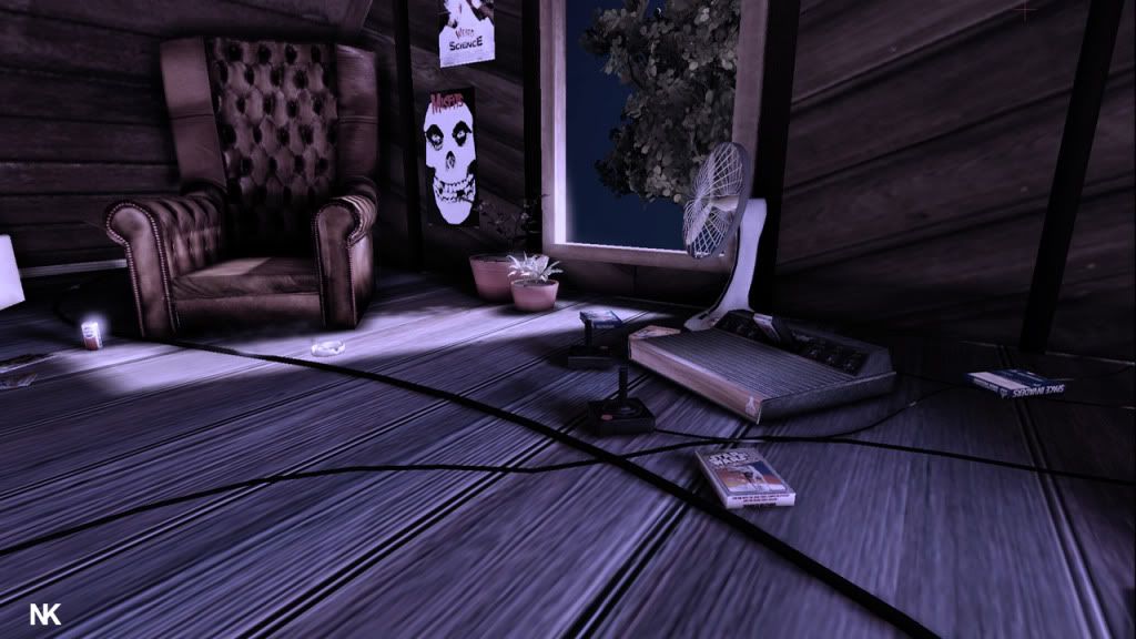
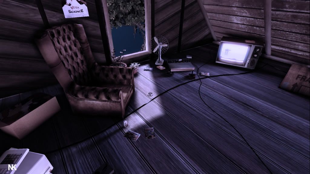
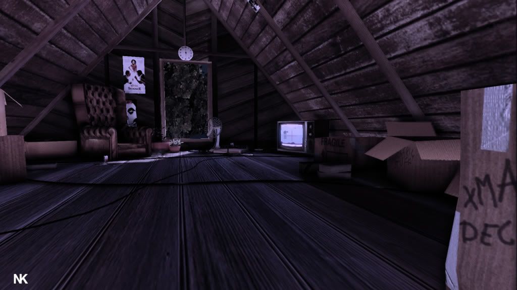
I am working on an attic scene, modeled in Maya and rendered in UDK. This is so far what I got, the attic is suppose to be based in the late 80s so all the props im working on have to have some kind of reference to that time period. The idea is that it is stored with boxes and loads of other stuff but at the same time it is also kind of a hang out place for a young adult who made a comfy chill out room for himself.
So far the scene is around 7K polygons.
Any crits or ideas where I should go with this?
Thnx


Replies
I dont know for sure, but the part of the wall with the window where the wood is slanted downward looks odd. I think the wood may be straight but id look for refrence to be certain.
The arm chair is weird from the front, not sure why, it looks like i can see the sides from the front.
Also i would work on your bump maps... right now they look to soft
I like the idea of the scene, so that's definitely to its credit, but several of the elements combined don't work for me.
Lighting - The scene is very dark and flat as a result, try and create a foreground, mid-ground and background area using varied degrees of lighting intensity.
Texturing - Try to create textures using normal map transfer techniques/hand painting, it is quite obvious in certain areas that the textures are flat images and as a result it looks very "cg texture-y"
Compositionally - Try and create interesting angles that have higher poly/texture resolution textures closer to the camera.
Some good reference:
http://www.movieweb.com/dvd/DVdRq65CX6MVhd/attic
(the attic from the goonies)
Also, Jumanji!
[ame]
Keep going on it, improving the things I stated should defiantly improve the scene, but of course its down to your own judgement.
See you by the refrigerator.
Here's another reference of an attic if you wanted to create an eerie feeling to it:
[ame]