Oven~
Hey guys my name is Phillip, an art college freshman & 3D newbie.
This is my first finished 3D prop....
I need to know whats going on, so plz let me know whatever u think :)
:)
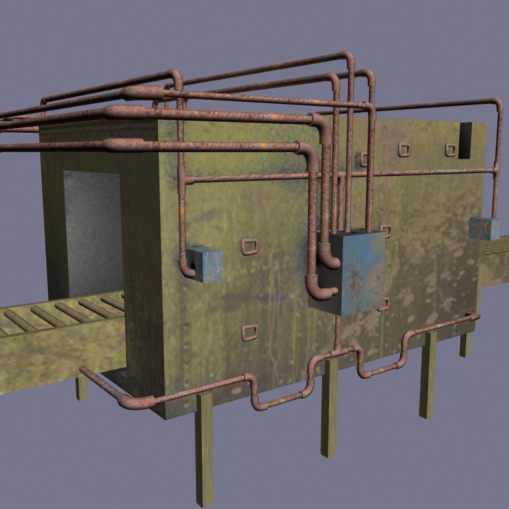
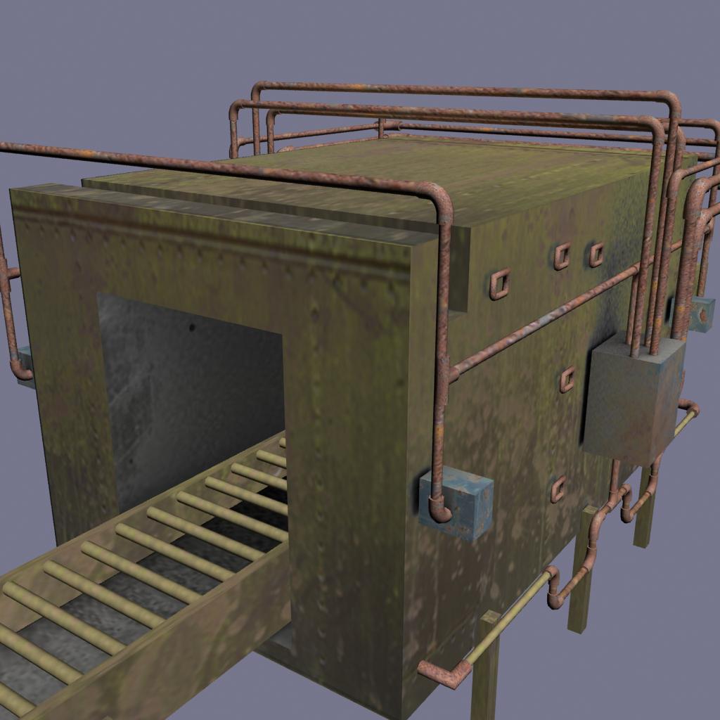
http://4.bp.blogspot.com/-trmrmRTtz80/TWIt5hF3S-I/AAAAAAAAAL4/aHCiWlwswcA/s1600/ZEYAN_Oven+UV-finished.jpg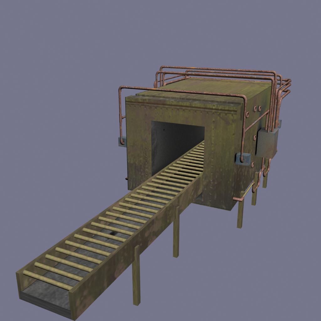

This is my first finished 3D prop....
I need to know whats going on, so plz let me know whatever u think


http://4.bp.blogspot.com/-trmrmRTtz80/TWIt5hF3S-I/AAAAAAAAAL4/aHCiWlwswcA/s1600/ZEYAN_Oven+UV-finished.jpg


Replies
You got balls posting this box mesh with photos on it. Massive balls, so i respect that, and will now drop the science i have for you.
I think you should take this to level 2, as it is a good piece to learn the whole prop pipeline... also get UDK or an engine if you want to make games art well, you need to see how it will look under "game time conditions".
Crits
- It looks like it has no design thoughts other than the overall shape of it... how was this built in real life, maybe try to get more in detail. USE references if you are not doing already. How do them legs attach? It looks like sofa style fittings at the mo... Screw, joints, gauges, valves... mechanical joins, presses,weldings... think who built it, and how it is actually built. These things are made from parts.
- No normal map, no specular map?
- Texture resolution problems due to how you laid out your UV map. See how some parts are higher rez (pipes, blue bits) to the larger surfaces, the yellow faces? (which appear more blurred and blocky, despite being nice on the sheet). You need a UV checker map to erm, check it. And you can do alsorts with sharing of UV space to optimise that layout.
- Diffuse is too light... too photo reliant. Am sure light info is also in the photos you used... so use corrections if you gonna do that. I make alphas also, if am doing that. Diffuse should be flat base colour to start and get a loose specular on the boil after that, i also have a normal and ambient at that point to play with. The more i do it, the less linear I am at this point... is good to play around to get that base... as in the end... you will need to paint and overlay and massage it all, finalise all the maps as they all interact and are all important. Just diffuse alone.. I am not feeling it as is, there is no difference on your model to indicate the surface bumps, the way metal interacts with light, how dirt and stuff interacts with light... and it takes away from the illusion that "could" be achieved, depending on how far you take it.
- I would remake the UV map, as it is good practise anyways (sit down and "do" time is needed when you start, so see it as that, just process... be prepared to make terrible bakes! Is just the way it is until it "clicks".
Keep at it.. :poly124:
However, since you went ahead and custom UVed it, it needs to have a custom texture. Without the wireframe shot, I'm still pretty sure those pipes aren't too efficient either.