'The Fixer' Character Model
So, normally i just stick to the mobile gaming thread, but i thought i had better dust off my sculpting skills and add to my portfolio before i go to any university interviews!
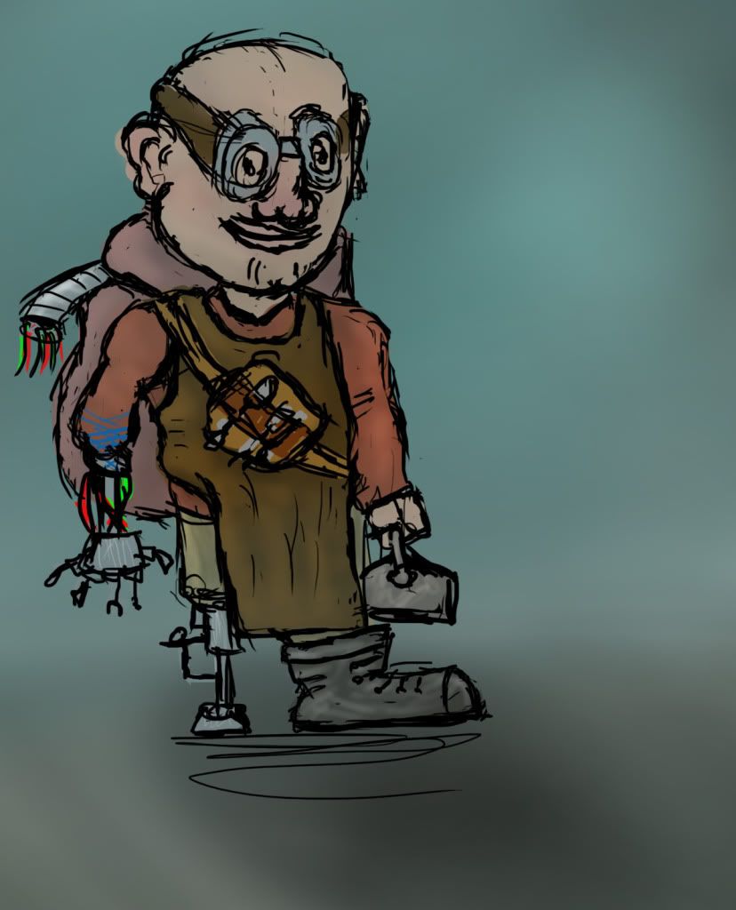
First things first, my terrible concept sketch, hats off to you if you can make out what its meant to be. For the majority of you who cant here is a brief description- The fixer, small dwarf/midget type character with a robotic arm and peg leg, with a "Swiss army hand" which has various tool attachments on each finger. He randomly wanders around gathering spare parts and repairing things....
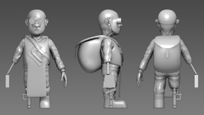
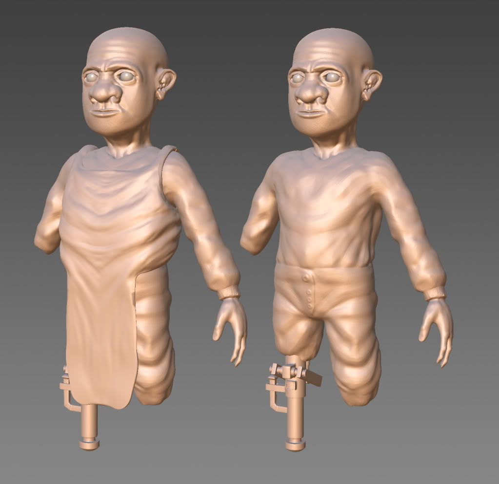
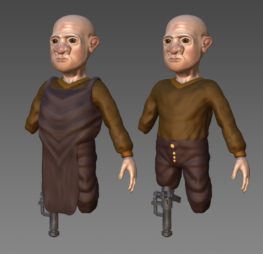
If my lack of drawing skills havn't made you hastely click your back button, here are some pics of the outfit block out, current sculpting progress and some colour mockups!
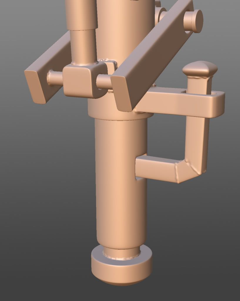
And i started adding some welding detail to the leg...
Still need to think of a nice concept for the robotic arm, so that'll come later.
thats all for now, you may now crit to your hearts content!
First things first, my terrible concept sketch, hats off to you if you can make out what its meant to be. For the majority of you who cant here is a brief description- The fixer, small dwarf/midget type character with a robotic arm and peg leg, with a "Swiss army hand" which has various tool attachments on each finger. He randomly wanders around gathering spare parts and repairing things....

If my lack of drawing skills havn't made you hastely click your back button, here are some pics of the outfit block out, current sculpting progress and some colour mockups!


And i started adding some welding detail to the leg...

Still need to think of a nice concept for the robotic arm, so that'll come later.
thats all for now, you may now crit to your hearts content!
Replies
I'd definantly look at some more face and clothes reference. Especielly the mouth/nose area shows off the typical cg character mistakes.
Really, the 3d isn't bad, but a lot of the mistakes I see are pretty common with people who can't draw very well.
Your ability to work in 3d seems alright, but your 2d is sub-par, I'd work on learning some of the foundational basics of art, form, light, color, anatomy, etc... your 3d stuff will improve a lot.
Searching about for "Fat nose" references now, hopefully can find a few decent ones, also got a few lip refs to go by too, know any good websites for getting reference material? save me sifting through the crap on google!
The nose could be called stylistic, but the mouth needs work and the eyes are definitely scary.
Its definately more of a stylised approach that im aiming for, especially with things like the ears and nose. Looking at the eyes now, i completely agree, his eyeball would just roll out of those baggy old things! With the mouth, i guess i've shot myself in the foot there, normally when i do faces the lips seem to have too much of a curve and it looks like the character is pouting, so this time i tried to keep it flat but too flat apparently!
I'll have a good mix 'n' match tommorow morning and try to get things to how they should be.
As for the cloth, it looks a little chunky to me, but i wanted it to look rather thick and heavy, not a light fabric, what would be the best way to go about doing this? just make the folds a little more convincing?
Thanks again.