indie arcade flight game
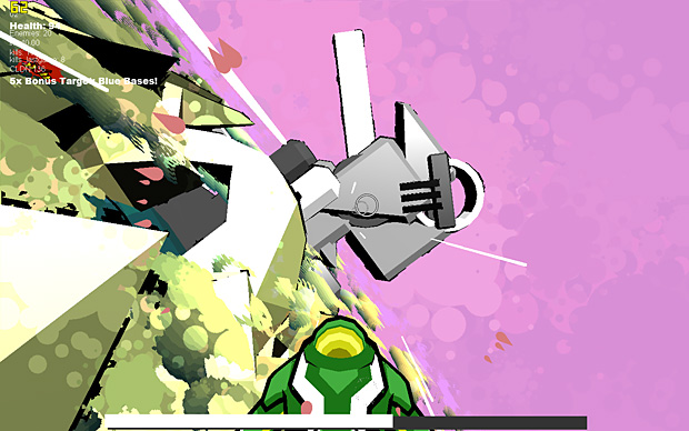
Hi all! this is a new prototype I'm working on. Theres not much in the way of sweet modelling here (it is a prototype) but I'd love some gameplay and art style feedback! If there are any game designers in the house, any thoughts on mission structure would be ace, its a bit bare bones atm..
pix: note, colour scheme is semi random to represent different random planets. hit backspace to restart and try another scheme

download:
http://dl.dropbox.com/u/8878789/TGOD_v30.exe
controls:
Throttle up/down: W,S
Roll ship: A,D
look/aim: mouse
fire gun: left mouse button
fire missile: rmb
goals:
1. the bar along the bottom fills as you get points, the level ends when you fill it completely
2. different activities earn points: killing enemies, destroying the large blue 'bases', and collecting ground-scattered pickups
3. at any one time, one of these goals is selected for a 5x points multiplier.. This changes periodically. Displayed top left (and targets appear ingame over bonus goals)
4. to kill the blue ball 'bases'- destroy one or more of the surrounding purple ball 'generators', which feed its shields. When a base has 4 generators it is invincible, but with no generators it dies very quickly. You can actually kill the base when it has 3, but it will take a while.
thanks guys
pix: note, colour scheme is semi random to represent different random planets. hit backspace to restart and try another scheme

download:
http://dl.dropbox.com/u/8878789/TGOD_v30.exe
controls:
Throttle up/down: W,S
Roll ship: A,D
look/aim: mouse
fire gun: left mouse button
fire missile: rmb
goals:
1. the bar along the bottom fills as you get points, the level ends when you fill it completely
2. different activities earn points: killing enemies, destroying the large blue 'bases', and collecting ground-scattered pickups
3. at any one time, one of these goals is selected for a 5x points multiplier.. This changes periodically. Displayed top left (and targets appear ingame over bonus goals)
4. to kill the blue ball 'bases'- destroy one or more of the surrounding purple ball 'generators', which feed its shields. When a base has 4 generators it is invincible, but with no generators it dies very quickly. You can actually kill the base when it has 3, but it will take a while.
thanks guys
Replies
The HUD doesn't relay information to the player in a intuitive manner. Some sort of visual element to indicate to the player how much health they have and making it more visually significant would be useful. The bonuses would be better announced by placing them near the center of the player's view with a fade out. The kill count and enemy count are more or less arbitrary and could be excluded without affecting the game. If you're applying kills to the progress bar anyway, kill count is largely unnecessary. I assume the other elements are for debugging purposes. The bubble effect on the screen, you should lose it. It's annoying and distracting. If it's not serving the game play, it doesn't belong.
Gameplay:
The thrust controls are largely ambiguous. I'm uncertain what I'm doing when I press the keys. Some clear feedback to the player when they change the throttle would be helpful. I also felt that there were too many enemies to fight, but they were also too easy to beat. I can take one out in passing by lobbing a missile at it, but I find myself surrounded at all times. Make them fewer in number, but more difficult to destroy. In fact, you might want to give the ships "shields" that can only be destroyed by your guns and weak against the ship itself. Then the missiles would be the opposite, weak against the shield but strong against the enemy ships.
Might I suggest you tie the appearance of enemies to the destruction of the bases? As you destroy the blue base, a squad of enemies (4-6 enemies) emerge from its destruction. Also assign 2 enemy ships to patrol each of the blue bases and attack the player when they come near. You could also add some non-combative enemies that spawn new bases while you're occupied with other tasks. Taking them out would be tactically significant in controlling the battlefield. Those could be spawned at an interval after you destroy the existing set.
Pickups are difficult to gather when in combat and don't offer enough recovery to be worth the risk. It might be better if they chase the player when they come in range. The ground pickups don't make any sense to me. Do they benefit the player in any way other than adding points to the progress bar? If not, then give them a purpose or get rid of them.
Those are the issues I see so far. Here's what you did well:
The controls are largely easy to understand aside from the throttle. They work well and are responsive. The onscreen enemy compass was a good idea. It makes up for the low FOV that monitors have. The collision indicator is a good idea. There were several times I ran into an object and it made me aware of it. Overall, it's a good first attempt. I've seen far worse from others who were paying to learn this stuff.
Edit:
I had another thought. Instead of filling the progress bar as you destroy things, why not set it up as an indicator of whether or not you've cleared the level of enemies? There would be a max population the level will allow and your job is population control, by genocide. When you've destroyed all enemy ships, bases, and base builders, the level is complete and you move on to the next challenge.
But seriously I did make a game with very similar controls (as in the video in the WO thread). Here:
*edit: link removed, I no longer have the original video, sorry about this...*
People hated it though, so I upgraded to this:
[ame]
Btw, the exe from dropbox does not run at all, so I cannot confirm if this is the same game from the WAYWO thread. I am on Win XP 64. Finally, never deploy an exe file, unless people really trust you. If you put the exe in a zip, more people out there will download it. I learend this the hard way..
interesting about the exe, heres a zip:
http://dl.dropbox.com/u/8878789/TGOD_v30.zip
does that work?
cheers greevar, gonna take a look at your suggestions- a few were in the original design, like spawning enemies when you attack bases. I guess I wanted more constant pressure rather than allowing players to simply wait before approaching a new target, but I think there's room for a balance. The idea of the pickups really was to encourage some 'zoom around really low' flying
edit: ah also with the thrust: the way its meant to work: once you've reached full thrust, if you hold down w after a sec boost will activate. definately agree it'll need a graphical representation to make obvious!
The game still does not run in xp64. I got it to work with compatibility mode on. I think you have compiled the game without strictly specifying it is 32 bit, so 64 bit systems think it's native 64 bit code and fall flat.
The game behaves rather nicely, btw. The controls are much better than what I could ever get. I also really like the dot "shadow" that warns you of nearby obstacles (I wanted to do that, but never could). I really like what you've got so far. Will be sweet when it gets some elaborate level design :thumbup:
Obviously, thrust indicated by a linear bar and some numbers would be the most effective. Perhaps also mapping the thrust to the mouse wheel when available and then having Shift to toggle boost? Instead of having ground pickups, you might want to just add ground targets that are difficult to target from the air and require you to fly in low to take them out.