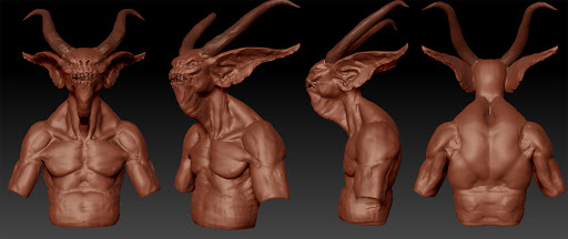
Hi, first post for me here, and I wanted to jump right into and WiP I'm doing for a school assignment. Doing a fallen one from diablo. Doing the model in segments.
Anyway, I think this is nice, and I like the concept you picked as well. I think you nailed the 3|4 shot
However, his back obviously needs a lot of work and his ears read really muddy right now. Make sure to get the earings in soon as well as they will add alot, especially in terms of asymetry
Agreed, good start, and yeah, it seems a little tricky figuring out how tall he is with the ref being crouched. Maybe you could do a quick transpose to see how you feel about it currently?
I don't think I would worry too much about matching the reference 1:1. It looks very good and definitely looks like the concept. I would be more concerned about maintaining proportions, which you seem to be doing just fine.
Your basemesh feet are weird. It has small toes on the inside and large ones on the outside. Also, the concept has 4 toes per foot.
I think the horns could do with being a bit more rounded, not such sharp bends, and that they should enter the skull more horizontal/from behind, and not so much vertical/from the top. The ears are a bit messy and lacking depth/structure, if you look in the concept it's actually built like a human ear, with a very elongated tip.
I agree on slimming and lengthening him a bit, he still looks too human. Also think you should give him a bit more of a pot belly like the ref.
Its looking cool so far. His torso and stomach area could do with some silhouette definition in the front view. Right now it seems as though his waist is the same width all the way down to his hips. Some definition in that area would help.
i agree with snader, to me it looks like he has a bit of a pot belly, so maybe that can help with the silhouette a bit as baj said. also he looks to be beefier than in the concept (like others have mentioned) so there are some needed tweaks there
otherwise its looks awesome, im really digging that creature, so ill be watching to see how this turns out :thumbup:
Snader's critique is on point. Elongating the body and following the reference in that regard will make him much scarier and creepy looking which is what you want. The pecs need a bit more meat on them to give them some weight, if you notice in the profile they are not helping the silhouette but from the front view it seems like they would have some form. The bottom of the pecs need to be flattened out as well, pay close attention to the form in the concept. Lastly the eye sockets are much smaller than they are in the concept, scale them up vertically so you can have those creepy glowing red eyes in your final piece.
This is a great start, you are heading in the right direction.
Thank you all for the feedback, really nice. Have worked on some of them, but will work more on the things you guys told me.
Have added the arms and hands, only worked on the proportions.
I made the legs longer and fixed the feet so I can sculpt them right. also made the ears smaller.
this is looking awesome! i'm obsessed with the concept and this sculpt is definitely doing it justice. one thing i'm noticing is it seems like his legs, specifically thighs, should be thicker to add to the cool proportions from the concept. i could be wrong though. i just think you could mess with the shape of the legs a bit.
Thx, didn't do much today, need to step it up tomorrow. But here is an update. Don't have time to break up symmetry to much. But I will trywith the bags and stuff.
Heartless: He has gone thruu a tummy tuck now :P.
JGcount: Yeap will add the earings. I don't have time to make the staff right now, but I will probably do it later. In an other assignment.
One thing I'd like to point out is that his legs seem relatively soft compared to the rest of his body, like not as toned and stringy. Feel like a bit more muscular/tendon detail around there would look cool.
Replies
Anyway, I think this is nice, and I like the concept you picked as well. I think you nailed the 3|4 shot
However, his back obviously needs a lot of work and his ears read really muddy right now. Make sure to get the earings in soon as well as they will add alot, especially in terms of asymetry
Keep up the good work!
He is looking great so far
//Jonas
Here is an small update, mostly worked on the posture.
I think the horns could do with being a bit more rounded, not such sharp bends, and that they should enter the skull more horizontal/from behind, and not so much vertical/from the top. The ears are a bit messy and lacking depth/structure, if you look in the concept it's actually built like a human ear, with a very elongated tip.
I agree on slimming and lengthening him a bit, he still looks too human. Also think you should give him a bit more of a pot belly like the ref.
Good luck mate.
otherwise its looks awesome, im really digging that creature, so ill be watching to see how this turns out :thumbup:
This is a great start, you are heading in the right direction.
Have added the arms and hands, only worked on the proportions.
I made the legs longer and fixed the feet so I can sculpt them right. also made the ears smaller.
only thing that looks off atm are the hands and transitions between certain joints (pelvis area mostly imo). Should look even cooler posed ^^
And are you planning to make the staff aswel`?
JGcount: Yeap will add the earings. I don't have time to make the staff right now, but I will probably do it later. In an other assignment.
One thing I'd like to point out is that his legs seem relatively soft compared to the rest of his body, like not as toned and stringy. Feel like a bit more muscular/tendon detail around there would look cool.