WIP-Hand Painted Stone Ground -first time
This is my first attempt at hand painting a texture, this will be titable, I want similar look like wow , I have read the forums and looked at some of the tutorials, but I am just making sure I am heading the right direction. Only two in middle have been done.
Any crits would be appreciated . I am using GIMP as a painting program.
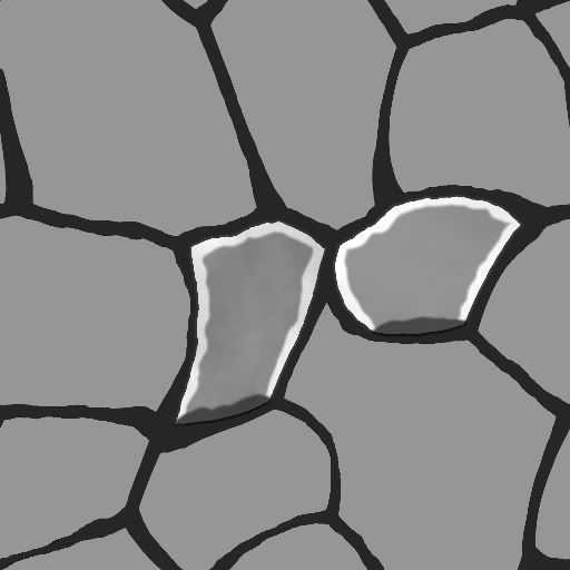
and here is the update as of 2/16/11:
done by tutorial on polycount tutorial section..
(sorry for the double post below)
Any crits would be appreciated . I am using GIMP as a painting program.
and here is the update as of 2/16/11:
done by tutorial on polycount tutorial section..
(sorry for the double post below)
Replies
first off, it looks like you spent a total of 10 minutes on this "piece". i understand its a work in progress but maybe do some more progress before posting anything up. this is especially true because the time from your first post till your second was a little over half and hour it looks like. in that time you added a total of, lets say, ten lines. do more work between your updates
also, do you have any reference at all that your using for this? a screenshot from WOW? another piece of artwork? i would STRONGLY recommend that you have a file with at least half a dozen different pictures to use as reference that you can have handy while painting. if you are already using reference, then post it up
i can almost guarantee that no one, or only a few people, are going to bother commenting on this, so i suggest you take some time (lets say 3-4 HOURS) and read some more tutorials, gather reference, and practice for a while before coming back to this.
and just because i've already written this much, ill give you some things to consider when revising
the "stones" look like they have a total of 4 colors being used within them, get some more variation or better yet, smudge some color around to get more natural tones. the shapes of your stones need some work, as they look super uniform and rather uninteresting, plus that larger one near the bottom right sticks out like a sore thumb among the rest. keep an eye on your light source (and if helpful, physically draw an arrow showing the direction of the light) because right now you have in consistancies within your highlights and shadows. hopefully that last bit helped in some way, but keep in mind im in no way a 2d painter
jimmypopali thank for your advice as well
Yeah, I will do more as suggested. I have done many real photo texturing, and found out hand painting texturing is a lot harder....I'll post in abit with more work and detail...
Thanks alot :-)
HEAPS of great hand painted tuts to get your head around it.
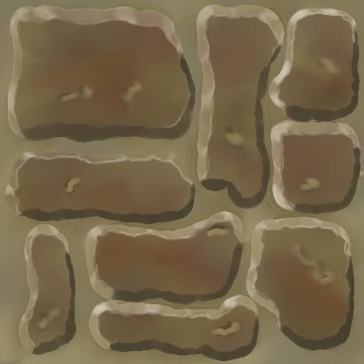
Here is an update based on tutorials on the polycount, still getting the feel of it:
More importantly how do you feel about it? Is there anything you think you can improve on? If so what? What did you do differently from the first and what might you do to differently on the next?
Can you describe your process so far? What kind of brush are you using? What is the layer set up like?
EDIT:
Some things to keep in mind:
Not all stones are colored the same, there is almost always variation. Think about how the stones are made, varying molten material not always the same blend. Or it was a mixture that was baked, cut and shaped and not always stacked in the same order they where made so you get some variation between the bricks.
You're creating a ground tile. As you imagine the light source you need to keep this in mind and not light it the same way you would a wall tile. Light will more than likely hitting it directly as if beams of light shot out of your head, rather than from the top of your tile to the bottom.
It's perfectly legit to model some bricks, do some bakes and create a diffuse/normal/spec map that way. You will definitely pick up some awesome skills keeping on the path you're on right now, but it can be helpful to come at problems like this in a few different ways to.
solid
blend
shadows
highlights
specular
Good luck you're off to a decent start.
I think youre off to a good start, just need to spend a little more love on the texture and keep practicing! Most important part..