Fable scene UDK
Hi everyone, it's been a very long time since I have posted anything here, which is a shame of kind of. Anyways...
Here are the concept pieces I'm working from. I'm using the top one for most of my reference.
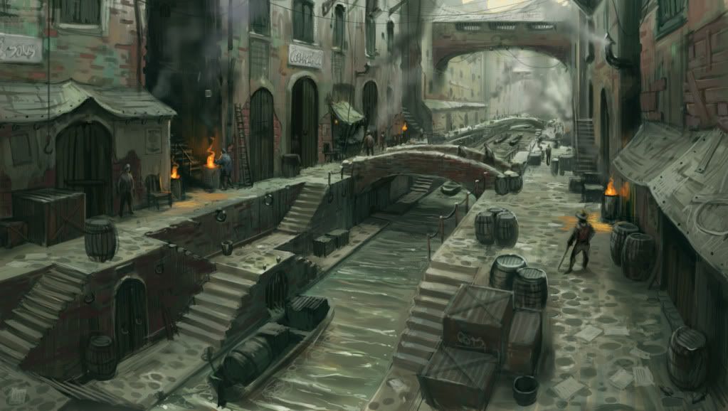
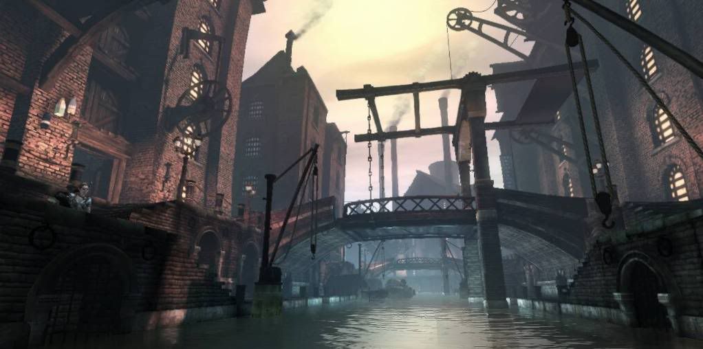
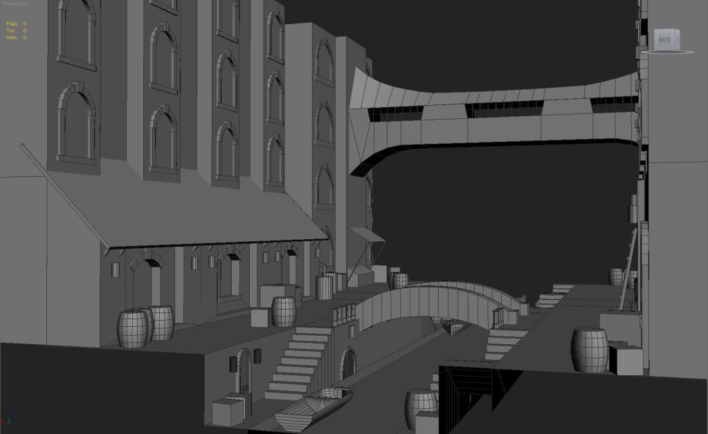
And here's what I have so far. It's a screen grab from Max, but I am planning on putting it all into UDK, which I've already started. I'm mainly looking for some feedback before I start unwrapping everything. I realize that there isn't too much to critique on because it is just the beginnings, but anything will be a huge help. Thanks!
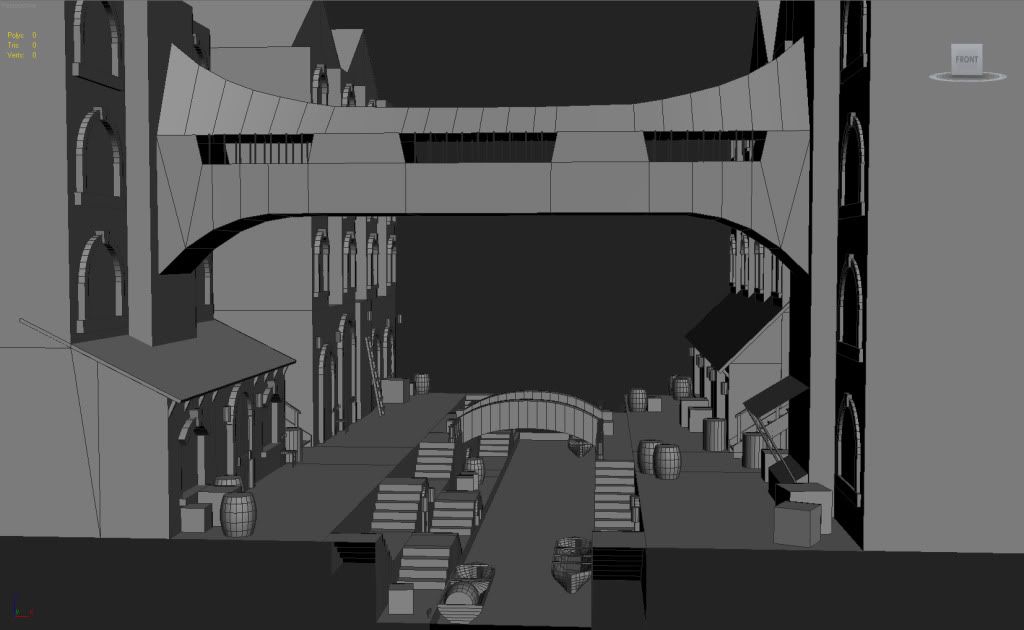
Here are the concept pieces I'm working from. I'm using the top one for most of my reference.


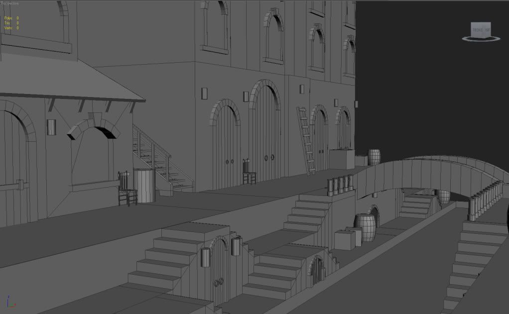
And here's what I have so far. It's a screen grab from Max, but I am planning on putting it all into UDK, which I've already started. I'm mainly looking for some feedback before I start unwrapping everything. I realize that there isn't too much to critique on because it is just the beginnings, but anything will be a huge help. Thanks!


Replies
Looking forward to how this turns out.
Keep it up!
Modularity is a lot harder than I thought it would be, but I'm learning a lot which is cool.
Everything is still WIP so nothing is in concrete.
Concerning the stone arch, I would like to do it in Zbrush, and I've been practicing, but it still ends up looking like soft clay rather than stone, so this is my temporary replacement.
Crit's would be much appreciated!
The top pic is from Max and the rest are from UDK.
Maybe try something like what Philip K has in one of his tutorials:
http://www.philipk.net/tutorials/materials/tilesold/tilesold.html
http://www.philipk.net/tutorials/materials/tilesbricks/tilesbricks.html
Good luck man.
You can also check out here for ideas on how to liven up those tiling textures
http://www.polycount.com/forum/showthread.php?t=56324
@joe gracey - I think u took a good approach by figuring out re-useble ans modular assets first, cauz it seems like the way to do in this situation.
However, I think (and agreing with previous comments) that for now the actual assets (modules) really need more work.
When u r plannig your modular facade try to add some more "breaks" into them, for example lines/patches of difeerent material like basement line on the bottom or deco concrete trim along the roof edge. Also try to play with volume more. Give your modules more depth - more extruded and recessed section (but they need to make sence of course).
Btw, usually it is betetr to have windows recessed rather than extruded
Also u can chek this links that may help u out with your modeling:
http://www.chrisalbeluhn.com/Building_Layout_Guideline_Tutorial.html
http://www.3dmotive.com/product-modular-building-udk
@d1ver: You're completely right about the black, thanks for pointing that out, and thanks for the great link, very helpful!
@Matroskin: what can I say, I achieve to be at your level! I'll work on the windows and making my scene more visually appealing. Great links too, thanks.