Tumbleweed- Webcomic.
Starting a webcomic  . I have 2 pages up so far. I'm not that great at this but i should improve as i go.
http://muzzoid.com/comic/
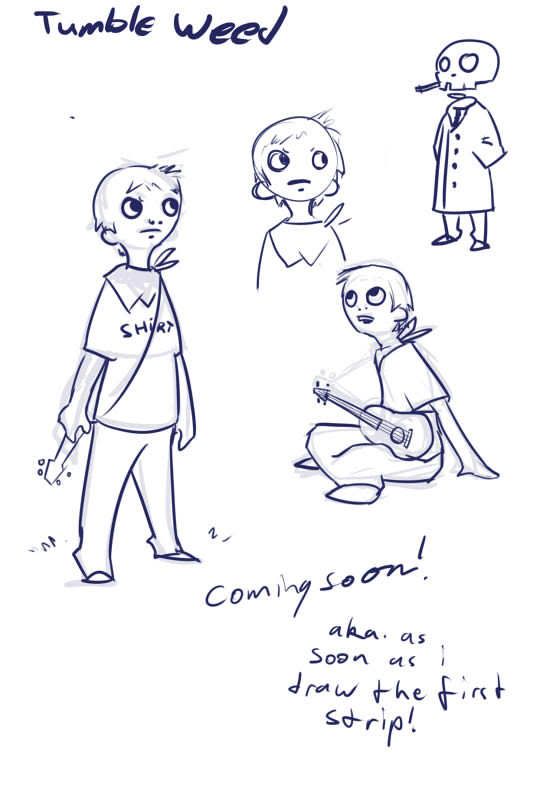
Oh and the character design sheet.

http://muzzoid.com/comic/
Oh and the character design sheet.


Replies
really nice simple style dude, shall add to favourites
Murph, yep. The style is probably a a cross between my own personal stuff, beartato and scott pilgrim.
New page is up.
I'll get a page with some actual meat to it in the next 2 days.
I really dislike the main characters lack of chin. Coupled with 'holes' for a nose he looks like a freaky brainless idiot. Please hint that he has a lower jaw!
Bookmarked, wanna see more!
Mmm i never though about anyone really disliking the chinless thing, i guess its something ive developed over the last few months in some of my drawings. So i think its kind of an acquired taste thing. Ill try and make it more prominent as we go without changing the style to much.
As far as the more complex pages, yeah that stuff will be the bulk of it, the first single one was more of a style test and the second one was i just wanted to do a quickie topical comic.
Ive got the next full page one sketched out, ive just got to finish it.