Home 3D Art Showcase & Critiques

Bustin' heads with head busts

Hey all, I've been working on my first Zbrush bust (or head rather; no shoulders to speak of) and I would love some C&C on what I could improve upon so far. I've kind of hit a mental wall and don't know where to go next. I feel like it still looks a bit bumpy/melted, and I know I should start doing some more medium and smaller detail soon, but I'm a bit hesitant to just move forward willynilly. Big thanks to Cesar Dacol Jr.'s tutorial on masking and sculpting in Zbrush, it helped me quite a bit thus far.
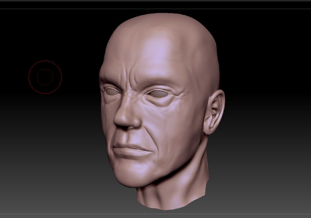
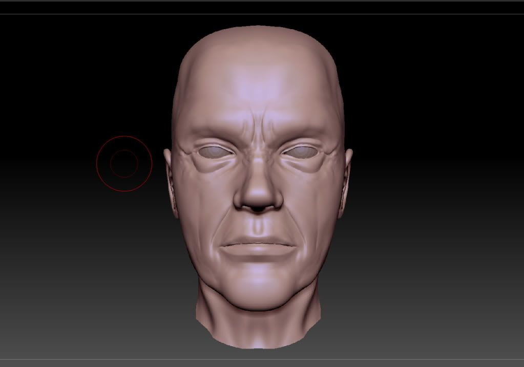
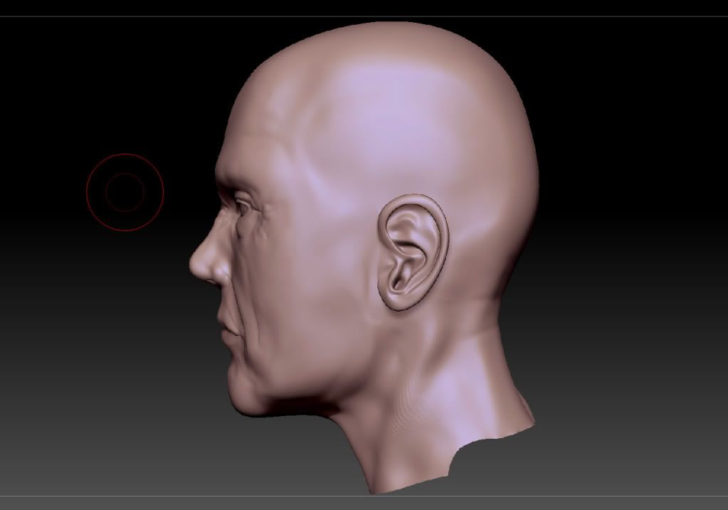
bust_1.jpg
bust_3.jpg
bust2.jpg

Replies

  • Captain Narway
    Added some wrinkles and refined some areas, as well as messed with the ear a bit since it looked a bit too sharp. Still does. Added pores as well. Overall, a pretty small update.

    bust_4.jpg

    bust_6.jpg

    bust_5.jpg
  • Captain Narway
    Baked the normals and textured the bust. Messed up the UV's. Redid the UV's. Redid all that and here's where I'm at now. Have to fix some weirdness with the skirt I built around the eyes and fix up the texture some more. Fun Fact: I started out with the mesh inly going half way down the neck. Then decided I wanted it to be more of a bust. So I stretched the polys. And now th eentire neck/collar bone area looks like crap. C&C welcome!
    bust_baked_wireframe.jpg
    bust_baked_34.jpg
    bust_baked_front.jpg
    bust_baked_side.jpg
  • megalmn2000
    Offline / Send Message
    megalmn2000 polycounter lvl 13
    The modeling looks good but I think there's too much contrast on the texture, making him unnatural. Also, the fold lines under the eyes are too strong and straight, maybe making them subtle will be a better choice. :)
  • Shiniku
    Offline / Send Message
    Shiniku polycounter lvl 14
    I think the shape of the eye is off. I think it's too even from top to bottom, and the transition into the tear duct doesn't look right. Also, I'd really work on the texture for the eyes - the eyes are the #1 thing to sell a believable model. Also, the fold around the eye are really pronounced, and it would make me think he has some rpetty extreme bags and bulges around, but from the side view it looks like it really doesn't.

    You've already acknowledged the neck.. yeah, stretching polies is never the best plan. It doesn't look like you spent much time on it comparatively, either. it's bringing the model down.
  • haikai
    Offline / Send Message
    haikai polycounter lvl 8
    Pretty good job so far considering it's your first.

    The head shape is too block-ish/square. The front half of the head should be narrower than the back. If you look at a skull from the top this can help you visualize it better.

    The neck is way too low poly and it's affecting your normal map (the wobbliness where the sterno-mastoid muscle descends towards the clavicle).
Sign In or Register to comment.