OneLungLewis - Sketchbook
Here are some shots of the Realtime Samurai Warrier I've been working on since Christmas. I will try to answer any question you may have about my process or how I did anything.
Lotus
Tri Count 48954
2 X 2048 Maps
Rendering Real Time in Marmoset Toolbag
I had a blast making this guy and learned so many things about character design.
My hole purpose was to create a Cinematic like Real Time Character from scratch. I'm currently a concept artist but my dream is to be a character artist, so this is my way of trying to achieve that goal.
I hope you enjoy and please leave me any comments or crits, they are very welcome.
Before getting started I wanted to personally thank my good friend and co worker R4ptur3 (Kyle Mulqueen) he was invaluable in this learning process.
It all started with this concept sketch I did right before the Christmas break.
Lotus Concept Sketch
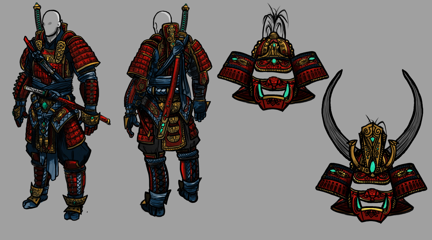
And then about a month and half later of about 3 hours a night it ended up like this:
Lotus Real Time Renders
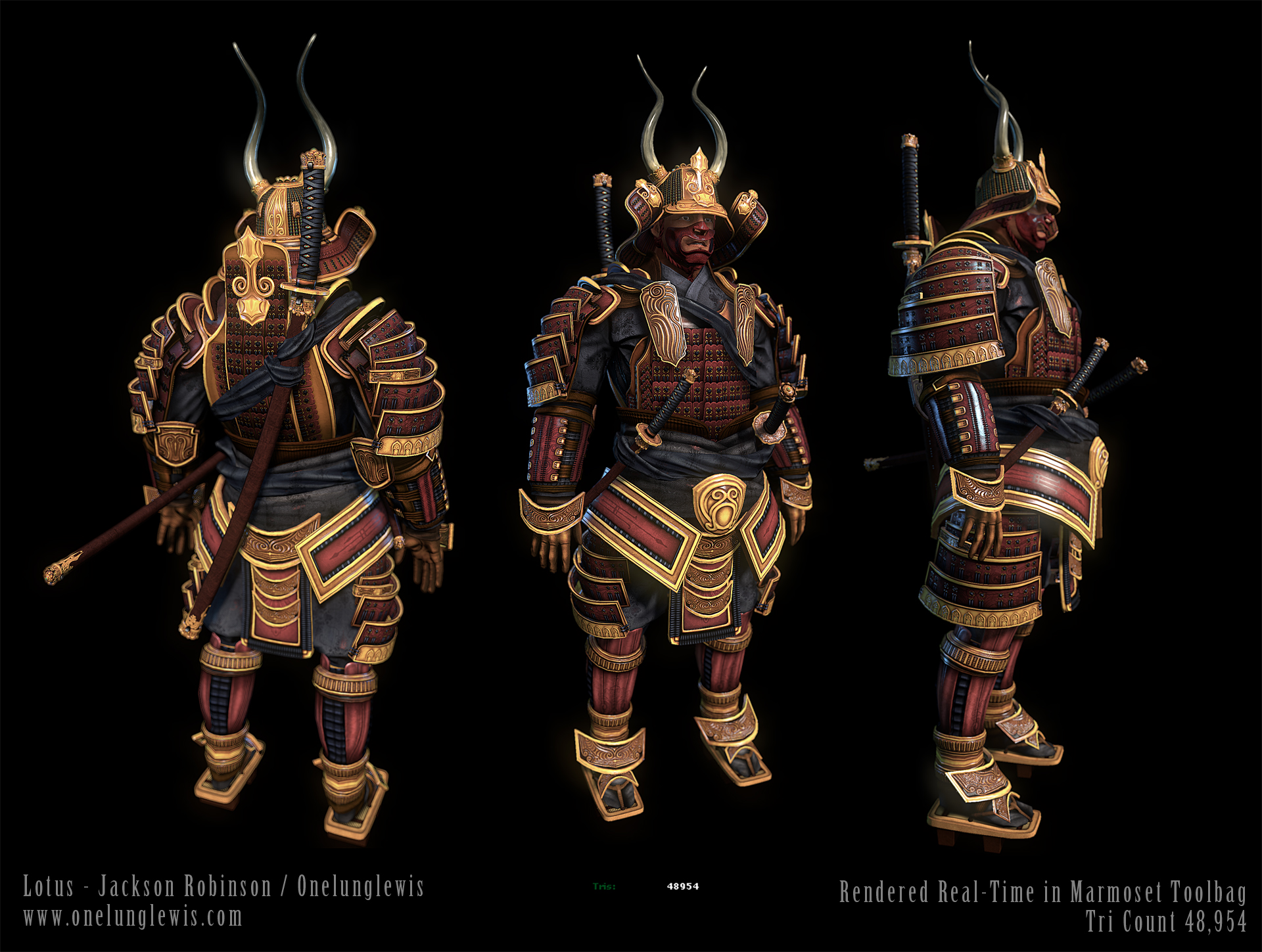
Click Here for a huge version
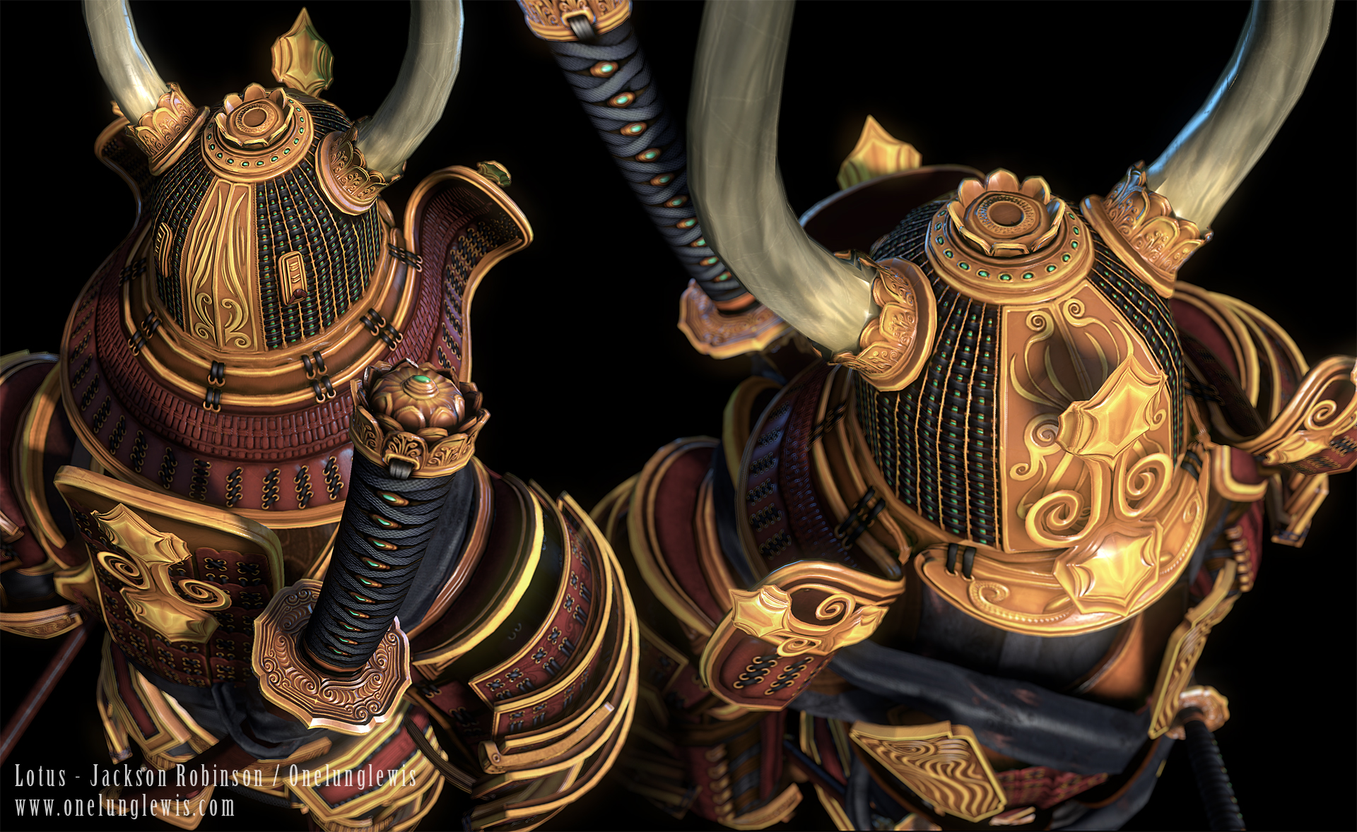
Click Here for a huge version
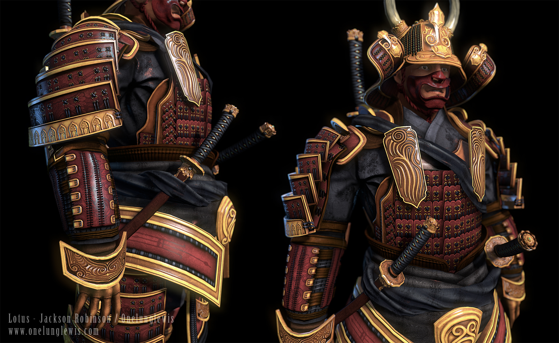
Click Here for a huge version
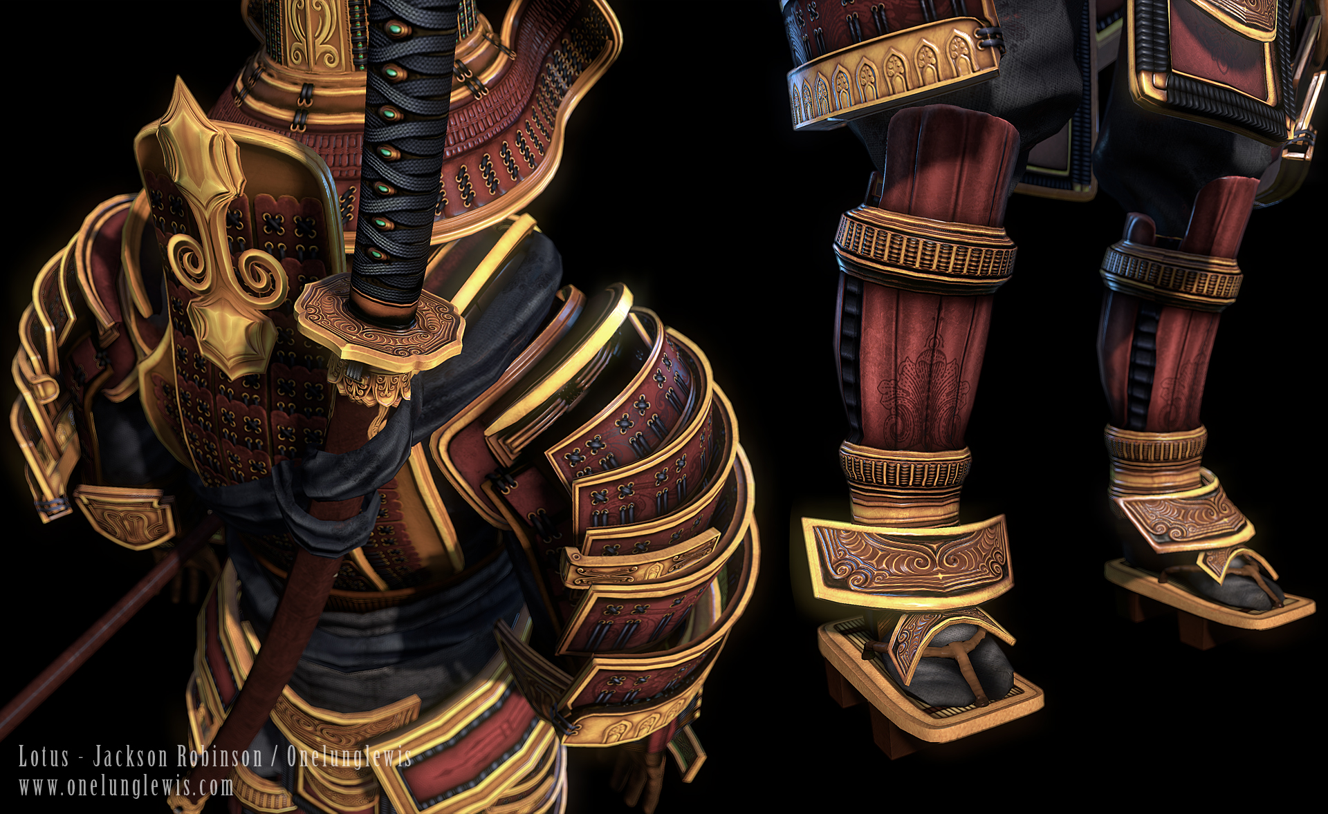
Click Here for a huge version

Click Here for a huge version
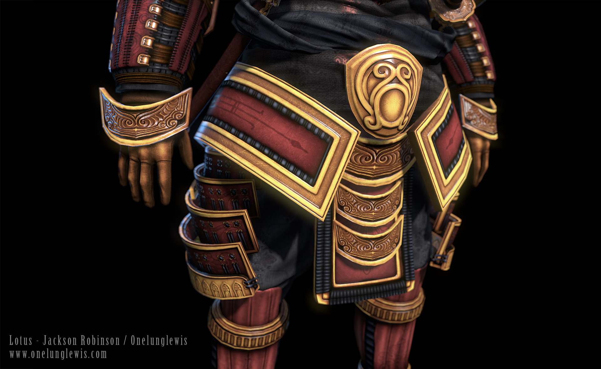
Click Here for a huge version
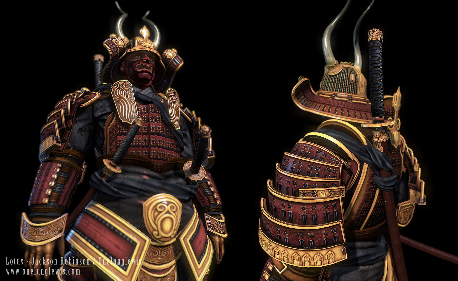
Click Here for a huge version
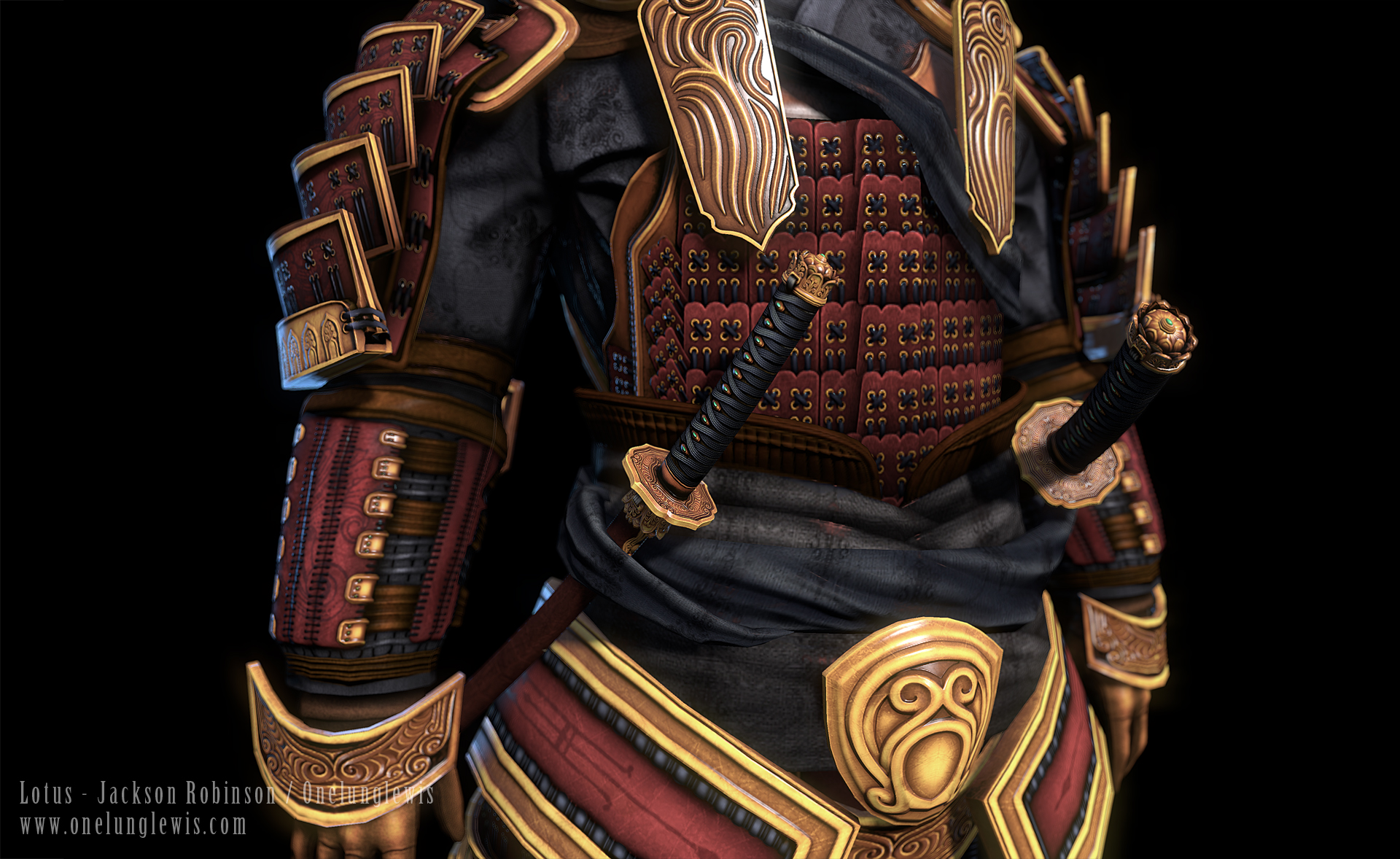
Click Here for a huge version
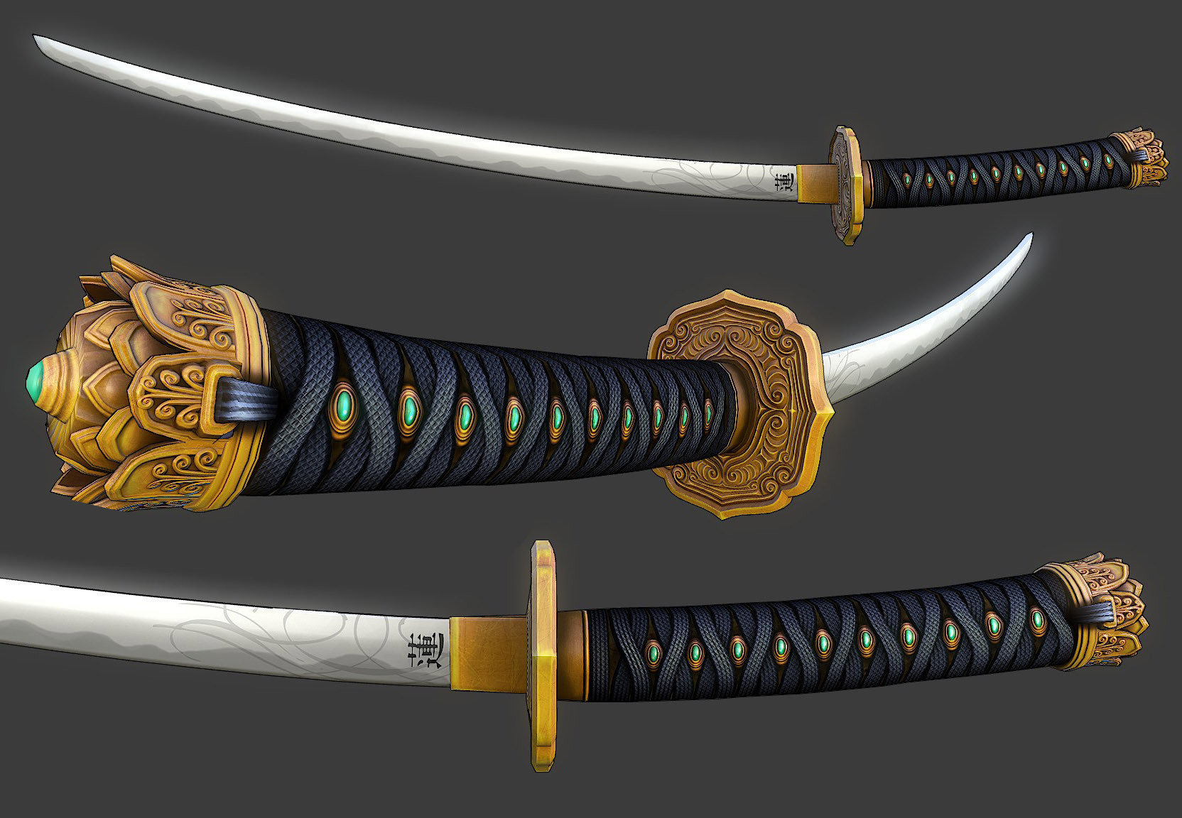
Here is a Detail of his sword, this was the first thing I started with. This version of the sword has a dedicated 2024 map. This was kind of a test to stretch my legs.
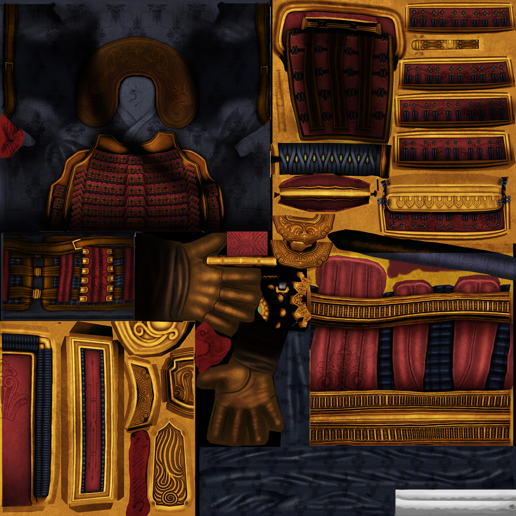
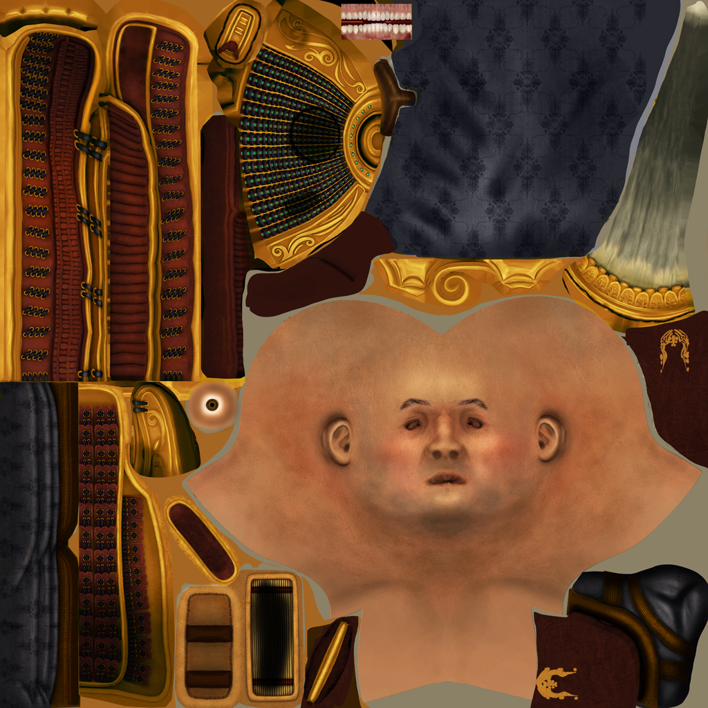
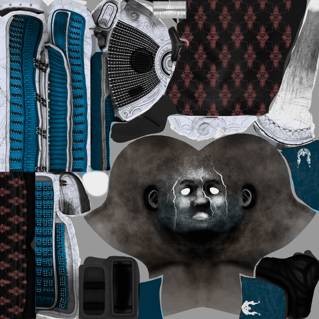
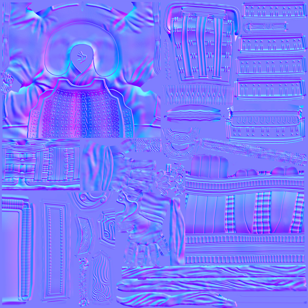
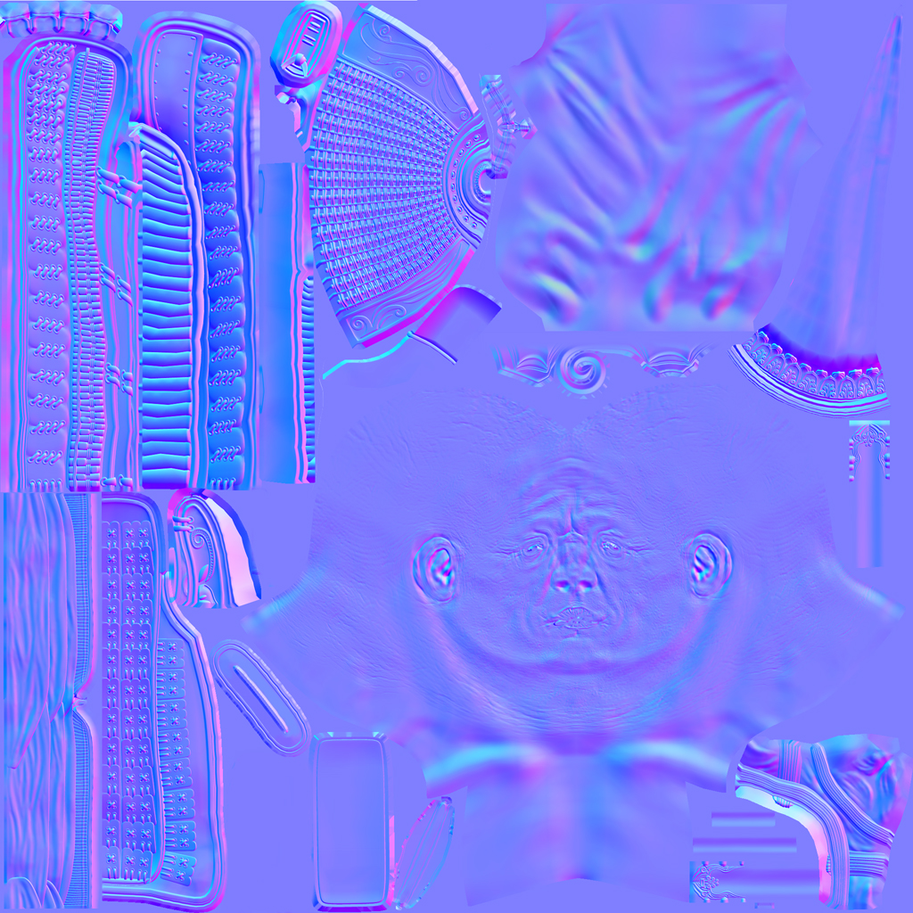
Here are the Texture Maps, everything you see execept the teeth is hand painted.
Diffuse
Specular
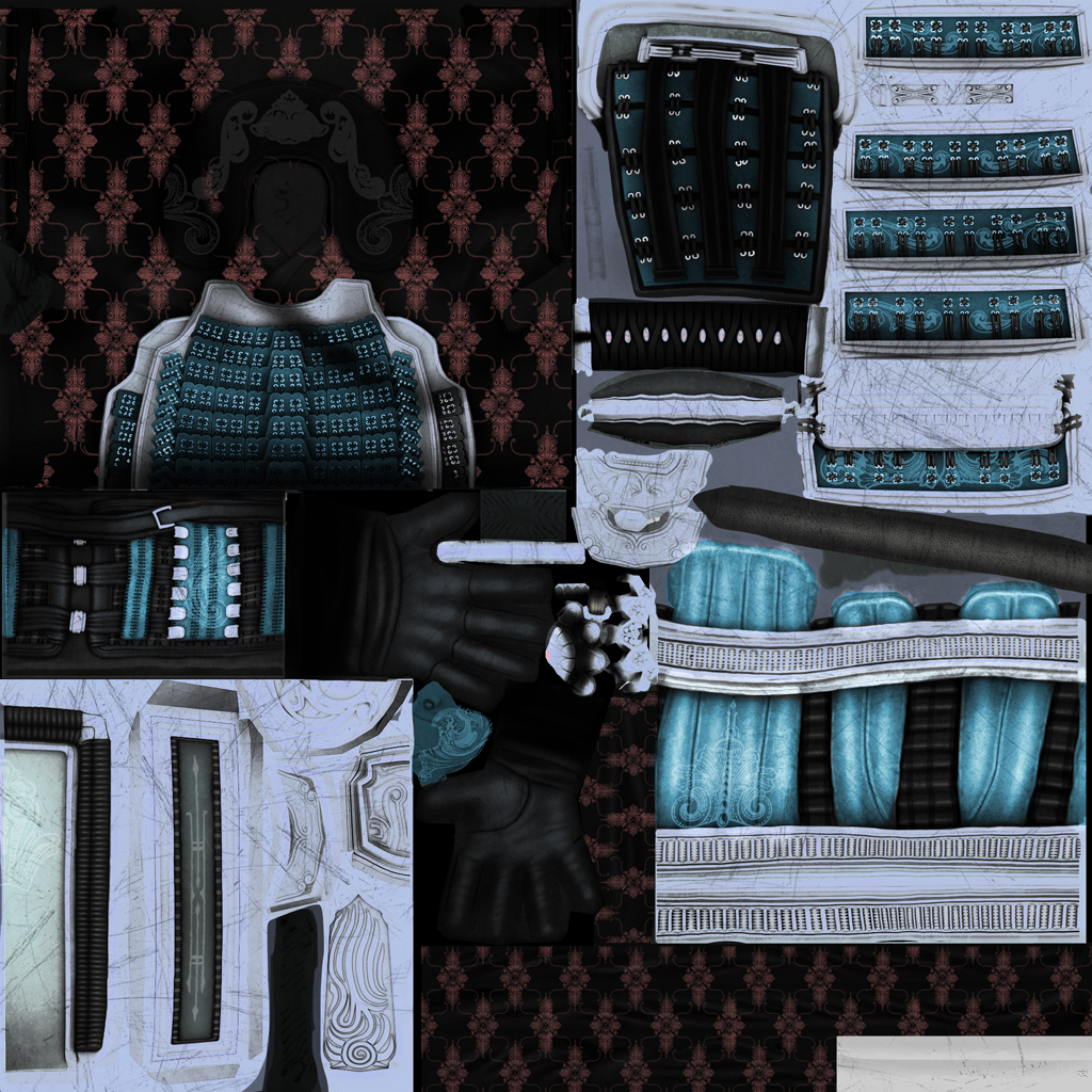
Normal
Lotus
Tri Count 48954
2 X 2048 Maps
Rendering Real Time in Marmoset Toolbag
I had a blast making this guy and learned so many things about character design.
My hole purpose was to create a Cinematic like Real Time Character from scratch. I'm currently a concept artist but my dream is to be a character artist, so this is my way of trying to achieve that goal.
I hope you enjoy and please leave me any comments or crits, they are very welcome.
Before getting started I wanted to personally thank my good friend and co worker R4ptur3 (Kyle Mulqueen) he was invaluable in this learning process.
It all started with this concept sketch I did right before the Christmas break.
Lotus Concept Sketch

And then about a month and half later of about 3 hours a night it ended up like this:
Lotus Real Time Renders

Click Here for a huge version

Click Here for a huge version

Click Here for a huge version

Click Here for a huge version

Click Here for a huge version

Click Here for a huge version

Click Here for a huge version

Click Here for a huge version
Here is a Detail of his sword, this was the first thing I started with. This version of the sword has a dedicated 2024 map. This was kind of a test to stretch my legs.

Here are the Texture Maps, everything you see execept the teeth is hand painted.
Diffuse


Specular


Normal


Replies
Kitana
Shoulder
Helmet High Res
Hats off to you sir.
As for a crit, I do feel that the details in the face are much less defined than in the rest of the model. I understand that the face isn't predominantly displayed, but I think that making the elements which are shown through the mask pop a bit more would go a long way. Some heavier bags under the eyes or deeper wrinkling in that area would help bring the eyes out from beneath all that armor, and infuse some personality into the guy. I think the mouth shows more of what I am thinking, how the bottom lip really seems to jut out and catch the light. I guess I'm really just looking for more elaboration in the eye region. More crisp, defining forms there.
But the only reason I point that out is because of what a great job you did with the rest of the thing. Amazing work, man.
Fucking awesome! No crits from me! I'm blown away
superb execution, the modeling and shapes are perfect!
Too bad you didn't keep the blue in the cloth but I understand its for more bad-assness.
Very inspiring and impressive! Thanks for the share
I'm a concept artist currently, but the studio I work for has been very supportive in my pursuit of becoming a character artist. They are now allowing me to transition into the role of character artist.
Diable fans please give me some crits I want to be respectful of the incredible art that comes out of the Bliz.
I'm a little unsure of the placement of armor and straps in the back the concept is only a front shot and the cinematic isn't very clear of whats going on back there. So any help from anyone that knows and can share would be greatly appreciated.
Blizzard Created Concept of the Demon Hunter Class
Great looking model it is going to be awesome! : )
Im using 3D Coat to paint with
I also started the first pass at color, I like hitting the harder things first so I started with the face. I know it looks like she is wearing a mask but the shadow will make a hole lot more sense in the end.
I'd say just tweak the gauntlets a bit, maybe just a push and more accents in the general curves/shape to make it more bulky.
Everything else seems spot on to me! Great work.
bounchfx:Ya I used 3D Coat to block in the lines. When I start painting for real I do a quick paint job in 3D Coat and bounce back and forth from photoshop tightening and cleaning up stuff. I go back to Coat when I need find the placement of something like an edge, thats not visible on the flats. Going back and forth from Coat to Photoshop seems to be very intuitive for me and I can get results pretty fast.
Hazardous: Thanks man! Really appreciate the kind words, by the way the Civil War is looking awesome!
So Going into this I wanted to really push my knowledge of mental ray and the Fast Skin Shader. Thought this was a great project (that was non human) to learn a few new tricks.
Here are some screens of the zbrush sculpt.
Polycount 3.7 Million
Maya Screen Grab
Low Res Base Mesh used 7364 Tri
Texture Maps:
Displacement Sub-D levels 1 - 6 943,456 Polygons resolution
Normal Sub-D levels 7 (you can't see anything but the fine wrinkle detail is there, I didn't want to double up on my detail)
Overall Diffuse
Overall
Gloss
Reflection
Roughness
Epidermal
Subdermal
Physical Sun and Sky
Key Light
RimLight
Eye Glow (I tried playing around with his eyes glowing but ended up ditching it)
Zdepth
Final Comp
The Samurai is Awesome, Btw.
Thanks for the composition breakdown.
I'm very impressed of your Samurai. Can you say something about the techniques you have used to create all the details i.e. on the protector of the sword or on the surface on the helmet? How is it possible to create such details on a flat surface with this nice edge flow?
How did you create the windings on the sword handle? Did you tweak all the vertices manually so they fit so perfect on the bended handle?
Thanks,
KK