Home 3D Art Showcase & Critiques

Dwarven Interior Environment

polycounter lvl 9
Offline / Send Message
barnesy polycounter lvl 9
Hey guys I have decided to create a Dwarven environment based on this beautiful piece of Warhammer concept Art.

112006_cart_17.jpg

Here is the blockout of the scene. I am currently in the process of sculpting one of those giant head fountains. I will post that up as soon as it is finished.
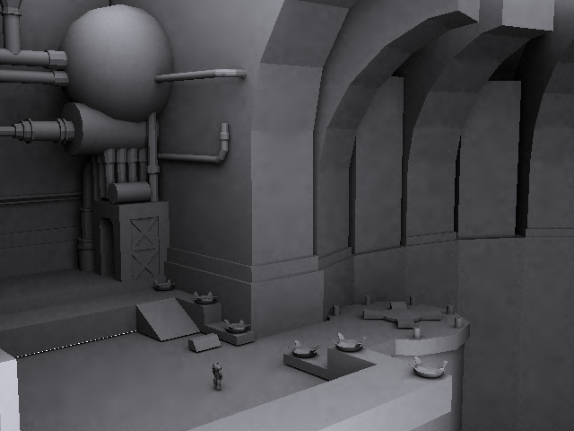
dwarve.png

Replies

  • greevar
    Offline / Send Message
    greevar polycounter lvl 6
    Is this going to be exactly like the concept or are you merely using it for general inspiration for the environment? If the former, there are a few things that are not matching up.
  • Darkmaster
    Offline / Send Message
    Darkmaster polycounter lvl 11
    awesome concept. the first thing that popped out to me is that I saw those jagged edges on the arches where the heads are going to fit beside. Either work out your smoothing groups or add more edges, because those harsh angles immediately caught my eye. since it is warhammer, are you going to stick to a tight poly budget or are you doing your own style?
  • Gotshoes
    Offline / Send Message
    Gotshoes polycounter lvl 9
    greevar makes a good point. I would say follow the concept , it will help show your accuracy as an artist. That be said I would go back and re-examine the shapes in the concept and compare to to what you have in your scene. Your problem areas at this point would be the the alter and the pipe works (off to the left). I think nailing the concept can only help you. Good start! Good luck! Cheers
  • barnesy
    Offline / Send Message
    barnesy polycounter lvl 9
    It has been an age since my last update on this!

    screen.jpg

    floor.jpg

    heads-1.jpg

    Sadly the module is due in on friday so I havent been able to spend half as long as I would have liked to on it.

    At the moment I am fairly happy with the lighing setup but I need to change the color of the heads from a hot orange to a dark brown to match the boiler. I also need to change the color of the pillars by the heads to a more grey color.

    I still have to finish off texturing the boiler and elevator shaft oh and finish off the rocky wall textures...still allot to do :\
  • barnesy
    Offline / Send Message
    barnesy polycounter lvl 9
    I have managed to play around with the lighting and AO in the scene and it had far better contrast now and really has that Warhammer look to it.

    [ame]http://www.youtube.com/watch?v=j-C_t8t9aeM[/ame]

    Highres_Screenshot_00004.jpg
    Highres_Screenshot_00000.jpg
    Highres_Screenshot_00007.jpg
    Highres_Screenshot_00001.jpg
  • Matroskin
    Offline / Send Message
    Matroskin polycounter lvl 11
    well, I've wrote u quite a bit on cgsociety, dunno tho at which point u taken that into consideration.
    Well, at least texturing seems to become more consistent than what it was before I think ;)

    Right now I would have 2 major concerns:
    1) textures despite being consistent suffer some "mudyness". The wall texture feels like dirty concrete (the decorative pattern is not really obvious and feels like gracks and dirt).
    2) lighting does not really correspond to light sources which u have there.
    There are even few fires right near the wall and there is no orange highlight on the wall... Overall it would need to be much darker in the upper part and more warm colored in the bottom part.
    Not to mention the green tint which comes from nowhere...
    check out Jason's dungeon environment for some cool lighting: http://www.jasonlavoie.net/images/PortfolioNew/Images/Renders/DemonThrone/DemonThrone_01.jpg

    That is why on cgsociety I mentioned that u might wanna review your architecture cauz if u want to have more lighting for the upper part u'll need to have maybe some hanging chandeliers which will require a bit adjusted ceiling geometry.
  • barnesy
    Offline / Send Message
    barnesy polycounter lvl 9
    Thanks for the comments. I am sorry for taking so long to reply ,I forgot about this thread :\

    Really sorry if I did not take all of your suggestions into account. I ran out of time and it was a nightmare trying to come to terms with all of the snazzy post processing and environment effects in UDK.

    I agree with the lighting, using a skylight made the entire scene bright and caused that strange green lighting. it would have looked much better if it was lit soley by the fires and larva. All of the flame lights would have helped too, I think the areas where there was no flame light on the wall were just particle effects , ooops!
  • Alex3d
    Offline / Send Message
    Alex3d polycounter lvl 9
    LOL April MUCH? But ohh baby, I love dwarven stuffs, I'd like to see more!
Sign In or Register to comment.