Sci-Fi Junkyard scene WIP
Hey ppl,
Starting a new thread of one of my current WIPs.
I started to work on the scene quite long ago, but i was busy with other stuff and only recently I thought I've got something to start showing :P
I did few explanatory vids to save me some time on typing
Here is a rough composition and brainstorming for the setting:
[ame]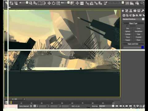 http://www.youtube.com/watch?v=-1DSBSyWdEk[/ame]
I started by figuring out main shaders for most of metal debris surfaces first as it will be used on most of the assets in the scene and will determine how i will model and texture the rest of the assets.
I definitely want to go with re-usable tiled sets of textures to be able to do most of things with them instead of doing large meshes with huge unique textures for them.
So i picked up the Vertex Color blend approach as it fits the large scale scene where various assets will need to have some visual variation while re-using same set of textures.
In the vid below I show few foreground rubble modules which I did and how my shaders work on them. That is my starting point to keep working on other meshes of various scale and detail to populate the scene in the future:
[ame]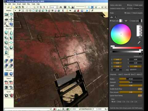 http://www.youtube.com/watch?v=zb6SzE_06lo[/ame]
And here are few screenshots which may show some details more clear since they don't suffer from video compression :P
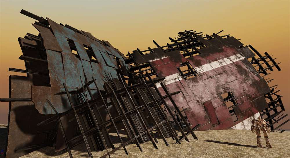
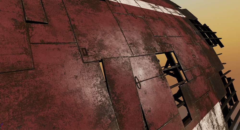
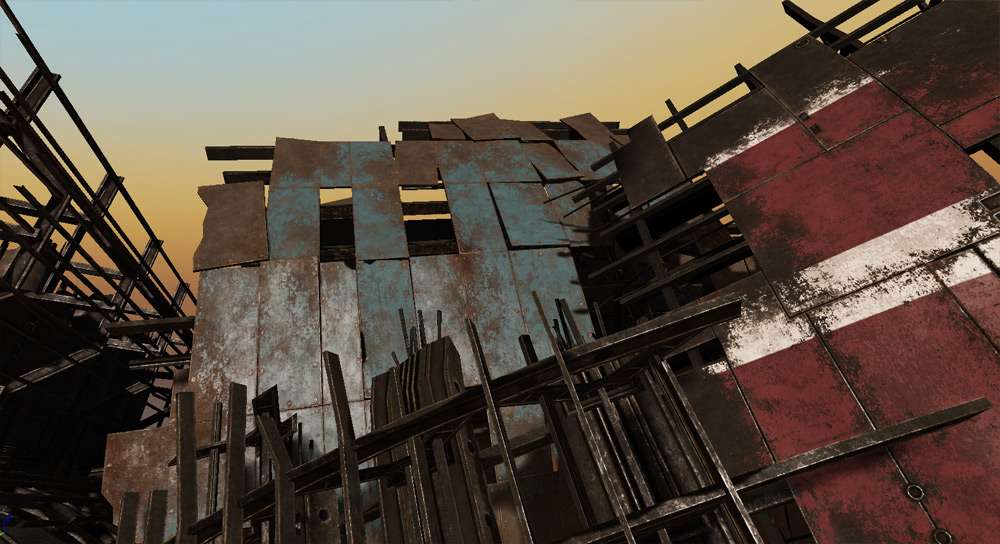
And here i started the mesh for the "beginning" area. I wanted to establish the shape and location of the mesh surrounding "player start" area first as it will be the departing point to start placing other assets around it in the future:
Note: i haven't applied the vertex colors to it yet.

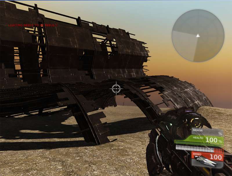
NOTE: the terrain is quite a rough shape for now just to get the feel. Same goes for the sky, fog and lighting. Water is a temp one taken from UDK and terrain is using a plain CgTextures image without any tweaks. It is a placeholder as well since i wanted to avoid checkerboard default textures in the scene :P
Starting a new thread of one of my current WIPs.
I started to work on the scene quite long ago, but i was busy with other stuff and only recently I thought I've got something to start showing :P
I did few explanatory vids to save me some time on typing
Here is a rough composition and brainstorming for the setting:
[ame]
 http://www.youtube.com/watch?v=-1DSBSyWdEk[/ame]
I started by figuring out main shaders for most of metal debris surfaces first as it will be used on most of the assets in the scene and will determine how i will model and texture the rest of the assets.
I definitely want to go with re-usable tiled sets of textures to be able to do most of things with them instead of doing large meshes with huge unique textures for them.
So i picked up the Vertex Color blend approach as it fits the large scale scene where various assets will need to have some visual variation while re-using same set of textures.
In the vid below I show few foreground rubble modules which I did and how my shaders work on them. That is my starting point to keep working on other meshes of various scale and detail to populate the scene in the future:
[ame]
 http://www.youtube.com/watch?v=zb6SzE_06lo[/ame]
And here are few screenshots which may show some details more clear since they don't suffer from video compression :P


And here i started the mesh for the "beginning" area. I wanted to establish the shape and location of the mesh surrounding "player start" area first as it will be the departing point to start placing other assets around it in the future:
Note: i haven't applied the vertex colors to it yet.


NOTE: the terrain is quite a rough shape for now just to get the feel. Same goes for the sky, fog and lighting. Water is a temp one taken from UDK and terrain is using a plain CgTextures image without any tweaks. It is a placeholder as well since i wanted to avoid checkerboard default textures in the scene :P
Replies
Anyway glad to see you pump some work. On the art side, so far so good. Love the painted stuff. Keep it up and hoping to see some sort of a UDK blockout soon:)
Cheers!
p.s. those videos combined were around 10 mins. which is quite a lot and I doubt many people linger on a single topic so much. So by saving your typing time you might actually scare away some who would get a better idea through a couple of informative pics and few sharp and to the point lines of text.
very cool stuff!
(It's Jobye btw hehe)
First of all Vlad, wow you have just taken my working knowledge of udk and trashed it...got some learning to do.
About this though d1ver, all i can say is if someone cares enough to learn then they should be willing to stick around for the videos, if they don't want to learn then screw'em, its our job as artits to be enthusiastic about our craft and ready to learn new things on a constant basis to stay updated with the times!
Moar!
I appreciate that!
d1ver - lol, u got me on that
Dunno, I personally like watching vids more, even if they r longer than reading the text, but u've got a valid point tho.
sltrOlsson - first i do a set of textures for panels, trims, grids etc keeping in mind the possible look of assets which they will be used for.
Then, i just model what i want but remember what kind of texture layouts i have. I assign appropriate texture IDs and map them on each mesh. In any case, the overlays (rust, paint etc) use masks the set of which every texture has. Those masks are done based on the original diffuse map, so the mask matches the same mapping as the diffuse UVs.
Does it answer your question?
Here is example of diffuse which i used for the meshes shown above:
Trims:
Panels:
Yeah, great. It was just the base panel texture i was a bit unsure of. But you are using the original diffuse ask mask? Not a separate alpha?
P.S.: there might be a couple of weeks delay since I need to finish some stuff for Rising Storm MOD (as I promised to do that first). So i will resume the work on this scene in a week or two :P
Got some time to resume working on this scene once again...
Had it abandoned for about a year
Here is most recent WIP update, as b4 I made a quick vid to describe it, plus few images.
Overall I've got major layout with big/mid scale meshes done so far.
Now next thing I plan will be bringing more variation to the rubble color by adding paint layers and maybe globally tweaking the metal texture (to determine).
Terrain needs to be textured, smaller props and vegetation to be added afterwards as well. Still lots of work to do, but at least i am back on it
----VIDEO
[ame="
Awesome that you've started working on this again, I remember it and have been looking for it for a while
Would have been be cool tho. Maybe at the next opportunity
@marq4porsche - u r right, that was just a base layout of main masses using base metal texture which was quite the same everywhere. Still working on it;)
@zakhar2 - good point. I assigned 256 thinking that it is still quite huge mesh, plus it is sometimes seen in the foreground too. But I'll definitely override/check lightmap res for the actors in the scene as a little optim polish. I already did so on some of them, even switched to vertex colors in some cases.
Oh well, worked quite a bit on this one since my last post. Not that it was taking long to do, just was lazy again :P
Still a WIP:
- missing small detail meshes on the ground and somewhere around (especially still want to add some hanging cables)
- missing some more old numbers/markings on the rubble
- maybe lighting and post-process tweaks in the future
etc - maybe u'll point out more
But I thought I could already show something:
Just a closer shot of water where I tried to follow some good suggestion i've got to add some "spit oil" feel such as little rainbow patterns in shallow areas etc.
I really dig the composition in the 1st, 2nd, and 4th shot, with the 4th being my favorite.
Your transition from the ground to the water looks a little rough...maybe darken the ground near the edge where it gets wet or place some pebbles near the edge or something.
Good work man
I also think you could push your light/shadow contrast and specular maps a bit further. Right now the shapes are a bit flat and some large gradients would come a long way in creating more interest.
It kinda depends on the direction you want to go, I feel like you could push the non-rust specular a lot more to make it pop. Right now the scene reads pretty much as yellow and matte. You want the red metal to read differently from the other scrapjunk and also different to the foliage. You also want to be able to make the distinction of the foreground and the background. You also need to amp up the brightness and then pump the contrast a little bit more to get more depth.
In this shot you get a clear punch from the red coming from the right, clearly distinct from the rusty parts and the foliage, and then a trail leading off into the distance. But before everything kinda-had that yellowish tone to it. Think about it
Great work so far! Really inspirational and I love it
nice progress nonetheless.
Speakin' about progress I think I remember in those videos seeing you talk about some sort of progression of space inside the environment. Like you lead on the player from a confined space into an open one. On these screen I feel a bit lost in terms of where are all these shots in regards to the whole scene. As Thiago said, some landmark to tie it all together would work nicely. If i remember correctly you used to have some sort of an acid lake in that big space you had. Maybe you could still use it, like in the [ame=
Since you've introduced vegetation taking over the whole place I think some color in vegetation would be a nice accent. Maybe some sort of bright red flowers in those bushes or something? Heh, it's funny how I always want you to add some red flowers:)
Also even if we disregard the landmark thing I feel like those screens generally lack some more background. Maybe you could use all those awesome rubble assets to assemble some sort of a huge structure in the back? Or have some ships fly by or have a few suns or moons or something. Maybe this is a dumpster planet and there are these service ships bringing in and dumping new loads of trash?
Also maybe some particles emitting some green gas at places?
anyway, I'm to rambly and you keep it up!:)
Totally appreciate that.
As most of u suggested, added more large background pieces, more light/shadow contrast, post-process tweaks of the colors/contrast too.
Added/re-aranged some close ground pieces for extra depth/parallax feel.
I did not really target for a "one-and-only special landmark" since it was supposed to be looked 360 deg around, but i think that some areas being enhanced now kinda come out more now to serve as "local" landmark I hope.
Added more grass on the ground to help justify the bushes.
Despite some suggestions, i don't want to make vegetation necessary pop, but rather feel more integrated with the rest, so I "dried" it bit more actually:P
chrisradsby - thanks for an awesome paintover, man! I used some of your ideas about color balance and sharper lighting contrast, tho i didn't go that extreme to change color scheme to cold. I've got some blue paint as well, so i didn't want it to fade either. I still like the warmish feel to it
d1ver - lol, u r definitely a flower-power guy:) I definitely should do those sometime, but with recent modifs I guess it have got more details overall, so i didn't want to add more color noise especially since I went with dryer vegetation feel. I added some animated falling leaf particles and wind, so hopefully i'll do a fly-by vid for it.
Voila after some changes, thanks again guys for your input!
I don't know if you know, man, but this has a great enslaved vibe, which is nothing but a good thing. I enjoyed that one immensely.
Really inspirational
Just realized that back in 1996 this could have looked like this
http://images.wikia.com/starwars/images/1/1d/SWSotE_%28Ord_Mantell_Junkyard%29.jpg