Home 3D Art Showcase & Critiques

Nemlet's WIP's

So this thread is dedicated to all my work in progress pieces.

First up is a subway "module piece" that I'm creating. I'm just getting into low-poly art, baking, engines etc. I'm use to high poly stuff so I've been trying to make the transition. I want to practice if I ever get restrictions to how many poly's something needs to be. Down below you will find the subway photos. I might abandoned this project for I started off doing a high poly then switched to normal maps, and it's a really big mess in my opinion but I'll try to still work with it. C&C
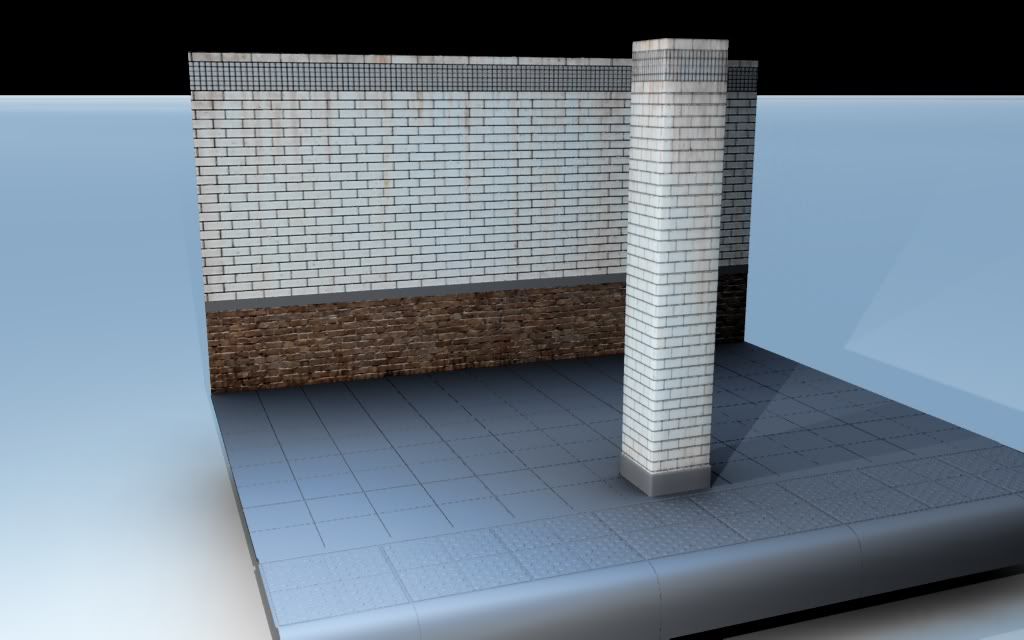
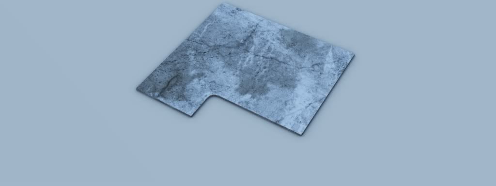
sub_floor_8.jpg
Tile.jpg
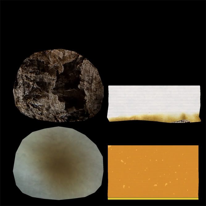
Cigarette_not_complete_final.jpg
cigarette_map_finaljpg.jpg
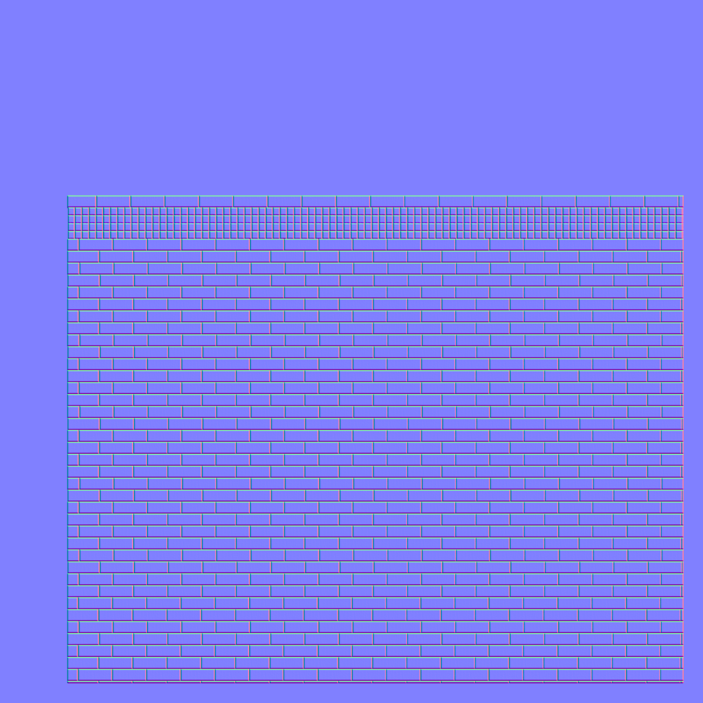
Pillar_normal_wip.png

Zack Dembinski

Replies

  • LateWhiteRabbit
    Is this for a game or just a scene you want to render out?

    I ask because that cigarette texture is too big and detailed for a game cigarette. I am also curious as to why you aren't using all of your UV space on the pillar normal map at the bottom of your post.

    I also find it kind of funny that this is the second subway WIP I have seen on the first page today, and both of you chose to start off by showing us the same style pillar.
  • Nemlet17
    LateWhiteRabbit:

    I'm going for a render but eventually want put it into UE3.

    Was going to lower the texture quality when the time comes. I'm horrible at managing my UV spaces cleanly. I feel like that kid on the first day of school who wasn't prepared.

    Yeah, I was contemplating about putting it up. I saw that post and figured I'd post too instead of letting the files sit on my hard drive awaiting a critique.

    Zack Dembinski
  • Nemlet17
    So I've decided to not continue on the subway scene for now. I've made to much of a mess to salvage it for UDK.

    So here's a block-out of my next project which will make it's way into UDK, hopefully. Just rough shapes, scale, etc. I have two different ideas. I personally like #2 but it's up to the viewers!

    Crtis & Comments are gladly welcomed.

    Idea # 1-
    WM_BO_1-1.jpg
    WM_BO_2-1.jpg
    WM_BO_3-1.jpg

    Idea #2-
    WM_BO_ALT.jpg

    Zack Dembinski
  • Oniram
    Offline / Send Message
    Oniram polycounter lvl 17
    I prefer idea 1. seems like you can get a lot more interesting detail out of it as opposed to the same repeating mesh.
  • AlecMoody
    Offline / Send Message
    AlecMoody ngon master
    The sense of scale in your blockout is really distorted. hex bolts make the wind mill seem like its only a few feet high and then the fences are so small that the wind mill by caparison would be a thousand feet tall.
  • Nemlet17
    Oniram- Thank you for the response. Idea #1 it is!

    AlecMoody- Thanks for the feedback. I will work on these issues today.

    Zack Dembinski
  • Nemlet17
    Here's a small update. I tried scaling again, this time with a human figure as reference. Down below will also find a picture of the beginning stages of the wood stairs and a WIP of foliage.

    Could someone please really hardcore critique the foliage (grass). I don't know how to make it standout. I'm a bit lost. I'll post a few pictures of what I'm going for.

    Block_out:
    Block_out_2.jpg

    Grass:
    Grass_crit.jpg
    Grass_crit_1.jpg
    grass_1.jpg

    Here's some screen-shots from various games that I'm going from. Any suggestions on the best way to go about grass? Not so much the planes, alphas, etc but the texture/specs.

    Example reference-
    windmill_16.jpg
    windmill_15.jpg
    a7970005qf7.jpg
    guildwars22009081906141.jpg

    Wood_stairs:
    stairs.jpg


    Zack Dembinski
  • BadgerBaiter
    Shame about the subway station. I am currently working on a 30 second animation of a disused London underground station, was looking forward to seeing it progress!
    Am probably going about it completely the wrong way and making a right pig's ear of it ;)
  • Nemlet17
    Good luck on your adventures with your subway scene BadgerBaiter! I have not abandoned mine, but put it on "hold."

    Zack Dembinski
  • Justin Meisse
    Offline / Send Message
    Justin Meisse polycounter lvl 19
    for grass I generally model out blades of grass and render a texture from that, i usually use lofts and color them with vertex color followed by a painting pass in photoshop.
  • CrackRockSteady
    What Justin said.

    Take a look at this thread: http://www.polycount.com/forum/showthread.php?t=79595&highlight=%22cottage%22

    about halfway down he has a little breakdown of how he did the foliage. This is pretty close to how I usually do mine as well. Allows a lot of control and gives nice normals (if you use them), and lets you easily render AO into the textures as well.
  • Nemlet17
    Thank you Justin and Crack for the suggestions and link! I will give this a try tonight. Here is what I did prior to your post. Will have a new update tomorrow.

    Grass_new_1.jpg

    Zack Dembinski
  • Nemlet17
    Here's another update. Still working on the foliage but not worthy of showing yet. I've started modeling on the stairs when at school. Something is throwing them off, IMO it's the side rails (may be to small?). Your thoughts?
    stairs-1.jpg

    Edit: Here's also some pics of the wood plank textures.
    wood_plank4.jpg
    wood_plank5.jpg

    Thanks,
    Zack Dembinski
  • Nemlet17
    Here are my new results for the grass. Thank you Justin and Crack. I still have to add some opacity to the grass (if needed), different color, and variations. Also down below you can find the updated staircase.

    Grass:
    Grass_redo.jpg

    Stairs:
    wood_stairs.jpg

    Zack Dembinski
  • Nemlet17
    It's been a while. School, work, and other projects have been stopping me from working on this...blah blah blah we have all been through it. Anyways, I'm starting the base rocks in which I will take into Zbrush. then bring it into max, low-poly, bake, etc. C&C

    Windmill_rock_rough.jpg

    Zack Dembinski
  • pbot
    So I was just reading through some of your stuff, you said that you felt the stairs were wrong, where's your reference?
  • Nemlet17
    Hi pbot. I felt the railing that you would grab doesn't feel right (maybe proportion?). I just created them from my head, no reference. :(

    Zack Dembinski
  • pbot
    Dude, use reference!!! They always tell us in school, reference everything!! When you model, reference!! When you texture, reference!! When you sleep, reference!!
  • Nemlet17
    Haha, will do from now on pbot.

    So I'm changing the way I do the rocks. The previous way would work except: insufficient computing power = not going to go my way. So I've started doing some single ones as a test. Down below you will find my rock. This was the first time I baked a normal map from a high-poly....I think it went well. It's just I hate uvw's and texturing which deserves to die...I mean take leave from this world. Have to learn to grind through this process. The rock is 320 tris? Is this to much.

    Rock_test_1.jpg

    Zack Dembinski
  • Nemlet17
    Another small update. Work has been taking all my time (typical). Anyways here is a small update on some rocks I created the other day.

    Rock_formation.jpg

    Zack Dembinski
  • Nemlet17
    Finally, finally, finally! I found a good work flow with uv's and baking the normals. Here's my results just from last night. I did up the poly count of the rocks in the first photo but not by much. Just wanted to get some more smooth edges than hard ones. The second photo is low-poly or so I think (200 tris). Is this to much for a single rock?

    First:
    Zbrush_what_I_did_it_4.jpg

    Second:
    Zbrush_what_I_did_it-1.jpg

    Thanks,
    Zack dembinski
  • Nemlet17
    Ok so I finally made my way into UDK today. It's a lot to take in but I'm loving it. Down below I got the one of the rocks finally put in. I'm trying to make the normal map standout more but I'm not getting it all the way. I've looked up how to multiply, add, constant3vector it. Any suggestions? Critique hard so I cry ;)

    First_UDK_try_.jpg
    First_UDK_try.jpg

    Zack Dembinski
  • BadgerBaiter
    Managed to miss several of your posts somehow :/
    Anywho, as to your wooden stairs, I agree with you on the side rails. They do look slightly out whack... either the top and bottom bars are too tall... or the vertical bars are too short.. its managing to look squashed somehow, IMO.
  • Nemlet17
    Agreed Badger. I plan on tiding them up here in the next few weeks.

    Recently I've been dabbling within UDK. I've been trying to create rocks efficiently and I'm getting there....I think.

    Down below is my third attempt at rocks. I put some sharper edges within the mesh. (note the gray rocks next to the brown are my first attempt rocks) I plan on doing another rock tomorrow until I master the way. C&C

    Highres_Screenshot_00013.jpg
    Highres_Screenshot_00014.jpg
    Highres_Screenshot_00015.jpg

    Zack Dembinski
Sign In or Register to comment.