Subway (UDK WIP)
Hey guys,
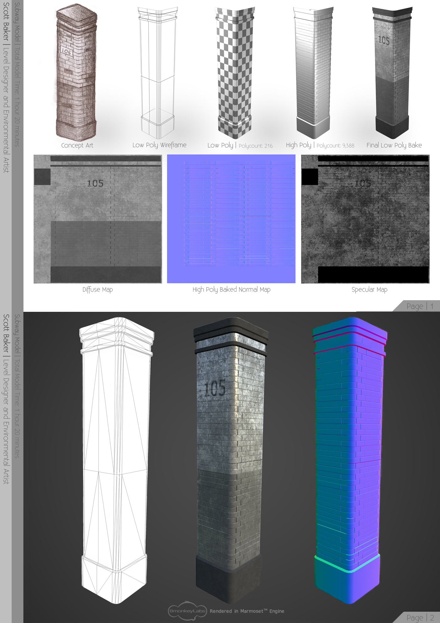
So I started working on a level design of a subway platform. The concept initially began when I had modeled a Subway Pillar and basically just went from there. I've been working on it just short of 4 days now.
Subway Pillar:
Subway Map Screenshots:
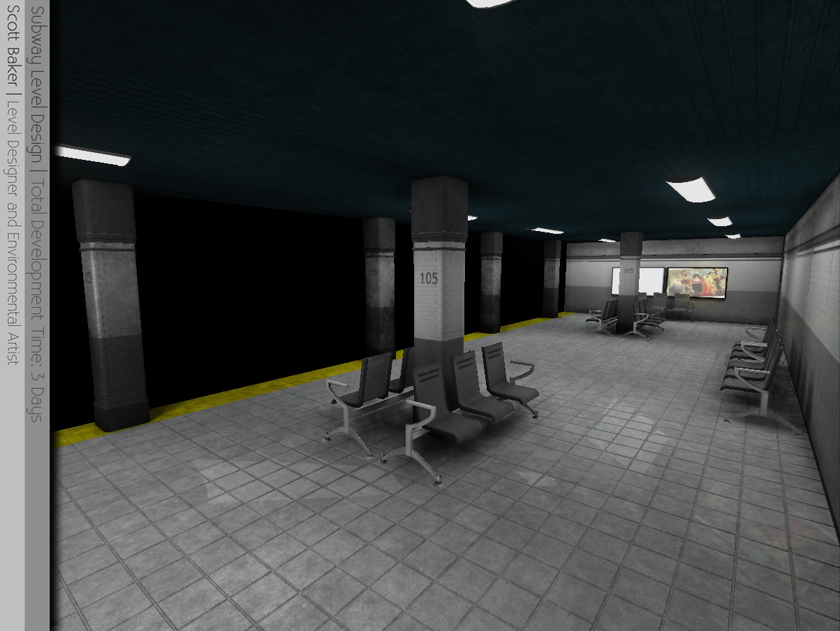
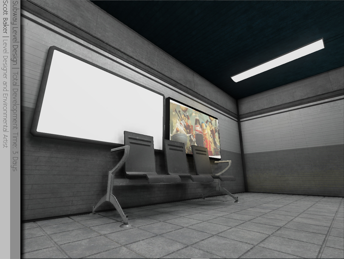
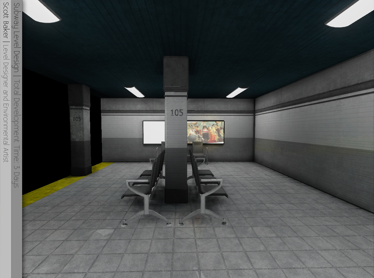
Walls etc are Modular. So I can extend the platform if need be.
This is currently heavily a work in progress, and I know I've a lot more detail to add (doors, stairs, more adverts, decals and some bins) But if you guys could let me know what you think of the current work in progress screenshots that'd be great!
- Scott.
So I started working on a level design of a subway platform. The concept initially began when I had modeled a Subway Pillar and basically just went from there. I've been working on it just short of 4 days now.
Subway Pillar:

Subway Map Screenshots:


Walls etc are Modular. So I can extend the platform if need be.
This is currently heavily a work in progress, and I know I've a lot more detail to add (doors, stairs, more adverts, decals and some bins) But if you guys could let me know what you think of the current work in progress screenshots that'd be great!
- Scott.

Replies
Its a great start though
Only crit is to maybe add some grout to the tiles on the ground. Looking forward to seeing how it turns out!
@duxun I've always been afraid to add color to textures. I'm half color blind and even still without using that as an excuse I really don't have any idea behind the techniques of color composition. Any tips would be great.
So I spent the last two days and a bit working on more detail objects. I have completely revamped the texture on the chairs, and fixed some of the advertisement board materials. Pipes have been added, a stairs, and corridors to another platform. I've also added patterns to the walls by creating a seperate but tile-able material so they can be interchanged wherever. I've also added bins, and started working on some decals like news papers and the like.
I know from these screenshots that there are areas that have less detail than others. That's simply however because I've only just started working on the corridor that joins the two platforms and the staircase area.
As always critique if you can!
Note: I've not forgotten about adding grime and the like, those will be extra detail that I'll add later I just want to get the overall composition of the level design down for now.
Screenshots:
Thanks guys for your help so far, I'm loving how this is turning out and your advice and critique is quite literally priceless info =D
- Sythen.
the clean look is better, in my opinion, doesn't mean you can't have dirt, just not paint flaking everywhere and pipes so rusted they look like they belong on a BP oil rig.
also id suggest varying up the spec a bit if its going to be 1 texture tiling a bunch. check this out to see how.
http://www.chrisalbeluhn.com/UT3_Add_variation_to_repeating_textures_Tutorial.html
I've also been messing around with Detail maps and might have come up with a solid final material for now.
Also in the second screenshot I've made some curved walls just to add variation and depth to the original walls. The room front is also a heavily work in progress. Right now it's just a basic model and basic diffuse.
- Sythen.
I've taken a lot of things into account with this next update, I've re-done some surfaces. Added more detail to a few textures and completely re-worked my materials.
Lighting has also been re-done and some post-processing too. The level really seems to be coming together since my first post of WIP earlier a week ago.
The third screenshot is just to show off the floor tiles and the lighting from the ceiling lights and advertisement boards. I know I've a lot more detail to add to that hallway.
Let me know what you think!
- Sythen.
Here's a video I've made of it's current progress:
[ame="
Screenshots:
I know the floor does look fairly blank in area's. My current focus is the Tunnel however (I also know there's seams in the texture).
Let me know what you think!
- Sythen.
Thanks for the advice, I'll be working on that
I think your cealing could be ok if it was not brick.. and make it like there are rock sheets around, and some are missing. indicating that it's covered to have that flat cealing look. But brick as it is would not be able to support it. Some ref pics of lighting and elements that you could benefit from.
looking good tho keep it up
Not sure what you mean by key lights either. Do you mean just tone down the brightness and increase falloff?
As for the white color. Yeah I usually never do use white lights, so these are technically still work-related.
@Glottis8
Thank you for the screens, definitely a few things I could benefit from.
@Nick2730 hmm.. So decals and different rotations to break up the level a bit. Got it.
Key light refers to you main directional lights, these are the strongest in your scene.
- Sythen.
I took sourcy to mean, looks like its from the source engine, it does have the "valve" look to it, which is a good thing, very "portal".
Thanks for the comment #scotthomer good to see you found it inspiring. =]
As always, comment and critique:
Thanks!
- Sythen.