The BRAWL² Tournament Challenge has been announced!
It starts May 12, and ends Oct 17. Let's see what you got!
https://polycount.com/discussion/237047/the-brawl²-tournament
It starts May 12, and ends Oct 17. Let's see what you got!
https://polycount.com/discussion/237047/the-brawl²-tournament
WarTorn Town (WW2)
Hey everyone,
New to Polycount, I'm really excited to get going on here. I think having people watching and checking out my work, will encourage me to keep going on my projects.
I'm currently in college focusing as in Level design, however I'm interested in environment art aswell.
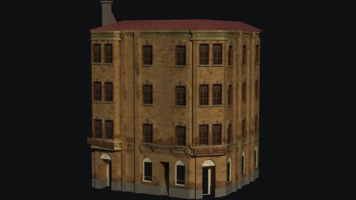
This is my current piece that I am working on. Any comments are welcome and appreciated.
Thanks,
Ben


Replies
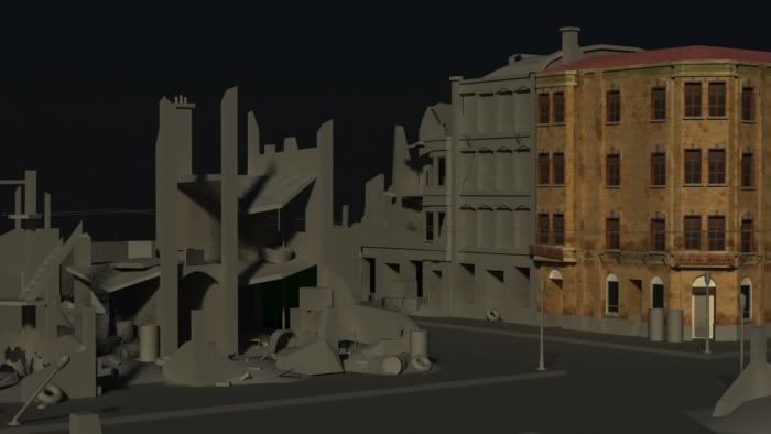
Some of the damaged parts of the environment seem unrealistic. The 2nd and 3rd floors of the damaged buildings seem to be bent and have pretty much no support keeping them up. Also, the bending on the sign post is a little too extreme.
Good start! A top down view would help to see the design layout of your level...
@looprix thanks ill do some sketches today and see what I can come up with. Ill also get the top down view up when I post the sketches.
@SnaFuBAR I've never played that game, ill look into it.
I think you also need quite a bit more love into your textures, the color sseems rather saturated and bland. Signs seem barely noticeable and retains some of the same values as the building. Hiten Mistry had a really nice approach to doing some buildings in his Normandy scene. I would check it out to see how he broke down some of his scene, although he didn't necessarily have shelled out buildings.
Keep it up, nice start so far i'd say.
http://3.bp.blogspot.com/_4kkT22kuvoA/SfR0kKfUQiI/AAAAAAAABg4/5YK1SyNSbTQ/s1600-h/war3.jpg
@Kaburan - Thanks, I think I'll go back and find some better reference. I agree with you on the textures, I'm thinking I will keep the base brick texture, and rework the additions, (windows, signage, all the extra bits.) Then possibly work in the plaster look in the buildings further down the street.
Here are some silhouettes I did to revamp my rubbled buildings. I also looked at COD for some reference on how they modeled rubble. Any tips would be helpful.
I'm leaning towards #2
Here is the top view mapped out, this is the first level i've designed, any c and c is welcome.
Based on a FPS, Team Deathmatch map,
Any comments are welcome and appreciated.
[ame="
I've got the street car in now, I've also just realized that the side building is 2 colours..
More Debris in the foreground, aswell as fixed the bricks that are broken in the front building.
Remembered this guy did a war torn ww2 Normandy scene, maybe it could be used as a good point of reference?
http://www.hitenmistry.com/Hiten_Mistry/Normandy_1944.html
http://vimeo.com/9067032
When you have the chance I would appreciate that better crit.
In general the composition of this scene works well, you've got a focus point (the tram and the damaged building behind it). The close building on the left can be used to show some nice detail on a residential house hit by a bomb. And the two larger buildings can be used as examples of surviving buildings. Yet you really need to further these concepts - build on them by -
1.) The residential building on the left needs to have some much more awesome details. I would suggest using a high poly bake for the damaged sections to push those highlights that you can get from the lighting. To push that this is a resedential building perhaps have it so the building has some elements of the interior showing as such - http://www.museumoflondon.org.uk/archive/exhibits/blitz/changing/lives02.jpg
http://rookery.s3.amazonaws.com/1042000/1042470_8767_625x1000.jpg (download for some reason)
By doing this it gives you an opportunity for some much more personal - detailed - objects. Such as beds, wallpaper, shelves, books, lamps ect. Also take a look at the way this building is damaged, the floors are still intact - only the outer walls have fallen. This is because it was not directly hit, you could show this by putting a crater near this building.
2.) The large building on the right, as I said previously you could use this as an example of how life goes on despite the war. You should add some minor damaged such as where shrapnel has hit. This building is badly damaged but some bit are relevant:
http://www.bbc.co.uk/stoke/content/images/2005/06/15/wreckage_150_150x200.jpg To push that survivors are still living/ working here you could have new posters/ newspapers on the walls and also if you were to use darker lighting add an interior glow to some of the windows.
3.) The thin, tall undamaged building sitting between the building i spoke about in 2 and the completely destroyed building. I would suggest making this just a shell (still quite undamaged) http://www.mikes-steam-engines.co.uk/images/Mersey_Models_Building.jpg Maybe not quite as dramatic as this. Yet its important to note that many tall buildings simply collapsed when bombs hit nearby.
4.) The Tram - You should use this as your center prop - Go all the way with it, do a highpoly and find lots of great reference http://upload.wikimedia.org/wikipedia/commons/d/df/Gothenburg_old_tram_2.JPG Again this needs to be used an example of survivors or as destruction - either make it completely destroyed or still functional (lights on, maybe a few sparks around it to illustrate movement, perhaps silhouettes of people inside) You can break it up into an almost modular sense like this guy did http://www.freshmindworkz.hu/wolverine/media/hipoly_metrotram.jpg
http://forums.epicgames.com/showpost.php?p=27657747&postcount=51
5.) Once you've worked on these elements you should have a lot of character, yet to add some more story you could add elements such as body bags outside the residential house with smoke and flames still emitting out of it.
http://www.ericringsby.com/getz/3rdusarmy/fullsize/image_16.jpg
Hope these points help and don't come across badly.
This is some photos taken by a guy in Holland. Check it out, their is some interesting references in there i think..
This is what I'm thinking is how I would go about it:
Take my low-poly model that I have right now and add to it create many details etc.
Then I bake the normals to the low poly however, should this be all one object or should it be broken into pieces and then baked?
I've only done very basic high-poly modeling before.So this will be interesting!
Thanks sltrOlsson, As I go through with the above comment I will definitely keep that in mind.
Ben
I've extended the foreground building, added in a couple chairs, a book shelf, lamps, and also a fireplace. I've also added a crater in front of the building too show the blast location.
Here is a very quick paint over of where I want to go with this piece: I was thinking maybe a newstand that had been set up after the fact would be interesting. I also thought it would be neat to have like road closure barricades that would block the public from the crater.
Also, I'm wondering about how to go about baking my building from high to low to get the normals.
Right now the main structure of the foreground building is one chunk. Should I just duplicate it and then go nuts modeling in the bricks, damage, interesting window decos etc. then just make the cage large enough to encapsulate it all?
I've only ever done small pieces that I baked from high-poly. Any help is appreciated.
Ben
For the wooden supports those would all use sections of one wood tile material. Most of the undamaged building would be a brick tile with possible geometry cuts for unique damaged details or use decals for slight variation, water stains, grunge and light damage.
Also know that in UDK, 3dsmax and Maya you can use two different tiles and blend between them (damaged and undamaged). If you use vertex blending, that can mean putting a few extra verts in places you want to show damage, or you can use a regular mask. However this doesn't come without cost, its a semi complex shader so you don't want to use it on everything and you want to make sure that it is significantly contributing to the scene.
If you go the modular route you could model a window and the surrounding brick, or section of the wall, unwrap and texture it then copy that around as an instance, then doing a separate damaged version, if you plan out the UV space both versions can share the same sheet with a lot of the similar details overlapping, so you don't have a separate unique sheet for the damaged part, with a lot of the same details from the first.
I think i will re construct the foreground building the modular way. Also for the rubbled pieces, so far I have just been taking a plane lining it up with the wall to be damaged and then swift looping and then extruding, to create the form.
Is there a better way to do this as I end up with very blocky, chunky looking pieces.
Thanks again,
Ben Strasser
As for the damage, swift loop can be good, but it can also lead to a lot of extra loops, which if you're baking I guess doesn't mater that much. It can be hard to get straight cuts/loops to come off as an impact damage which tends to be a bit more organic. If you're going to bake the details, it can be helpful to put together a few alpha brushes based on reference, take those into a sculpting app and knock some damage around. Remember its not just about bombs and shells, but fire fights and other impact damage from debris being thrown around.
http://farm4.static.flickr.com/3488/4043509194_cef414644d_b.jpg
http://www.flickr.com/photos/stubbsuk/72991855/
http://www.flickr.com/photos/9378682@N08/1062559342/
Also keep in mind that if the mortar in bricks is weakened you can get some sag and displacement, especially impact damage.
http://www.flickr.com/photos/shutterfool/2883530154/sizes/l/in/photostream/
For me a lot of the ideas I get to approach the geometry come from staring at ref and wondering how to create it. I did some digging and a lot of it seems to be fairly organic with jagged bricks sticking out of piles of brick dust and debris.
which will chunk up the tri count pretty quick.
http://farm5.static.flickr.com/4061/4688616234_0a1a72be52_o.jpg
http://farm5.static.flickr.com/4061/4688616234_0a1a72be52_o.jpg
http://www.flickr.com/photos/nlscotland/with/4699858795/ (National Library of Scotland, WW1 war torn areas some good damaged brick ref)
There was another shot where the damage went up to a support beam and the bricks where cleared off (didn't save the link for that one... bummer) so that's an idea, a well placed support pillar can help keep a straight line while allowing damage.
http://area.autodesk.com/tutorials/quick_shatter_tutorial
I don't know how well versed you are with physics simulations but one thing I've tried with fairly decent results, was to set up some simulations and smack some randomly broken geometry around with some simple objects. Works good for creating high poly impact cracks. 3dsmax and I'm sure Maya too has some good random fracture mesh scripts. So check www.scriptspot.com (for max) and www.creativecrash.com(for maya) I'm not sure which you're using... you might of already said and I missed it...
http://cg.glacierise.com/blog/?page_id=126
IF you get into rayfire it can do some pretty amazing damage and rubble piles that you can build low poly meshes around fairly easily using plug-ins like WrapIt.
[ame]
This interactive fracture method works great at adding the sag and displacement I was talking about. This method isn't specific to max the principles transfer well enough to Maya, XSI and probably blender.
Also check out scripts like Stone Placement Tools which help create brick walls fairly easily. Might be a good base to start knocking some physX around.
http://www.scriptspot.com/3ds-max/scripts/stone-placement-tools?page=1
Grabbed a couple scripts, on there the fracture Vorroni, which takes any mesh that you have made and explodes it into a bunch of smaller random pieces.
I think my plan of attack is to build that foreground building modular, have a window, a pillar piece, then have my broken pieces. This way it will be easier to handle in Mudbox. I will then create my details there and then bake them back down. (Would it be better to do a retopo at this point then just baking it down? Might have more control.)
I have not used physics simulations before. They look very cool!
Ben
Spline painter in Graphite Modeling tools lets you paint splines on objects, this is fantastically helpful for painting wires and pipes that run along a building.
Also in 2011 they included object paint scatter, you define a library of objects and paint scatter then around. This is great for piles of rubble, and rocks. If you create a few high poly piles you can bake down some pretty realistic normal maps.
If you're not running 2011 don't worry Niel Blevins (Soulburn) has an awesome pack of scripts that includes Spline Paint, Wire Bundles, and Object Paint scatter. Personally I still prefer these to the ones they included in max. He also has a ton of helpful CG education stuff on his site too, one of them covers using reactor to create piles of rubble. Considering he worked on Walle where they had piles of rubble all over the place, he's a good guy to go to for that kind of stuff. Some good worn out procedural paint chip tutorials too.
Almost have the right side buildings to where I want them, tackling the rubble tomorrow!
Any comments are appreciated,
Ben
Here is another update,
Any suggestions on lighting? I was going for "the morning after" look, was aiming to add smoke etc, but I'm not sure it has that punch it needs...
The punch is probably lacking due to the sky not matching the lighting. Try to change the background around first until it's what you want before changing the lighting itself. I don't feel that the sky is good enough to base the lighting off of it yet, which is generally my preferred method.
Looking great though.
Ben
I'm not sure what the plan for the rubble pile is, it seems kind of dense poly wise? You could probably crunch and bake some of it down if you needed to, but its going to look worse. I would only do that if you ran into performance issues in game and since it looks like you're going for a rendered scene built mostly with low poly techniques I don't think it matters.
Keep up the good work, its coming along great!
My plan right now is to leave it as because I have run out of time project wise.. (Due tomorrow) But I will be revisiting this scene, My goal would be to get it into UDK for a better presentation and shown for what I want it to be. ( A level and not just a pretty still)
Still alot of work to go before tomorrows presentation!
I'll have my "final" up tomorrow, thanks for all your help polycounters!
Ben
Edit: Also is there anything that you see that I should fix before I show tomorrow?
I will be revisiting this, so I would still love to hear any comments.
But the ambiant is bit too dark and lacks some saturation i think. The sky suggests brighter one
Hows this?