The BRAWL² Tournament Challenge has been announced!
It starts May 12, and ends Oct 17. Let's see what you got!
https://polycount.com/discussion/237047/the-brawl²-tournament
It starts May 12, and ends Oct 17. Let's see what you got!
https://polycount.com/discussion/237047/the-brawl²-tournament
duderz
well since i've been a lazy asshole this new year so far, i decided its time for me to do up a full game character. hopefully ill stay pretty regular with updating this thread, and i hope the community will have some good critiques to give. i'm planning on making him a soldier with a more DIY getup (think along the lines of brink)
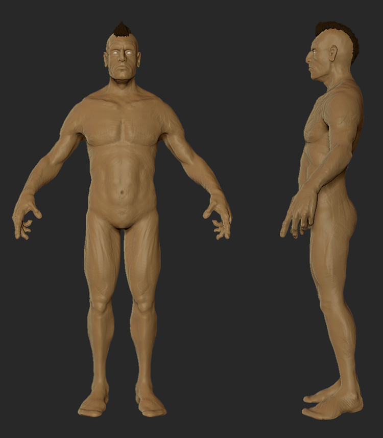
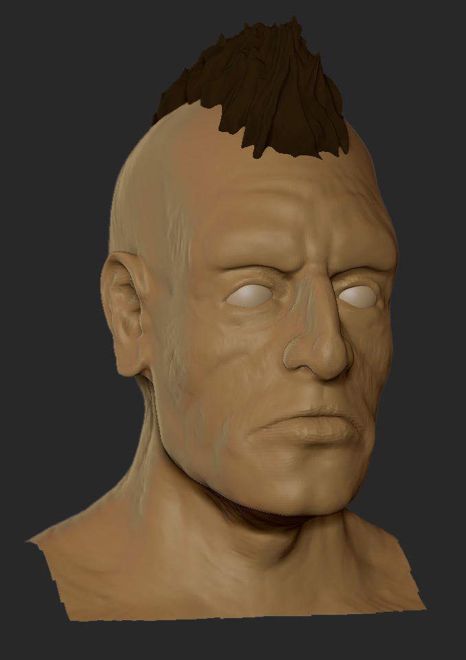
this is after about 3 sessions, starting from zspheres. a lot of the body is still pretty rough because i want to fix any anatomical errors before i start finalizing anything. also the mohawk was a quick test and is by no means permanent.


after i finish up the body, ill start looking into clothing designs and doing some paintovers. as always, critiques are welcomed
this is after about 3 sessions, starting from zspheres. a lot of the body is still pretty rough because i want to fix any anatomical errors before i start finalizing anything. also the mohawk was a quick test and is by no means permanent.


after i finish up the body, ill start looking into clothing designs and doing some paintovers. as always, critiques are welcomed
Replies
Either you posted too soon, you're not using reference, or you're simply still learning Zbrush. Whichever combination of those it is, this simply wasn't worth opening a thread for yet, not at this stage.
I see a speed-sculpt, rough around the edges, loose on anatomy and with no hint of direction. What's the design, what are you hoping to make here? Make sure you think that through first, then post.
Give the community something they can critique, otherwise your thread won't garner a single reply, and that's always a letdown.
i really am ticked off that i even took the time to read what you said, expecting some sort of actual viable response. this is one of those cases that you shouldn't have said anything at all and left the thread with no replys. all i asked for was some tips on the body before i finalized it and continued on, and i believe i was very kind in doing just that.
"otherwise your thread won't garner a single reply, and that's always a letdown"
well then im really happy you were the first one to comment on it then so it doesnt become a letdown.... seriously, did you think when i saw your response i was going to be "picked up"? come on, use your brain..
/rant
but really, was that necessary? this is a game art community where i THOUGHT i was going to get legitimate replies giving me tips on what i could improve. starting a thread is the only way you can get actual critiques unless your swizzle, daphz, scudz, ferg, or any of the other "cool" people on this board and you happen to put something up in the WAYWO thread (no disrespect, you guys are awesome, but thats how it is). if this is too soon, then by all means, let this thread get no replies and leave it rotting at the bottom with all the other dead threads, but don't post a completely useless comment giving me no help whatsoever with what i actually wanted. im sorry if im harshly out of line for anyone but this is probably the LAST thing i expected to see as a first reply.
the true test is to see if anyone else that stumbles here is kind enough to actually help me through this, because you sir have done the opposite.
EDIT: that rant was a bit crazy and i apologize, after reading it a bit i realized it was because i just woke up and have to head to work, so im not in the best mood. but im still sticking with what i said because i believe you were so counterproductive with your comment that you actually made me want to work on this guy less. regardless, ill post an update tonight with some more progress and hopefully it will be worthy of some (helpful) responses..
Right now it looks like a stylized chunky guy with claytubes all over him.
- just off the bet, i think even with your stylization the delts seem maybe a notch to flat? Also its hard to tell but from the front he looks nice and filled out but from the side super skinny.... based on what i'm seeing from the front I'd expect him to have a bit more mass in the stomach/hips/thigh area...
Butt looks low, and if i were you, I'd make the distance from front to back on the thighs the same, if not greater, than viewed from the front. Carve out those muscle groups a little more, especially on the arms (:
Without a frame of reference or a point of comparison its hard to say what is spot on and what's a little off, because the reference is in your head and we have a pretty hard time seeing that... You can't really fault anyone for not coughing up a through critique with so little offered as a measuring stick... so the conclusion people draw is that he must be posting for praise, well its not that great and I can't tell him what to fix because I would be guessing at what he sees, so I'll abstain from posting until it gets refined.
Is this guy stylized? Yep sort of, but maybe that is or isn't what you're going for... You mention Brink in regard to gear, but is that also in style? If so you're off in quite a few areas from that style.
Is the anatomy a little spotty, yea sure but maybe he's a bit of a freak or a mutant... Or maybe you're trying to add in some Brink style? Hard to say...
The anatomy in the face is a little weird in a few places. The mouth seems wider than it should be, but then again, maybe that's stylized.
The cranial ridge above the eyes looks pretty blobby and doesn't really seem to conform to the shape of a normal skull.
All over there are scratches and pock marks that probably won't bake well are probably going to make refining and fixing some of the shapes harder.
Some of the scratches look like muscle fibers, which is weird to see on people who have skin, fat and connective tissues normally laid over the muscles, especially in a an area like the ass.
The thumb has a very strange ridge running down it, I'm not really sure what that is?
The pec/deltoid transition is kind of weird, its a bit too much like a muscle shawl instead of separate muscle groups, sure they blend and flow together but normally there is some definition. I'm not suggesting show every muscle fiber but some indentation and transition would be good.
[rant]
Lastly, and this goes for everyone who like to stylize and pose their hands, I wish every last one of you bastards had to rig up and animate the nightmares you create, if there's one area we need you to pay attention to bone length, its in the hands.
Why does he make a crazy looking fist, or why can't he open his hands properly? Lets go yell at the animator for placing the joints where the modeler put them instead of redoing the hands and putting things in their proper place, because we all know he has time to redo the hands on every fuckin model...
Oh but it looks so great when I sculpted!... baahh then you rig it up.
/deskflip
[/rant]
You may know all of that but we need to see it to get a better idea of what's going on here. Also posting all of that info shows that you've been putting a lot of effort into this, and the more effort people see on a project the more likely they'll be inclined to respond-- no one wants to give crits to someone who doesn't care or isn't working hard. Make sense?
All that being said, until you're a pro with anatomy it's important to have rock solid ref, and if you do you should post it. Something like these is what I'm talking about [NSFW]
[1]
[2]
[3]
You're 70% there with the anatomy; your general proportions are pretty good, the issue is more with a bunch of slightly misplaced / misrendered anatomy.
For example, compare the pelvic area as you've rendered it to the first ref image I posted-- most of that lower abdominal region is wrong. That 'v' shaped pinch is caused by the taper of the abdomen and transition from the pelvis to the femur. It happens right along the inguinal ligament (also this diagram shows the location with muscles overlayed).
Another point to look at on your model is the shoulder/upper chest area. For one, you haven't really rendered the neck muscles, and it almost looks as though there are 2 sets of clavicles. Bring them up, and attach the muscles like they should. The sternocleidomastoid is nonexistent on your model, and as a result you have no 'pit' of the neck.
Your model has a lot of inaccuracies like this. What you need to do in addition to working from good ref is spend some time with anatomical charts and familiarize yourself with why many of these regions are shaped as they are.
Anyway, I still like the overall look of the model, particularly the face; shows a lot of character. You just need to spend time ironing out the issues we've.
And as for getting better responses, the reason why you posted this in the first place, being more explicit about needing help with things like anatomy will help distinguish you from someone who's just posting for praise.
Good luck with this Mike, hope it turns out well.
ceebee - i am using reference but most of which has been diagrams, which all seem to have slight differences. i will get some more reference of actual male figures and give him some "life". also, i am going for a somewhat stylized look, but definitely not to the point of being completely wrong in my anatomy so ill try to address some of that as well
dekorkh - oh i don't mind him at all anymore, im quite grumpy when i only get 4 hours of sleep, but i seriously wish people would have a bit of understanding for those who are out to learn and willing to take input. oh well, can't assume the members of polycount would be anything other than flat out blunt. i agree about him being skinny from the side, ill address this today
SnaFuBAR - the whole model in general needs a bit more definition as its only at the first subd level, but ill definitely give some extra attention to the ribs and arms. oh and i completely agree about the hair, it was really quick to get an idea of a shape
Mark Dygert - thank you in particular for the detailed write up, and now that you mentioned the problem areas, they stick out like a sore thumb. and i hope no one thinks im mad at not getting critiques after only a few hours up on the board, i was upset at the fact that the first post was harsh and gave me no help WHATSOEVER as to how i can fix him. all i was looking for was some initial anatomical insight as im new to character modeling. as far as stylized goes, i want to keep him more towards realism, but to me real is boring so i tend to include more stylized features. im not going for a brink look when it comes to character design, but more in the clothing and gear, so ill start addressing the areas you mentioned. also, the scratches and pock marks all over are just from my approach to the character and they won't be seen in the final. i like to use a high polycount at first, then cut and build up shapes more similar to real clay, rather than starting low and defining my shapes as i move up in subd levels. and i know the hands are wack, ill say that right up front. i had a hell of a time even getting them to look human. i need to give them a more straight out pose and tweak the length of the fingers. i just hate looking at oddly straightened out hands
again, thank all of you for taking the time to give me much needed advice and guidance. ill hopefully have a few hours tonight to address the issues you've all brought up, and have an update later tonight or tomorrow :thumbup:
EDIT:
wake - just saw this post, thank you immensely for the reference and the specifics regarding the muslces. and i will remember to be more obvious about what kind of critique im looking for :poly142:
You're off to a good start bro, there are a few small anatomy things to fix but nothing that cant be fixed by the move brush and some tweaking. As for reference, diagrams are nice, but real world photos and sculpts/studies can come in handy too.
I also agree that the more you show, the more we can help. So showing inspiration or examples of where you'd like to go could help us help you.
So i'm no anatomy master
here's a blog on bulletstorm that might help with some design stuff - http://www.peoplecanfly.com/blog/2011/01/how-to-make-an-army-out-of-one-bald-dude/
hope this makes sense! xp
p.s. thanks for calling me a "cool" dude
I hope you can see that most of the posts after mine say the same thing in a different way, though.
To quote Ceedee:
"Looks like you need to use a good bit of reference dude"
"Right now it looks like a stylized chunky guy with claytubes all over him."
Vig:
"You can't really fault anyone for not coughing up a through critique with so little offered as a measuring stick"
And to paraphrase Wake: we can't know what you're going for, so we can't critique this very well.
How that differs in message from what I said mystifies me, but it's nice that you respond better to their phrasing, and I hope you let that push you forward.
Also, harsh? Believe me, that wasn't me being harsh, and I wouldn't have posted it if I wasn't sincerely trying to help. Perhaps I could have fluffed it up a bit, but I think my point was clear. 'Use reference, show us what you're going for. Then post. Help us help you.'
For future reference though, the fact that the hands were so messed up certainly didn't help my impression that you'd cooked this up in no time at all and wanted us to do the hard work of looking up reference for you.
If you're still having trouble with them, smooth them and step down a few levels to get the base shape right.
And mike it's looking pretty cool, at least I think so, but i do agree with everything else. when I saw the mohawk the first thing I thought of was post-apoc bandit.
lol having some fun without me are you :P
On topic: I find the skin a little scratchy in too many areas. Did he survive a fire or something ?
Good to know
Yeah I haven't updated my progress for awhile yet regarding my character. It's been noted, and I posted pictures on the original topic. Still need to add more details, and shape it out more. I do believe the looping is fairly accurate to other references I looked at.
i had a while today to tweak my character quite a bit, and got around to smoothing out all of my scratchy marks from sculpting. i focused mainly on the core and upper arms, seeing as they seemed to be my biggest problem areas, but i also tweaked the face, neck, thighs and got the hands to a more workable state (keep in mind all i did was tweak the proportions, straightened out the fingers and smoothed out the knuckles and joints) i need to spend a fair amount of time on them seeing as they seem to be quite hard for me :poly122:
ill probably be able to get in a few more sessions this weekend. let me know what you guys think
girls dig my sketches!
#2 when people give any kind of critique whether it be good or bad, respect it. either dont answer or answer in a non agressive way. these people are here to help you and its rude to critique somones critique, even if they are trying to bait you, in this case you should just ignore them.
you dont have to accept all criticism. It is simply advice. You can choose to take it or not.
also, sculpt a penis on him.