The BRAWL² Tournament Challenge has been announced!
It starts May 12, and ends Oct 17. Let's see what you got!
https://polycount.com/discussion/237047/the-brawl²-tournament
It starts May 12, and ends Oct 17. Let's see what you got!
https://polycount.com/discussion/237047/the-brawl²-tournament
Iron Horse
Hi guys! This would be my first post on these forums although I've been looking at some of the great stuff on here for a while now.
This is my first ever completed model, I'm still in school working on the in's and out's of CG. Attached are screencaps of the aforementioned completed game model, rendered in the marmoset toolbag engine. The poly count including the ground and the particles is 16,846 tri and excluding ground and particles is 15900 tri.
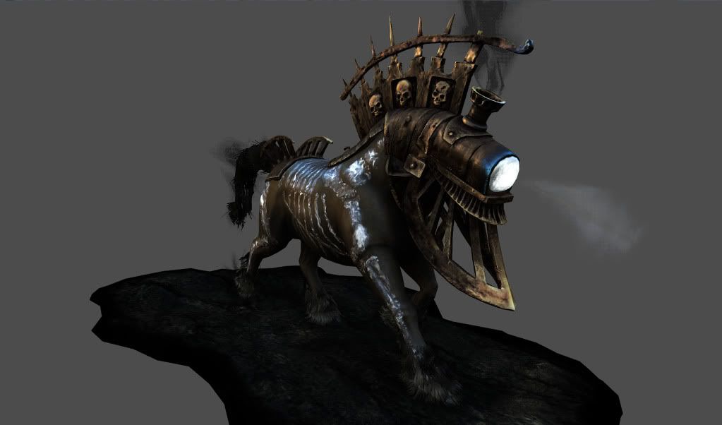
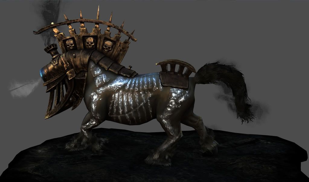
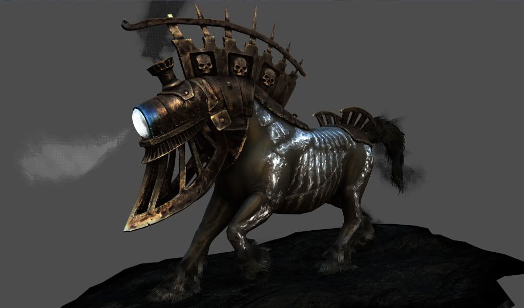
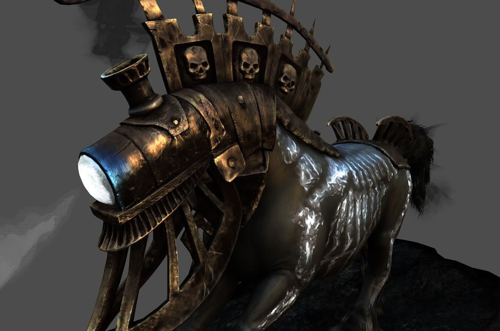
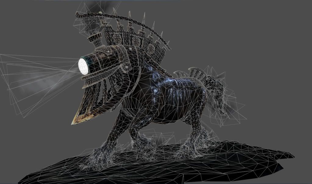
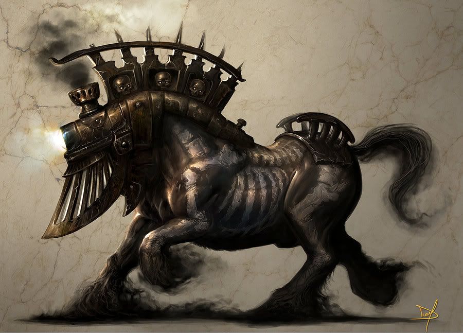
Concept by Nanya of Deviantart:
Criticism is welcomed! Thanks :thumbup:
-T.W.
This is my first ever completed model, I'm still in school working on the in's and out's of CG. Attached are screencaps of the aforementioned completed game model, rendered in the marmoset toolbag engine. The poly count including the ground and the particles is 16,846 tri and excluding ground and particles is 15900 tri.


Concept by Nanya of Deviantart:

Criticism is welcomed! Thanks :thumbup:
-T.W.
Replies
Particles=need some attention. I know this is difficult to do in a renderer. See if you can get into a game engine and use the engine's particle system. I find these much easier to work with than modelling softwares.
Does marmoset have a "No Alpha Cutout" or "Soft Alpha" material type?
Alternatively you might try enabling anti-aliasing? Many engines will swap to use alpha-to-coverage if AA is enabled...looks nicer.
Don't know Marmoset well, just speaking from general experience....
@Rhoutermans I never rode one either haha
@cman2k That might be the cause of my particle issues. However Marmoset only allowed me to have the particles transparent if I switch on the Alpha to Coverage option, which results in the dots. If I don't switch that option on, my grids remain opaque. I'll look for an anti-aliasing option though. Thanks a lot!