Outdoor/Forest Environment
polycounter lvl 16
Hey guys,
A little bit about the project; so far this is all off of my own back- learning UDK to a standard, creating my first attempt at foliage, etc and I'm aiming to create a gaming "experience" for players- I've managed to port Dungeon Defence character AI to the UDK September 2010 build and get everything working in this 3rd person world, and I'm aiming to create my own custom HUD, menu system etc so that by the end of it I have this final full package that is pretty much completely my own work and a full experience for the player. I'd also really like it to look as good as possible...
This is my first attempt at really creating an outdoor forest environment with trees and foliage so I'm looking for feedback and advice really on how to improve.
So far I've made a video of where I'm at;
[ame]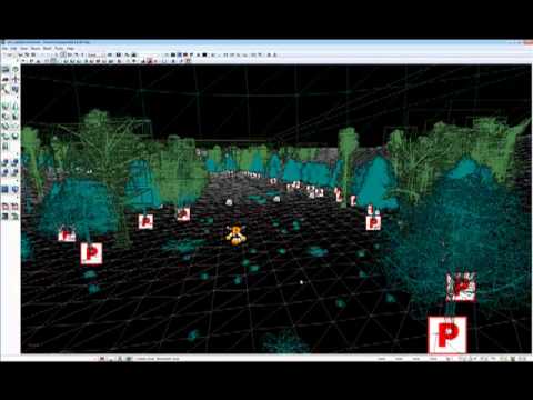 http://www.youtube.com/watch?v=Y0gLEAWptAc[/ame]
and it looks like this;
Starting Area;

Water Area;

So far- this isn't the final layout at all, the main play area is currently flat with a lot of negative space, the lighting is currently just a spotlight and a skylight and has really been adjusted yet and everything is very WiP but I'm trying to create trees/foliage to a good standard as I realise these are going to be one of the main assets in the scene.
I've never created anything like this before so it's been a bit of an experiment and I've managed to make the following using 3DS Max;


I've also used SpeedTree to tree and create some trees that I can make the forest appear more dense with, but I'm at the point where the SpeedTree's look much better than my own (even though they are all running through the same type of material trees- at the minute just pure diffuse with no spec/normals).
I thought my trees were ok, but I see even now as I'm posting this that they could be improved. I think the pine-like trees are ok but the oak-like trees need to appear better, so I'm wondering how I might go about doing this, what peoples advice is, etc?
What I'm thinking is I'll keep all of the current trees that I have but go about making a few more variations of each type so that the current trees can be "filler" trees.
Just after any advice/opinions so far really, mainly focussing on the trees and their creation, and then in the coming days/weeks I'll expand on this to hopefully have a full environment that not only looks good but also plays as I want it")
Cheers for any help and opinions!
A little bit about the project; so far this is all off of my own back- learning UDK to a standard, creating my first attempt at foliage, etc and I'm aiming to create a gaming "experience" for players- I've managed to port Dungeon Defence character AI to the UDK September 2010 build and get everything working in this 3rd person world, and I'm aiming to create my own custom HUD, menu system etc so that by the end of it I have this final full package that is pretty much completely my own work and a full experience for the player. I'd also really like it to look as good as possible...
This is my first attempt at really creating an outdoor forest environment with trees and foliage so I'm looking for feedback and advice really on how to improve.
So far I've made a video of where I'm at;
[ame]
http://www.youtube.com/watch?v=Y0gLEAWptAc[/ame]and it looks like this;
Starting Area;
Water Area;
So far- this isn't the final layout at all, the main play area is currently flat with a lot of negative space, the lighting is currently just a spotlight and a skylight and has really been adjusted yet and everything is very WiP but I'm trying to create trees/foliage to a good standard as I realise these are going to be one of the main assets in the scene.
I've never created anything like this before so it's been a bit of an experiment and I've managed to make the following using 3DS Max;
I've also used SpeedTree to tree and create some trees that I can make the forest appear more dense with, but I'm at the point where the SpeedTree's look much better than my own (even though they are all running through the same type of material trees- at the minute just pure diffuse with no spec/normals).
I thought my trees were ok, but I see even now as I'm posting this that they could be improved. I think the pine-like trees are ok but the oak-like trees need to appear better, so I'm wondering how I might go about doing this, what peoples advice is, etc?
What I'm thinking is I'll keep all of the current trees that I have but go about making a few more variations of each type so that the current trees can be "filler" trees.
Just after any advice/opinions so far really, mainly focussing on the trees and their creation, and then in the coming days/weeks I'll expand on this to hopefully have a full environment that not only looks good but also plays as I want it
Cheers for any help and opinions!
Replies
Dunno how much the visual would be the priority in this case, but as for the visuals there is lots to be done though. I mean, its clear that ideally u want it to look as good as possible, but since u r putting gameplay stuff in it that will depend on how much time u will have available to invest in visuals themselves after all.
Anyways, here r few suggestions for the visual part:
1) Terrain is too flat and open. Even with speedtree procedural LODs and StatMesh LODS that is too open area for tha action game. Various things will suffer from such an open space especially polycounts and enemy spawns/events as u can see them from far.
U could use more hills and large rocks to create more curvy path with large size "natural" occluders. It will be also more interesting for the eye.
Aslo far away hills look ugly when bold so by occluding the far view u would avoid that.
Whatver is visible from far but inaccessible can be done with simple "forest plane" decoration.
Some good looking examples of mentioned approaches:
http://www.brameulaers.com/forest.html
[ame]
2) separating trunk and tree top is not a good idea imo. It is will double the actor quantity (which will result in slower render) and more hassle to manage placing trunk and top individually. Plus it is kinda useless from asset's "variation" point of view as one can do a good looking forest even with 3 different trees by scaling and rotating them.
3) your foliage textures have not enough alpha in them. The leaf texture reveals the "flat" nature of the polygon which it is mapped to. U can avoid that by making more "holes" between leaves and leaving larger gaps with just branches seen through.
Also remember that "mip mapped" foliage will tend to fill the gaps more the farer u get from the tree so larger gaps will kinda slow that process down a bit.
4) Right now it seems like the bark texture is only used on "real 3d" trunk/branches while foliage planes contain only leaves. Mix that a bit, add some branches to the foliage planes as well. Also use some leafless branch textures to support trunk-foliage transition. This way you could create more organic looking tree foliage.
When making a natural enviro u should follow specific logic when placing assets.
More grass stays closer to larger obects like trees and rocks for example. Asstes are kinda getting grouped into "islands" of bigger and smaller size vegetaion. All that subtly transitions one into another.
Hourence's book on level art/design would be useful in your case btw
I've got to admit so far I've tried to get it working so that there's something for the player to do (hence the character AI) so I spent a fair while working out things like that, and I've never created a "playable" level environment, but what I'd really like to do is create something that's artistically good in the end.
What I like about Adam's and Brom's work is that there doesn't seem to be a great deal of trees in the forest (when you look at the number of assets), yet the forest seems really full. That's definitely something I'd like to look at.
Right now I'm working on making some new trees considering the "fake" branches and more alphas on the textures to hopefully give a better and less flat.
Regarding point 2) - totally, I did actually try and get the tree top and trunk to be a single mesh but I've been having trouble. I adjusted the vertex normals in max on the leaves and attached the leaves to the trunk, but that skewed all of the vertex normals for both elements. Then on importing an .fbx into unreal it wouldn't allow both the leaves and trunk as a single mesh... any tips on that? I guess I'll experiment more really.
Thanks for your help anyways, much appreciated- all noted and taken on board
Well, i heard that one can set custom normals and get them into UDK through fbx import but i never did it myself.
So i can't say exactly whats could be wrong, but if u used Edit Normal modifier in max then I actually used to have some troubles with it. Maybe try to merge 2 parts first and then re-edit normals.
Also make sure that smoothing groups are set right, especially UDK is sensitive to sequential order of SGs. The mesh cannot have them, say, SG 1,3,4,8 etc. Instead it should be 1,2,3,4..., no skipping numbers.
I've sorted the problem I was having before, it was my error (of course, as usual... noob!) basically before I had set the custom vertex normals on the leaves and then attached the trunk to the leaves, which reset the custom normals I'd set and I thought everything was broken and that I had to import each part separately. What I've done now is attached everything first, made a bigger reference mesh and then set the custom normals from that- seems to be working a charm now.
I've taken you're advice, restarted the trees (I thought it would be easier to start again) and I've come up with the following;
I've not used as many leaf planes on some so that the middle is somewhat exposed, I've modelled in some actual branches, I've tried to make it so that you can see through some areas so there isn't as much bold full colour, hopefully they are starting to look better.
I've come to the conclusion that I'm not going to use my old trees or SpeedTree trees anymore either, so these trees are going to be the only ones. To improve them a little further I'm going to add some of the ground texture (when I've decided what that is, I'm redoing that too!) to the bottom of the trunk to ease the blend, and I'll also put a light gradient on the leaves to fake the AO and hopefully I might be able to call them done!
Whilst before I hadn't touched the lighting at all (atm it's basically a DominantDirectional and a Skylight set to slightly blue) I was advised by Cholden/Max Power to adjust the "Environment Colour"- so I've attempted that as can be seen here;
It's not a greatly noticeable change at present (everything has a slight blue tone to it, on shadows) but it's something I'm going to have to fiddle with... I figure the next few days I'll decide on terrain materials, then on foliage and small rocks and then with those assets I'll work my main lighting a bit so that I can adjust the Environment Colour so that the shadows aren't ridiculously harsh.
Thanks for all the help so far
Especially those 2 in the middle
As for the adding gradient in the middle that is one of ways. U can use it, but it is limiting your `ramdomness` rotation angle of leaf planes tho. What could actually look nicer is baking Radiosity solution into the vertex color of your tree and in Unreal just add a Multiply node to multiply vert. color info with diffuse.
You will get a better looking and more flexible occlusion this way.
As for your shadow colors etc dont really worry about that too much now. I think what u really need to do first of all is to sculpt the terrain in a more optimal and interesting way. Then, u can place trees and stuff on top. But trees are only assets while terrain is pretty much what dictates your level design now, so that would be more priorityto do
http://www.polycount.com/forum/showpost.php?p=1278675&postcount=981
For now its not that important, but that "rain" stuff looks strange. U see it against the sky but it is not rendered against the ground. So it looks like that "rain" is a part of skydome texture :P
And the drops are too high density and brightness so it looks more like a massive star fall.
I basically restarted everything from scratch (keeping what assets/etc I could) and went to build from the ground up, and I can definitely say that not only is it looking better (imho) but it's running more efficiently overall- currently 60fps udk max (although I know this doesnt really mean anything at the end of the day).
Things I've done;
New map entirely
Rebuilt terrain (smaller, currently 32x32- although this is only one section of the map)
Took out the "rain" material on the skybox
Fiddled with basic lighting (currently only torch spotlight, moon dominant and skylight)
Tweaked post process settings (very near DoF, small vignetting and small film grain)
Created and placed trees more efficiently
Created and placed rocks
Created a few flower bunches for added colour
Placed flowers/grass/ferns/etc
Redid terrain materials entirely
Added cloud particles
Boosted rain emitter attached to player and added rain splashes
A video of everything is here;
[ame]
Things to note about the video;
-In recording the video it used the default postprocess chain- so none of the ambient occlusion/film grain/vignetting is present properly (DoF is, but thats set in world properties)
-Rain emitter doesnt work correctly, in turning on the recorder the fps dropped to 30 so the rain and splashes were not so noticeable overall and the splashes also attached to the player model at 0,0,0 - note that in the actual game without recording this does not happen and is working correctly
-Water material is not final and is currently just an awful material attached to a large fluid actor, so will be changed for the better.
-Cloud particles are not final, just testing at the minute, not even sure if I like them, but they will be darkened and/or removed
-Lighting is just the torch spotlight (5 brightness, slightly yellow), moon dominant directional (2 brightness, blue) and skylight (for shadows, .25 brightness dark blue), and the lighting isn't final and there are no light sources whatsoever- am intending to make some lanterns further along the pathway
-placement of rocks around the beginning of the level is just so I remember to make them bigger/block the player properly
Pictures of the environment (with PP, no rain/splash particles);
Things I'm planning on creating to expand the environment into a proper small playable level;
-Fence Pieces
-Campground Signage
-Campground Gating
-Lanterns/Light Fixings
-Campfire
-Main Log Cabin
-Tents/Camping Shacks
-Bridge
-Rock Faces (to occlude on grassy areas)
-Fallen Tree/Logs
I'm wondering what people think of the improvements so far. Is the placement of assets looking better? Is the lighting looking better overall? Bear in mind the placement of assets so far isn't final and is just a first pass, and also that the lighting is fairly dark (but hopefully not too dark or too light, although looks fine on my screen) as it is intended to be lit up by the torch as well.
Hoping that everyone thinks this is an improvement over my original anyways
Cheers
Its a nice improvement of the layout.
Few thoughts meanwhile:
- If you do the visual occluders (like small hills) usually they are obstacles at the same time, e.g. player cannot go ower them. Otherwise there would not be much use for them. Exmaple: you get small hill to block the far view. But if player walks on top of it he can see whatever the hill was blocking.
So usually the hill might have a steep angle or some small cliff or fence or large rocks not to let player get high enought to see whats on the other side.
Or if you want to make small hills accessible (to have variation of "walkable" surface) then the level is split into fewer but larger areas which have really big occluders. So there is a bit of challenge here
- as a minor suggestion I also wanted to mention that flowers a too bright and stand out too much from the rest of the enviro.
- You could add some shore line texture close to the water.
keep it up
Im just gonna run down the sky only in this
1- Clouds need to be atmospheric, clouds are not solid objects as you have them
*solution: on your sky dome mesh create a instanced copy of it to slightly scale inside your present dome, create a shader that has a sky dome clouds layer alphaed out. put that clould layer on a panner so it slightly moves left and right..
Bonus!: Create a multiply of a clouds layer at a lower opactiy in a opposite direction in the same shader to make it feel more layerd.
2- Lighting, First off to get it to time and shoot arcs is great....however your overall look and feel arent there yet...
*Solution: I suggest when you have the flash of lightining if your do what I mention above with the clouds layer, have that flash the dark clouds brighter (not white but illuminate them via a timer in the glow node.) To match the overall flash better. The lightning arc itself could use a few things, Mainly a better texture (not a solid object as its presented but self-illuminated on its edges and semi transparent and much skinner go into google and look up ref of lightning)
3-your overall night time just feels like the same texture tiling all over...you need to look at a star light sky and really see how it blends with multiple stars and nebulas etc to make it really feel correct.
*Solution: Overall the best way you can achieve a good night sky is by blending different textures of night stars on different tiles correctly, pretty much as I suggested above with the sky , same system applies, find good star night photos and blend...to make it feel more night time, what I would suggest is to make a "star alpha" and mask it out with a multiply to a color parameter and then add that to another "star alpha" and have those both tile differently, you can then control which parts glow brighter, and what color they glow..a bit of extra work but worth it for nicer effects
Anyway I hope this gives you a run down of things to improve on tech wise...Your trees and such I would skip till you get the atmosphere correct tech wise first...making pretty art is trial and error , making pretty tech is..trial and error..but on a longer and bigger scale
@matroskin- Thanks, I forgot to mention last time that I would be making rock faces/cliff areas to occlude the player and environment behind, so the hills that are there at present are a rough guide for me to put that geometry, thanks for reminding me.
The flowers are bright/saturated (especially with the extra bloom at present)... at the minute I'm going to leave the saturation how it is as I sort of like it in contrast to the solid green, but I'll see how it looks when I'm nearing completion and have lit/finalised the post FX, great advice though! Also, OT but your Sci Fi Junkyard is looking great- nice materials!
@seforin- I'd love to hear someone say "dat's pretty art yo" about my work so I'll definitely work on things. Regarding the clouds I've changed them so they are so "Mario" anymore, so they blend more with the clouds on the skybox- I kind of like that they add extra depth. Regarding the skybox though I think I might have a seperate cloud effect applied to a scaled in spherical fog volume.
I'll look into making the lightning better- totally agree with what you're saying so I might even look into seeing if I can create it dynamically so that each strike is different.
The stars I'm using at the minute is literally just a 64x64 tiled across (I think it's that small...) so yes I'll look into making a texture set and better material.
Thanks for the input though guys, I hope to work on it in time for my next update
Regarding this update: I've gone over things again and tried to decide what I want/what looks good/what adds to the overall effect. I've done a fair amount overall.
I've added;
-Clouds light function
-Specular terrain material
-New water material
-Fence/posts/camp signage
-Updated plant material
-Rain material
-Fire/effects
Regarding my overall rain emitter- I uploaded a video here as it couldn't be recorded properly -
[ame]
And then I've done an updated video to show how things are now;
[ame]
Bear in mind that the particle affect breaks in the video (thats the reason for the rain video above, also note that it doesn't happen in game only when I'm recording), asset placement is also not final and neither is lighting/materials (due to the specular breaking the lighting that was already set up- this will be corrected at a later date when I've lit properly)
What I'm thinking of doing now is
-Editing the rain material to be bigger/smaller on a per asset basis
-Fixing the physics on the camp sign
-Making suggested changes
-Blocking volumes
-Dressing/redressing the scene
And then creating a few more assets;
-Lanterns/light source
-Main log cabin
-Tents/camp shacks
-Rock face/occluders
-New water mesh
And hopefully that will make things look more complete.
Thanks for the feedback so far, I'd be interested to hear opinions on the new changes, whilst I make suggested adjustments, cheers!
-Your terrain normal map seems really crunchy. You might want to go over that and smooth it out some.
-Tree placement seems to be sporadic and random. I don't get much of a forest feeling, it seems very empty.
-Trees are something I am sort of struggling with too. I suggest continuing to populate with the trees you have now. Then in a little while after you have your scene more fleshed out, go make new trees. Save over your old ones and UDK will automatically update with the new awesome trees.
In all though, that's a great start. I like how you also have game play elements and whatnot in there too. Keep banging away at it and I'm sure it'll be awesome in no time!
Regarding the tree placement, none of it is final at the minute- I've placed assets randomly, and in built up areas, at the minute to get a general feel- I'm planning to expand this level out into a campsite style area so there's more playable area.
About the actual trees though, what is it that needs improving on specifically? The texture? Needs more/less leaves? Placement? Types of trees? etc?
Since last time I've changed the skybox slightly so that the clouds are now on their own separate fog volume, so that when the lightning strikes only the clouds light up and not the stars, I've also adjusted the speed of the clouds slightly.
I've modified the lightning strikes so that they are slightly more blue and see through in the middle, but havent changed the texture as of yet.
I've rerigged the hanging sign so that now everything works correctly
Have added a hanging lantern, that has a candle inside- with emitter and light that move in relation to the whole mesh- specularity needs setting up correctly and the light itself is likely to be set up in kismet to have its brightness/radius animated slightly to emulate fire light (obviously the current colour/brightness are just for testing purposes)
I've also looked at the foliage and created a material that allows for interaction of the player and gunfire when applied to "interactive foliage", but also have standard wind influence when applied to normal static meshes.
All that can be seen in this video;
[ame]
I'll be cracking on again and making assets for the campsite area such as the main cabin, as soon as I can.
As for your trees, what stands out to me so far are your leaves and your textures. The actual trunk meshes seem ok for now. I'd just revisit them a little later after you get everything working/into your scene and ready to go. But that's me personally.
Watch out for those gates and lamp posts. They r too small. The sign on the gate almost touches charactr's head. Uniform scale up wopuld help.
Also the moon looks more like the star from the skybox but bigger size. Check moon refs better, also maybe think of subtle but wide white glow around it.
but i think this might be interesting for you to make the trees look less flat:
http://wiki.polycount.com/VertexNormal?action=show&redirect=Vertex+Normal
http://wiki.polycount.com/VertexNormal
Here is some work I've done in relation to natural environments, maybe it will help you.
http://www.polycount.com/forum/showthread.php?t=72008
@Matroskin- Thanks for the pointers, at the minute the moon is basically the reflection of the main light passed through a mask to give it it's current appearance- I'll try and fiddle to give it a glow/bloom etc.
@Morpheus- I've checked out those links thanks, I had loads of trouble at the start but using normalthief has made the lighting better
@RexM- I remember seeing your thread a while ago- I love how low poly your work is but how great the effect is, I'll be looking more into your thread
Thanks for the awesome feedback anyways guys. It's occurred to me I haven't put up any pics of my newest trees/other assets so some of the comments may be relating to my old trees in my first post. I'll make some improvements and try and upload my lates asap.
Think I'm about done on getting most of the main models done (until I do a 2nd pass/see something I've missed), so I've made a cabin that I'm going to use as my "main" cabin and then reuse for the camp shacks, and a cliff occluder as can be seen in;
[ame]
What I'm going to do now is (I think...) remove all of the static meshes, place the occluders and resculpt the terrain and then work on placing assets properly and logically... so hopefully this is the last time you all see the environment in the random state its in at the minute.
After placing assets I'm going to look at fiddling with the clouds again to better suit the environment and I'll look into lighting it all properly and placing blocking volumes.
Regarding the trees- I've took a few shots of them in situ at the moment;
and there's a few more on my flickr account; http://www.flickr.com/photos/31285011@N02/
Hopefully on replacing all of the assets things will start to come together properly now
I've spent a few days trying to understand Scaleform and how the HUD/menu systems are created and I've managed to create my own main menu, HUD and pause/exit menu to go with my game level. Currently the main menu/pause menu are made using Forecourse UI by Allar as it was a fairly quick way of making those menus as seen here;
[ame]
The main menu will eventually have the level (or at least a small version of it) to pan round. The resolution settings do work correctly (and the huds/level/menus scale correctly too) but it's difficult to show that in the video (I tried! :P)
My next plans are to actually get on with placing the assets etc so...
-Expand/Sculpt Terrain
-Place Assets
-Rescale Fluid Actor
-Make sure all ferns are "Interactive Foliage Actors"
-Check scaling on signage/lanterns
-Size rain drips on assets accordingly
-Blocking Volumes
-Level Streaming
-LODing (via distance culling, etc)
Add map to main menu
The main bulk of that will be the placing of the assets I assume, but hopefully by the end of the week I'll start to have a more complete environment.
Any feedback so far would be appreciated.
Well I think I'm about ready to call it done for the time being. The reason is that I need to test my work in order to get results for my dissertation and then obviously I've got to write it all up. I know there's a few things that need fixing up but overall I'm fairly happy with it and hopefully at the end if I have time I'll be able to go over it and make it even better for hand in.
I've been hard at work and I've come up with the following screenshots (bear in mind the darkness as it's lit up by a torch in game);
And there's plenty more (including wireframes, lighting and unlit breakdowns) on my Flickr account: http://www.flickr.com/photos/31285011@N02/
A video of what it looks and plays like (and I've managed to fix the recording of the rain slightly);
[ame]
and there's also a longer video just going over some of the more technical aspects of the environment (i.e. materials, kismet, etc) on my youtube channel: http://www.youtube.com/user/AaronMWhiteCoUk
So that's it for now, until I get more time to tweak.
Regarding what I've done so far, if you could download my game and then fill in a quick survey for my dissertation that would be an amazingly great help to me.
My game is available here: http://dl.dropbox.com/u/20422466/DE-WoodsG/DE-WoodsG.rar
My survey is available here: http://www.kwiksurveys.com/online-survey.php?surveyID=IHEKKN_a3fad9f8
The game is about 182mb in size and the survey has about 30 questions, but most are multiple choice so it should only take about 5-10mins to complete in total. If you could download my game, fill in the survey and pass around to anyone at all that would be such a great help to me (especially looking for novice game players).
The game runs mostly at a solid 60fps on my PC which is Win7 64bit, Q6600 stock and ATI HD5700, so my pc isn't great and it runs fine, and it also runs ok enough for me to record it, so hopefully it runs fine for everyone else, but if not just PM me and I'll sort something out.
Last thing... all art, features, concepts etc are mine except for the following;
Trendy Entertainment- for use of the horde code/enemy models/AI.
Michael Allar- for use of the Forecourse UI.
Epic Games- for use of the character/weapon models and making a great engine.
So yeah that's it for now. If you could play my game and fill in my survey I would be eternally grateful.
Thanks guys
Aaron
Also I've just fixed the survey link in the main post (it was dead, but now its fine) so now it should link to the correct survey which is http://www.kwiksurveys.com/online-survey.php?surveyID=IHEKKN_a3fad9f8
Thanks in advance to anyone that fills this in for me. If you have any questions or anything then please PM me
EDIT: also had more feedback from a player with a Q6600 and a GTX 260- getting 58-62fps, so that's great- so yeah if the fps goes too low please try at a lower resolution, and then please fill out my survey as that's what is important to me at the minute
The cliff occluder is a nice addition. Maybe break up its surface a bit more
I've got documentation to cover at the minute regarding testing and results, but after if I've got time I'll be coming back to tweak things like that.
Is there any chance you might be able to download and play the game and then do my survey please? I need all the help I can get!
Also if anyone is experiencing a D3DCOMPILER_.dll error when installing or going to run the game then that means the DirectX needs to be updated for some reason. The solution is to download and install the latest update which is located here; http://www.microsoft.com/downloads/en/details.aspx?FamilyID=2da43d38-db71-4c1b-bc6a-9b6652cd92a3
Thanks for the feedback so far guys and please keep it coming! I'd really like to get a lot of replies to have as big a set a of results that I possibly can.
Cheers!
I'm trying to analyse all results as scientifically as possible, as it is part of my MSc, and I'm noticing some interesting trends across the board- so far there is a very strong correlation of 0.95 (1 is the maximum/perfect) in agreement for losing track of time whilst playing games, so that's great as that's really the basics of what I'm researching for.
As always I'd love more feedback for my survey so it can have a higher degree of accuracy overall, so I'd be grateful for any more replies.
Thanks again guys
So... that's the documentation bit out of the way for now... so now I'm thinking about improving the art/gameplay experience of what I already have. I've made some renders of my current assets;
Pine 02:
Foliage:
Rocks:
and there's a fair few more on my Flickr at Aaron's Flickr
Regarding the above assets- I realise that they aren't all 100% finished and there's a lot of tris that could be cut (on the foliage/rocks), but it's just to show what I have so far
I'm interested in any suggestions/etc that anyone has to improve. So far I've been suggested things like;
-Include controls/etc for new players
-Display a goal/objective to make the gameplay clearer
-Flesh out the scene with more assets
-Damage the cabins/use mesh painting on them
-Mesh paint the rocks/cliffs to make them interesting and varied.
If anyone has any more suggestion/advice that would be great, I'd love to hear them so I can make this piece better
Cheers guys
Aaron
Basically regarding the 3D artefact I took in a lot of the feedback I've been given and implemented a fair amount of the ideas to make everything a bit more streamlined and less buggy. So I managed to;
-Added a quick tutorial system (thanks to research)
-Added a killbox under the floor to stop enemies from slipping through it (it still happens but not as much now, couldn't find the actual reason for it!)
-Removed support for keys that aren't used (so no pressing F and falling through the floor)
-Tweaked the sky slightly (less/bigger stars, slightly editted clouds)
-Fixed the rain particle system (Now it rains properly, regardless of fps)
-Tweaked the post processing (slight sharpen/etc)
-Tweaked rain material effect
-Added a moon and tweaked ambient lighting somewhat
-Made the water look better (with real time reflections)
Among other fixes.
Overall it doesn't look or feel too much different from the initial game but it does play with a lot less bugs!
Looks wise....
I've attempted to capture the rain particle effect in the images but it was pretty difficult, so it's not particularly noticeable! It looks more effective in motion...
[ame]
So if you were curious to check out what the pretty much final build looks like then its here; http://dl.dropbox.com/u/20422466/DE-WoodsA/DE-WoodsA.rar
All work is my own except, thanks go to:
Trendy Entertainment- for use of the horde code/enemy models/AI.
Research- for use of the Interaction System.
Michael Allar- for use of the Forecourse UI.
Epic Games- for use of the character/weapon models/engine.
Regarding the documentation- I spent most of my time working on it and getting it ready for print. In the end it came to 185 pages (although I had a lot of appendices!), so a massive thanks to everyone that filled in my surveys and tested my game scenario for me. I found out that time can be manipulated to affect a players perception of a game (i.e. time flew, game was fun) but I also presented a whole load of new angles/questions regarding the subject. I managed to have it all printed and bound, so I have a nice looking thesis to go with the game level...
If anyone is curious about the results/wants to look at the thesis further then please just PM me and I'll look at uploading it for people to see.
Anyways cheers for all the help with this guys.... I can't wait to work on new (better!) projects and start getting to grips with getting some proper Tech on my portfolio