The BRAWL² Tournament Challenge has been announced!
It starts May 12, and ends Oct 17. Let's see what you got!
https://polycount.com/discussion/237047/the-brawl²-tournament
It starts May 12, and ends Oct 17. Let's see what you got!
https://polycount.com/discussion/237047/the-brawl²-tournament
The Dark Mass
I'm working on this project for my portfolio that shows my knowledge as an environment/ prop artist at creating current gen artwork. My primary goal with this project is to learn UDK as well as improving my work and my portfolio.
Concept: In a small town in New England, hidden by old dense forest, tourist who visit the region are being reported missing. An investigator is hired by the family of the latest victim to find the reason why, only to find a mysterious cult, that operates out of the old town church. The old church house is an imposing dark structure made worn by age and harsh winters. It is surrounded by dead shrubbery and old trees. The place gives off a sense of foreboding.
I've wanted to do a fall scene for while now as well as learn the ins and outs of Unreal. My experience in unreal is minimal (mainly following the video tutorials) but I know this will be a good project to cut my teeth on. This also gives me the opportunity to put everything I know together and make a proper scene. I hope you enjoy.
Primary Assets
-Church
-Dormitory
-Street
-Sidewalk
-Curbs
-Fences
-Graves
-Light-post
Foliage & Vegetation
-Oak Tree
-Maple Tree
-Birch Tree
-Pine Tree
-Grass
-Shrubbery
-Ground Cover
Ground Textures
-Grass
-Dead Leaves
Tools
-Maya 2009
-Mudbox 2010
-Photoshop CS3
-Crazybump
-Xnormal
-UDK
Marmoset Test:
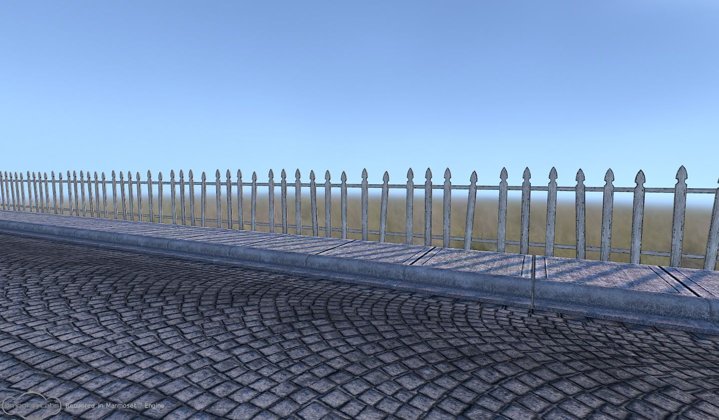
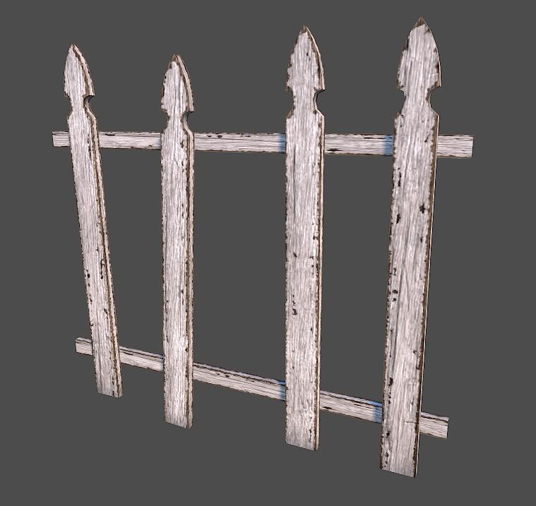
Mood & Reference:
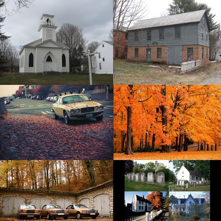
Concept: In a small town in New England, hidden by old dense forest, tourist who visit the region are being reported missing. An investigator is hired by the family of the latest victim to find the reason why, only to find a mysterious cult, that operates out of the old town church. The old church house is an imposing dark structure made worn by age and harsh winters. It is surrounded by dead shrubbery and old trees. The place gives off a sense of foreboding.
I've wanted to do a fall scene for while now as well as learn the ins and outs of Unreal. My experience in unreal is minimal (mainly following the video tutorials) but I know this will be a good project to cut my teeth on. This also gives me the opportunity to put everything I know together and make a proper scene. I hope you enjoy.
Primary Assets
-Church
-Dormitory
-Street
-Sidewalk
-Curbs
-Fences
-Graves
-Light-post
Foliage & Vegetation
-Oak Tree
-Maple Tree
-Birch Tree
-Pine Tree
-Grass
-Shrubbery
-Ground Cover
Ground Textures
-Grass
-Dead Leaves
Tools
-Maya 2009
-Mudbox 2010
-Photoshop CS3
-Crazybump
-Xnormal
-UDK
Marmoset Test:


Mood & Reference:

Replies
Hey guys, I've been away for awhile but now I'm back and have a lil bit of progress to show. I've been slowly learning the ins and outs of UDK and while I'm still learning tons of stuff, I've been able to start putting some stuff together. Ignore the materials on the trees and the church for now, all that stuffs placeholder for now including the church model. I've been tweaking and reworking the textures for a while now and I have a more final layout that I'm going to be using as well.
I reworked the fence texture as well as the cobblestone the most. Right now I'm still not too keen on the materials for the sidewalks or cobblestone so that may all see some changes. Working on the fence before the church was good for me because I'm going to be more able to make the material on the church read better than I would have before. My next steps are to finish the church model and work on the second building as well.
I'm also having trouble being able to get the spec and normals to read more clearly in the scene. Now it feels like everything is very flat, and I know it shouldn't be. Right now it just feels like everything is diffuse shaded only and there is little to no lighting detail showing from the textures. I'll be watching some more tutorials so they may explain whats going on but if you have any info thanks!
I just spent the morning looking up tutorials and working to make my grass look good in UDK. I still have a bit of cleaning up to do but I'm loving the results so far! I have to tweak the grass so that it's in smaller clumps and easier to control. Earlier in the day it had really harsh shadows but I found a way to remove that by adding an emmisive texture. I also learned how to give a static mesh a texture by default instead of having to add it in the viewport.
I had wanted to get a better start on the church itself but got caught up in doing other work. I just started the grass last night and kept going. There are still a lot of things to change and improve upon but I believe this is a good start.
Here's an update on my tree model. It's about halfway uv'd and textures are still wip.
I also wonder why the planks in the picket fence are so widely spaced. Shouldn't it be more like this? Right now it looks like literally ever other slat - exactly - has fallen out and been removed.
Another update, this time with more lighting test, hopefully better than before. I also changed the fences around and added more detail.
What res is your skybox at? I feel like I'm seeing pixelation in spots.
How closely are you planning to follow the concept in post 2?
You know what to do
Here's an update for this scene
- Minor modeling changes (less tree branches, windows on church)
- texture updates
- lighting overhaul
- added fog
- added trees to background (needs more models)
yeah, imo this was the best color/light/sky setup:
-also, the mood in this is great- straight out of rosemary's baby.
Here is what I am thinking.... just my ideas! just keep them in mind
1. The main light source is a pole lamp in front of the church, I'm also going to experiment with small lanterns on the side of the church.
2. The windows will be boarded up with light shining through
3. The materials for the church are not quite done yet, there will be far more variation and detail in the final textures, right now the wall texture is applied to the whole structure.