TurtleTank
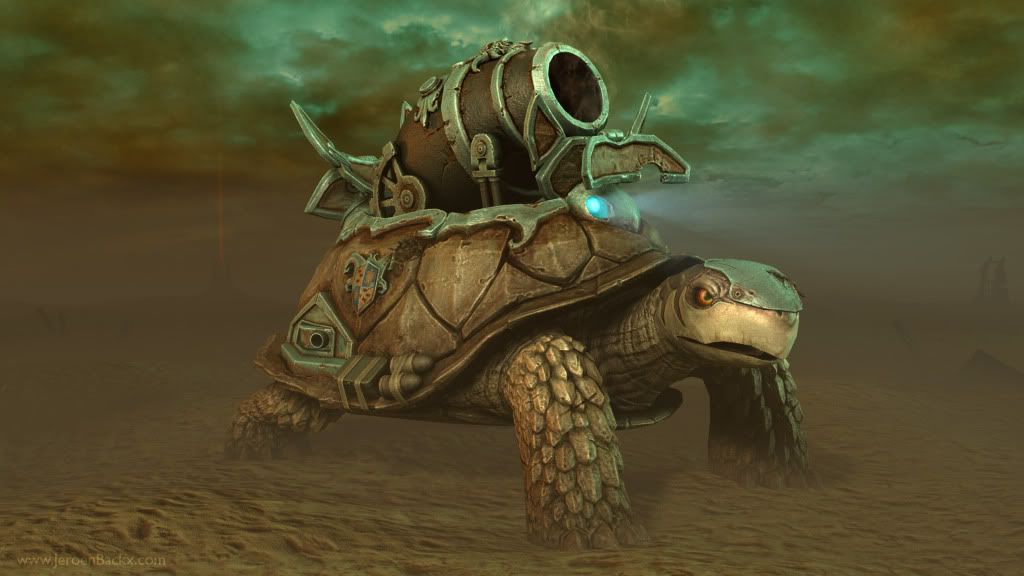
EDIT: The following image shows the end result of working with the feedback I got in this thread based on the images I originally posted.

I figured it'd be best if I showed it on the first page as well. You can go through this thread to see a little of how I ended up with this result.
====================================================================
Hi, this is my first post on polycount.com. Hopefully many more will follow, this seems like a really cool community.
My name is Jeroen Backx, a 29 year old guy from the Netherlands. I've been 3d modeling for nearly ten years and I have been active in the games industry for about 3 years. Unfortunately my former employer bankrupted and now I'm in between jobs. This did finally open up some time for me to work on my own stuff. The model i'm showing here today is the result of that.
I haven't really actively been looking for a new job in the industry but now that this project is finally finished I'm going to put some more effort into it.
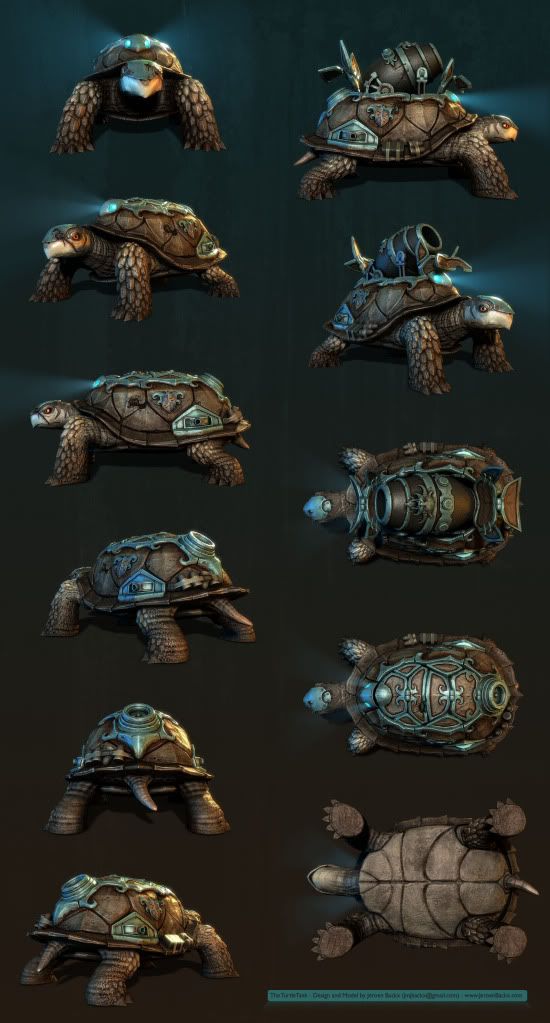
The character you see below is called the TurtleTank. He's like a cyborg creature with a bigass cannon hidden in it's shell.
The character was made from scratch by my own design. It's taken me more than a hundred hours to make this guy but i'm quite happy with the result.
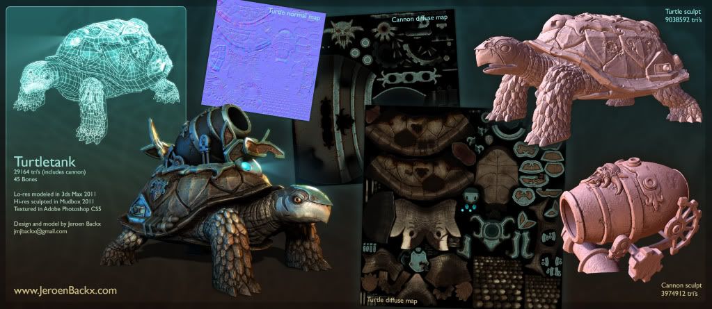
I used 3dsMax, Mudbox and photoshop. This is my first serious sculpting project, so be gentle ;-)
Seriously though, i'd love to hear your opinion or critiques
If you would like to know more about this character, see some higher resolution images of it or see some of my other work. Please visit my personal portfolio website: www.jeroenbackx.com
Let me know what you think!
Higher resolution images:
http://www.jeroenbackx.com/index.php/2011/01/the-turtletank/

I figured it'd be best if I showed it on the first page as well. You can go through this thread to see a little of how I ended up with this result.
====================================================================
Hi, this is my first post on polycount.com. Hopefully many more will follow, this seems like a really cool community.
My name is Jeroen Backx, a 29 year old guy from the Netherlands. I've been 3d modeling for nearly ten years and I have been active in the games industry for about 3 years. Unfortunately my former employer bankrupted and now I'm in between jobs. This did finally open up some time for me to work on my own stuff. The model i'm showing here today is the result of that.
I haven't really actively been looking for a new job in the industry but now that this project is finally finished I'm going to put some more effort into it.
The character you see below is called the TurtleTank. He's like a cyborg creature with a bigass cannon hidden in it's shell.
The character was made from scratch by my own design. It's taken me more than a hundred hours to make this guy but i'm quite happy with the result.
I used 3dsMax, Mudbox and photoshop. This is my first serious sculpting project, so be gentle ;-)
Seriously though, i'd love to hear your opinion or critiques
If you would like to know more about this character, see some higher resolution images of it or see some of my other work. Please visit my personal portfolio website: www.jeroenbackx.com
Let me know what you think!


Higher resolution images:
http://www.jeroenbackx.com/index.php/2011/01/the-turtletank/
Replies
Anyhow, I also wanted to mention that I exported this character into the Unreal 3 engine. I'll be posting a video of that soon as well. It won't really be a playable or fightable character as that goes a little above my head. However, it's animated and i'll be able to walk around it in realtime, which is kinda cool. I'm looking forward to showing that off :-)
I guess you guys are right about the colors. I was a little hesitant about using bold colors for the character. I tried some different shades on the shell but it soon made it feel very busy, so I guess I took the easy way out and just made everything brown (hey, all the gamedevelopers do the same thing amiright? :-P ).
This is the case with most of my personal work though, i'm always a little uneasy about which colors to use. So yeah, c0ldhands is right on the money. I'll try to be a little bolder with my color palette from now on.
You might have been able to achieve almost the same result with alot less polies I think.
I'm sure I could've shaved some off the polycount. I'm usually all about keeping it as low as possible but this time around, it being a personal project and all, I might not have been as conservative as I should have. Still, a lot of the polycount goes into the scales on the legs, which I feel are pretty important for this character. Also there are a lot of small decorative elements which I preferred to do in geometry rather than just in texture. But even then, I guess I could've saved a couple of thousand tri's here and there. Oh well :-)
@conte, thanks man! Hopefully my second art post will be better yet! I'm sure it will because theres so much great feedback and support here.
[EDIT] I looked at you portfolio stuff and i love the models and the style of the game! The game comming out to PC (As in computer :P)
@sltrOlsson, yeah I suppose the head looks a bit plain compared to the rest of the model. Thing is, the other side of his head has this really bigass scar, which you can see in the viewpoints render. I should've made that side of his head face the camera. Unfortunately I only realized this just after I spammed this render all over the internets.
Also, thanks for looking at my portfolio! The game (Fairytale Fights) does have some graphic appeal I think. Unfortunately it was held back by less than great gameplay design, level design, enemy ai (I could go on...). So it never really became a success. It was supposed to get a PC version but the company went bankrupt before this happened. Eventually it only ended up on the Xbox 360 and PS3.
@p442, yeah I think that would've fit nicely. The next project I'm doing, I'm definitely going to post WIP images. I love the great feedback here.
I'm planning to do a second version the first render and I'll try to adjust it based on the comments you guys are giving.
If you look closely and read the character bio thingy at the top, The gun is inside the shell, and the turtle is a robot. therefor the gun is attached inside the shell, and you can see gears and pistons there as well.
I think the turtle tank is an abolutely wicked concept. I want one
Just kidding, Praetus. Thank you as well, I appreciate you pointed out what you thought you saw. Theres more to it, but if you thought it was all just piled on top of the turtle instead of being supported by a more complex system, then I definitely could have improved stuff. I would love to hear your thoughts on this.
Thanks guys, I really appreciate the feedback so far. I'm currently working on a second version of the scene render, taking into account many of your critiques.
Well executed too, although i would err on the side of maybe slightly too high poly. But it totally depends how big this guy will be ingame, if he's as big as large tank or bigger it would justify it. Nice stuff either way, i really wanna see this bad boy animated!
Based on all your feedback I went back and did a second version of the scene render. I think it looks a lot more dynamic and maybe somewhat more realistic. I hope you guys feel the same but if you see anything wrong with it, please don't hesitate to point it out.
Anyhow, this time I did the render with VRay instead of Mental Ray. I'm pretty new to working with VRay so I'm sure i'm not really getting all that it has to offer but I think I got a nice result nonetheless.
the only thing I will say is that if that's sand, it looks a tad odd!
great work.
Reminded me of Blastoise, with the cannon on the back. >_>
The design is great! Very original. :thumbup:
You should post video of the shell opening up for cannon .
also agree with tda on the scale reference thing.
wanna see more now.
+ 1
I think you should do a more interesting ground texture to. It's a bit boring atm.. Other then that, ace!
after spending lots of time i now realised that
it needs something nearby to compare and see turtle's scale!!
(sorry, couldn't resist)
I'm still working on the scene render, see my latest wip version below. I adjusted the sand texture. Hopefully it looks less odd now like some of you mentioned. Furthermore I did some small color tweaks but nothing big.
As was suggested by a lot of you, i'm going to put in some kind of size reference. I'm not really sure what it'll be because I want the image to keep the 'desolate other world-ish' look. I'm thinking of a decaying human corpse. Maybe it would be cool to see a trail of footsteps going from the corpse back to the big spaceship wreck in the back. Though that might not make a whole lot of sense as it seems like a windy environment. The footsteps would be blown away in a matter of hours. Oh well, i'll think it over some more.
So, either the corpse or maybe a bird of prey. If you guys have another suggestion thats also very welcome!
@attattattack: the renders are of the lowpoly model. I'll also post a video of the creature being animated in UDK soon!
What about an vulture sitting on the turtle waiting for some nice corpse?
Very nice work on the turtle itself. I like the overall feel and love the surface treatment. No crits there from me.
@AimBiz, sorry I didn't respond to your comment earlier but as you can see I took your advice. I think the image improved because of it. So, thank you very much!
To everyone else who commented and helped me out in this thread, thank you. The difference between this, and the scene image in my initial post is the result of all the great feedback I received in this thread.
Let me know what you think!
The astronaut works, but it doesn't have the same high quality that the turtle got. I thought it was a character from Nine first :P
[ame="
Fantastic work jeroenbackx, it is a pleasure to see such a cool concept executed in 3d. The textures and render are fantastic. Thanks for sharing, would be great to see the UDK stuff.
My only crit is triangles could be cut perhaps... yet is it worthwhile? As it looks great as it is for a portfolio, as it catches the eye for sure. Optimisation depends on context of use... :poly121:
ps. Is it at all possible to post videos vimeo.com on these forums? Their embed code doesn't seem to work here...
<iframe src="https://player.vimeo.com/video/19528872?title=0&byline=0&portrait=0" width="640" height="400" frameborder="0"></iframe>
...nope
I guess you're right about it looking a bit slow, I worried about this to but when I looked at reference for a walking turtle they didn't seem much faster. I did want him to behave slow and sluggish but maybe I overdid it a little.
Oh well..
That was great to see! I also love the extra touches like the fan and little turrets.
Edit: In the UDK material, could you play with the material on the light so it flickers slightly and has a fade? Just an idea.