Home 3D Art Showcase & Critiques

My Giant Spider Needs Your Crit

Hello everyone!
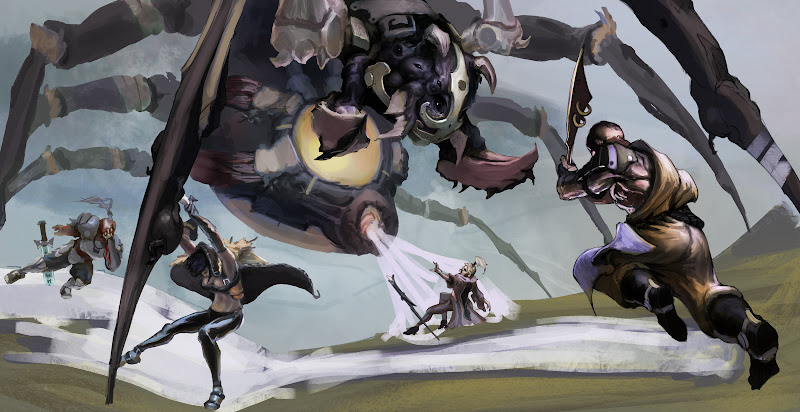
This is a colour comp of an illustration that came to me in a dream. I haven't started any rendering, just placing values and colours in places where they will approximately go. If you guys have any feedback, I'd be glad to hear it before I merge everything down and really get my hands dirty.
Thank you!

REald.jpg

Replies

  • Stinger88
    Offline / Send Message
    Stinger88 polycounter
    Looks good already. Will be watching the progress.

    Have you thought about giving the spider more than 2 eyes? Maybe just some small ones around the larger eyes. Just a thought.
  • Mark Dygert
    That is pretty awesome! I'm looking forward to seeing more.
  • LateWhiteRabbit
    Like Stinger88 said, spider's have more than 2 eyes. Just like they have eight legs, they also have eight eyes. I guess they have a numerical theme going on.

    Looking good otherwise!
  • Two Listen
    Offline / Send Message
    Two Listen polycount sponsor
    I really like the spider. The people are bugging (ha) me a little bit, though. Especially that lady in the black pants, I can't really tell what she's doing or where her head is... I think she's stabbing the thing in the leg, but for a moment I thought her head wasn't there but that you could see some blond hair flying back behind her. Then I thought her head was hanging low in the front maybe sort of covered by a hood, but I'm still not entirely certain. Also don't know what her other arm is doing.

    Also the muscles on the guy in the front are sticking out at me. His outfit for his torso area is a little hard to decipher (though you said you hadn't really done any rendering so I'll not worry on that so much) and that's an awfully strong white secondary lightsource that's looking a little odd.

    It's a really cool idea as a whole though, and that spider's shaping up real nice! Hope to see the rest of the piece follow suit.

    Edit: As a side note the two eyes thing doesn't bother me, sure they usually have 8 (but not always, I didn't think? Might be wrong, though). But they also usually aren't 30ft tall and I think his head looks neat.
  • jimmypopali
    I think the guy on the right and the spiders head is the main focal point, the other people in the scene are very high in contrast and take away from the focal point. It does look like there is a lot going on (dark characters - light background)

    Great start to this!
  • 55joe
    nice man. reminds me of oldschool eq box art. (they are awesome)
  • isso09
    Thanks a lot for the crits, guys! They really mean a lot to me, and are very helpful. I addressed some of the issues and rendered out most of it. All I gotta do now is figure out a way to work the magic in without making it too jarring and render out the spider. Let me know what you guys think!

    REalspy.jpg
  • konstruct
    Offline / Send Message
    konstruct polycounter lvl 18
    the weight distribution on all of the characters except the one in the foreground is really weird. they all have these super dynamic poses, but all have both feet planted on the ground, way far away from their center of gravity. it might be good to get some better leg positioning
Sign In or Register to comment.