The BRAWL² Tournament Challenge has been announced!
It starts May 12, and ends Oct 17. Let's see what you got!
https://polycount.com/discussion/237047/the-brawl²-tournament
It starts May 12, and ends Oct 17. Let's see what you got!
https://polycount.com/discussion/237047/the-brawl²-tournament
Mega man redux UDK level
Hi some of you may rember my work with the sonic level. From that level i have found a fascination with old school pixel art. in particular mega man. While strolling through Google i found a image that really represented the imagination that was early 90s gaming 
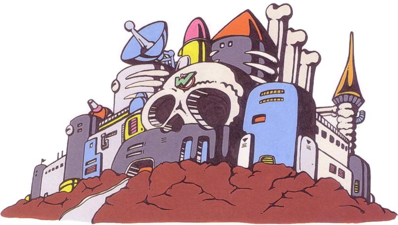
i feel that with games like call of duty we have gotten to a point were are graphics are so realistic that imagination is not really necessary. Not that i dont like call of duty its awesome, BUT I miss imagination in video games. As limitations go so does the need to be creative. so here is step one of what i am trying to create
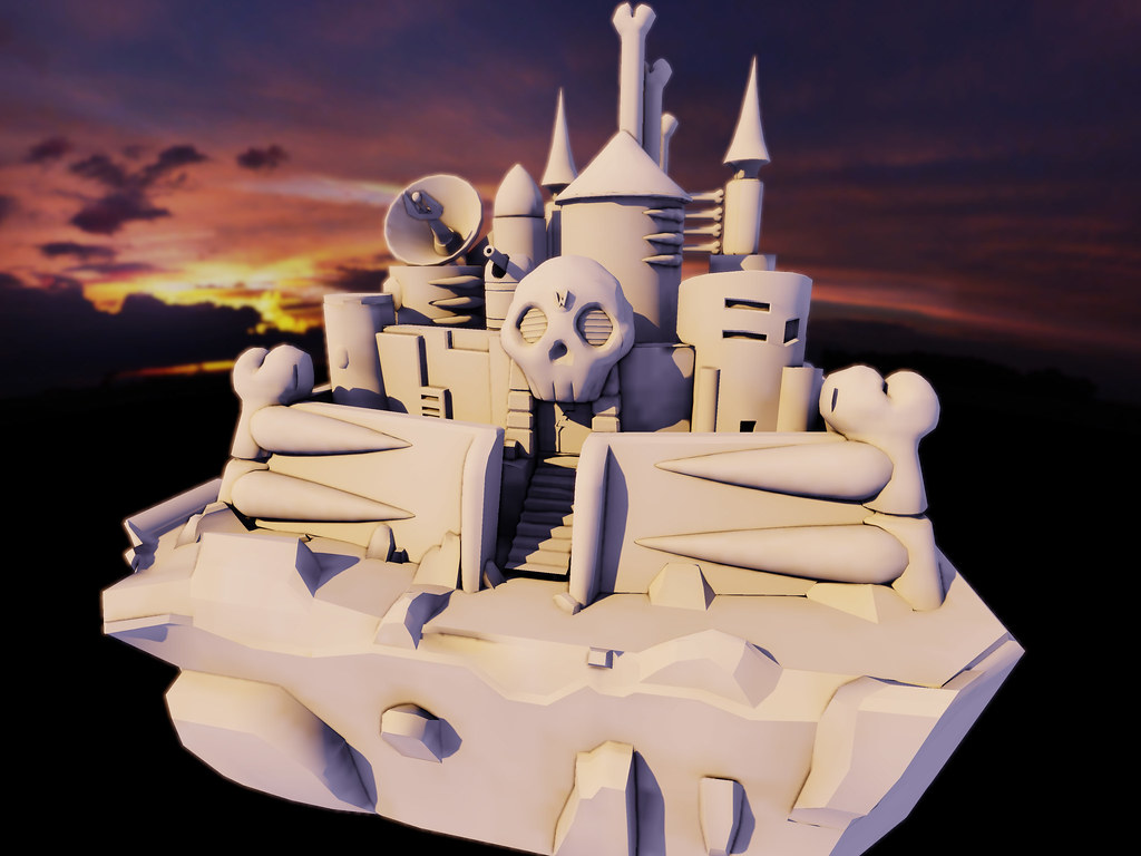
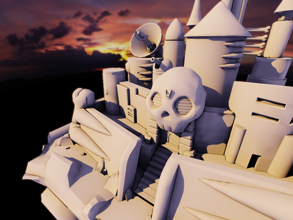
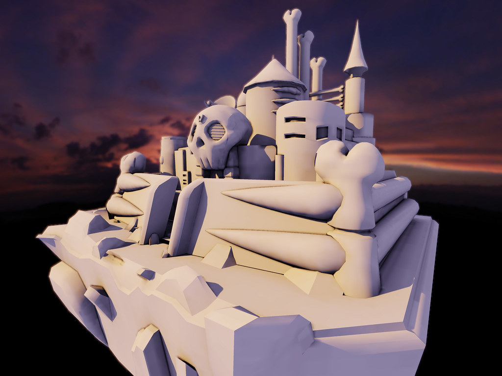
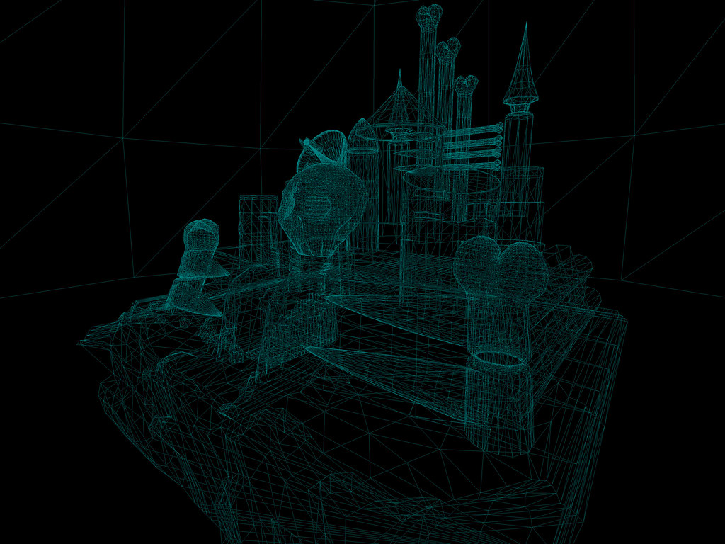


i feel that with games like call of duty we have gotten to a point were are graphics are so realistic that imagination is not really necessary. Not that i dont like call of duty its awesome, BUT I miss imagination in video games. As limitations go so does the need to be creative. so here is step one of what i am trying to create


Replies
Looks really good so far but how will you texture it? Same style or updated in your own way?
http://www.themmnetwork.com/2010/05/08/the-mystery-of-wily-castles-pipe/
http://starcraft.incgamers.com/forums/showthread.php?p=25589
http://howtowinstarcraft2.com/tag/valkyries/
I've got to agree. I don't know if you intend to make Wiley's castle a playable level or just render it as a portfolio or showpiece in UDK, but I'm seeing a lot of wasted and excessive polygons.
The bone tops and the skull look particularly wasteful. You could optimize and cut out a lot of polygons and still retain the same look and shape. You'll get faster renders and it will be a lot easier to lay out your UVs.
Other than that, it's looking great. I love the idea of translating 8-bit environments to current gen specs and look.
Looking good, enjoying the updates
this is a tillable texture that goes over the back ground hills
i will put up the rest of the textures tonight