Armored assault (character WIP)
I've decided to make a next-gen level game character model based off this concept I did toward the beginning of the year:
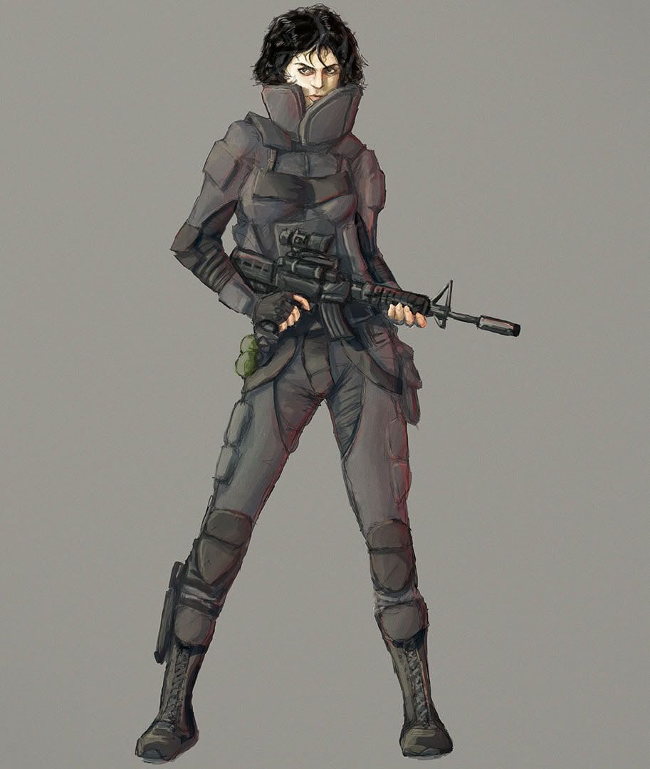
So far I have:
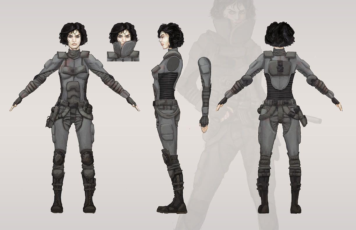
Turnaround concept:
Head WIP:
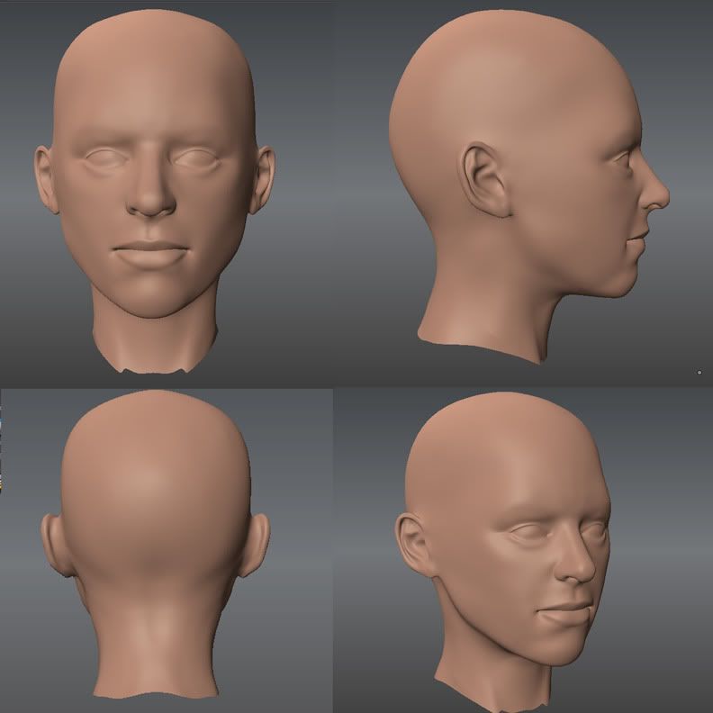
The head isn't looking too much like the character, but I'm mostly focusing on just making it look human first.
Also having some problems with femininity, I know it looks a bit mannish now... but my character isn't uber feminine. I'm having some trouble striking a balance, it seems to either look like a man or like a squishy little girl. Any advice here would be appreciated.
Any critiques and advice in general would be appreciated, it's not too late to make adjustments to the character either.
Also, I'm not sure how I'm going to do that hair. I haven't seen many 3d game models with curly/frizzy hair like this.

So far I have:
Turnaround concept:

Head WIP:

The head isn't looking too much like the character, but I'm mostly focusing on just making it look human first.
Also having some problems with femininity, I know it looks a bit mannish now... but my character isn't uber feminine. I'm having some trouble striking a balance, it seems to either look like a man or like a squishy little girl. Any advice here would be appreciated.
Any critiques and advice in general would be appreciated, it's not too late to make adjustments to the character either.
Also, I'm not sure how I'm going to do that hair. I haven't seen many 3d game models with curly/frizzy hair like this.
Replies
Comment/critique?
I've also started with the body, pretty much just roughed in at this point:
feedback greatly appreciated
Anyway, made some adjustments and worked on the high-poly some more.
I'll get started on retopology and such soon.
Also her head looks a bit masculine, maybe make her neck a little longer and her head slimmer and less brutish? Then again, characters aren't my expertise so I could be completely wrong. haha.
I think your earlier head was more feminine, the nose on the most recent seems very wide. I also think that displaying in orthographic does a lot to widen the character and make her seem a bit manly, I would guess that she isn't so bad in perspective.
The wrinkled fabric on the suit looks great. The sculpting itself is pretty good, but It seems a bit flat because nearly everything is one piece. Using separate subtools (I could see 20 or so for such a suit) for all of the parts, like buckles, straps, and packs would do a great deal to add depth, better crevices and shadows, and make the model seem realistic. It would also, I presume, be much easier to work on pieces without constantly masking and isolating things. Cloth should bunch out right next to where its strapped down, and yours has a pretty flat transition, i.e, the boots look great, but if they were sculpted separately then it would be pretty easy to bunch out the fabric where it pulls tight on the leg.
By far the best character I've seen you do so far. Eager to see how it turns out man.
Thanks for the crits! Yeah, I've been pushing the legs up and down quite a lot and can't quite get them the way I want them. I do agree that the lower part is probably a bit short though, I'll try and fix that. I'm really trying to avoid overly exaggerated supermodel proportions on this one though, which is a bit tough.
@Razgriz:
Thanks! I think it's my best character so far too, and I've definitely learned a lot, I'll be working on another immediately after this and hopefully it will be leaps and bounds better.
The head hasn't changed since I last posted it - though ZBush is messing with the perspective a bit. I can't disagree though, it is still too mannish. I'll see if I can work on that.
Also, I had been thinking of using a bunch of separate subtools this whole time, though frankly I'm not entirely sure how to do it. Like, when I see someone model someone naked, and then put clothes on them as separate pieces, I always wonder if there's some secret to getting the new pieces to conform to the body so well.. is there? Definitely on my next model I'll be more adventurous and do this more. Any more info on doing so would be appreciated though.
Although, I will note that the shoulderpads, kneepads, belt clips, belt buckle, elbow pads, gun holster, and shoe laces were all modeled as separate pieces in an attempt to add more depth
Also, I did all the modeling (except the Max stuff) in mudbox. Only brought it into ZBrush for decimation master .
@Builder_Anthony:
Thanks!
She's 9,800 tris. Her hair is about 2-3K of that
Comments/critique?
A big thing that'd help overall believability though is eyelashes and wetness to the eyeball
The clothing has a watercolor-y look that I like, but in the further shots it looks a bit too muddy and flat. The pockets on the thighs for example.
Everything elbow down looks deflated - her hands are way too small. Her head is too wide, make it narrower w/o much scaling to the face - i think the face is ~ok. The hair takes away from her, try again with some reference or throw a helmet on her... or do something simpler for this one and give her a buz cut.. Her pose is a bit jolting.. turn it down just a notch.
And watch out for crazy angles/perspective when rendering... bold camera choices but I don't think they're working - thus, better go with something more subtle, tried and true.