Home 3D Art Showcase & Critiques

Rico's WIP thread.

*****Latest Post*****
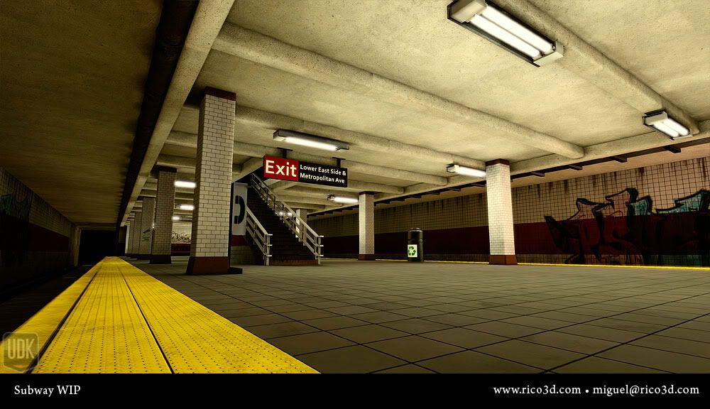
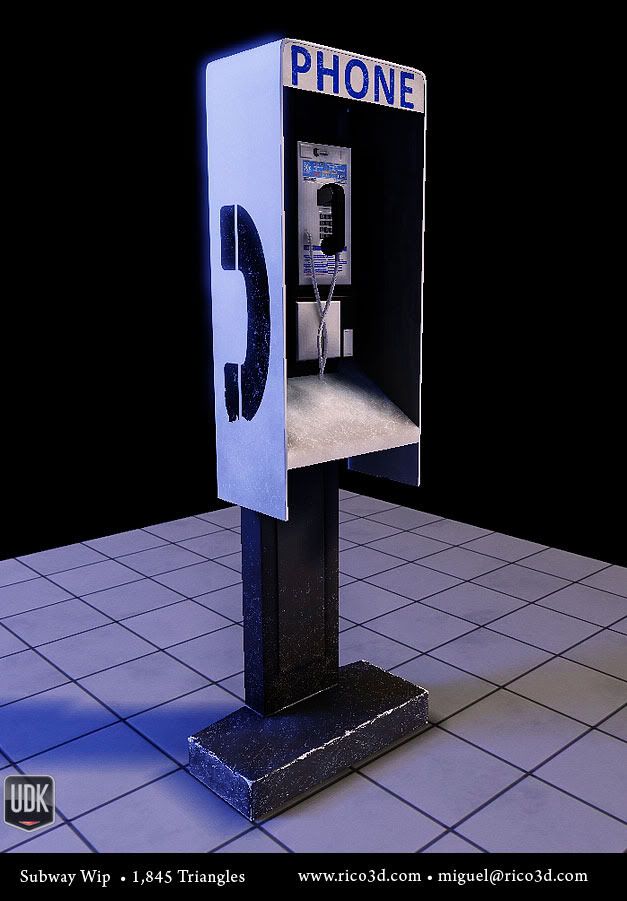
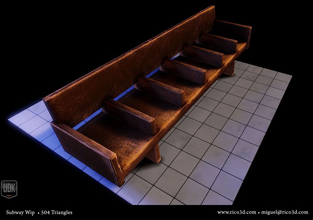
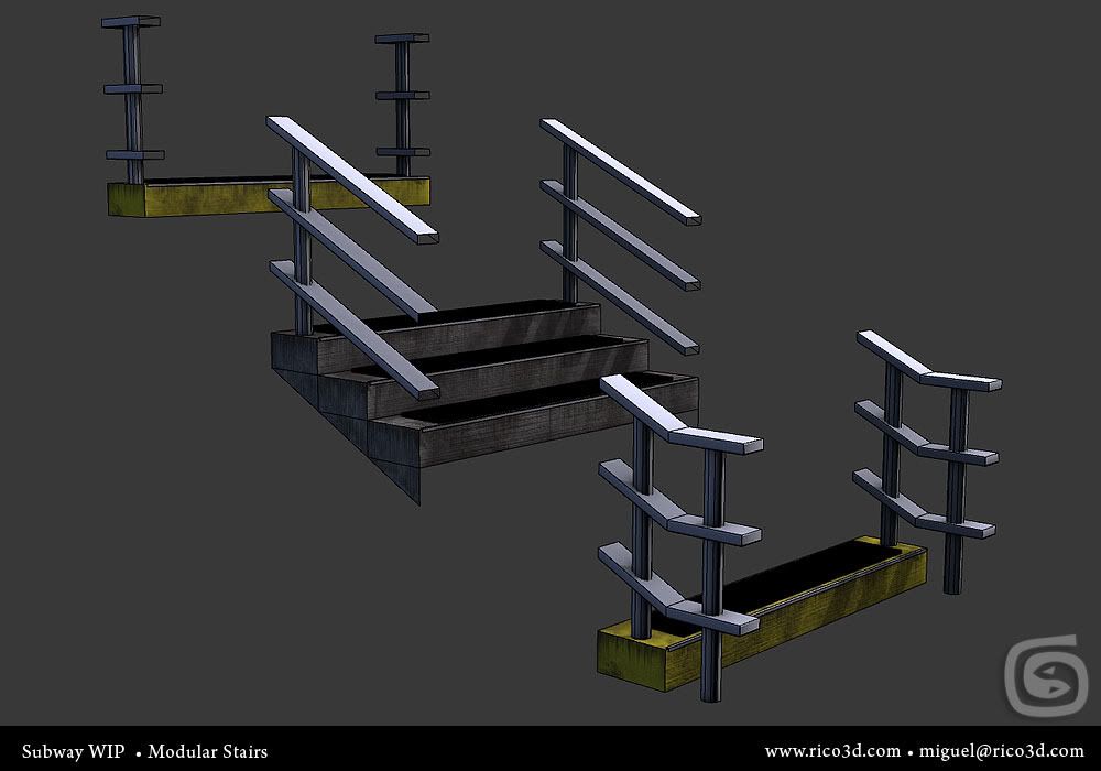
SubwayRender_49.jpgSubwayRender_48.jpgSubwayRender_50.jpgSubwayRender_51.jpg

******

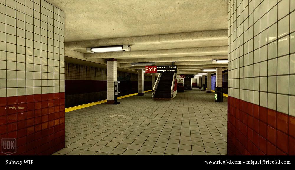
So I started this scene a while ago but put it on hold, I recently went back to it.

I'm giving more love to all the assets this time around and going to be making more as I go on.

Crits please!
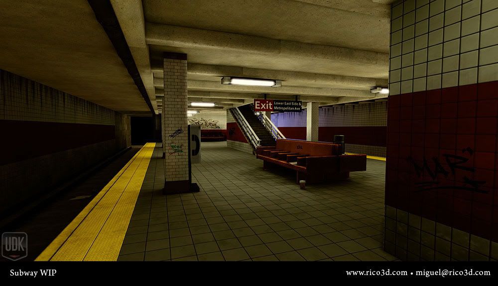
SubwayRender_38-1.jpgSubwayRender_36-1.jpgSubwayRender_34-1.jpgSubwayRender_39.jpgSubwayRender_40.jpgSubwayRender_43.jpgSubwayRender_42.jpg

Replies

  • Jessica Dinh
    Offline / Send Message
    Jessica Dinh polycounter lvl 10
    Hey your stuff is cool! :D However I think that slimy grime coming down from the top of the walls is a little exaggerated and excessive. Make it lighter maybe, have less streaks? Same thing with the edge scratches on the phone base and the bench.
  • ajr2764
    Offline / Send Message
    ajr2764 polycounter lvl 10
    Good stuff man. Whats interesting is I have a NYC subway environment from a while back that I need to return to sometime after I finish my current project. A few things:

    -some of the textures like on the phone and bench seam a bit too sharp.
    -you may want to vary up the dirt on the outer subway walls, looks un-natural and tiling is noticeable.
    -there is a visible seam on the roof support beams where the dirt meets.

    If you get a chance it would be nice to see some more breakdowns and some texture flats of the assests. You may want to add some piping or power lines in there if you havent planned too already, makes it come alive more. In my subway I actually incorporated all the generators and ran wires across the ceiling to the lights..Look forward to see more of the progress.
  • AsaNYC
    Offline / Send Message
    AsaNYC polycounter lvl 15
    First, the things that won't require extra work
    1. The stains are too uniform as previously mentioned
    2. The stains aren't coming from anything, which would focus them in one or two places.
    3. The ceiling over the track should carry through the support beams over the platform.
    4. Lights generally run lengthwise, at the edge of each platform and centrally along the actual platform.
    5. Garbage cans are kept away from the edge (center, actually) so nothing ends up in the tracks.
    6. Helvetica is the font you want for all MTA signage.

    If you have polys and memory to spare, there are tons of details in a station that you can add to make this place believable.
    1. Add station signs to each column facing along the length of the platform.
    2. Station signs hanging on each side showing where the train is actually going.
    3. Suspended power and data cables on each side of each track, with the central/inner ones also providing overhead lights with power.
    4. Subway system maps and notices in the middle of the platform alongside the benches.
    5. Graffiti doesn't happen in-station anymore, especially nothing that big in a station this recent (Most stuff is throwies and those are in tunnels) but I understand having it for old-school stereotype's sake.
    6. The ceilings aren't bare masonry, but heavily painted-over. Good job for zbrush/mudbox/blender and a spec map.
  • Rico
    I appreciate all the feedback guys! A lot of really good points and suggestions you guys made.

    I got caught up with other things but will be able to work on this again pretty soon.

    I'll make sure to hit all the points you guys posted on the next updates!
  • Rico
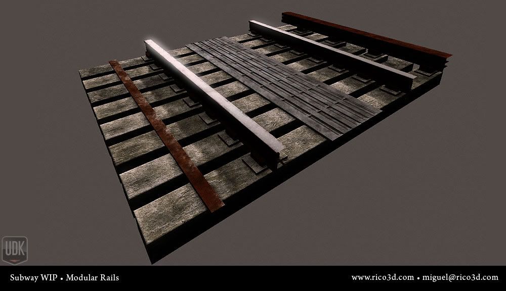
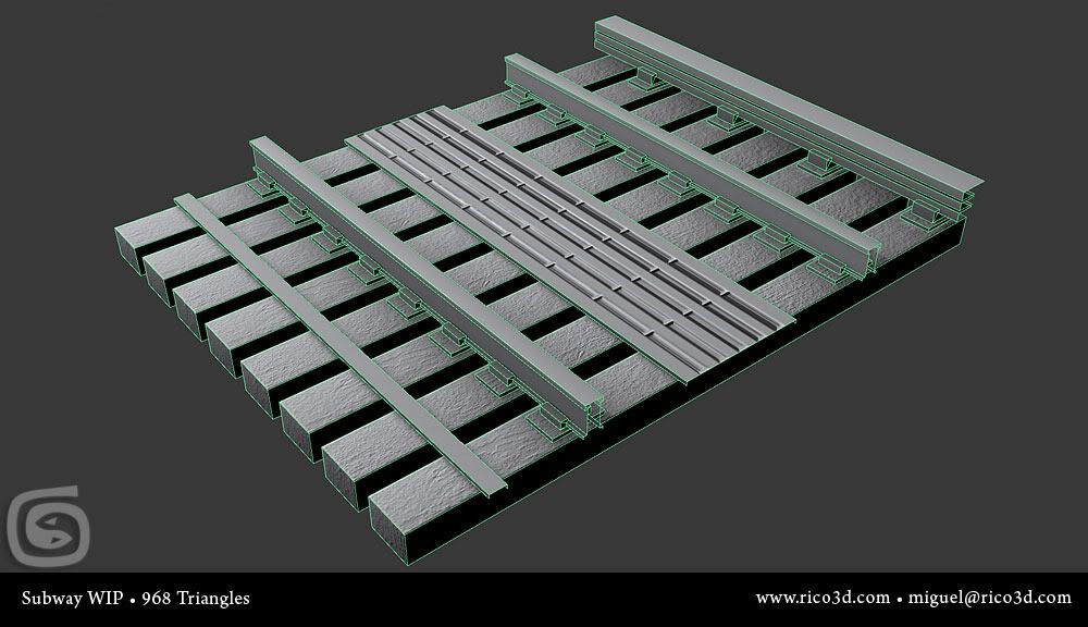
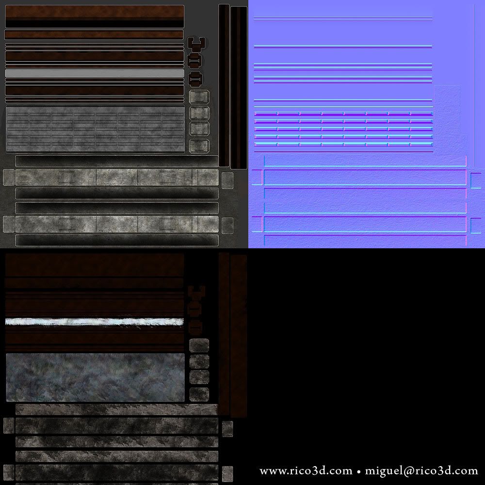
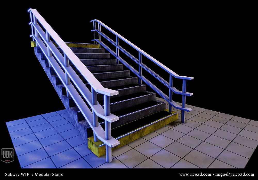
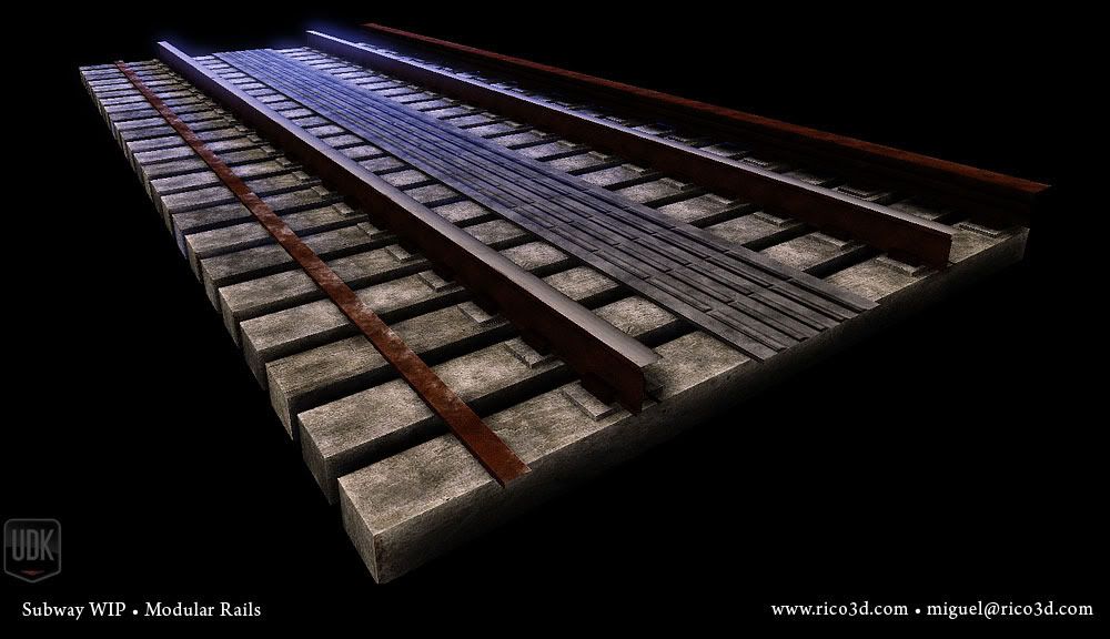
    Well, had some time yesterday and today to redo the rails I had as place holders.

    SubwayRender_49.jpgSubwayRender_48.jpgSubwayRender_50.jpgSubwayRender_51.jpg
Sign In or Register to comment.