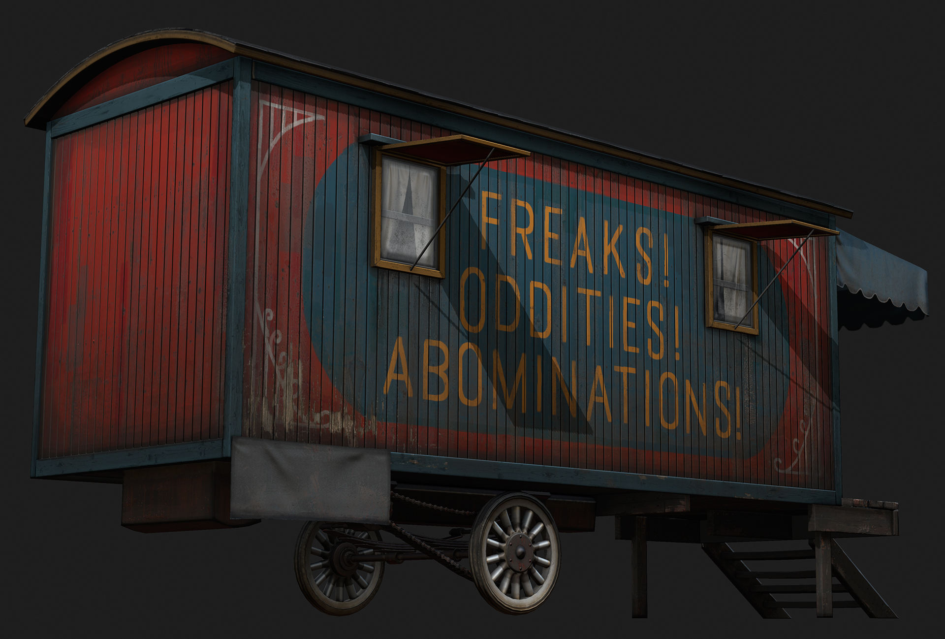
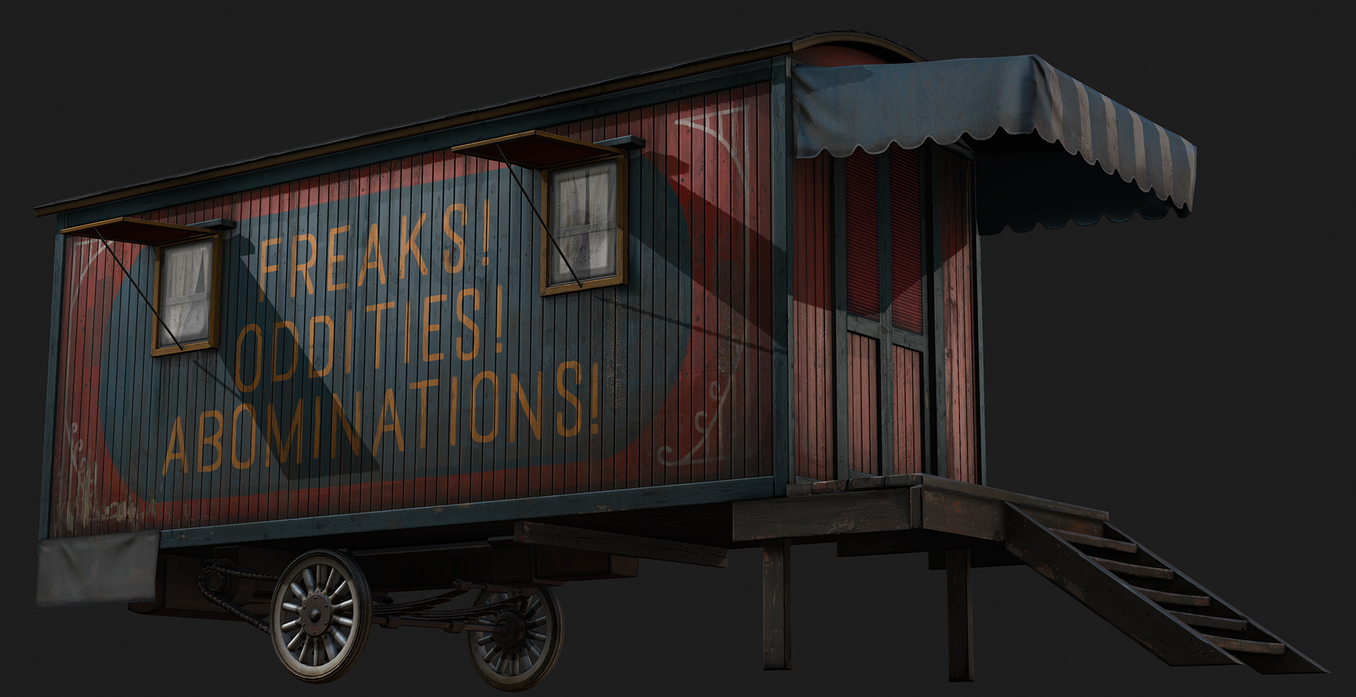
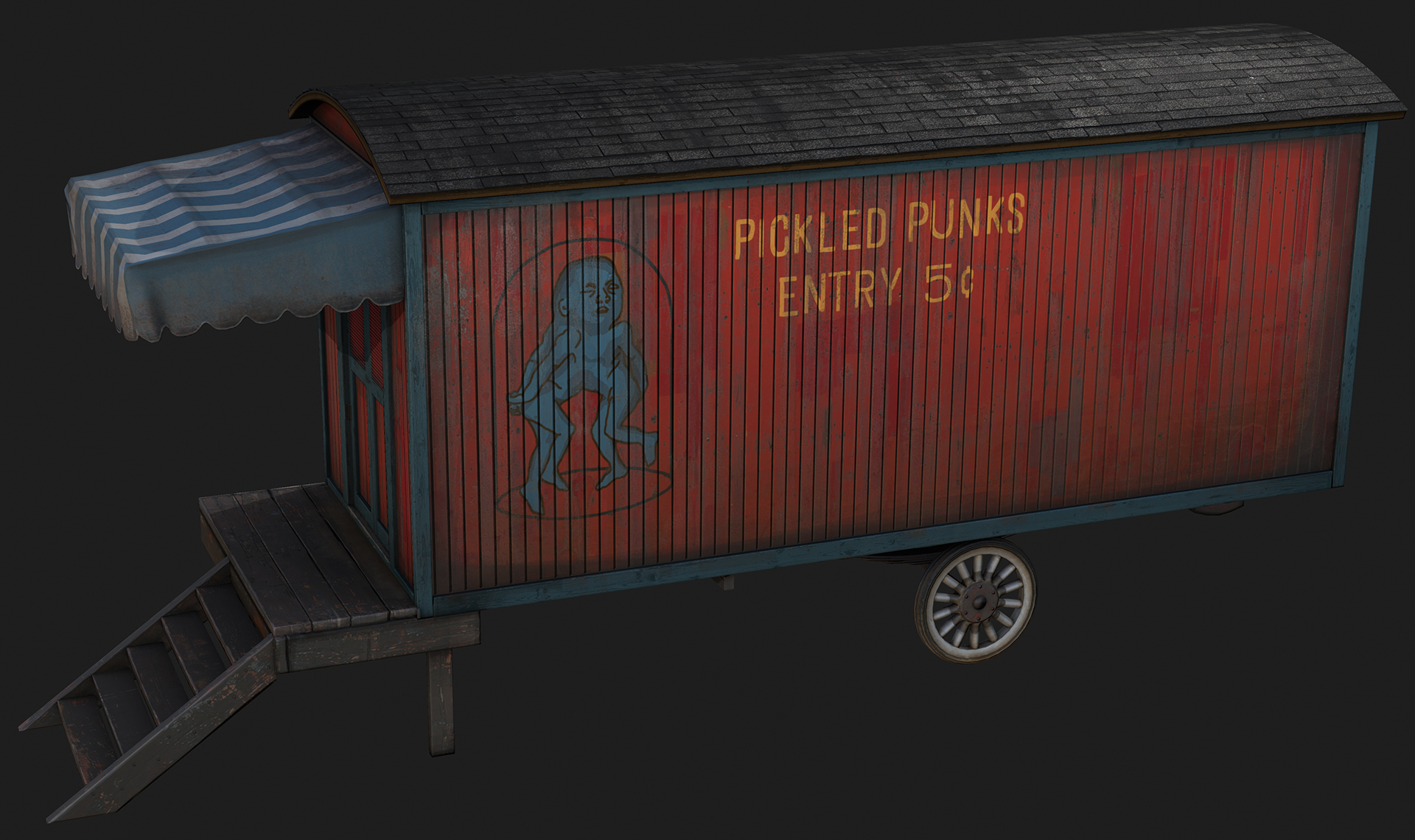
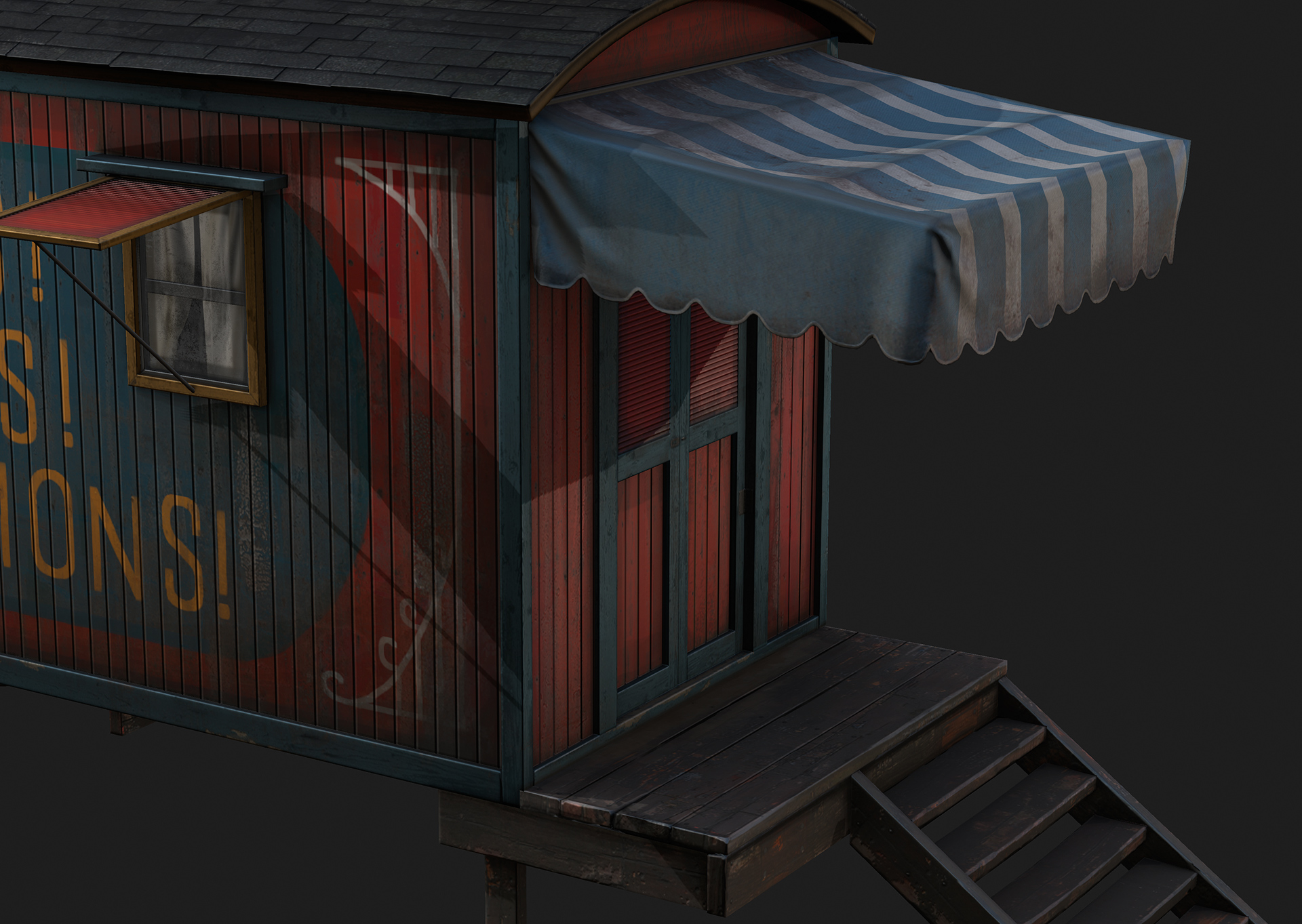
I put this together as a portfolio project for when I overhall my website this march. The goal of this model/texture was to get some wood surfaces into my portfolio and to mess with mixing bright colors and dirt.
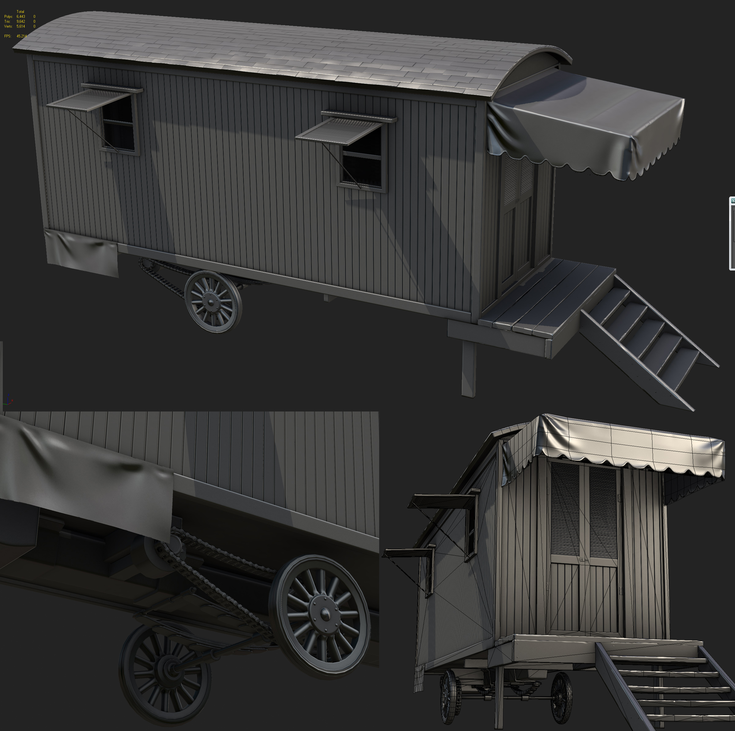
All the images are max viewport grabs with the 3 point shader and the final model is just under 10k.
Loving this, only thing it might benefit from is some some more chipping in the paint, that might help break up the red a tad more, and help sell it as painted old wood. Maybe more so near the door and more used areas.
Yeah i'm going to try out some more paint chipping. Hopefully I can implement chips on the main panels without becoming overly noisy. Either way im going to put more chips on the blue supporting beams.
I'm also going to try and work on the text on the front. It looks a little too much like a font right now. Also, If you look carefully you can see an old version of the text I left faintly in the spec map, I think its a good detail.
I think your font could be more circus themed... they had those elaborated and in perspective... different sizes... As far as the rest, i like it. Good job man!
What a lovely texture you got going on this sweet trailer ! I really like the different color values you got going on the red side of things, which makes it really interesting to look at - what could potentially be a totally boring repetetive plane. Great job on that !
What kinda caught me off-guard was the line where you say that it "was just under 10k".
I'm all for putting as much "modeled-out detail" in a scene as possbile - believe me ^^ but I don't know if you invested the polygons in the right places.
I don't know if it's really neccessary to have 7-8 subdivisions in one row of the wheels while the door entrance planks are one solid box and the small bar holding the window just floats on there, with no visible ("eject") mechanism.
I mean clearly you put a lot of attention and love to the underlying parts which shows a great sense for technical detail, yet it won't be the most visible part of the vehicle but has - from what I can tell from the wireframe - the most polygons of it all.
I kinda expected more visible detail in the upper area as well. Some visible cracks in the woods or some similar stuff maybe.
It's safe to say that it's just nitpicking and in the end you could easily shave off a ton of polygons, if you wanted to !
So, great addition to your portfolio. I'll be sure to bookmark it
Thanks for the feedback. For an an asset that isn't going into an actual game I would rather not limit myself with geometry or texture res. Since it is a 1 smooth group max bake it would be totally broken in any environment other than max with 3 point's shader
Not anymore, in 2011 with the latest Hotfix mine works the same. But yeah as for game-engines you're right.
Technically I have nothing bad to say, awesome model. I thought it looked great before you even pushed the paint chipping, but it really made it pop.
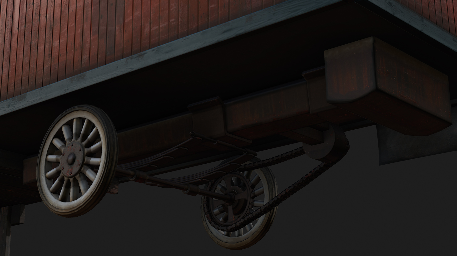
One thing that irks me is the underside, it's a shame when you went to the trouble of modelling it that it appears it wouldn't work. At least the Leaf Spring suspension is odd, like it's floating. The axle needs to be attached, or at least restrained from horizontal movement on both planes with the allowance for vertical movement to the underside of the trailer. The leaves closest to the trailer need to be attached also. There doesn't seem to be any strain on them from the weight of the trailer either.
I think the image is just very dark and not showing it correctly. Let me know if its still wrong looking.
In retrospect I probably should have made the attachment between the leaf spring bar and that main chassis bit running down the center more beefy. It does look a little unbelievable mechanically with just a cylinder intersecting a flat surface.
Did a quick paintover to illustrate what I mean. Alternatively to being the the centre perhaps the part to restrain the movement could be over each spring.
It seems to be pretty hard to find a decent reference for this kinda thing at that particular time, I don't suspect my alterations would be period correct but it would function without falling apart. Also they would probably be a lot more leaves and they would need to be held together somewhere, either in the centre as in the red reference or like in the green reference towards the end.
I see what you are saying now. There should be a U bracket to restrict movement along the axis the trailer is dragged along. I'm inclined to not bother adding it since its dark under there but this will probably nag at me enough to eventually fix it.
Aye it only got my attention as I have been looking at hot rods for a model and trying to work out how it all functions, probably wouldn't be a real issue unless you where going to have the trailer lying on it's side at any point.
Maybe add some slight bowing to the wooden frame...with this being as old and worn as it is it surely wouldn't be so perfectly straight. You do it a little bit on the stairs, but everything else is too right angled.
I really the spots where the paint is worn/chipped off and the wood is exposed. That looks awesome.
Replies
Really liking the dirt. Nice job
http://farm2.static.flickr.com/1342/1353098183_b1e74a73d1.jpg?v=0
http://3.bp.blogspot.com/_ZZoD11F97_4/TPZRODtPPxI/AAAAAAAAAWQ/1lpzVNqHlL8/s400/shelf4.jpg
I'm also going to try and work on the text on the front. It looks a little too much like a font right now. Also, If you look carefully you can see an old version of the text I left faintly in the spec map, I think its a good detail.
What kinda caught me off-guard was the line where you say that it "was just under 10k".
I'm all for putting as much "modeled-out detail" in a scene as possbile - believe me ^^ but I don't know if you invested the polygons in the right places.
I don't know if it's really neccessary to have 7-8 subdivisions in one row of the wheels while the door entrance planks are one solid box and the small bar holding the window just floats on there, with no visible ("eject") mechanism.
I mean clearly you put a lot of attention and love to the underlying parts which shows a great sense for technical detail, yet it won't be the most visible part of the vehicle but has - from what I can tell from the wireframe - the most polygons of it all.
I kinda expected more visible detail in the upper area as well. Some visible cracks in the woods or some similar stuff maybe.
It's safe to say that it's just nitpicking and in the end you could easily shave off a ton of polygons, if you wanted to !
So, great addition to your portfolio. I'll be sure to bookmark it
And I'll add these urls:
http://www.dafont.com/theme.php?cat=106
http://www.dafont.com/search.php?fpp=50&psize=m&q=carnival
http://www.dafont.com/search.php?psize=m&q=tattoo
Not anymore, in 2011 with the latest Hotfix mine works the same. But yeah as for game-engines you're right.
One thing that irks me is the underside, it's a shame when you went to the trouble of modelling it that it appears it wouldn't work. At least the Leaf Spring suspension is odd, like it's floating. The axle needs to be attached, or at least restrained from horizontal movement on both planes with the allowance for vertical movement to the underside of the trailer. The leaves closest to the trailer need to be attached also. There doesn't seem to be any strain on them from the weight of the trailer either.
In retrospect I probably should have made the attachment between the leaf spring bar and that main chassis bit running down the center more beefy. It does look a little unbelievable mechanically with just a cylinder intersecting a flat surface.
It seems to be pretty hard to find a decent reference for this kinda thing at that particular time, I don't suspect my alterations would be period correct but it would function without falling apart. Also they would probably be a lot more leaves and they would need to be held together somewhere, either in the centre as in the red reference or like in the green reference towards the end.
Colt:poly121:
I see what you are saying now. There should be a U bracket to restrict movement along the axis the trailer is dragged along. I'm inclined to not bother adding it since its dark under there but this will probably nag at me enough to eventually fix it.
Edit:
Thanks Alan.
Maybe add some slight bowing to the wooden frame...with this being as old and worn as it is it surely wouldn't be so perfectly straight. You do it a little bit on the stairs, but everything else is too right angled.
I really the spots where the paint is worn/chipped off and the wood is exposed. That looks awesome.