Treasuretown - WIP - UDK
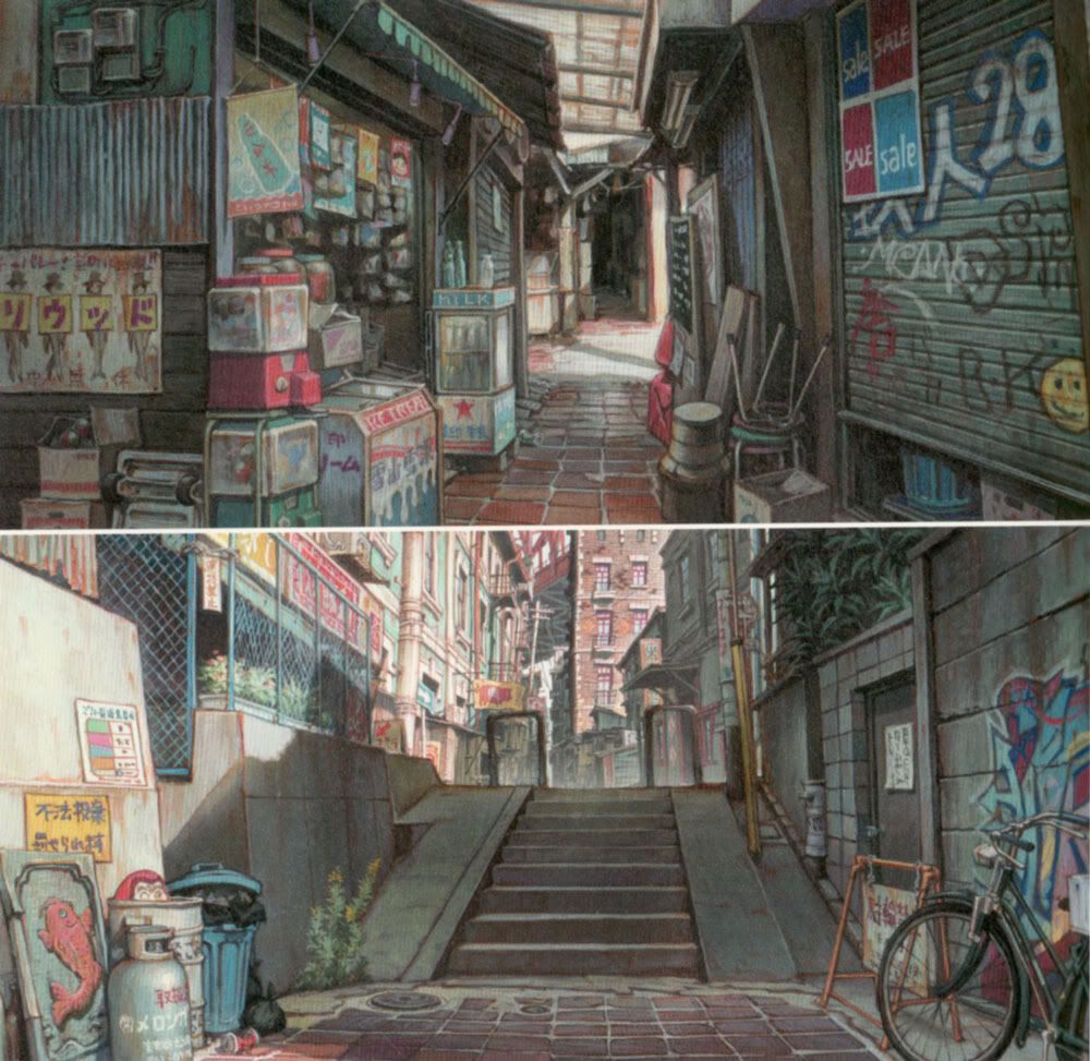
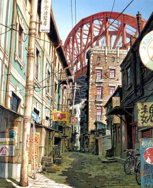
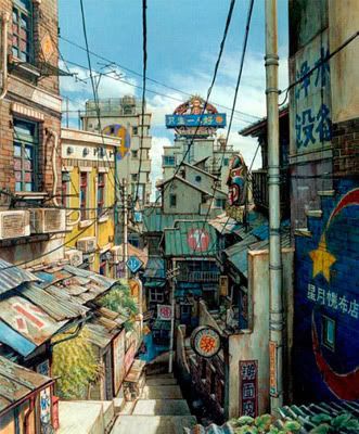
HEY POLYCOUNTERS! This is one of my final levels I am going to graduate with at the end of school. It is based off the movie Tekkonkinkreet. I really loved the over all environmental art style of the movie. Here is a first pass of the level. I hope to go back and really redo almost everything, at least texture wise. I graduate in about 6 months so 2 more Qrts.
Here is some reference I used to come up with the level.
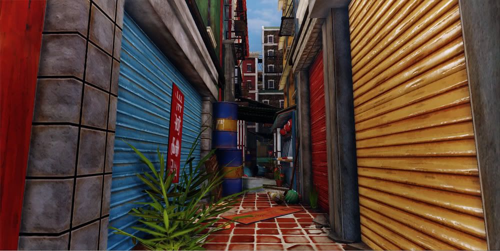
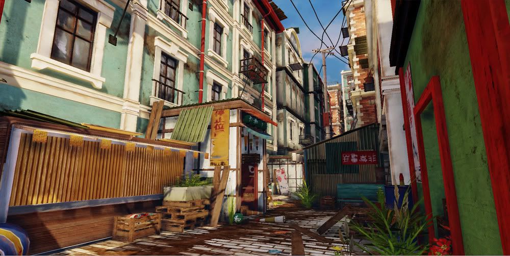
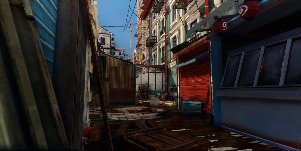
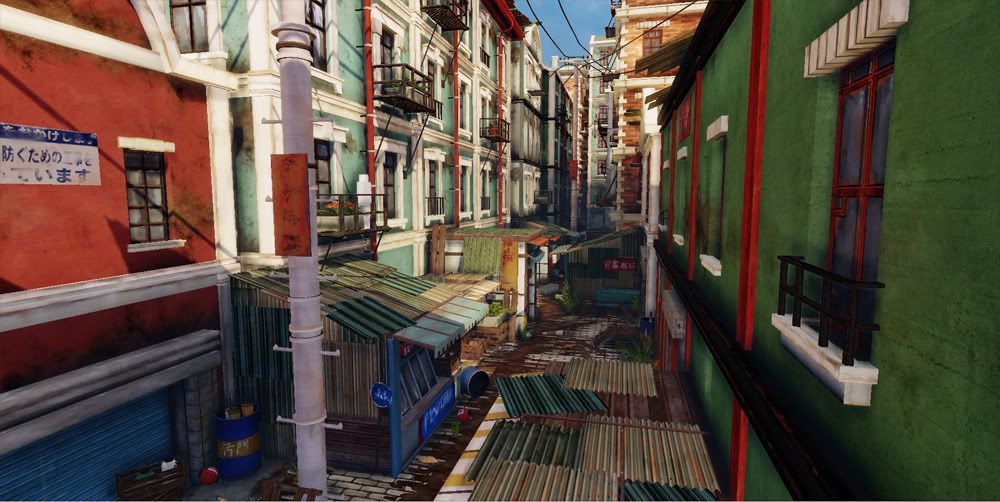
And here are some screenshots of the level.
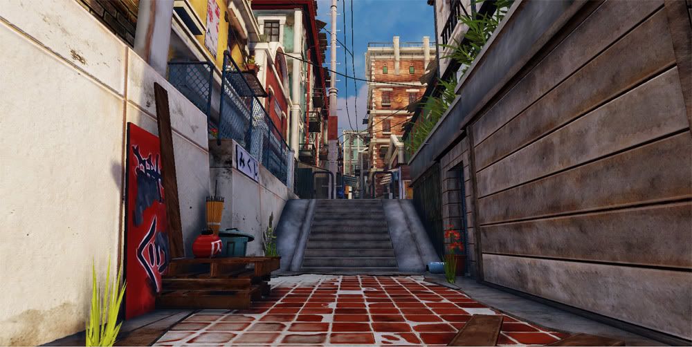
As well as a link to a video demonstrating a couple of camera angles I was thinking of for my portfolio demo reel.
http://vimeo.com/17944012
All CRITS WELCOME! The more the better, so I can make the changes this level needs!
Here is some reference I used to come up with the level.


And here are some screenshots of the level.


As well as a link to a video demonstrating a couple of camera angles I was thinking of for my portfolio demo reel.
http://vimeo.com/17944012
All CRITS WELCOME! The more the better, so I can make the changes this level needs!
Replies
The red tiles on the floor in the first two shots look kind of odd. I don't know what it is, I think maybe the grouting is too clean, and in general looks more like something you'd see indoors than outdoors.
Czar- about the tiles I was talking to Mike H. from Rockstar when he came to our school and he said instead of just a flat plane with mesh painting, that I should actually model the tiles out. I think that might take care of some of the awkwardness maybe?