Home 3D Art Showcase & Critiques

blizzard cataclysm wargan House work

polycounter lvl 7
Offline / Send Message
HughieDM polycounter lvl 7
Hey all tryin to finish this up but I would love some thoughts

BlizzardHouse01.8GI04.jpg
BlizzardHouse01.8GI04.02.jpgBlizzardHouse01.8GI04.03.jpgBlizzardHouse01.8GI04.04.jpg

also have the break down of my prosses at my blog
http://hughmccullom.blogspot.com/

Replies

  • MainManiac
    Options
    Offline / Send Message
    MainManiac polycounter lvl 11
    Im curious as to how blizzard makes their buildings to they can be walked into so well
  • HughieDM
    Options
    Offline / Send Message
    HughieDM polycounter lvl 7
    what do you mean they just model the interiors into the models. If you have wow installed and are interested you can check it out with the wow model viewer.
  • Vailias
    Options
    Offline / Send Message
    Vailias polycounter lvl 18
    frell: The collision model is most likely NOT the view model.. like in most games.
    hughi: looks nice overall. :)
  • Mark Dygert
    Options
    Offline / Send Message
    The modeling looks good. The texture on the tree has too much black in the crevices, I'm not sure blizzard uses black for shadows on anything, its always a slightly darker shade of the dominant color.
  • HughieDM
    Options
    Offline / Send Message
    HughieDM polycounter lvl 7
    Hey all thanx for checkin my work out
    and thanx for the cc
    so I created the stone texture and UVd it on
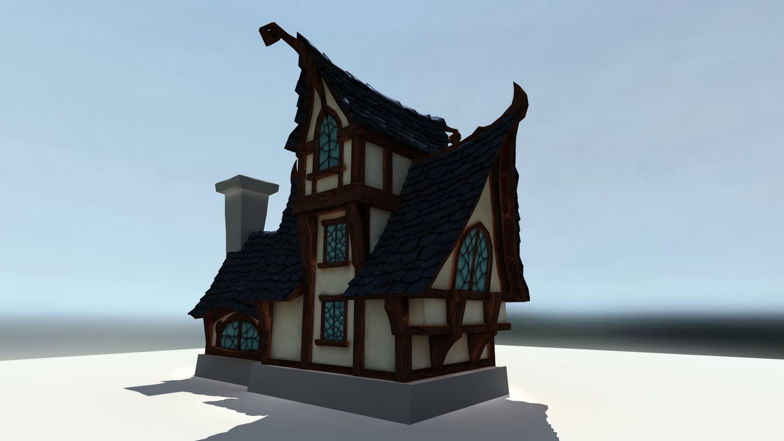
    Im planing on adjusting the silhouette with the mesh a little
    I alos adjusted the tree texture a bit I think the still requires some love let me know what you guys think
    as for the scene overall Im planning on placing the house on a hill with a nice painted sky bg any ideas would be greatly appreciated

    BlizzardHouse01v.8.41.jpgBlizzardHouse01v.8.42.jpg
    BlizzardHouse01v.8.43.jpg

    thanx
    Hugh
  • Tea Monster
    Options
    Offline / Send Message
    Tea Monster polycounter lvl 14
    I do love that hand-painted look. Could we see some wires on the tree?
  • HughieDM
    Options
    Offline / Send Message
    HughieDM polycounter lvl 7
    Hey yeah Im really enjoying painting the textures, and I feel like Im learning of cool little techniques
    heres the tree wire its about 4k polys
    TreeWire.jpg
  • HughieDM
    Options
    Offline / Send Message
    HughieDM polycounter lvl 7
    Been a little but heres an update
    Im planning on putting this in UDK
    THe scene Im thinking will be simple Ill have the house on the hill and ill paint the bg elemints on cards
    Im trying to think of smaller assets to create and place in the scene with it

    let me know what you guys think

    BlizzardHouse01v.9.1.jpg
  • Jeff Parrott
    Options
    Offline / Send Message
    Jeff Parrott polycounter lvl 19
    I like the silhouette on the house. I think the stone work needs some adjustments though.

    Mainly the texture needs more value change and the chimney area should be made of a different stone. Maybe brick?

    Keep punching up the textures across the board on this.

    Also your trees while cool looking are way too dense at 4k

    You have some great stuff here. Can't wait to see how it progresses.
  • xXm0RpH3usXx
    Options
    Offline / Send Message
    xXm0RpH3usXx polycounter lvl 13
    i think this:
    http://wiki.polycount.com/VertexNormal?action=show&redirect=Vertex+Normal
    will help giving the trees a little touch up, as they seem a little messy overall...

    also on the treetrunk you should be carefull about the texture.
    on some areas the cracks are going along with the growth direction in some its got a 90° to it
  • glottis8
    Options
    Offline / Send Message
    glottis8 polycounter lvl 9
    I don't know about the tree but the rest is looking really slick. I would suggest not so much detail on the branches.. .they look blotchy.
  • HughieDM
    Options
    Offline / Send Message
    HughieDM polycounter lvl 7
    Hey all thanx for the cc
    Jeffro: I def need to punch up and work the textures, I would like to first get the scene done and composition set, and the tree was made a while before this project and I thought it might fit but I Im leaning tword making some new trees that fit better. so I was watching your wind mill and I enjoyed your simple stylized sky did you use any particular ref would love any ideas for my sky and maybe some cool ideas on how to paint it

    xxmorph: that looks awesome any way to do that in maya cause I have no idea how to rotate my vertex normals in maya

    glottis: thanx yeah as I stated above Ill be creating new trees for the scene that fit with the painterly feel
  • BlvdNights
    Options
    Offline / Send Message
    BlvdNights polycounter lvl 8
    I want to see the Textures!
  • Jeff Parrott
    Options
    Offline / Send Message
    Jeff Parrott polycounter lvl 19
    The sky I painted by looking at a boatload of reference.

    This tutorial helped a ton as well:

    http://www.androidblues.com/cloudtut.html

    It's really just playing around with colors and figuring how to make the sky help accentuate the work you're trying to show off. I didn't want my scene to be to busy. I'd suggest something stormier for your scene though. Maybe give Monster House a rent or just check out the always awesome Chris Appelhans site http://www.froghatstudios.com/mh/mh_page2.html for ideas.

    The texture right now just seem very flat and lacking any lighting. You need to fake depth in the to an extent (shadows and highlights to give the illusion of depth).

    EDIT: In Maya to go Average your vertex normals. No idea if that will work but it's work a try.
  • HughieDM
    Options
    Offline / Send Message
    HughieDM polycounter lvl 7
    Hey all after looking around online and little found on vertex normal editing in maya I think I found an awesome way to edit them so I made a video let me know what you guys think
    [ame="http://www.youtube.com/watch?v=APV11HL6_es"]Vertex Normal Editing in maya[/ame]
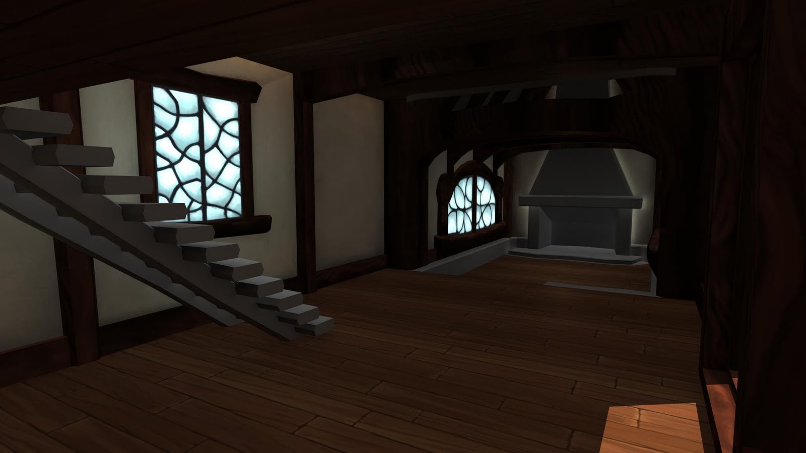
    and here are my textures so far I haven't made normals dono if I want to maybe just for more shape but well see
    WoodTexture.1.jpg
    RoofingTexture.2.jpg
    WoodPlankFloor.jpg
    Window.jpg
    Stone.jpg
    Grass.jpg
    would love cc and tips
    again thanx all
  • natetheartist
    Options
    Offline / Send Message
    natetheartist polycounter lvl 9
    if you want this to look like warcraft, you have to make it look way older, lower res, less interesting, and more brightly colored....like a nintendo 64 puked up a rainbow.
    >_>......


    seriously though, this is looking like a good start. You have a lot more information in certain areas, such as your trees than I've seen in WoW. The textures also feel more..rounded and cartoonish, less etched than that of Wow. Try increasing your mid-level contrast, sharpen some edges within your textures, and work with more scratch-work and highlight painted into edges.
  • Don Karnage
    Options
    Offline / Send Message
    I'd love to see how this turns out when it's done, keep it up fella!
  • wretchedgoat
    Options
    Offline / Send Message
    wretchedgoat polycounter lvl 8
    hey hugh,

    cool video for the vertex normals, that's a really neat way to solve that issue! And i agree with jeffro about the textures man. It's a good base but you could def push them more. Keep it up man
  • xXm0RpH3usXx
    Options
    Offline / Send Message
    xXm0RpH3usXx polycounter lvl 13
    http://tinyurl.com/357tmbq
    http://tinyurl.com/34d49u8

    on the second link go to the first search result, scroll down all the way...
    i think thats all you need...
  • Jeff Parrott
    Options
    Offline / Send Message
    Jeff Parrott polycounter lvl 19
    Looking at your flats there are a few things you're missing.

    You aren't defining the planes of the texture clearly. Everything is smoothed together. It's ok to have sharp edges on a texture to define something on the texture.

    You are not working sharp enough to warrant that resolution. Like natetheartist said knock the textures down to a smaller resolution and work with a 1 pixel brush (or don't be afraid too).

    The windows need more detail, like glows coming from inside or drape silhouette would be great.

    EDIT: Great find about the normals, thanks for the video!
  • Andrew Mackie
    Options
    Offline / Send Message
    Great looking stuff all around man!
    Keep it going!
  • MainManiac
    Options
    Offline / Send Message
    MainManiac polycounter lvl 11
    How did you make that grass?
  • HughieDM
    Options
    Offline / Send Message
    HughieDM polycounter lvl 7
    hey all back from chi town and on my comp to hit the work
    hope everyone had a good holiday
    natetheartist: yeah i had that tree before this project and I took it out and made some new ones that fit a bit better, Im still planning on going back to my textures to make them better. I just want to get the scene together first with the colors so I can tweek things
    Don Karnage: thanx I kinda want a some what finished piece for this thursday so we'll see...
    but even after that ill continue to work on it
    wretchedgoat: I still ow you a beer, sorry my last nights were with the girl you know..
    get that frog out its lookin bad ass
    jeffro: yeah I def need to work the textures ill prob get to that tmr
    Andrew Mackie: thanx im on it
    frell: just used a round brush with opac and stroked away with a grass image on my other screen to look at now and then, actually I kinda started over twice cause I didnt like how it was turning out but finally got this and I think its ok
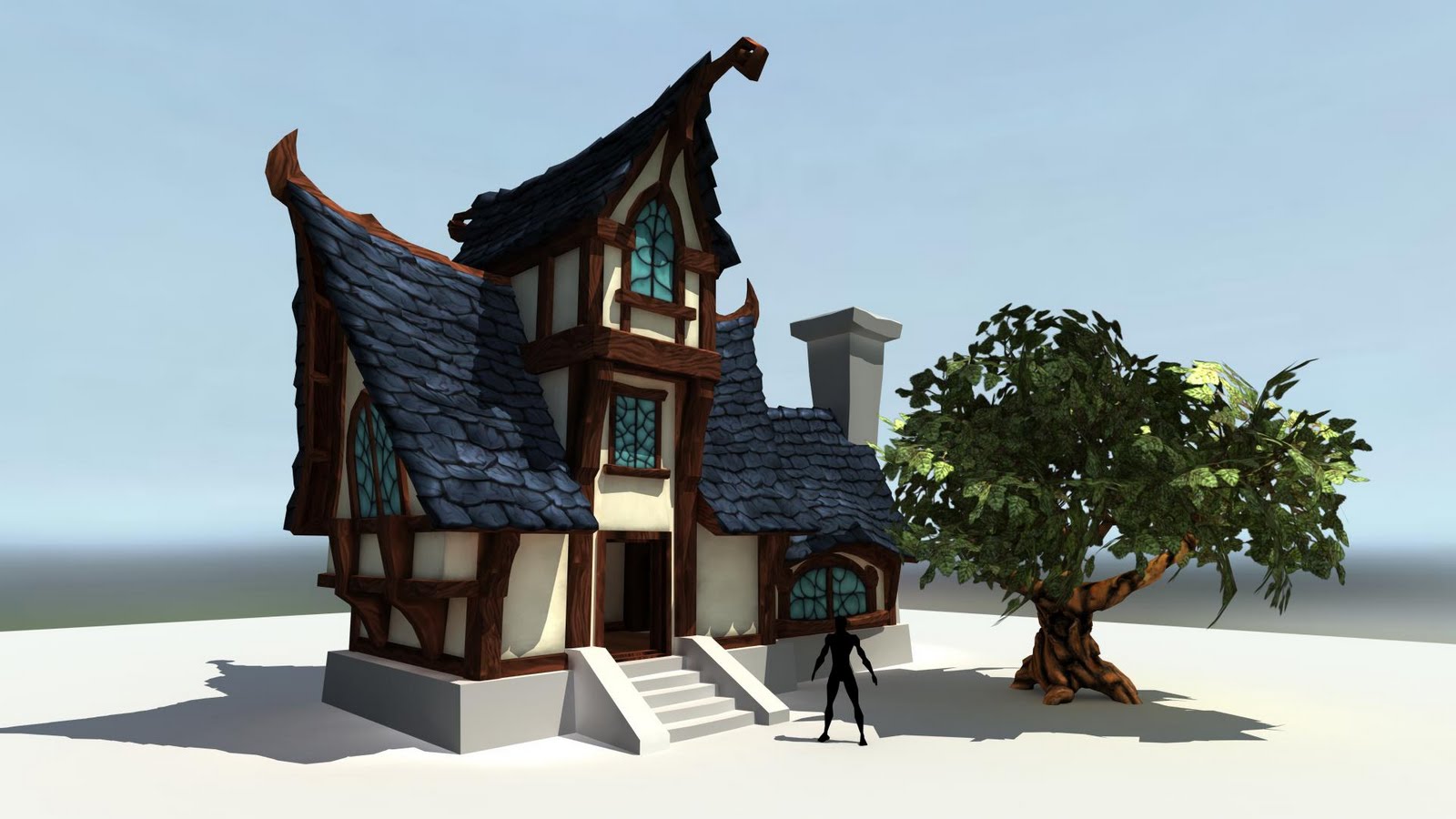
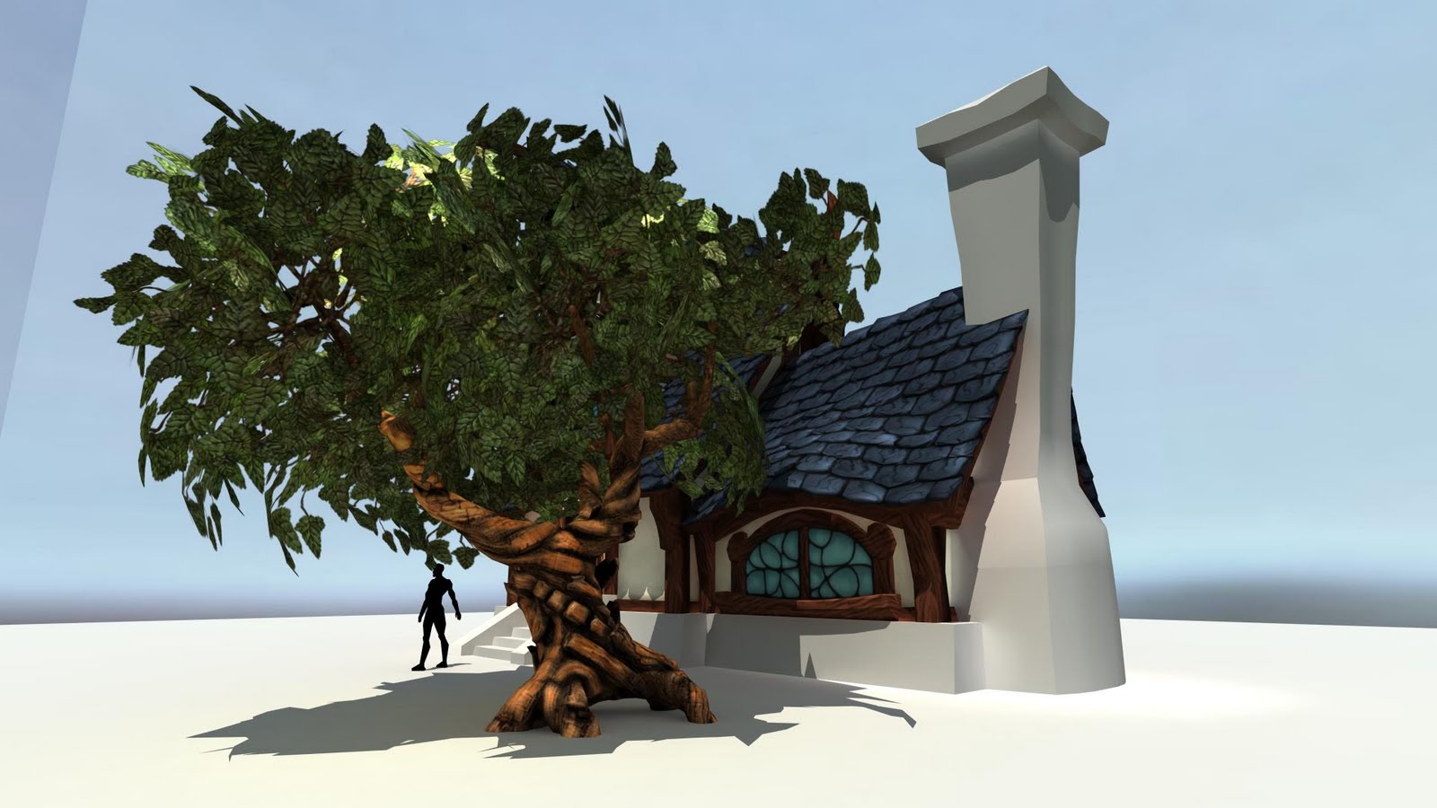
    any who so heres my up date I got it in UDK finally
    Image01.jpg
    Image04.jpg
    Image08.jpg
    as always let me know what you guys think
  • StefanH
    Options
    Offline / Send Message
    StefanH polycounter lvl 12
    looks nice . I would say tighten up the color scheme. Make it more WOW-ish. Maybe give the sky a little bit of a pink hue and make the grass bit more yellow. Sth like that.
    Also: the sky is not bright enough for the illumination its giving IMO.
  • duxun
    Options
    Offline / Send Message
    the sky bothers me because it's not of the same art style as the rest of the scene... maybe intentional ??
  • Jeff Parrott
    Options
    Offline / Send Message
    Jeff Parrott polycounter lvl 19
    Sky needs more going on.

    The ivy is too high poly. Reduce that some or just paint it on the texture for the building.

    Roof tiles read like bricks everywhere but above the door.

    Bricks are super flat. Give them more depth.

    Trees need as much character in the model as the house has.

    The house silhouette reads real nice I think.

    The lighting overall needs major work. I would really find a lighting scheme that is real moody. This lighting (mid-day) is kinda blah.

    It's coming along fine. Just keep refining it.
  • HughieDM
    Options
    Offline / Send Message
    HughieDM polycounter lvl 7
    Hey guys thanx for the cc
    the sky and lighting will be next up for work
    the sky I have on it right now is just a sky I had from onather project and Im still not quite sure what time of day to have the scene, I do like the pink sky with the yellow grass thanx stephen
    I think today ill create a sky first then go through my textures and tweek the colors to get a color sceme going
    Jeffro: thanx for the indepth crit
    do you think the roof reads like brick on the top from certain angles or that the texture needs work
    and the stone ino I need to work on that texture ill get too it
    trees def need more character yesterday was the first day putting them with the house ill work on there models
    thanx all time to get beck too it
  • Jeff Parrott
    Options
    Offline / Send Message
    Jeff Parrott polycounter lvl 19
    I think the texture just needs more work.

    But it could be the angle as well. Maybe try adjusting it and see if that helps.
  • HughieDM
    Options
    Offline / Send Message
    HughieDM polycounter lvl 7
    I figured I would knock the dust off this thread since Im working on this house again

    updated the ground and created some new trees props and shrubs

    some new lighting too

    BlzTownNightLightingB01.jpg

    BlzTownNightLightingB03.jpg

    BlzTownNightLightingB04.jpg
  • Lonewolf
    Options
    Offline / Send Message
    Lonewolf polycounter lvl 18
    that stuff looks really cool

    i like that style
  • pigdog04
    Options
    Offline / Send Message
    I think the moonlight adds a lot to this piece. Really Cool styling.
  • Andrew Mackie
    Options
    Offline / Send Message
    Looking really nice man.
    The lighting is fantastic.
  • jimmypopali
    Options
    Offline / Send Message
    The hightmap landscape is deffinately a WoW style.
  • SimonT
    Options
    Offline / Send Message
    SimonT interpolator
    the grass/ground transition is a bit too hard for me. but the rest is really nice!
  • HughieDM
    Options
    Offline / Send Message
    HughieDM polycounter lvl 7
    thanks all and I agree simon the grass ground transition needs some work Im thinking of making a lower more spread grass that is like a modeled version of the grass in the ground texture
    quick update
    Image08.jpg
    alot more images are posted directly on my website
    www.hughmccullom.com
  • Welbig
    Options
    Offline / Send Message
    Looking great Hugh, the only thing that really stands out with me is the rock texture. The strokes seem so big compared to anything around it. Maybe it is tiled too big? I've been toying around with some stuff after work here and there I'll have to wrap it up and post it somewhere so you can take a look at it.
  • toxic_h2o
    Options
    Offline / Send Message
    toxic_h2o polycounter lvl 8
    That video is awesome thank you for sharing. :D Also the environment is coming along nicely!!
  • Saiainoshi
    Options
    Offline / Send Message
    Saiainoshi polycounter lvl 9
    All of your asset textures need a final highlight/shadow pass. There is a great lack of detail highlight on the roof tiles and wood. The cream colored white walls need to be kicked down a few values as well, it's too contrasty against the wood and roof. For this to really be A+, your props should be as stlyzed as the house. None of your props look like any effort was put into them. Foliage looks good, just needs a little more color variation. Lighting and fog are great :) If you're not sure about the final highlight/shadow pass, I can do a quick paint over for you.
  • letronrael
    Options
    Offline / Send Message
    i love the style, simple and accurate and sure WELL DONE ! gratz
Sign In or Register to comment.