Home 3D Art Showcase & Critiques

Aztec Environment

Huntard
polycounter lvl 12
Offline / Send Message
Huntard polycounter lvl 12
Hey Guys,

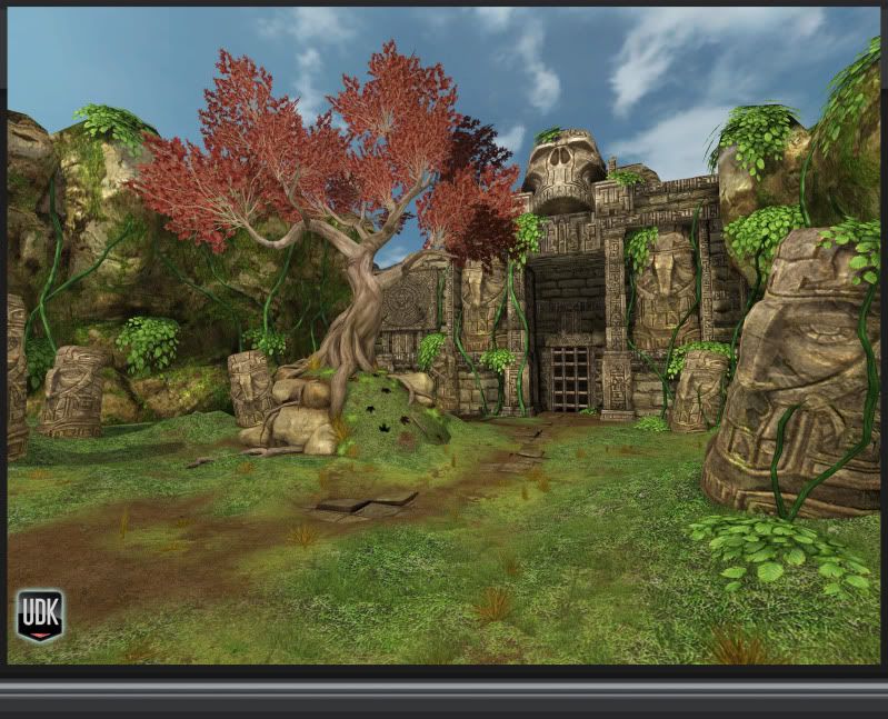
I did this environment to based on a tree prop I finished a while ago. I wanted to practice with terain and foliage, in addition add a bright and colorful environment to my portfolio. I would love to hear what you guys think. I am sure there are ways to make it better I have just been looking at it for a little too long and could use some fresh eyes. Thanks!

Aztec_Color_Page_01.jpg
Aztec_Text_Page_01.jpg

Replies

  • ErichWK
    Options
    Offline / Send Message
    ErichWK polycounter lvl 12
    hey! Man! So much potential! You have some really great detail going on here, my biggest thing tho is that it appears that the lighting is super flat, I can see shadows, yes. But doesn't really give it much substance, ya know? Some fancy Post work and this can be flying high.
  • KyleJensen
    Options
    Offline / Send Message
    KyleJensen polycounter lvl 12
    I think the directional light should be stronger. If you have a skylight in the scene, I'd suggest turning the brightness down so it doesn't conflict with the directional light so much.
  • skylebones
    Options
    Offline / Send Message
    skylebones polycounter lvl 10
    The modeling looks good, the textures look great, but as others have already pointed out. The lighting is very flat. Get a bit more contrast in there, some darker shadows, maybe even try a different lighting setup. Late day or something like that, a bright blue sky isn't the most visually interesting. Just experiment. Spend some time on that and you'll have an excellent portfolio peice.
  • JasonLavoie
    Options
    Offline / Send Message
    JasonLavoie polycounter lvl 18
    Ohhhhhh this is fricken nice, and yus... Imma say the same thing, needs a very solid lighting pass. Currently you have no contrast what so ever, and if you get your main pieces to start popping with some nice warm highlights, and some great soft cooler shadows (no blacks, colourize those sexy shadows) I think it would breath SOOO much life into this already awesome base you've created.

    Also, play around with your presentatin shots, right now this current shot is quiet boring, and you have some great areas to create some natural, dynamic framing that will really make this scene more interesting to look at.

    Move your camera around the tree and some of those statues along the rock wall, I think you will find some interesting angles from there. Also, play around with some more dramatic FOV to your camrea, get a nice low to top angle that really inflates the size of your temple.

    You have a very solid base, now you need to make this piece come alive :)
  • Huntard
    Options
    Offline / Send Message
    Huntard polycounter lvl 12
    Thanks Guys! I am going to rework the lighting and experiment a lot more with the Post Production chain to make this environment pop. I appreciate the help and should have some an update in a day or two free time dependent.
  • Xendance
    Options
    Offline / Send Message
    Xendance polycounter lvl 7
    What lights did you use to lit up the scene?
  • glottis8
    Options
    Offline / Send Message
    glottis8 polycounter lvl 9
    i think we all agree that you need to rework your lights. It looks like you have a shot unlit of your work. you should check out the Firefall work. This scene reminds me of their style.

    http://www.firefallthegame.com/

    They do all kinds of cool stuff with their lighting. Which gives depth and really makes the colors stand out in layers. I really like your textures and shapes, and i think with lighting like this, your scene can be something awesome. I will follow this thread! keep up the good work!
  • xvampire
    Options
    Offline / Send Message
    xvampire polycounter lvl 14
    is udk able to separate the sky into different perspective? ( into orthogonal)
    if yes then it would be useful to have skybox, easy to edit and lower poly :)
  • Huntard
    Options
    Offline / Send Message
    Huntard polycounter lvl 12
    Hey Guys,
    I have been messing with the scene lighting a lot today and I think I will be picking up the Eat3d post process and lighting dvd because i am not getting the results I am looking for yet. I am pretty sure it will help me understand the tools a bit better and give me the control I am looking for. Here is a quick update of what I got today. The lights I have going in the scene right now are 1 dominant directional light with warm tones and 2 point lights with a cool purple tone.

    Aztec_Color_Page_03.jpg
  • Jeff Parrott
    Options
    Offline / Send Message
    Jeff Parrott polycounter lvl 19
    You definitely need more contrast in the lighting. The rest of the scene is pretty good though. Just a few suggestions.

    It would be neat to have the closer tiki head texture a bit sharper.

    The planes for the leaves you might want to adjust them to not be so noticeably flat.

    I'm not keen on the tiled ground under the dirt and grass.

    The green vines seem a bit too saturated when they are closer to the camera.
  • paulsvoboda
    Options
    Offline / Send Message
    paulsvoboda polycounter lvl 12
    This is looking really great so far. Your latest lighting pass is an improvement but you can still take it much further. I love the tree, but while I say that I think you could work on the leaves a bit, they still look like planes. Maybe add a one more division and give them some curvature. But the trunk is fantastic, excellent job.

    As for the Eat3d Dvd, if you have the money go ahead, you can learn a lot from it and I picked up quite a bit from watching it. You can also check out Chris Albehun's lightmass tutorial, he breaks down what different settings do.
    http://www.chrisalbeluhn.com/UDK_Lightmass_Tutorial.html

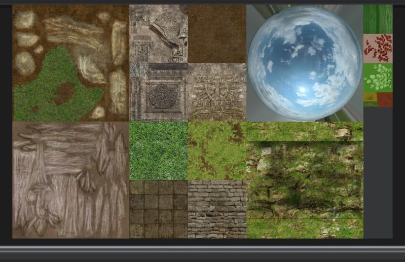
    I'll also attach an image of some of the more important settings I usually adjust.

    I really look forward to seeing where you take this scene. Great work so far, keep pushing it and you'll come out with something fantastic.
  • Huntard
    Options
    Offline / Send Message
    Huntard polycounter lvl 12
    Thanks for the input Guys! The tutorial site and screen grab really helped! I reworked the leaves and uprezed the Tiki to 1024x1024. I will go back and mess with the scene again when I pick up the Eat 3D dvd but will hold off for a little while do to cash flow constraints. Thanks for all the help! Here is what I got so far, let me know what you think.
    Aztec_Color_Page_05.jpg
  • [N]
    Options
    Offline / Send Message
    [N]
    Nice job !

    Just one thing, try to get a better transition between the grass and the column at the foreground. Some bigger grass plane all around it would help as the vegetation would grow on.

    Also pay attention to the visible plane on the top of the big skull and on the right up corner of the image.

    Keep it up !
  • roosterMAP
    Options
    Offline / Send Message
    roosterMAP polycounter lvl 14
    more light fx. it almost looks like ur rendering only diffuse. put the sun in an interesting place. daun/dusk does NOT work for this scene.
  • iniside
    Options
    Offline / Send Message
    iniside polycounter lvl 6
    Add little fog. Aztec ruins are usually in jungles. Bit of fog wouldn't hurt here :D.
  • Huntard
    Options
    Offline / Send Message
    Huntard polycounter lvl 12
    Thanks for the responses. I added some fog, messed with the lighting and changed the time of day to more of an early afternoon and increased the size of my grass foliage to create a better transition from the grass to the Tiki. I really appreciate all of the advice! Let me know what you think
    Aztec_Color_Page_07.jpg
  • Acumen
    Options
    Offline / Send Message
    Acumen polycounter lvl 18
    I like that sky a lot better, though still not the best choice. I don't know it just doesn't fit the kind of dark and moody props you got going on there. These masks look really threatening, yet the lighting doesn't incorporate that atmospheric possibilities.

    Also I don't know if that autumn tree fits in there. Everything's green and then comes the orange fluffy tree - I would think about turning the leaves to a more greener tone to take the focus away from the tree.
    Also it's kinda sad to see the prominent temple piece in the background disappear in the foggy thing.
    And Jason Lavoie already suggested playing with the camera and compositional work, I think you could/should try a handful of potentially interesting shots and post these in here, so people can give further instructions ?

    The list could go on quite a bit. I think it's great that you keep pushing and pushing and are so open for feedback and I can imagine this scene to be really great in the end, I just hope you keep on going until you're satisfied ! Cause the potential is enormous !

    some possible inspirations:
    http://www.habboi.co.uk/uploaded_images/udk_aztec_large_02.jpg
    video on that frontpage: http://www.udk.com/
    http://fc09.deviantart.net/fs12/f/2006/334/a/2/Aztec_Temple_by_rmalbon.jpg
  • Huntard
    Options
    Offline / Send Message
    Huntard polycounter lvl 12
    Hey guys long time no post. I did a few revisions on the scene and want to hear your thoughts. Thanks
    Aztec_Color_Page_03-1.jpg
    Aztec_Color_Page_02-1.jpg
    Aztec_Color_Page_01-1.jpg
  • Cap Hotkill
    Options
    Offline / Send Message
    Cap Hotkill polycounter lvl 13
  • Jeff Parrott
    Options
    Offline / Send Message
    Jeff Parrott polycounter lvl 19
    Looking pretty nice!

    The leaf planes seem like they need to be rotated around a bit more.

    The grass is lighting weird or is too thin. I can't really tell. It looks like it's glowing a bit.

    Looking real nice though.
  • JasonLavoie
    Options
    Offline / Send Message
    JasonLavoie polycounter lvl 18
    :( Where'd that awesome red go? Now's there just brown and green (looking nice) but add something to make this scene pop :) The Colour was working in your favor, now this is looking a bit generic, but the lighting / contrast is definitely heading in the right direction.
  • popngear
    Options
    Offline / Send Message
    There's way more volume with your lighting now and it is improved for sure. However, there's nowhere to focus you eye right now. I would try having some light emitting from behind the gate and perhaps from the skull which would lessen.
Sign In or Register to comment.