The BRAWL² Tournament Challenge has been announced!
It starts May 12, and ends Oct 17. Let's see what you got!
https://polycount.com/discussion/237047/the-brawl²-tournament
It starts May 12, and ends Oct 17. Let's see what you got!
https://polycount.com/discussion/237047/the-brawl²-tournament
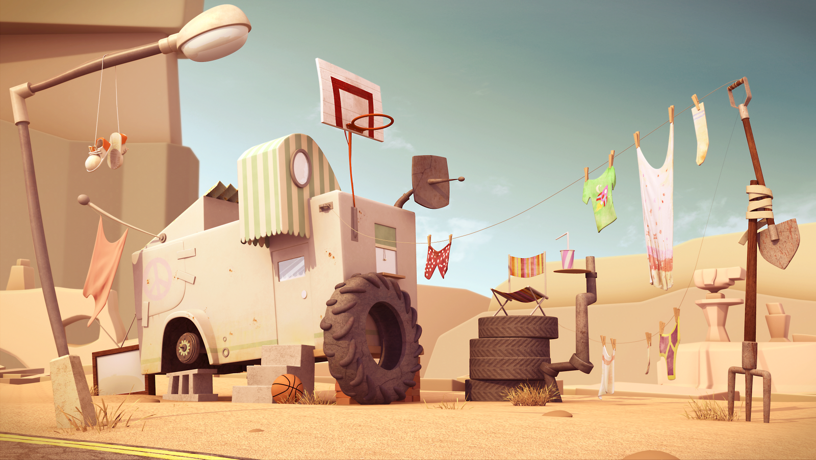
That's Life
Hello all,
I have been lurking on here for a while was going to take part in some challenges but work got in the way and i wouldn't have put the time i would have wanted in the challenges. But, i am now in unemployment road and wanted to kick things off with my latest finished bit of work called That's Life. I will be making a sketch book as well, to show you upcoming bits and bobs. I have just started a scene so will upload some stuff for that soon.
But for now here it is, I say its finished but with all things when you look at something for too long you think everything is gravy, let me know if anything stands out that looks weird!

Replies
Is that a Vray or Mental ray or what render?
I second noname for the caravan floating above the cinder block and for the road/sand transistion.
And I'll add that the details on the tire against the caravan are too smooth imo.
Hayden Zammit get a good point about the caravan that blends a little too much with the overall scene, maybe try more saturated color just to have a focus point on this image.
I think everything in general looks fantastic, but maybe the color palette isn't helping things. The colors are all warm so the scene feels like it's lacking depth. Maybe cooling off the background tones a bit, or warming up the foreground a little more would help. It just sort of feels like an orthographic image, like everything is compressed together.
http://orloffillustration.blogspot.com/
Yep i totally agree that the caravan blends into the background a bit and that it is very warm, i think i may need to make the caravan more white as this is what the focal point should be.
It is rendered in mental ray.
Yeah the reson some parts are floating is that i originally had it all connected but a few people felt that it went against the original concept and by making everything look like it is connected it lost some of the flare, flow and curves of the objects. But definatly agree with the sand blending materials is something i really want to grasp.
@Voff i am very new to game engines and felt i would be over my head trying to get this into a game engine, however my next project is a lot simpler than this. Not sure what you mean by WF? Polys is on the big side of things but can be optimized easily as for texture sheets they vary from 128 to 2048 the reason a lot of them are fairly big is because i rendered the original at 4k width and 2k height. But i have big sive and half size for each texture. Concept link is above to the illustrators blog.
But thank you for all the feedback really much appreciated i will give it my best shot to try these things out, once again thank you!