The BRAWL² Tournament Challenge has been announced!
It starts May 12, and ends Oct 17. Let's see what you got!
https://polycount.com/discussion/237047/the-brawl²-tournament
It starts May 12, and ends Oct 17. Let's see what you got!
https://polycount.com/discussion/237047/the-brawl²-tournament
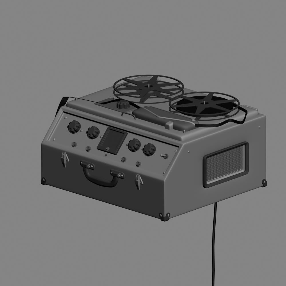
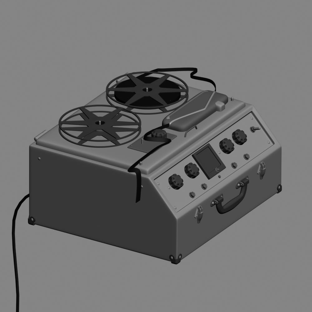
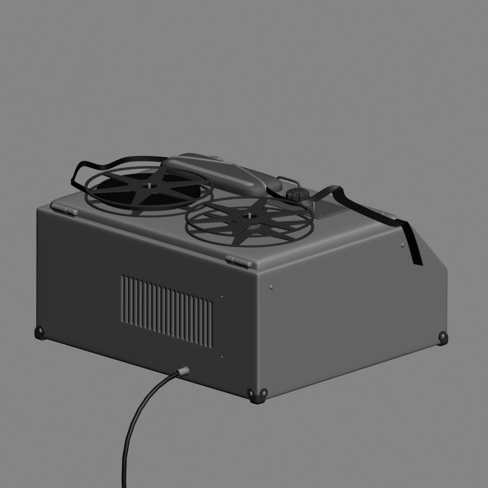
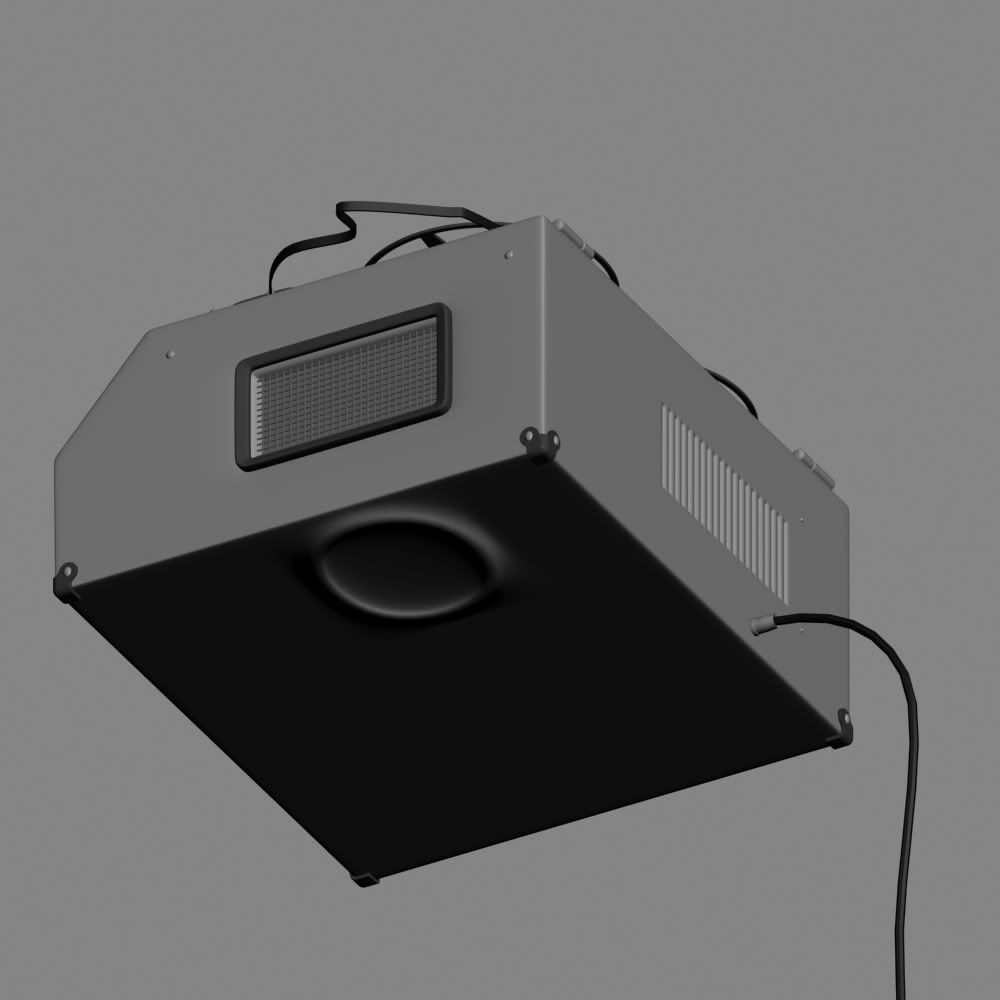
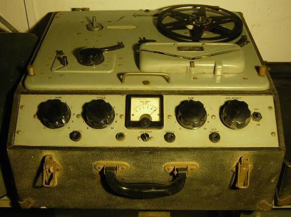
Ferrograph_Recorder
How do you think this looks. Critiques are welcome.


Replies
i think it looks solid and is a good start so far.
But try to stick closer to your reference ( which is btw awesome) some parts look a bit rushed right now especially the top piece where the tape runs through, but im guessing it's not finished yet
and next time turn on perspective for your screenshots so there is some feel for the proportions.
else it is nice
cheers