The BRAWL² Tournament Challenge has been announced!
It starts May 12, and ends Oct 17. Let's see what you got!
https://polycount.com/discussion/237047/the-brawl²-tournament
It starts May 12, and ends Oct 17. Let's see what you got!
https://polycount.com/discussion/237047/the-brawl²-tournament
Sci-Fi Corridor
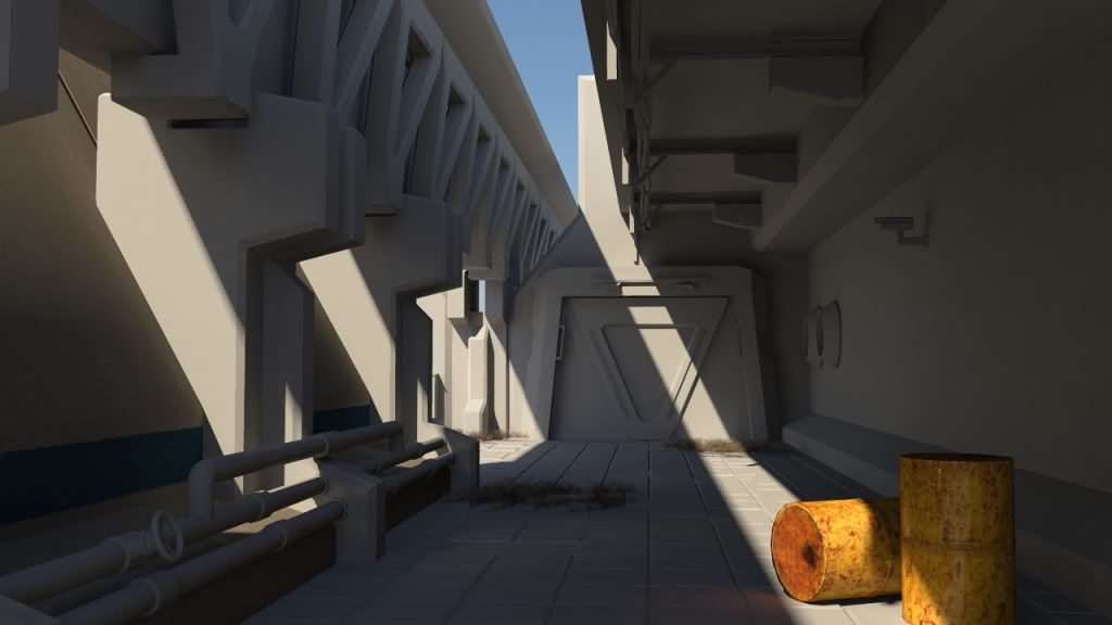
I'm currently working on a science fiction corridor for a university assignment. I'm trying to create something a little more atypical than a darken hallway by creating an outdoor maintenance passage that has a dusty, arid feel to it. As of right now it's rendered out in mentalray, but I've been creating a lot of modular pieces in hopes of bringing it into UDK when I'm finished. I'd love some feedback, especially in regards to composition, lighting, and texturing.
AO: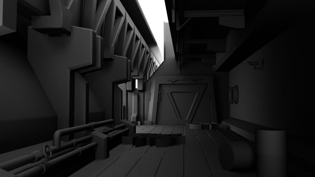
Lighting Only:
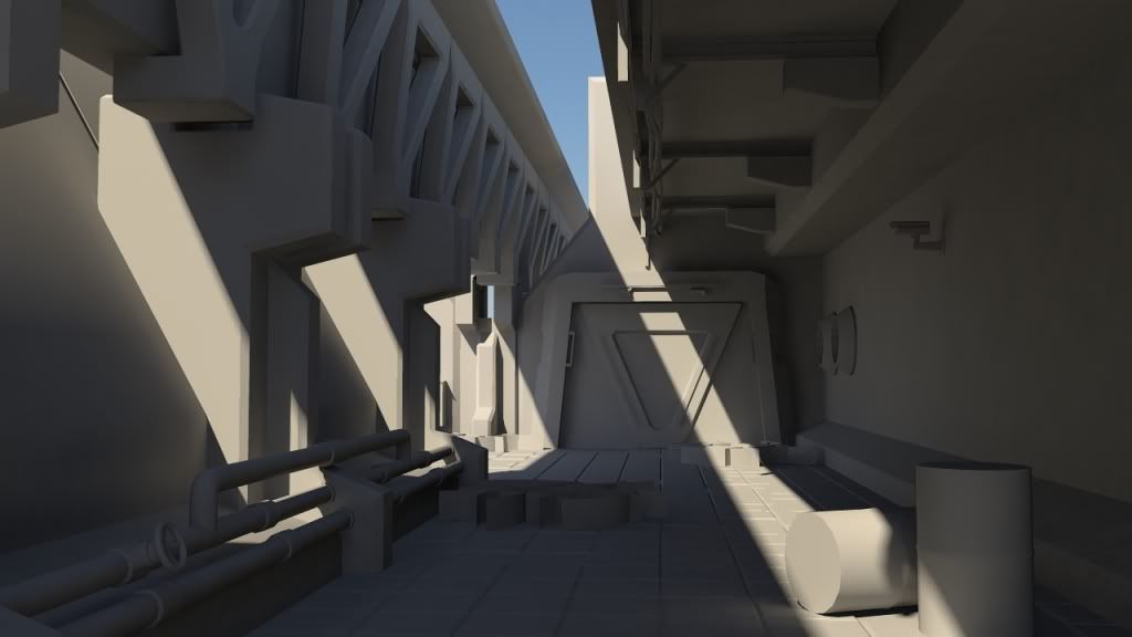
WIP Texture:
AO:

Lighting Only:

WIP Texture:

Replies
It looks like a solid foundation so far, I would do a basic colour pass on everything, giving it a representing colour for the UDK, lightmass will bake nicely into this instead of having the default UDK checker, this also helps visualization of the level.
Goodluck.
I think the biggest thing I see with these 'Sci-Fi' corridors done well is focusing on modularity. It's a whole lot easier to make one asset look fantastic and have that fill up a room than to have to make hundreds of assets at the same quality. I think the biggest advice I could give is to try mentally breaking up the blockout into small sections and begin working on those sections.
Another thing is settling on a mood and colour scheme. Does it use bright colours to create focal points? Is it more grungy and grey?
I'm sure you've seen this before but Minotaur0 did a fantastic job on his:
http://www.polycount.com/forum/showthread.php?t=73253
A lot of good things to look at in there.
Best of luck.