First Project for my level design class [WIP]
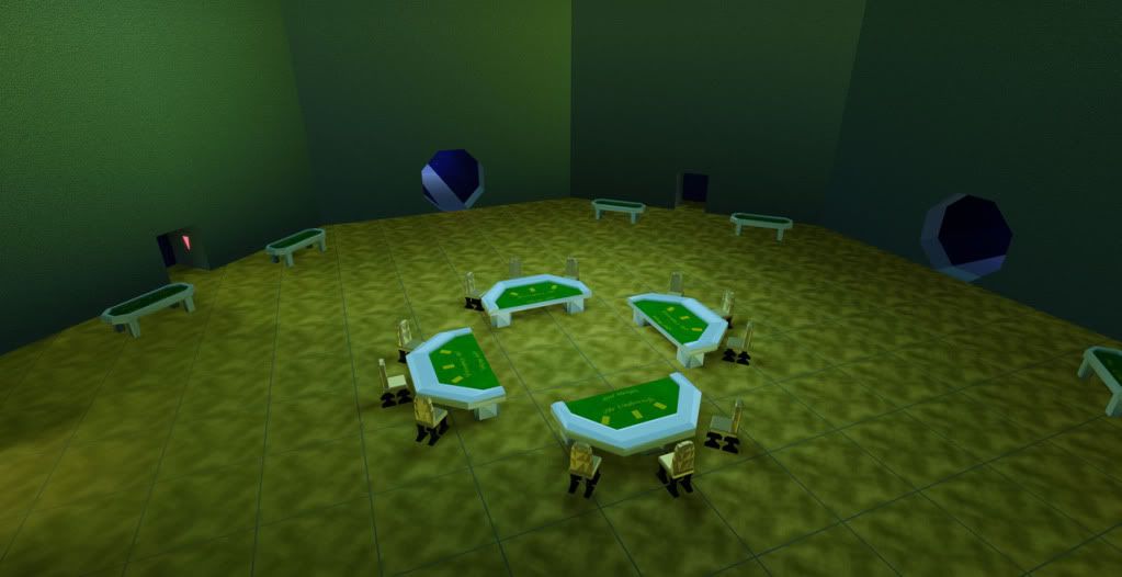
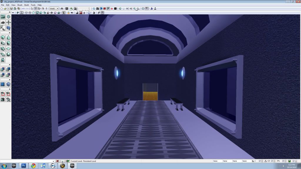
I know it still needs some tweaking, but would like to hear some feedback on what else you guys would like to see in this project I am working on. Most the static meshes were made by a classmate who i am partnered up with. I have not done much in Maya and it will be in my next semester for sure. As I take that class i plan to improve upon what is already started on. Thanks in advance for your feedback!
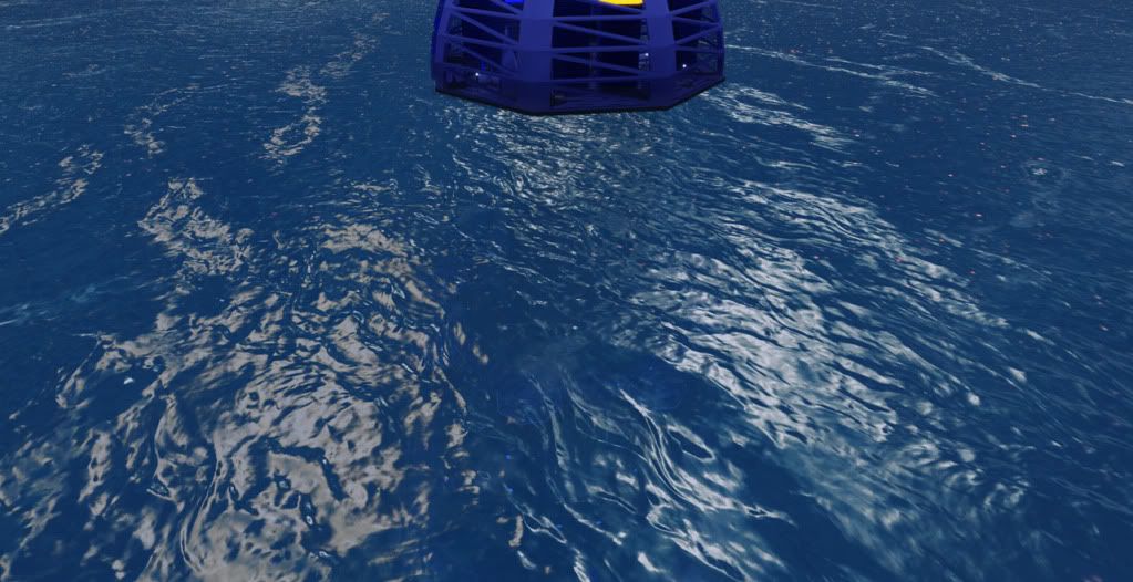
Water I must give credit to Hourence's tutorial for the help. It def got me started in the right direction. The second project in the class I made 100% on my own and i guess i should go back and do the same for this one.
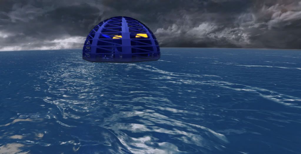
[ame] http://www.youtube.com/watch?v=fBtuYVOJ1hw[/ame]
not sure how to embed the youtube video here if someone wants to point me in the right direction then thanks!
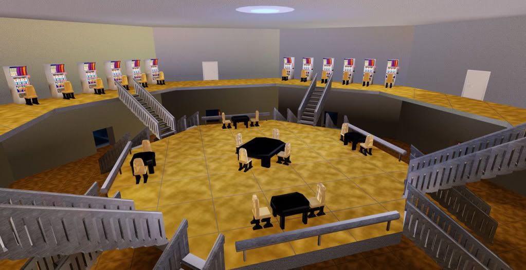
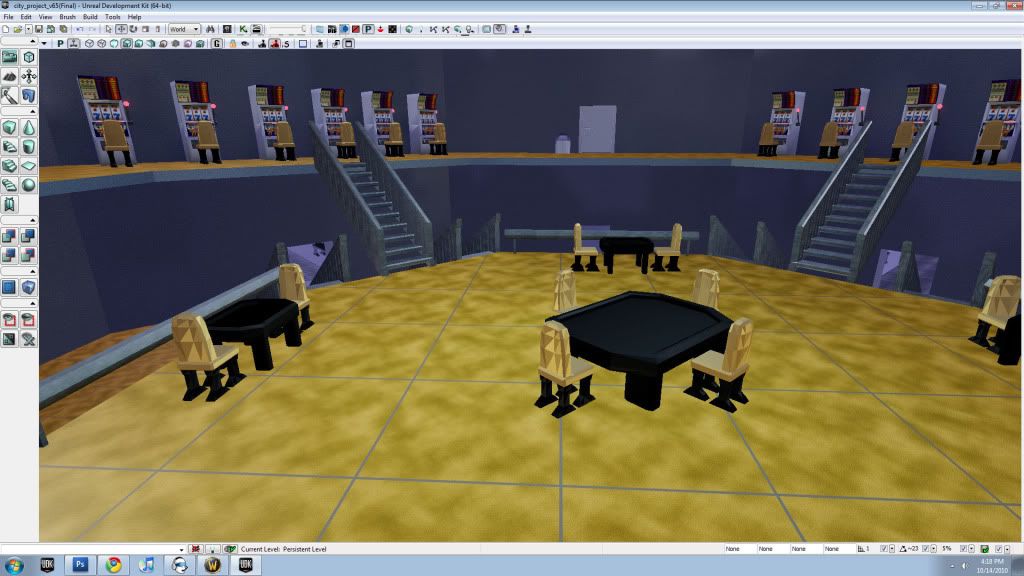
Not happy with the material on the stairs and to be honest after 3d modeling I plan to scrap the stairs all together and make it look a lot more professionally done. Any suggestions to go well with the map?
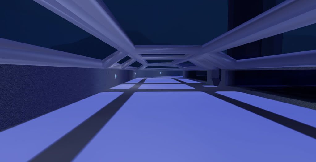
Lots of room to add things here at the bottom ring in the future. Thing that I am most excited about with the map is how much i have to improve upon it in the future and so much room to just add on more to the map.
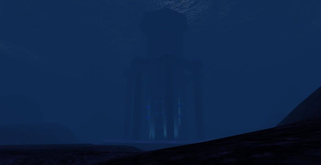
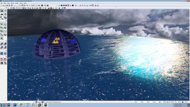

Water I must give credit to Hourence's tutorial for the help. It def got me started in the right direction. The second project in the class I made 100% on my own and i guess i should go back and do the same for this one.

[ame]
 http://www.youtube.com/watch?v=fBtuYVOJ1hw[/ame]
not sure how to embed the youtube video here if someone wants to point me in the right direction then thanks!

Not happy with the material on the stairs and to be honest after 3d modeling I plan to scrap the stairs all together and make it look a lot more professionally done. Any suggestions to go well with the map?

Lots of room to add things here at the bottom ring in the future. Thing that I am most excited about with the map is how much i have to improve upon it in the future and so much room to just add on more to the map.


Replies
Right of the bat...I don't think you have any continuity... all of your settings seem to be different rooms that are not connected. Your big spaces make your static meshes look small and shallow. Your environment doesn't tell a story or make you want to explore it and find out what it is that is doing. Over all... does it need to be that big? you might want to scope your level down to less nodes so that you can really focus on making your level look polished and not empty.
This might sound a little harsh, but those are the things that I thought about when I saw your work. AND! I know for a fact (cuz i did that while i was going to college) That when you do your first couple of projects for school, you want to make something big and epic... so you go for grandeur and big levels.... but from experience I can tell you that focusing on just a couple of rooms of your whole level would turn out better. So keep posting your work, and I hope this comment helps you out.
EDIT: Always reference ideas, simple rule when trying to achieve something authentic in feel.
Ichll3d is right.. i forgot to mention.. always use reference. How a room is put together will make your work look real or not. Carving holes into a big cylinder is not believable... maybe you should carve your level and use static meshes from unreal... i am sure that you can find uses to all their repertoire of meshes to make something look good, without you worrying about modelling if you are not that experienced.