Home 3D Art Showcase & Critiques

Game art

Hello everyone, Lately I have been really busy working on a project in unity, there will probably be a thread here at some point about the game. Anyways Its a cartoon game, so I haven't had the chance to do any realistic art. So this thread will be for me to through in models I do in my spare time.

I would love to here what everyone does and doesn't like about each model. Im currently trying to grow artistically enough that I will be able to create a nice looking portfolio...

So here is the first one I did, just a simple cement road barrier...
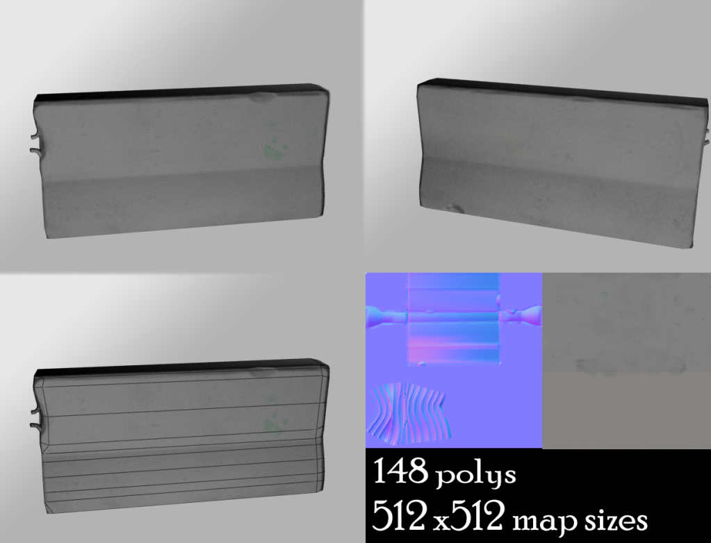
barrierimages-1.png

Replies

  • Cap Hotkill
    Offline / Send Message
    Cap Hotkill polycounter lvl 13
    You should learn to take more advantage for your uvpace, for example the Metal bards doesn't need to be as big as the Concrete barrier, you already made big cuts on the sides, just detach them and make the concrete use more UV space and the metal rods use just the little spaces that are left.

    Just think about it this way, Small things, Small uv Space, Big Things, big UV space. use a checker board texture to see how much texel density are you using for each piece and make a balance of it.
  • Priske415
    Thank you for the advice Cap, I will definitely keep that in mind for future models.
  • Ajstark
    Offline / Send Message
    Ajstark null
    Good start but the first thing I'd address if your use of UV space. There should be very little negative space. maybe mirror the front and the back? Also see what happens if you bump the contrast a bit on your textures. It kinda just looks uniformly gray right now.
  • nick2730
    Try to include more detail or at least something aesthetically interesting. There is very little variaty in the texture which makes it look very mute. Add some color or something to the map
  • Priske415
    Thanks so much everyone for all the advice. Ive kind of revamped the model a bit, made the UV's use a lot more space, and redid the texture. Is it looking better?
    barrierimages-2.png
  • nick2730
    Here is someone else work i found and a real ref pic. Look at the variation on the concrete. You see how they have wear in specific areas? Like water damaged near the base cause they would be outside and exposed to the elements. Are you using a base texture? Or did you paint it in? Check out cgtextures.com tons of images to work with there

    Also the very white backround detracts from the model and overly brightens the whole seen try toning it down
    barrier.jpg

    figure1.jpg
    136731.JPG
  • Priske415
    Okay, so I went out and took some pictures, used a lot of references and made a texture that Im pretty proud of... Thoughts?

    barrierimages-3.pngbarrier.gif
  • itsmadman
    you mite want to move on to your next model you could make this look better but agin it is just a simple barrier. But learn from your mistakes. When uving which is a very important part of texturing you must make sure all your uv shells are equal proportionality. Then grow a fear of negative space. Use it up as much as possible. in fact some times its good to create seams just so u can use more space(be careful though). Another thing master the creation of normal maps through Z brush. Its a learning curve but your normal maps will be much more interesting. Dont get too dedicated to a model that would not be that detailed any way. So what is the next thing that u have interest in modeling
Sign In or Register to comment.