Nordic Mead Hall Fable style
Hey guys,
As part of a university assignment to take a game and come up with DLC for it. OuR DLC was based around inventing a new norse culture into Fable 2. From there we all had to make 2 assets from a Norse village that we had come up with.
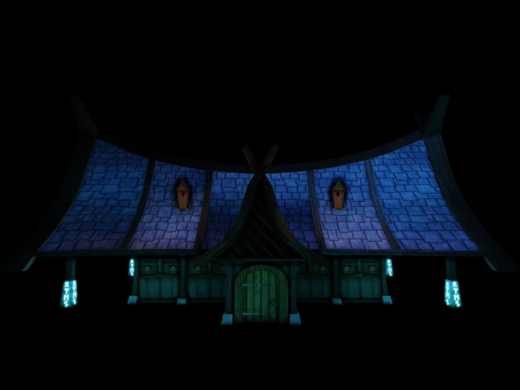
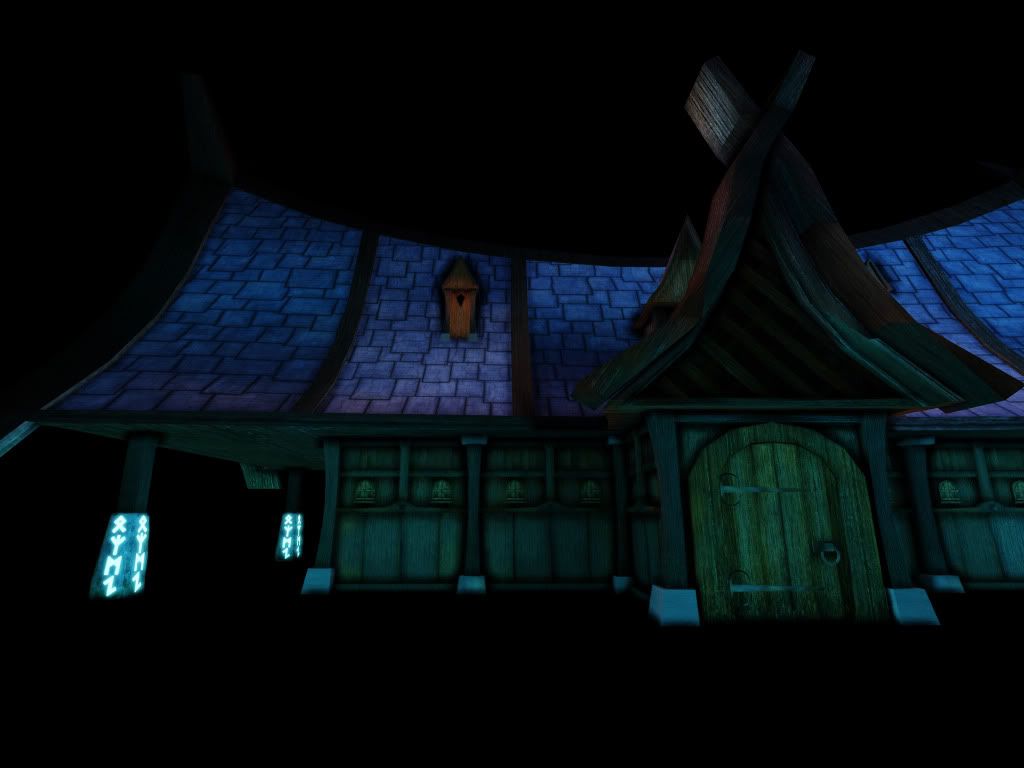
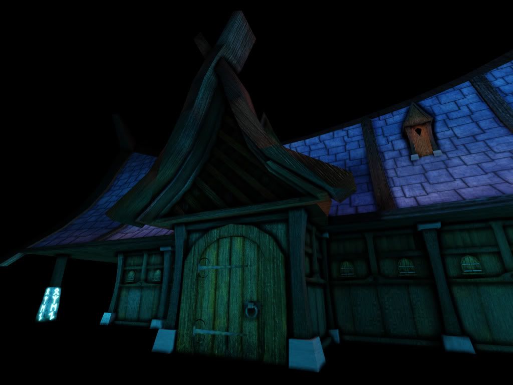
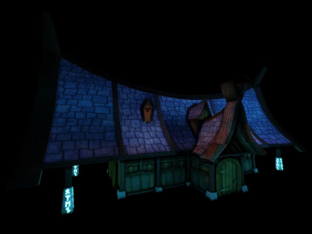
Here is my first asset. It's a mead hall and is the second biggest building in the village. Most of it is modular except for the roofs obviously!
Also i am aware that the wooden beams over the door need fixing! And the lighting is meant to be night time but i am a bit rubbish with lighting to say the least, i really need to work on it!
C+C would be awesome!
Here is some ref mainly for walls and such
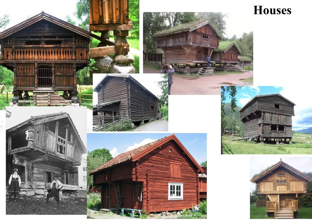
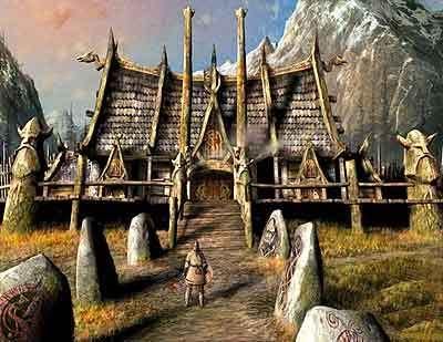

and an idea of where i got the roof from


Replies
noob question though....how do i render with a different colour background?
I don't really see any of your reference incorporated into your design, aside from the fact they are both wooden buildings...As far as Fable goes, I see Fable in the sense of "lets exaggerate things and get really cool shapes to our stuff", you got that for sure, but aside from that I don't immediately think Fable
Why are the windows like 6 inches tall, and so many of them?
I also feel like the large overhangs of the building could use some wooden support structures like those visible in your reference
and are you using maya or max? changing your rendering background depends on which one you're using
Well the buildings here are quite complex and in Fable there building tend to be a litttle more simplistic but i see what you mean, ill try to incorporate some more of the supports into the building.
As for the windows i wanted to replicate the small windows that are near the top here
But looking at it now i think there many be too many of them, ill have a play around with the playout of the panel and see what i come up with.
And this is actually in UDK but ive figured out how to change the background now
Again, thank you for your reply
The shape and construction of the roof bothers me. In the roof ref you posted, the roof is supported by the giant vertical timbers, on the model they're tacked on for decoration?
The deformation of the building is pretty extreme. In Fable all the buildings had some sort of deformation but it was more along the lines of "what if the gravity was cranked up 200%, everything was slightly more pliable and left to sit for 100 years". Under those circumstances your building would "hang" quite a bit differently.
Considering smart construction techniques are 40% of game asset creation it might be good to post a wire frame overlay without lighting, the UV layout and the textures used.
I'm not sure I understand all of the polys in the boarder above the window and it looks like you have polys covering the lower wall? Also why are they clipping through the trim?
i completely understand what you mean about hitting the WoW style.
I think it might just be my rubbish attempt at lighting which is causing the style to appear more WoW. Here is a screen from Maya without the lighting as i do feel it isn't as WoW as the lighting makes out!
But the model itself is still quite Wow though i understand what you mean about the deformations although do you just mean the roof or everywhere? Also do you think the stone pillars need to be bulkier?
Here are my four texture sheets. Currently they are at 2048's with the stone being a 2048 x 1024. Obviously i will take these down to a smaller scale.
and here is what the building is mostly made up of apart from the rooves of course!
as for that panel is was a quick 2 minute play around to try and use less of the windows and when i finish ill make them fit obviously. But yeah i pulled out the wooden panels so hopefully you have a better idea of what is going on!
again, thank you for the reply
Big difference with your reference.
I am having issues with the shadows though. If i zoom too far out my shadows pop and get ugly