WIP Stave Church - Fable Style
Hey guys,
For a university group project, me and 5 other guys are designing models that would fit into the world of Fable 2.
We decided to run with a nordic style and out of the models i decided to go with a Stave Church.
And here is a photo of a Stave Church.
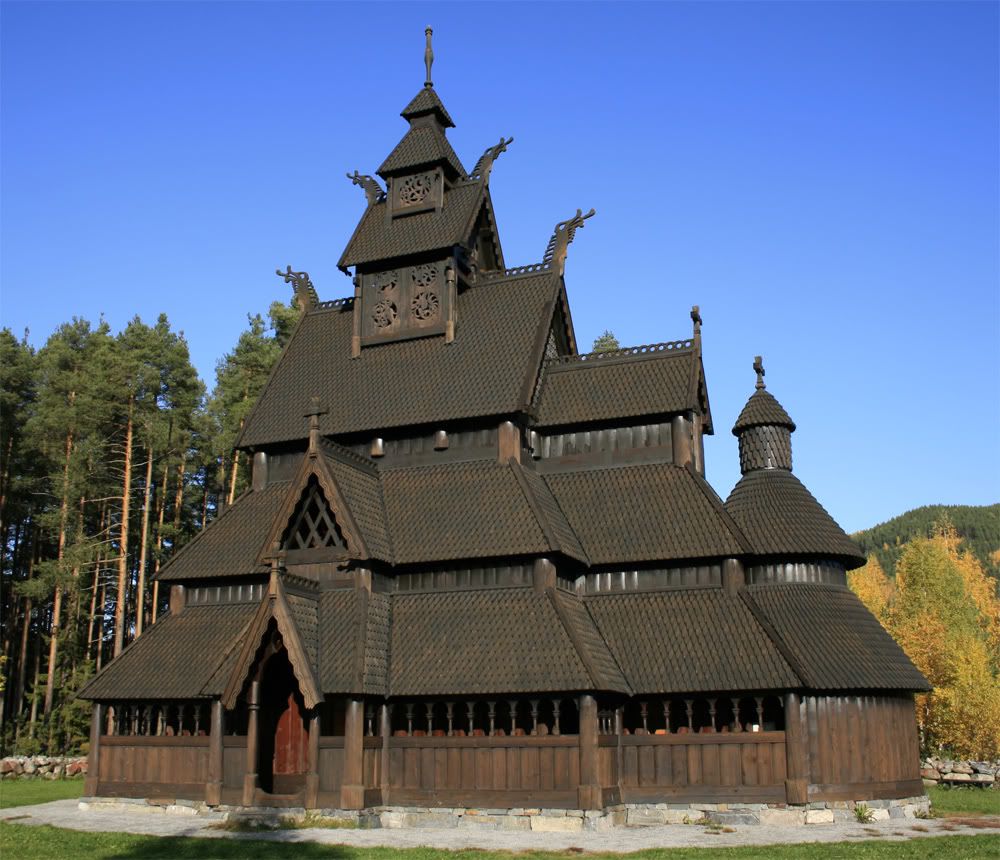
There are still bits to be added to the model a bell ontop of the round spire, but i want to make it look abit more slap dash and thrown together as though its been an after thought.
But here is what i have so far.
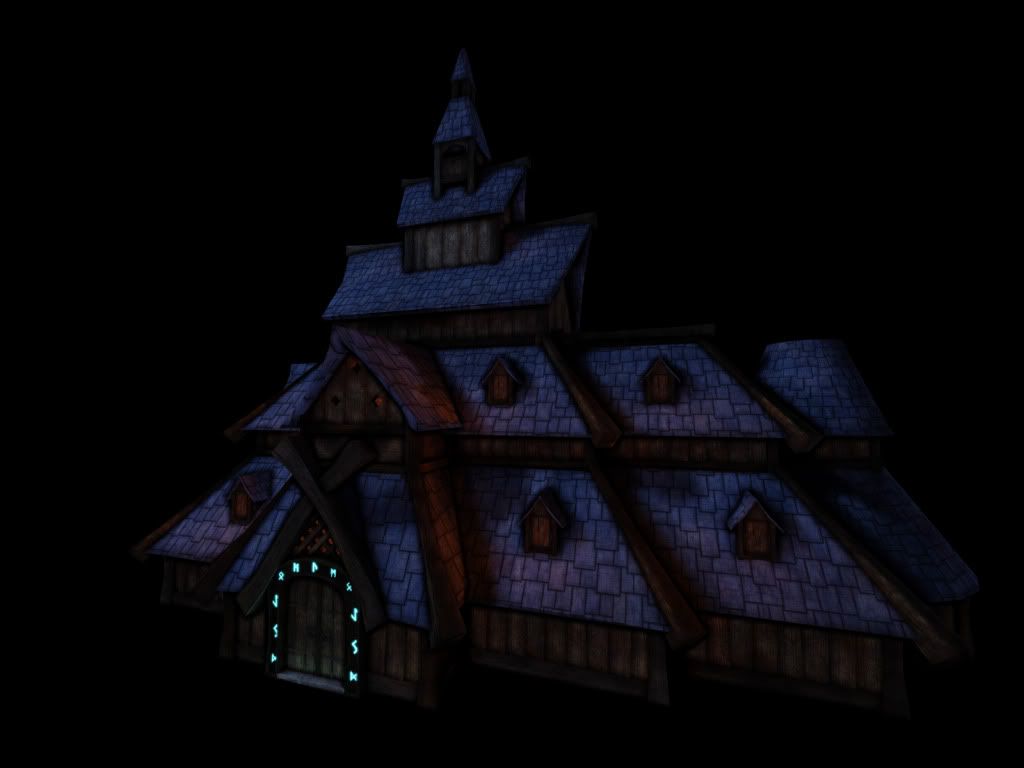
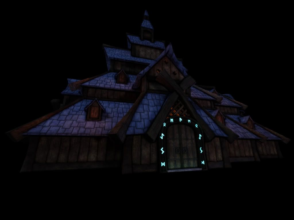
Comments and Crits are more than welcome
For a university group project, me and 5 other guys are designing models that would fit into the world of Fable 2.
We decided to run with a nordic style and out of the models i decided to go with a Stave Church.
And here is a photo of a Stave Church.

There are still bits to be added to the model a bell ontop of the round spire, but i want to make it look abit more slap dash and thrown together as though its been an after thought.
But here is what i have so far.


Comments and Crits are more than welcome
Replies
TOO DARK!!
It looks quite nice... as far as I can make out through squinted eyes and tilting back my monitor at weird angles! brighten it up some!
Are blue tiles a bad thing? :P
Style is looking good so far, any more buildings or model you are planning?
Thanks for checking back
@jimmypopali
Hey man, currently it is a fair bit off finished, so once thats all done it will be put in some form of small scene, there are people working on other buildings for the project so there is always a chance that they will all be placed together to see how they all work together and thank you for the comment
@Jessica Dinh
Thank you for the feedback
Apologies in advance about the black background still, not really sure how to change that in UDK yet. It will be in a scene by the time i complete the project.
Thanks for looking
The left building with the 3x duplicated wooden support and the 2x duplicated window and roof structure for example. Looks like it was taken and moved.
I think for example you could have made the one wooden beam different at the 2 endings and then mirrored and rotated it, so you got 2 possible variations.
Also not having every roof the same size and position would help a lot. Some bends and moved around vertices and I'll be sure it'll break up the monotone look of things.
Moreover you could move the windows position so it's not aligned perfectly.
For the roof texture I think you should really create a lower rim texturepart to texture the edges of the roof - should make a huge difference !
The extensive use of the crossed wooden parts on the right are really not helping the repetetive look. 18x same visible structure are really overkill, imo. Maybe think about a different kind of system there ?
Also I think the roof texture is too bright in general, as well as it looking cartoony whereas the rest looks much more realistic and closer to fable's style. The roof screams WOW to me - actually looks a lot like certain other roof textures some guys painted in similar wow style environments. Maybe make sure to give the texture a cohesive look alltogether.
Gonna be interesting to see how it turns out. Being a Uni Project it sure is hard to keep things going and finish in time, I guess
Hope you keep working on this piece and make it shine !
Thanks for that
And yeah none of us in the group im in at uni could make our minds if the tiles were working or not, i think it got to a stage it had been sitting on our models for so long we just assumed it looked fine.
Thankfully i can still work on this one over christmas before i have to hand it in so ill have some free time to really rip it apart.
Thank again for the feedback