Alligator Shaman
Hi, I'm new here and I was wondering if I could get any critique on some work I'm doing.
In Uni, we have to make a character based on the challenge given for Dominance War IV.
Here's where I'm at so far.
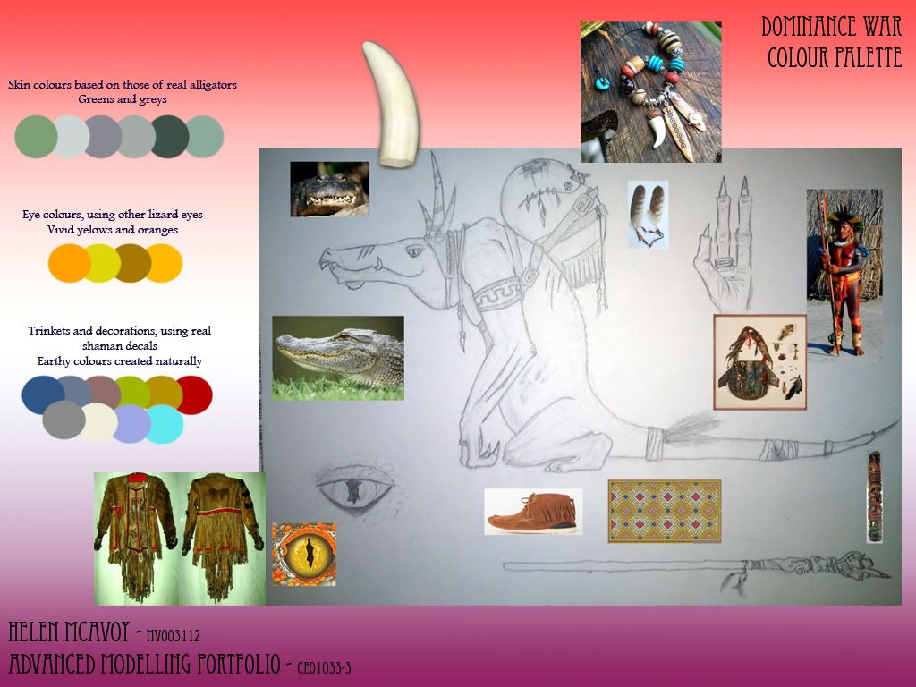
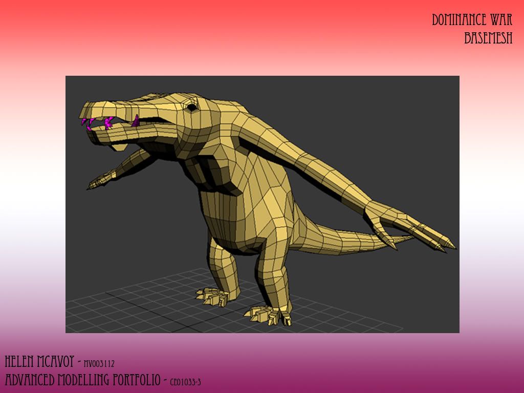
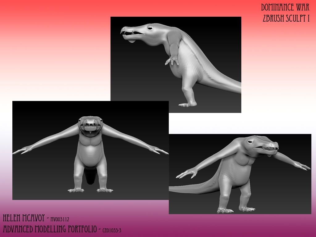
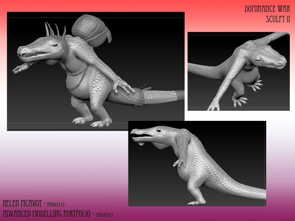
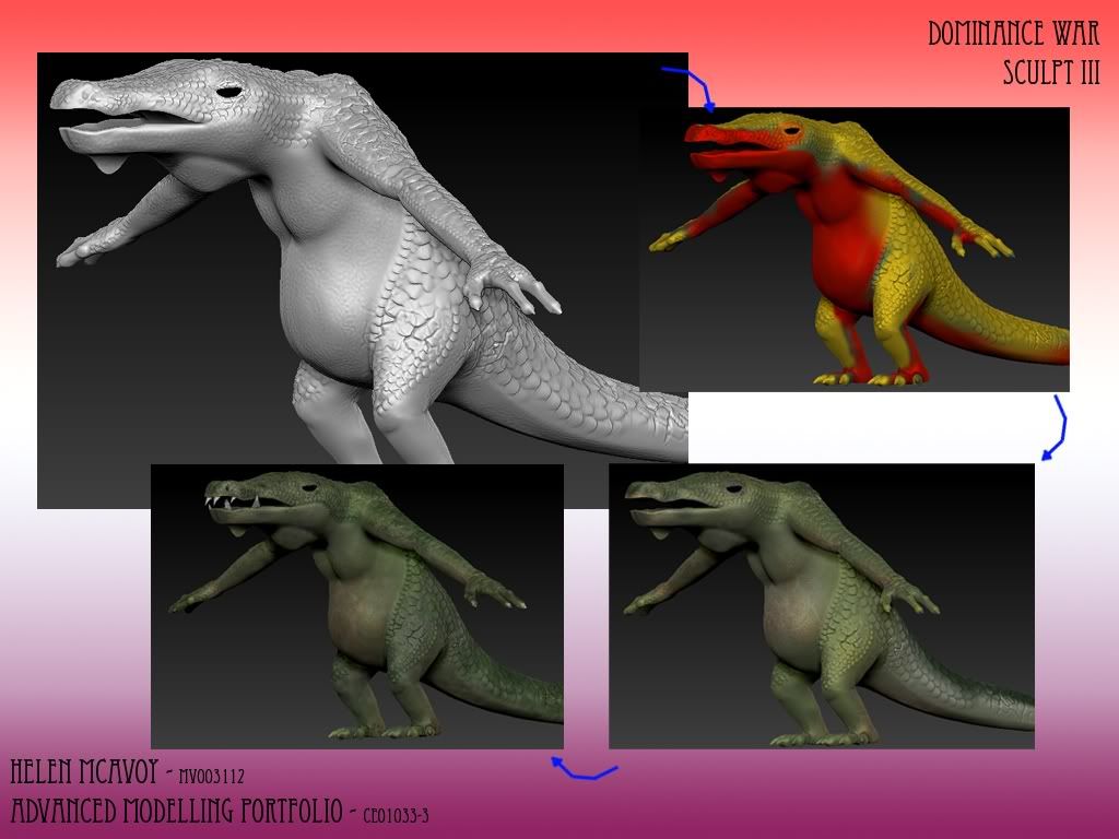
I've been a bit terrified of posting it up here, but I've got five weeks until my deadline and I thought it would be best.
Thanks guys.
In Uni, we have to make a character based on the challenge given for Dominance War IV.
Here's where I'm at so far.


I've been a bit terrified of posting it up here, but I've got five weeks until my deadline and I thought it would be best.
Thanks guys.
Replies
I fixed your image links, be sure to use
From front view, that eyes are too far apart. You can see even in your own photo reference that the eyes, and head in general, is a lot more narrow on top.
The scales and details are looking pretty good, but I think that's probably the last thing you should worry about. There are a number of cartoon alligator type characters out there that may provide some inspiration on getting stronger proportions. Alligator claws have more than 3 fingers and are somewhat webbed. Of course the number of fingers on characters is often changed for various reasons, but I mention it because he feels a bit dragon-like or some other kind of reptile.
Looks like a good start though. Good luck with the project!
With him, the alligator was more a starting point, but I've steadily been making him more humanoid, so I wanted the claws to be less webbed, etc.
I'm trying to get him like the concept art rather than like an alligator.
Ah, sorry about the IMGRES tags, it's how I've been posting on other forums.
One of the lecturers told me to move the arms down from the T-pose.
@Vertrucio I'm working on making the tail thicker. It is really long, I just don't have an image with it in right now.
A big mistake new artists make is doing detail before key problems to your entire design have been worked out. No art director in the world is really that concerned about how bumpy you can make your model, that's really just icing on the cake. The real key is to make your base model look good without detailing, to which detailing can only add to it, not cover up defects.
Not to mention the technical and efficiency side of it, if you're going to be changing the underlying geometry, you're wasting time doing details that you'll just have to redo later since the new underlying geometry in place.
Also, I kind of thought it was ok as it was. Obviously I was wrong, but there you go.
Lesson learned: rushing is for idiots.
from what i see from your picture your alligator looks like hes about to tip down, hes legs are way too small to support that giant body of his, try looking at some animal anatomy to get these down right on because its more important then getting the little details on your texture. ;D
I understand this crit runs counter to haikai's, but if you're press for time, you might as well stick with the concept art you've done already.