The BRAWL² Tournament Challenge has been announced!
It starts May 12, and ends Oct 17. Let's see what you got!
https://polycount.com/discussion/237047/the-brawl²-tournament
It starts May 12, and ends Oct 17. Let's see what you got!
https://polycount.com/discussion/237047/the-brawl²-tournament
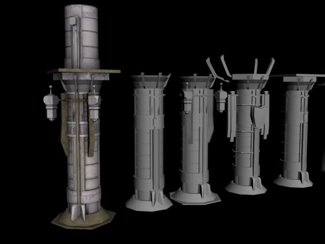
Critique please - Gothic Column Prop
Working on a gothic column prop for a cathedral I am doing for class. Would love critique on the texture work thus far. Far from finished, this is a first pass but I am having trouble working on it. Referenced Darksiders for the modeling portion, and am referencing Assassins Creed and God Of War for some of the texture work.
Color palette includes purples and blues, primarily, very low saturation, with brass accents. Texture is smooth stone slabs. There is a minor sci-fi twist put on it for the sake of the project guidelines.
There is no normal or spec, this is only the diffuse. I'll upload some more images from several angles in a minute.
Texture work is my weak point so I would appreciate, along with critique, useful tips on how to improve in Photoshop in order to better apply grunge and other methods to my maps. I model in Maya, unwrap, texture, bake, etc. in Max and use Photoshop CS5 for all my maps.
The other props you see in the scene will be textured similarly once I get a nice one going for this column. Just as idea as to the style I am going for. All will be imported into UDK upon completion / final presentation.
Thanks!!

Replies
Doesn't really strike me as a gothic architecture. The stretched 8 sided cylinder at the base doesn't look good. Is the base supposed to be this shape? Or are you being frugal with geometry on what should be a rounded corner?
The overall shape looks interesting. Are you working off of any references?
The pillar doesn't strike me as being made of stone. There is barely any color there. Maybe try adding more color/values in here to break up the different segments of the column.