Home Contests & Challenges Archives Low Poly Challenge

TRON - VEHICLE - Grindy

polycounter lvl 10
Offline / Send Message
Grindy polycounter lvl 10
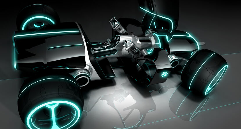
I want to do a 4 wheeler based off the Light Runner. I'm new around here and doing a low poly anything is a new experience for me.
830px-Light_runner_render.jpg

I started today by getting some wheels down on the grid... and oh my, those polys sure adds up quite fast. I'll keep working on those and make my way to the final design and proportions and then I'll axe the extra polys.

Here's my progress so far:

tronbase.jpg

Replies

  • Grindy
    Offline / Send Message
    Grindy polycounter lvl 10
    For some reason my file didn't save everything so I remade the wheels after work with the poly cap in mind, got an early version of most of the buggy done.

    tronbase2.jpg
  • Baddcog
    Offline / Send Message
    Baddcog polycounter lvl 9
    Lookin good, can't see those cylinders inside the ref pic wheels though.
    -edit-
    my bad, I saw a straight on side view, they are there indeed.

    And can't tell, but does that thing have butterfly doors?
  • Grindy
    Offline / Send Message
    Grindy polycounter lvl 10
    05_TRON_lightRunnerModelConcept.jpg

    tron_legacy_light_runner.jpg

    There is a cockpit that moves to let people inside, the doorish things on each side seem to just be decorations of some sort. I'm not sure yet if I want to make the cockpit, my first idea was to go for a roadster vehicle.
  • renderhjs
    Offline / Send Message
    renderhjs sublime tool
    I read 1064 tris on the last progress pic, you might have to remove some details from the last state if you want to add more details to the cockpit or other areas. You could if you have not already remove all the faces from the bottom that will not be visible, use planes to face smoothness and roundness of the wheels at the caps, and delete triangles inside the wheels.
    I think the wheels are the most tris intense elements even more because you have them 4x, so try to save as many tris on those as you can if you need more spare tris.

    Oh and the front wheels appear to smaller in the designs as the back ones, in your model the all look like the same size.
  • hawken
    Offline / Send Message
    hawken polycounter lvl 19
    details like the rear suspension could be in the texture. Anything that doesn't contribute to the models silhouette can be axed basically.
  • Grindy
    Offline / Send Message
    Grindy polycounter lvl 10
    Thanks for the comments guys! Will keep them in mind.

    renderhjs: Yea the front wheels seem less thick than the back ones. Good catch.

    I'm not sure I understand what you mean by " use planes to face smoothness and roundness of the wheels at the caps, and delete triangles inside the wheels. "
  • Grindy
    Offline / Send Message
    Grindy polycounter lvl 10
    Reworked on it this morning after some time away from the computer. I took some liberties on the original concept. The planes that make the "front window" and the "mirror" will show information windows to the pilot , sort of like a HUD. The planes in the wings will relate to the car's engine.

    tronb.jpg
    trona.jpg

    Off to unwrap it now. :)
  • Grindy
    Offline / Send Message
    Grindy polycounter lvl 10
    Slowly started texturing it.

    troncf.jpg
  • roosterMAP
    Offline / Send Message
    roosterMAP polycounter lvl 14
    I dont think green is the right color. try the orange like in the game portal.
  • ddoan88
    Offline / Send Message
    ddoan88 polycounter lvl 7
    I agree with roosterMAP. If you do not like the orange maybe just stick to your first reference image and use the baby blue.
  • Grindy
    Offline / Send Message
    Grindy polycounter lvl 10
    Still working on it, slowly but surely. I intend to finish it in time and I should work on it A LOT tomorrow.

    Ditched the green glow for a blue one and it works much better, I must agree.

    trondz.jpg
  • Grindy
    Offline / Send Message
    Grindy polycounter lvl 10
    New WIPS.

    bolideb.jpg
    bolidea.jpg

    Completed the cockpit, re-did the wheels interior and the other metallic parts, have a basic idea of the chassis' plates too...

    Off to do some more!
  • Grindy
    Offline / Send Message
    Grindy polycounter lvl 10
  • jmiles
    Offline / Send Message
    jmiles interpolator
    lookin pretty darn good now man..although, it's looking a little flat yet.. if I might suggest, there should be more specularity on the top most surfaces that are either plastic or metal, or rubber.. look for references of these materials on google.. how much sheen would be in the rubber of the tires, where are the hottest specular highlights in the metal/glass.. this will help describe your form a lot better and even produce some bump!.. your edges are looking pretty good. I would also suggest that for your glows, perhaps make that cyan a little closer to white, but keep it noticeably cyan.. this will indicate that the hottest part of your light will be the brightest, but still maintain the blue color you're going for, and for the fx, make the inside glow a little bit darker-- like the cyan color you want but about half way to black (set this to multiply), and for the outside glow, make it a color closer to a true blue, and set that to screen.. did a little test to show ya as an example.. of course you could adjust any of those steps to whatever you like.. and I could just be talking about my arse.. anyways.. like where ur car is headed.. keep pushing it!

    glowexample.jpg
  • Grindy
    Offline / Send Message
    Grindy polycounter lvl 10
    Cheers jmiles! I tried what you said for the glows and they pop much more now. As for the specularity, I'm planning on having a spec map done tomorrow, hopefully it will be even better then! :)

    boliiiiiiide.jpg
  • Conor
    Offline / Send Message
    Conor polycounter lvl 18
    That texture's looking really good now, nice work. I don't see any specular highlights on it yet though - don't forget to drop in a few lights and gloss everything up a bit to make it feel more like Tron Legacy.
  • renderhjs
    Offline / Send Message
    renderhjs sublime tool
    yeah very good texture improvements,

    some crits / ideas:
    • textures feel desaturated, could use some color shads or highlights. Same for the reflections, they are grey scale right now.
    • tiny highlights on the rubber of the wheels, they are very difuse right now
    • painted shadows below some of the wings or behind the wheels
    • draker or different color for bottom body? like a split line that defines top from bottom. I say this because the shape looks almost vertically symmetrical, some distinction between up and down could be nice.
  • Grindy
    Offline / Send Message
    Grindy polycounter lvl 10
    @renderhjs: Thanks for the crits, I'll try them out and see where it leads.

    @Conor: I'm a bit lost in the specularity and gloss department I must admit. I get it just fine when it implies the use of lights (in the software) but here I'm not sure how it interacts with self-illumination.

    I've been using self-illumination (cranked at 100) for the recent shots of my car, so basically, if I want to add specularity to it, it needs to be painted on the diffuse? Am I understanding this correctly?

    And I'm not sure what you mean by "gloss everything up a bit" - Do you mean in the texture itself or in Max?

    Any light will be appreciated.
  • Grindy
    Offline / Send Message
    Grindy polycounter lvl 10
    So I tried to add some color variations and accentuate the shadows. I'm not 100% minded on the bottom and side hue change, I tried a few colors and different setups, this is the one I prefer so far. Made some changes to the tires as well.

    82363620.jpg
  • Builder_Anthony
    I reaaly want to drive one of these its a shame they dont actually make them.
  • Conor
    Offline / Send Message
    Conor polycounter lvl 18
    Grindy - here's the material for my chopper:

    tron_chopper_materials.png

    The diffuse color, specular level, self-illumination and reflection are all controlled by maps. For the in-game shot I didn't use reflection, I'm only using that for the beauty shot. I used a flat color for the specular color but you can also use a bitmap for that.

    Look in the top right of this image to see the textures I used. The self-illumination map is all black, but has white in the areas which should glow (ie the bright glowy lines). The specular level map is black where you want no specular highlight (in the cracks and matte surfaces) and grey for slightly shiny (metal parts) and white for really shiny (glass). So you don't actually paint the highlights in the texture, you place lights in your scene and move them around or use the 'place highlight' tool to create interesting specular highlights, like the highlight on the canopy in this shot.
  • Grindy
    Offline / Send Message
    Grindy polycounter lvl 10
    Thanks for the infos Conor, I'm aware of most of this but the rendering part was the one that bugged me. I got most of it figured out now. :)

    Here's my editor view.

    pollpc4tronlightrunnere.jpg
  • Grindy
    Offline / Send Message
    Grindy polycounter lvl 10
  • Conor
    Offline / Send Message
    Conor polycounter lvl 18
    Tron racing! That looks fun! Great in-game shot.
  • 8-Bit
    Offline / Send Message
    8-Bit polycounter lvl 6
    Looks Great!

    Love what you did with the color variations.
  • Grindy
    Offline / Send Message
    Grindy polycounter lvl 10
    Beauty shot done. Now to pack luggages for Christmas.. yay!

    pollpc4tronlightrunnerb.jpg
  • renderhjs
    Offline / Send Message
    renderhjs sublime tool
    I like the textures now a lot, great improvements throughout the posts.
Sign In or Register to comment.