I may be getting greedy, but I would appreciate some crit. Mostly drawing related. I haven't put in the highlights or a secondary light yet. Also, the face needs a lot more work. But yeah, let me know if you find something! Thank you!
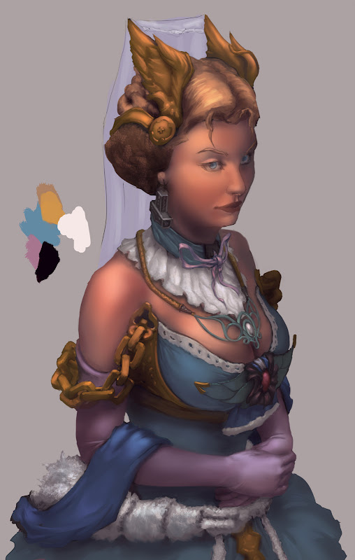
i think her hands may be a little too dainty and small. The left hand looks a little awkward and larger than the right, but like the gesture of how they laying.
love the concept & design, colors are fantastic! I almost prefer it without the highlights, and when you do add them, to be really conservative with them!
So do her breasts support the gold chains or do the gold chains support her breasts? ;-) Also, her mjolnir earrings are made of solid metal i assume? Imagine the length of her earlobes...
As for the mjolnir earrings themselves, it could use more highlights (if it is metal) to emphasise its shape as it took me a while to see the curved peak at the bottom.
Yeah the face looks a little strange at the moment. The perspective seems slightly off (could just be the light though). It does look very nice so far though, besides those few nit picks. What resolution did you start with by the way?
her hands look a little strange, but the artwork seems good. I will say that she seems to princessy' like she's from Final Fantasy. You have some Nordic elements in there, but I don't see her as fitting in particularly well in Nordic culture.
Hey thanks everyone for replies! It's really helpful to get so many opinions.
Unfortunately, I finished rendering before noticing that I had replies, so I may have gone against what some of you said. This is it so far:
I think highlights (on the face at least) are overdone. I tried to push the contrast a little to make it more dramatic, but I may go back to a looser version. The reason it was so misty was because I DON'T KNOW LIGHTING WELL! And when you leave out information it looks better.
Doeseph: I started at 2128x3357. I usually start with a digital sheet of a6 paper, if that helps.
I may play around with highlights some more but for now I gotta get to my other pieces! Thanks again everyone!
Replies
love the concept & design, colors are fantastic! I almost prefer it without the highlights, and when you do add them, to be really conservative with them!
As for the mjolnir earrings themselves, it could use more highlights (if it is metal) to emphasise its shape as it took me a while to see the curved peak at the bottom.
Unfortunately, I finished rendering before noticing that I had replies, so I may have gone against what some of you said. This is it so far:
I think highlights (on the face at least) are overdone. I tried to push the contrast a little to make it more dramatic, but I may go back to a looser version. The reason it was so misty was because I DON'T KNOW LIGHTING WELL! And when you leave out information it looks better.
Doeseph: I started at 2128x3357. I usually start with a digital sheet of a6 paper, if that helps.
I may play around with highlights some more but for now I gotta get to my other pieces! Thanks again everyone!