Viking game character - BA project, looking for crits
hey guys! My first post in this part of the forum:)
I'm working on my final project of my bachelor degree, and I've decided to make a viking game character. I want him to be a high quality portfolio piece, so I don't mind if the poly count reaches 25k tris (that is ok for a game main character right?)
The background is that he's sort of a retired hero, that was comfortably living out his last days with his family until viking raiders burned his farm and killed his family. He now travels all over northern europe, taking vengeance upon the murderer one at a time. he's also picked up a drinking habit.
So, I want to get across that he's old and tired, and that he used to be well off, but is now worn out and has lost everything. I also want to make him look like an experienced fighter and formidable warrior. I want to do it in a style similar in proportions to games like Darksiders and WoW to some extent,but a bit more realistic on the texturing.
Currently working on the concepts, and very much looking for critique! So far I'm pretty happy with his proportions, and where the outfit is headed, but I'm kind stuck on what more to do with it. I'll think on it for a bit more, and then start making the final concepts and character sheets.
Here's some sketches and mood sketches:
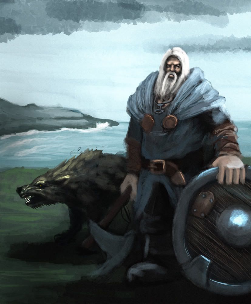
Oh yeah, and he also has a dog. His only friend. Might make it, might not, depending on time.
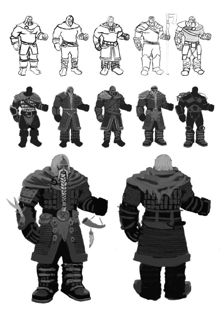
I'm pretty happy with the overall design, but I feel it lacks some personality, and also, I'm worried that the long kilt will be difficult to animate.
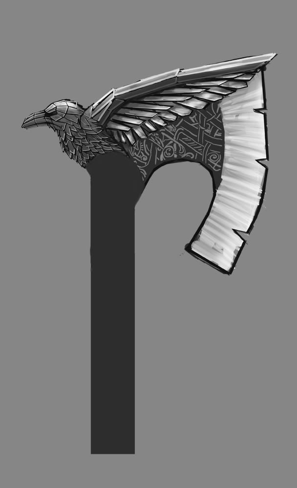
The axe is going to be 2-handed so the shaft will be a lot longer.
I'm working on my final project of my bachelor degree, and I've decided to make a viking game character. I want him to be a high quality portfolio piece, so I don't mind if the poly count reaches 25k tris (that is ok for a game main character right?)
The background is that he's sort of a retired hero, that was comfortably living out his last days with his family until viking raiders burned his farm and killed his family. He now travels all over northern europe, taking vengeance upon the murderer one at a time. he's also picked up a drinking habit.
So, I want to get across that he's old and tired, and that he used to be well off, but is now worn out and has lost everything. I also want to make him look like an experienced fighter and formidable warrior. I want to do it in a style similar in proportions to games like Darksiders and WoW to some extent,but a bit more realistic on the texturing.
Currently working on the concepts, and very much looking for critique! So far I'm pretty happy with his proportions, and where the outfit is headed, but I'm kind stuck on what more to do with it. I'll think on it for a bit more, and then start making the final concepts and character sheets.
Here's some sketches and mood sketches:
Oh yeah, and he also has a dog. His only friend. Might make it, might not, depending on time.
I'm pretty happy with the overall design, but I feel it lacks some personality, and also, I'm worried that the long kilt will be difficult to animate.
The axe is going to be 2-handed so the shaft will be a lot longer.
Replies
1. You're using a soft texture brush and then not polishing it up with something tighter, so we're losing a lot of shape and interest.
2. Never use the 1 or 2 pixel size brush (like you did on his shield). Just looks bad.... really bad. Instead use a tighter brush (see #1)
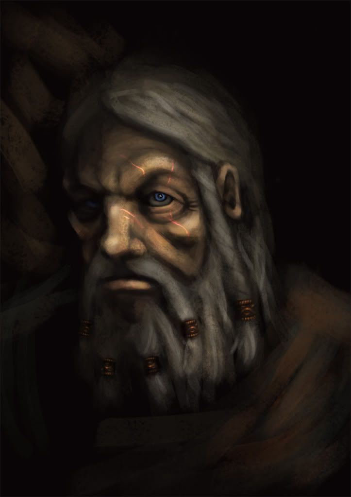
3. Need secondary light source. The image of the face has 1 light source and we lose half the image.
I tried to work in a different way with the character sheet I`m working on.
I just mark out the shapes I want and bucket fill them, and then go into them and try to detail it up. It`s not perfect, but I think it at least looks more readable and professional. I`m also doing more lineart now, as I think that if I draw everything out first, I will know where to go with everything when I start coloring.
I`m real big on testing, and since I`m going to be making a short cut-scene with this character, and I`m generally not awesome with rendering, I decided to test out some render settings, and start putting together an animatic. I got some help from a friend of mine, and he helped me set up the scene in Vray. This is the first frame, which is basically a test of lighting, and some snow effects. Everything else is just proxies.
Also, I`m testing the workflow I`ll be using for the final model. The plan is to make a high poly model in zbrush, retopologize in max, and unwrap, polypaint in zbrush, and then use the lowest subdivision for my low-poly model, and render out normalmaps and diffuse from the high poly.
I`m testing this on a portrait of a sort of Witch Hunter like character. (calling him gregorio:P) I`ve retopologized it, and I`m currently working on finishing the model, so I can unwrap and start texturing.
your sculpt says other wise though xD
thats some awesome improvement on ur concept and your sculpt looks nice
Looking at it side by side, I think I`m definetly more comfortable with the 3D stuff than the 2D:P
Still, being my very first poly paint, as well as my first human skin texture, I must say I am decently, pleased, though i admit it is terribly hasty:)
I`ve finished the character sheet, and started sculpting the high res now.
I tried to dirty him down a bit more, and break up the symmetry. Pretty happy with it. The shoulderpad is a placeholder atm. I want him to be abit more armored, and I like the metal plate as a material variation, but I`m stuck finding a cool design. I need something that suits a one-time wealthy viking warrior. Something simple and effective, yet with a bit more "design". Any ideas? :P I need something that will go with the axe, but less epic, as I want the axe to be his most extravagant belonging.
Here`s the progress on the body. It`s my first proper full body sculpt, so I appreciate help with anatomy! I know the proportions are "wrong", but I`m going for stylistic proportions, and more realistic anatomy.
I like your character so far. Maybe you can broaden him a little more as you add layers of clothing on him. I like Stoick from How to train your dragon. Maybe that will help.
Look at this amazing sculpt Kotter did, it's only 3.4k, yes Kotter was going for ultra optimized but still I think a main char should only reach about 8-12k tris, 25 just sounds ridiculous to me, a nice full sized building would be about that high, maybe even lower!
I think somewhere around 10k-15k would be better. Studios are always looking for people who use(and not abuse) tris. This guy isn't SUPER detailed and the only reason Mass Effect characters had high counts was because a lot was in the head because they wanted nice facial animations.
Veneficus: Looks good so far, you might want to look at some more reference for the front and sides of his neck. It's looking a little extreme. Can't wait to see how this turns out.
glottis8: Stoick is awesome! I`ve tried to bulk him out a little bit, but I`m not sure I wanna add much more clothing to him. I`ve added more hair though, and I think that helps getting him more in that direction.
DDuckworth: The polycount is based on the numbers from the newest games that are coming out, like uncharted and mass effect, like the others said. I`m definetly not aiming for 25 k, tho, I`m just not going to concern myself too much with it, as long as it`s under that limit. I`m still fairly new to making characters, so with this project I want to focus on making it look nice, and I think opimisation will come with experience, and I can hopefully focus on that in my next project
Deady: Thanks, and you`re right. The neck is a bit extreme, but that was kinda what I was going for, but maybe it doesn`t quite work? I want him to have sort of stylized, blizzard-esque proportions, and I like how his body is so massive in the shoulders and neck area, but maybe its not reading the way I want it to. I`ve used Hogarth, and body builder images for reference on the neck muscles, and I think the anatomy is more or less there, but the proportions are obviously extreme. Any ideas on how I could keep it stylized, yet more believable?
tda: Thanks for pointing that out! I`ve actually been struggling with the question of how detailed my retopology should be! I didn`t use the lowest subdivision in zbrush, I actually made a retop from scratch, but I`m starting to think I`m still in basemesh-mode when I do it. Should the retopo actually be a lot more detailed than what I am doing here?
Here`s a retopo I did for the body. It`s exactly like you said, shapeless and boring:P But how should I balance detail and economy in this case? It`s around 8k tris now, and not very detailed. Should I be throwing more at it?
I haven`t been able to do much the past week, due to other schoolwork piling up, but I`ve managed to start sculpting some proper hair, and added some more accessories to him.
Also, I`ve tried my hand at making a chainmail texture. Mostly worried about the tiling atm. I think it looks ok. Haven`t started painting the trims. There is also an issue along the front seam, which I think I will fix manually with polypaint. What do you guys think?