Bird attack!Tjielp tjielp
Hi guys,
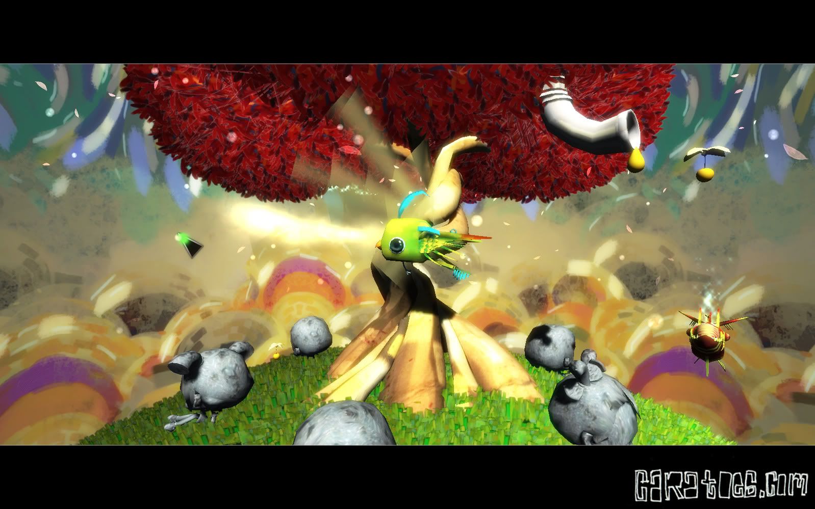
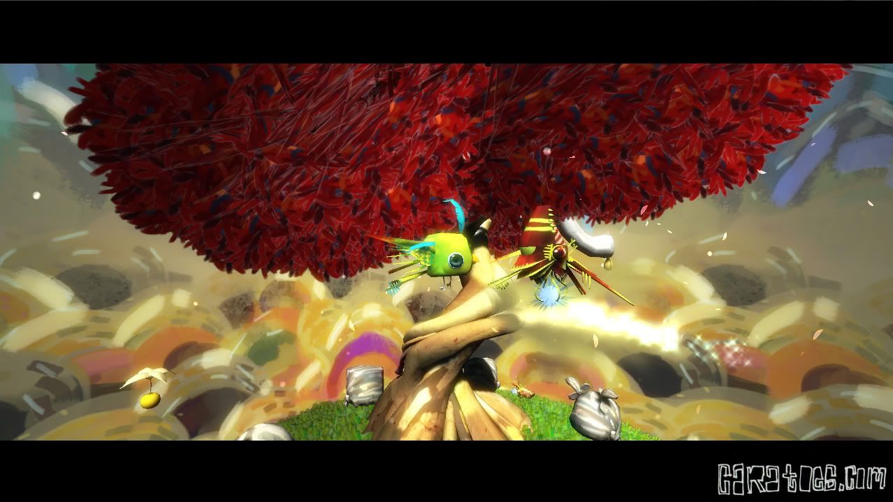
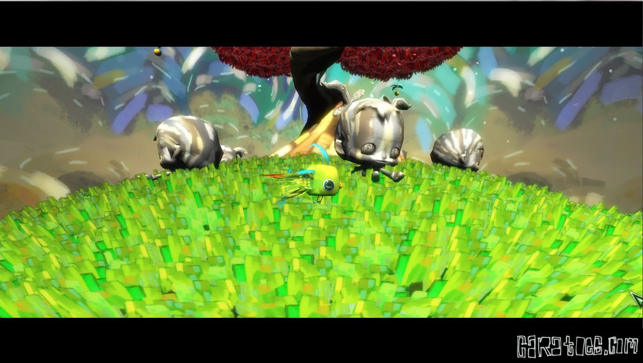
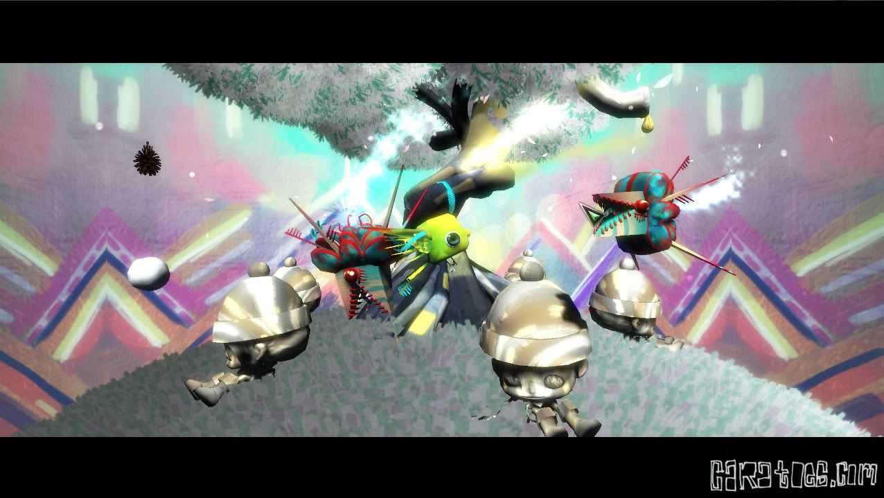
some screenshots of a game I worked on a while ago. It s called Pomana.
Everything visual is designed , modeled (except tree trunk ) and textured by me.
Hope you guys like
Btw, the site on the pictures doesn't work yet. I'm still working on my site , but it will be finished soon!
and then I show you my Blog
Student looking for internship February 2010
some screenshots of a game I worked on a while ago. It s called Pomana.
Everything visual is designed , modeled (except tree trunk ) and textured by me.
Hope you guys like
Btw, the site on the pictures doesn't work yet. I'm still working on my site , but it will be finished soon!


and then I show you my Blog
Student looking for internship February 2010
Replies
With your assets in the scene, together, the screens are quite hard to read, as there's a lot going on in each. My eyes aren't able to settle, and there's a lot of visual noise, which makes each screen quite hard to look at, at length.
I also have no idea what gametype this might be :P Which makes it hard to figure out exactly what's going on, and makes each image look all the more random and trippy.
Would it perhaps make more sense to show this work in motion/video?
Im not sure what the game type is. Here is a little promo-video I made, but I don't think it tells enough. I only made it to show of the visual, not the game. But I m working on it!
In the game you play a bird, you can switch bird by a single mouse click. So you turn into a black bird to attack the enemy's.
Goal of the game is to free the children by pushing the fruit into the ray of light beaming out of the tree.
http://vimeo.com/15996424
Really want to see this working.
But I agree it is busy. I think it's just the backdrops. They seems like somewhat random modern art, when maybe a toned down, but somewhat crazy looking sky scape would be best.
Big solid patches of blue with some funky clouds, maybe a far off castle in the back. So it's not plain /boring. But not a kaliedescope either.