Life Springs by Team Exile - level prototype (Image Heavy)
Hi everyone,
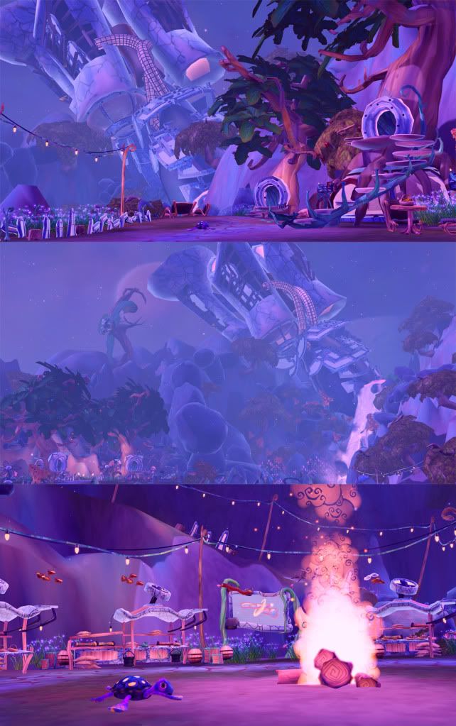
This is a WIP prototype level that our team of 7 has been working on with the mentoring of members from SOE. The premise was to create a level that would fit within the Free Realms style, with a sci-fi twist added to it.
Long background story short, a group of exiles crash land on a desolate planet, and in the process frees water thats been trapped just under the surface. This in turn creates a waterfall and a lush oasis for the exiles to live in and they cannibalize the ship in order to construct a new community for themselves. They also discover the underground cave that had contained the water, and they have converted that into a mining facility.
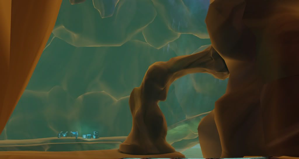
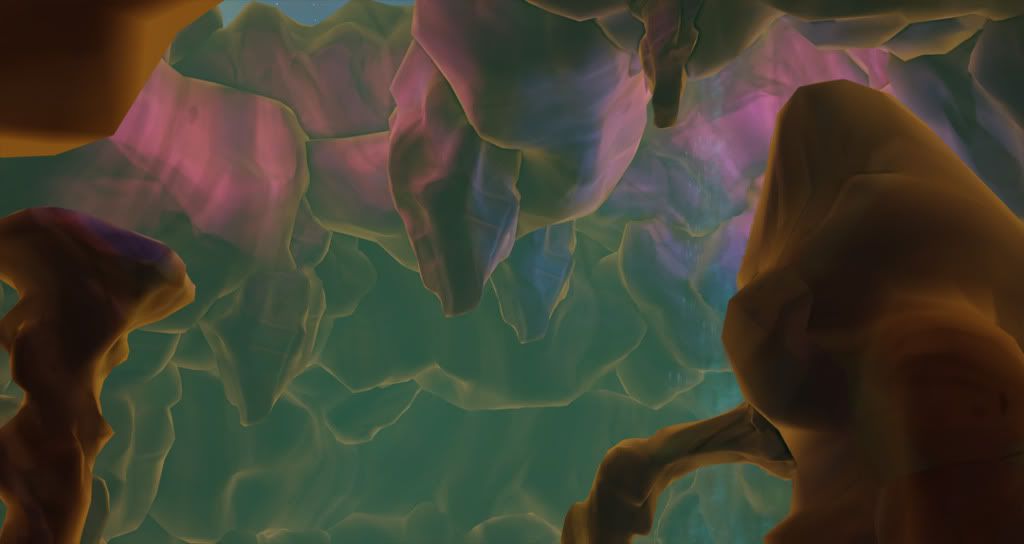
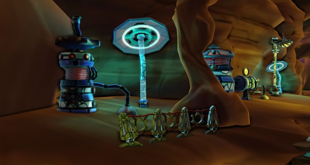
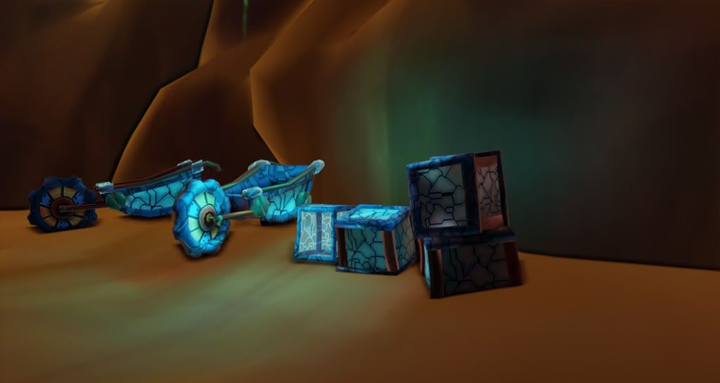
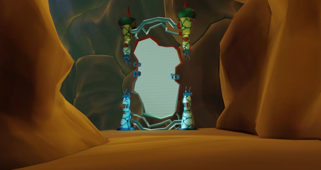
So far we have completed node one out of 3, and currently working on node 2 which is the cave that used to contain the water. Because we're going for the same style as Free Realms, we aren't using any normal maps, very limited spec, and handpainted textures.
We're planning to have the nose of the crashed ship protruding into the cave for Node 3 and we're currently working on props for that.
Feedback is very welcome and encouraged. Thank you!:)
Scene Concepts for Node 1: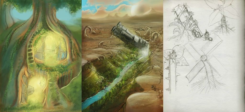
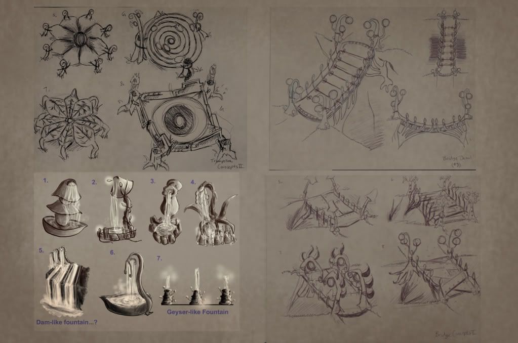
Asset Concepts for Node 1:
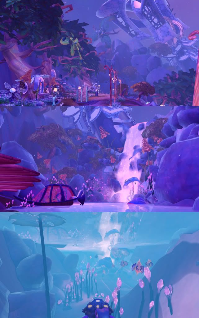
Screenshot Set 1 for Node 1:
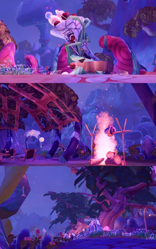
Screenshot Set 2 for Node 1:
Screenshot Set 3 for Node 1:
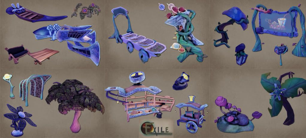
Assorted Assets for Node 1:
Node 2:
WIP Screenshots Node 2:
This is a WIP prototype level that our team of 7 has been working on with the mentoring of members from SOE. The premise was to create a level that would fit within the Free Realms style, with a sci-fi twist added to it.
Long background story short, a group of exiles crash land on a desolate planet, and in the process frees water thats been trapped just under the surface. This in turn creates a waterfall and a lush oasis for the exiles to live in and they cannibalize the ship in order to construct a new community for themselves. They also discover the underground cave that had contained the water, and they have converted that into a mining facility.
So far we have completed node one out of 3, and currently working on node 2 which is the cave that used to contain the water. Because we're going for the same style as Free Realms, we aren't using any normal maps, very limited spec, and handpainted textures.
We're planning to have the nose of the crashed ship protruding into the cave for Node 3 and we're currently working on props for that.
Team Exile:
Lead: Julio Juarez
Co-Lead: Ryan Horn (poster)
Daniel Oien
Daniel Sams
Pedro Flores
German Benitez
Christine Vila
Lead: Julio Juarez
Co-Lead: Ryan Horn (poster)
Daniel Oien
Daniel Sams
Pedro Flores
German Benitez
Christine Vila
Feedback is very welcome and encouraged. Thank you!:)
Scene Concepts for Node 1:

Asset Concepts for Node 1:

Screenshot Set 1 for Node 1:

Screenshot Set 2 for Node 1:

Screenshot Set 3 for Node 1:

Assorted Assets for Node 1:

Node 2:
WIP Screenshots Node 2:


Replies
Can't wait to see this project finished!
The purple theme reminds me a lot like the Draenei race in Wow. they have very heavy pallet of purple, pinks and blues but they are also balanced with browns, yellows and grays.
if you are going to continue with the purple colors, i suggest as a point of reference you take a look at how Blizzard balance these colors so they don't overpower the player, and half blind them.