The BRAWL² Tournament Challenge has been announced!
It starts May 12, and ends Oct 17. Let's see what you got!
https://polycount.com/discussion/237047/the-brawl²-tournament
It starts May 12, and ends Oct 17. Let's see what you got!
https://polycount.com/discussion/237047/the-brawl²-tournament
Sci-Fi Tech Girl
Hey guys,
Here's the progress I've made so far on my latest character project. I'm going for a high detail, next gen style scientist/techie girl with two clothing variations. I'm planning on taking her into a game engine when I'm done. (Probably Unity.)
Here's a concept I did a while back... her legs are wonky, but it gets the idea across.

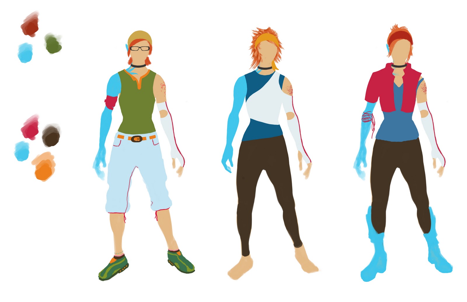
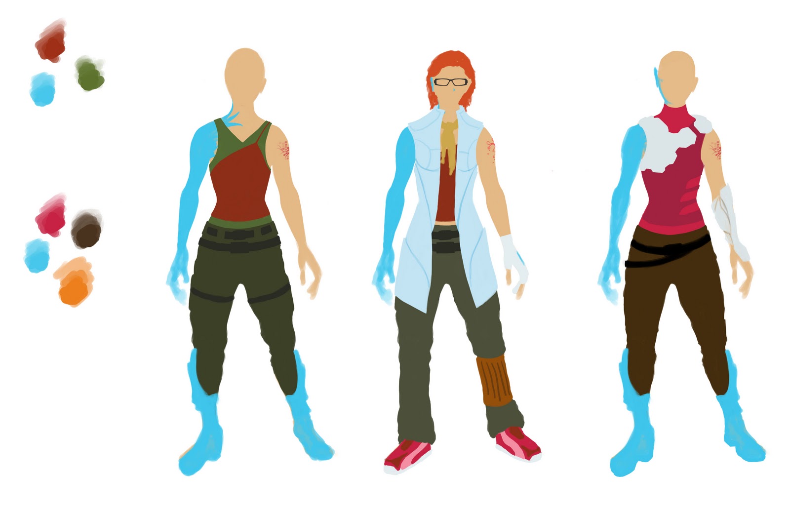
Here are some simple color/silhouettes of some potential variations: (I'm using the ones wearing glasses.)


At the moment finishing up the base body sculpt... here's a [ame=" http://www.youtube.com/watch?v=7QF-oVJ8iTE"]timelapse[/ame] of me working so far.
Here's the progress I've made so far on my latest character project. I'm going for a high detail, next gen style scientist/techie girl with two clothing variations. I'm planning on taking her into a game engine when I'm done. (Probably Unity.)
Here's a concept I did a while back... her legs are wonky, but it gets the idea across.

Here are some simple color/silhouettes of some potential variations: (I'm using the ones wearing glasses.)


At the moment finishing up the base body sculpt... here's a [ame="
 http://www.youtube.com/watch?v=7QF-oVJ8iTE"]timelapse[/ame] of me working so far.
Replies
I'm still not exactly sure what kind of hairstyle I want to give her... any suggestions?
I'm still not sure what hairstyle I'm going to go with, so I sketched out a some variations that are in the vein of what I'm thinking. At the moment I'm kind of liking the one with the ponytail. Any opinions?
I'd really appreciate some critiques on the anatomy, etc...
(Yes, I realize the head/body don't quite line up in the shoulder department; I'll merge them later.)
C&C much appreciated.
Here are the base tones for her face... I still need to add some imperfections and desaturate the whole thing a bit. I'll do that once I bake down the vertex map to my low poly.
It's looking good, I would tone down the wrinkles on the clothing. They are all too uniform, you might want to work some bigger volumes/ and get some asymmetry unless you are looking for symmetry on this model.
The hands on the low poly looks a little wacky, thumb placement/wrist to hand proportions wrong, check the proportions with reference. Sometimes I just take a screen shot of my sculpt into PS and overlay an acceptable reference pic on top to see how far off I am.
I also agree with the shirt being too wrinkly. It looks like she left it in the washer overnight instead of drying it right away.
The shoes are kind of weird with the circular tops. Maybe that's how they do it in the future or something, but I think there's a reason why the tops of most real shoes are fitted a certain way.
Overall the low poly mesh looks pretty good. Hopefully you can bring out some more details with the textures.
@ Shaffer - The pants are mirrored, but the shirt is not. I'll be looking into the wrinkles, though. I certainly don't want her to end up looking perfectly symmetrical.
@ Haikai - I didn't have any one particular person I was going for. I used an amalgam of pictures.
I'll experiment with smoothing out the wrinkles a bit.
I've revisited the shoes. I totally scrapped what I had before and started over. :P
Flat textures screencapped from Modo: