[Portfolio] - Bo Mathorne
http://bomathorne.blogspot.com/
Hi folks, I believe it's been something like a year since I last posted here which is way too long, but time passes quickly when you're busily amused. I've recently updated my blog and put together a small showreel and I thought I'd share it with you guys. Some of the content dates back a few years so it won't all be new but there's a couple of pieces in there you haven't seen before. Most notably,
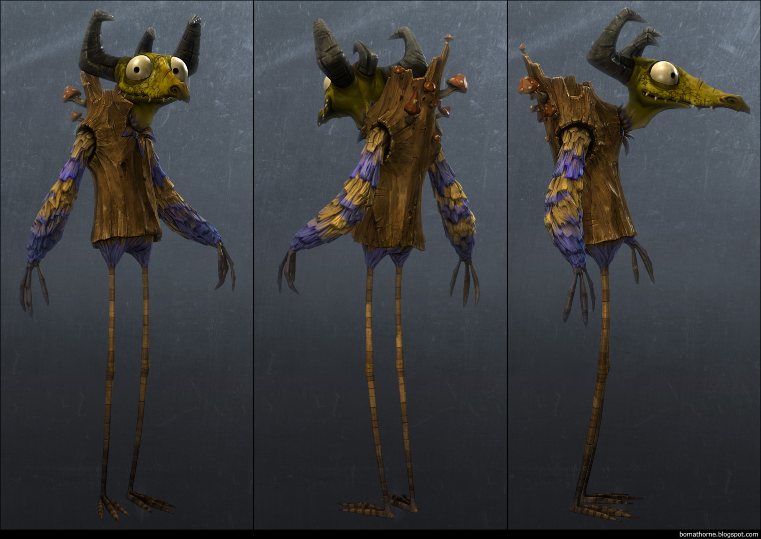
this guy, my first "next gen" character:

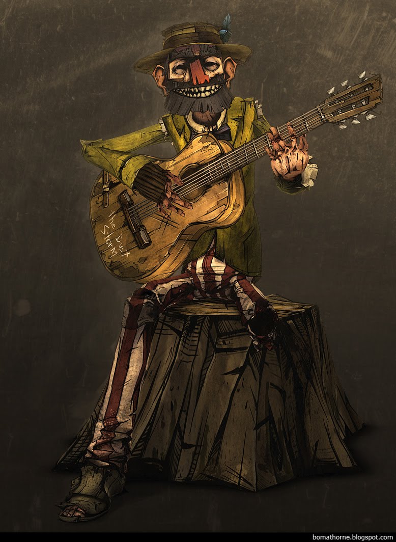
And for those of you who recall my so called "Dust Storm Character", I ended up doing a whole film in the style together with seven other students as our bachelor project. I can't talk too much about it, but you can see one of the main characters (very much based on the original) and there's a couple of clips from the final film in my reel.

Hi folks, I believe it's been something like a year since I last posted here which is way too long, but time passes quickly when you're busily amused. I've recently updated my blog and put together a small showreel and I thought I'd share it with you guys. Some of the content dates back a few years so it won't all be new but there's a couple of pieces in there you haven't seen before. Most notably,
this guy, my first "next gen" character:

And for those of you who recall my so called "Dust Storm Character", I ended up doing a whole film in the style together with seven other students as our bachelor project. I can't talk too much about it, but you can see one of the main characters (very much based on the original) and there's a couple of clips from the final film in my reel.

Replies
favorite has to be the guitar dude and his animation in the reel
Awesome work, man! I'm jealous I don't have such shining examples in my own portfolio. That's my own fault, though :P
So good man!
btw, what was your nickname on cgchat?
i remember that one!
Archanex:
For the mouth I made a whole bunch of completely separate mouth pieces, something like 26 in total. Basically like replacing heads in stop motion. I gave the animators the possibility to do a little bit of stretching and stuff on the actual shape, but we really liked how snappy and rough if felt this way. Also it gave me the possibility to really craft every expression, so for instance his teeth in more pointy when he's grinning than when he's afraid and so on.
I'll look into making some wire shots of the guy, but be warned, they're awfully messy to look at.
P442:
All textures are made in Photoshop, I only used Zbrush for the monster.
conte:
I think I was called something like [DLS]Merskum back then. He's happy that you recognized him.
Thanks again.
Really Great job!
i guess the mouth is just exchanged meshes in the animation, right? love it, its working really well, as for the lowpolies, i think in your pure diffuse textures you could improve a lot with a bit more colour variation in the highlights and shadows, just some tinting going on, its better in the earlier (earlier in the video) lowpolies but is really obvious in this legless moskito dude with wings, but even the earlier ones could use a bit more variation in their shading curve guess
Steffen, you're spot on, I made a bunch of different meshes and textures for the tramp's mouth and gave the animators the possibility to do a bit of wiggle to go a long with the snappy animation. I'm really happy with how it ended up looking.