Hand painted windmill environment
Figured it's about time for me to move it out of the WAYWO thread. The texture sizes are a bit off on things now. I'm just painting them and I'll resize them towards the end of this. Shooting for another hill in the background and a sunrise maybe. I was hoping for a few outside ideas and critiques from here.
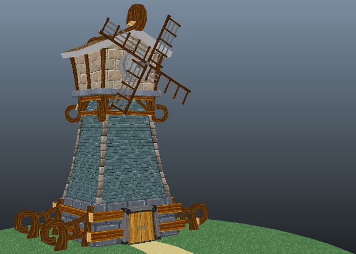
Here's an angle close to what I was thinking for the final:
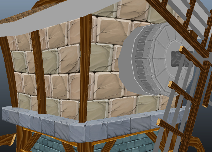
Still working on these textures around here:
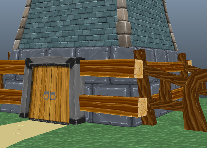
Up close shot of the bottom area:
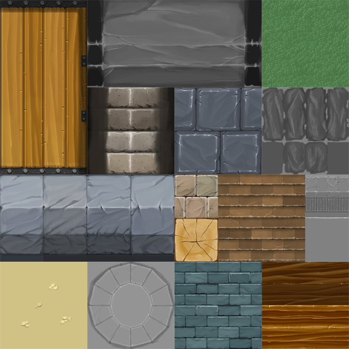
The texture flats so far (Again some sizes are a bit nuts):
Here's an angle close to what I was thinking for the final:

Still working on these textures around here:

Up close shot of the bottom area:

The texture flats so far (Again some sizes are a bit nuts):


Replies
your yellow bricks have highlights on three sides but no corresponding shadow, implying it is built like a step-pyramid which contrasts with the shape of the model.
the gray stone has highlights everywhere and even shadows on all sides - this is painted like a ground texture, but you have it on the walls. you also have these blocks going around corners, which look wrong.
in fact, there's almost no shadows or ao on anything, so everything feels floaty
the door looks striped - don't go light/dark/light/dark. variation is good, but our brain picks up patterns too easily.
the blue bricks are the best. they have shadow, highlights, light and dark variation. but it's all very monochromatic. and i'm not wild about the blue color. the indented bricks might be a bit too much, as well, as they stand out in the tiling quite a bit.
the white rocks look pretty good. again, they have highlight, shadow, nice variation. cracks are all a bit soft in them, making them look almost sea-smoothed.
wood is a bit too contrasty for my tastes.
the windmill vanes should be much larger. they're small and unimpressive and get lost in the piece.
i don't like the angled dark parts of the door frame. they come off as looking like poor UVing.
texel density is painful, but you said you're aware of it.
Having said all that, this is a good start. you've got the bones of something cool here, it just needs some refinement. Don't toss out everything you know simply because you're making something hand-painted, all the rules apply.
Sectaurs: Thank you! Exactly the feedback I was hoping for. Yes I totally agree about this feeling disjointed. I've painted it in 3 hours blocks once or twice a month (during a lecture I give) so it makes sense it feels like that.
I'm going to rework the textile density across the board tomorrow.
I will tackle all the texture changes you suggested too. Great eye on all those things. Everything seems super fixable. The 'seastone' and blue bricks are probably the textures I'm happiest with. I really want to rework a lot of this. Probably defining values first then colors (like I normally do) is how I how rework this.
Thanks again for the badass critiques. It's definitely what I needed. Give me a bit and I'll post an update when I get most of the textures reworked.
itismario: Thanks I'm digging the grey bricks more than the rest. I think like Sectaurs said the cracks need to be sharper though. Nothing ends early.
Make those things HUGE.
Here's an update with some working lighting in. Still reworking a lot of this. The blue bricks are not going to stay up top and tiling too much below. Thinking about doing stucco with a few bricks showing underneath for the top area.
Yeah the blue tiles are too small. Then you can maybe add more color variations to it.
Also for the texture above, only make a quarter of that grey circle
mmh i think i prefered the white stones on top and the double row of grey stones below.
You might want to think about a the function of a windmill a bit more which could lead to a bit more detail. I'm specifically thinking about how they normally rotate and how there is a sail wheel in the back that helps rotate the upper housing of the blades so they align for maximum umm... windage...
I like that you exagerated the size of the blades, and I like the slopes and curves on the building, cool stuff, maybe also exagerate the shape of the blades also?
keep it up
Vig: Thanks! Good crits. I've added those rear blades and tweaks the large blades to match the style of the supports.
Telmac: I've sadly never played Majora's Mask. I googled it and couldn't find much. Any shots of it that you know? I tweaked the brick scale some to match up.
marq4porsche: Thanks. The wood is pretty simple stuff. Reference and look at other games that have worked wood in this style is the best approach. The bricks have been scaled up.
glottis8: I like the vines idea. I'll have to work those in at the polish stage.
Sectaurs: !!!! Getting there. Just keep plodding away at this.
PogoP: Lighting is temp. Just a orange directional and a blue ambient. I'll rework that as I get closer to finishing this.
That all said here's an update. Hay bales and the shot composition is starting to get figured out. going to add in some background details in (house silhouette, fence, sky, clouds, etc) once I finish the door handles and the roof textures.
Not sure if UDK with lightmaps and realistic rendering fits this well, you might be better off with windwakeresque cel shading.
Decided to just lightmap the ground. It looked a bit off with lightmaps on everything.
Marquis I am going to add cloth on the windmill. It will probably be something a bit warmer.
Still have to make some rocks for around there, texture the crates/small prop on the side, and possibly add in background elements like a forest or castle (something off in the distance on the left side and right side.
I like how this is progressing
- The fields are in more of a yellow/brown/orange tones and have the hay sticking out of the ground.
- Hay blocks.
- two different wooden carts to add more things to the scene, also if you put a pitch fork somewhere.
- Hay sprites on the ground.
Just a list of ideas, always better then being stuck at some point.
Pix I like the cart idea. I think I'll add that it as well. I'll probably adjust the grass color some when I polish the textures. I'm planning on going over each texture and rework some of the surfaces (bricks, etc) a bit once the scene is all in place.
You gonna do more of these?
I would add a window on the shadow side with a nice warm interior glow.
And maybe make the crates a little closer to the color of the wood on the windmill.
But overall, great progress!
The brick texture got reworked. It was reading a lot flatter than I wanted. I worked more depth into the texture.
And instead of UDK I lit it using vertex colors in Maya. It's not quite there yet lighting-wise. but it's a lot less clean that it was in UDK. Which I think for this piece works better.