SKETCHBOOK: Veneficus
Hello Polycount!
This is my first post. Nice to meet you guys!
I'm doing my final year of a Bachelor in Character Animation at Teesside Uni in England. Originally from Norway though:)
I'd like to start by posting something I did last night. For my final year project I want to make some game characters, and I wanted to see how fast and how well I could make a low-poly/basemesh character. The character is Varaha, the Boar. The third Avatar of Vishnu (from Hindu mythology).
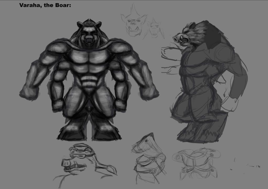
The character sheet is just a sketch I had lying around.
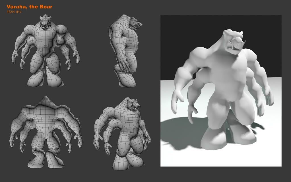
I'm happy with the overall model, and the fact that it took about 2 hours. I think the model has some issues with the amount of polygons on his lower pecs, and on the same area on the back area. Too few on the front, too many on the back. The mesh also stretches in the armpit between the arms. Also, the face isn't very good I think, but I'm not quite sure what to do with it. Maybe it's just too low poly?
Here is some other stuff I've been working on.
By the way, critique is wanted and welcomed for all my posts!
This is my first post. Nice to meet you guys!
I'm doing my final year of a Bachelor in Character Animation at Teesside Uni in England. Originally from Norway though:)
I'd like to start by posting something I did last night. For my final year project I want to make some game characters, and I wanted to see how fast and how well I could make a low-poly/basemesh character. The character is Varaha, the Boar. The third Avatar of Vishnu (from Hindu mythology).

The character sheet is just a sketch I had lying around.

I'm happy with the overall model, and the fact that it took about 2 hours. I think the model has some issues with the amount of polygons on his lower pecs, and on the same area on the back area. Too few on the front, too many on the back. The mesh also stretches in the armpit between the arms. Also, the face isn't very good I think, but I'm not quite sure what to do with it. Maybe it's just too low poly?
Here is some other stuff I've been working on.


By the way, critique is wanted and welcomed for all my posts!
Replies
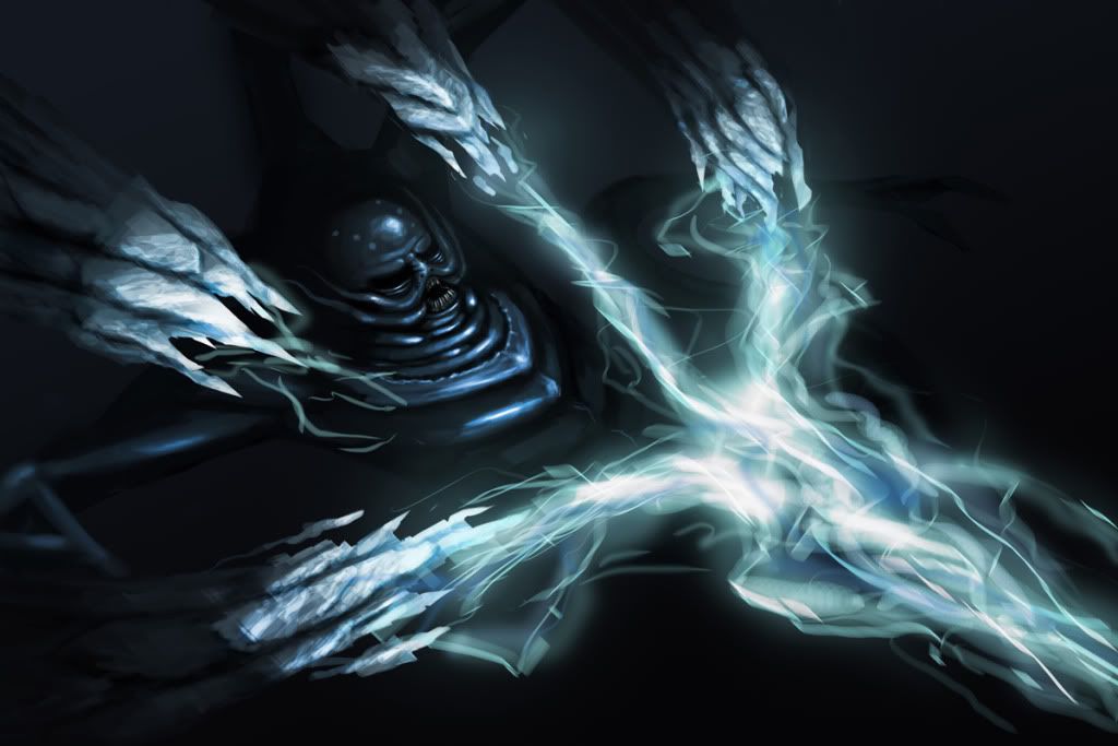
It's Narasimha, the half-lion from Hindu mythology. Vishnu turns into a half-lion to tear a guy with demonic powers to pieces. Pretty badass:P
The composition could use an adrenaline shot to me. I'd keep it similar, big guy on the top with wide stretched arms framing guy getting killed below him... Where i'd change it is the point of view. I'd try to milk everything i can from perspective to help sell how massive he is, and have the shot looking up at narasimha from the vantage point of the victim.
Orange > blue color scheme's an alright choice. But you gotta get those values better before continuing. Stuff's kinda muddy.
I'd like to see textures on the model you made. I think it could be cool.
I think it's an improvement, but the background needs a lot of work, and I feel like there's something off with the style, which I can't quite put my finger on.
I like the red one with dark figure, got atmosphere. Small fix - holding axe like that is kind of unusual, fliping the blade so it face ground should be nice.
ps. less blood-gore, more girls
I definetly want to do some more girls (hurr) as I've noticed that being able to draw hot girls seems to be a major requirement to be a good concept artist:P
About the axe, I drew it facing down first, but then I thought it would give a more agressive undertone if it was facing up. But.. I think you're right, it just doesn't work at all:P
girl... cant say anything, i like the alive one, not undead with long arm
keep goin, man)
And here are some illustrations I did for school recently.
In terms of your renderings, a quick thing I would say is that you're going in too close and using too small a brush before you should; keep that canvas zoomed out, and stick to a big fat brush until you've really laid down your base tones and general forms.
Keep posting man
And thanks for the advice! I think you're right about that. I do tend to get ahead of myself. I also feel like sometimes I will get to a certain level of detail, and then I'm just lost. I usually stop somewhere in the middle of artisticly rough, and nicely detailed, achieving neither:P