The BRAWL² Tournament Challenge has been announced!
It starts May 12, and ends Oct 17. Let's see what you got!
https://polycount.com/discussion/237047/the-brawl²-tournament
It starts May 12, and ends Oct 17. Let's see what you got!
https://polycount.com/discussion/237047/the-brawl²-tournament
non generic sci-fi corridor?
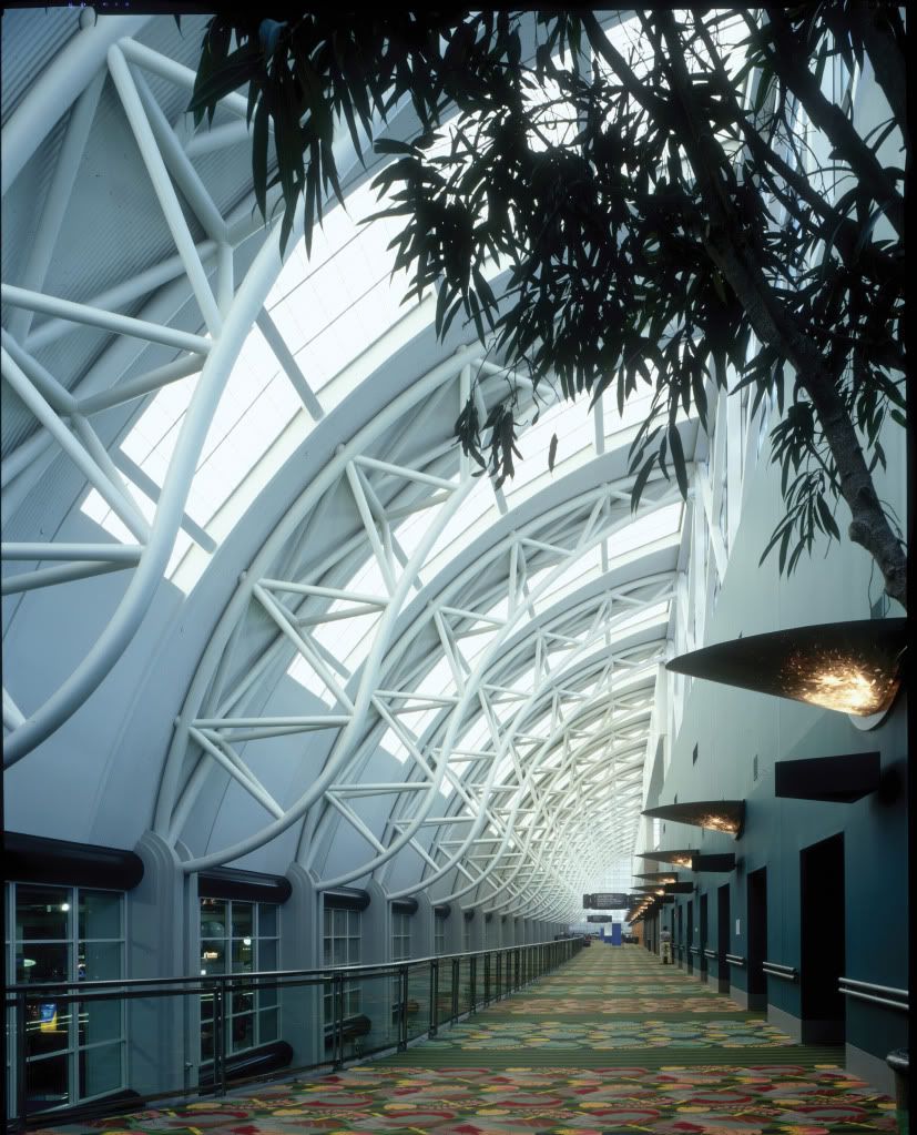
So I have a class assignment to do a sci-fi corridor. I pretty much cringed when I learned this because I know it is done a lot. I think I want to stay away from making a dark octagon hallway. Not that those things are all bad, iv'e seen it done really well. I found an image that I thought would be a good starting point

does anyone have an idea to make it seem more futuristic? maybe some ideas or concepts that break away from the norm would be cool. Anyway... my adventure awaits me (goes to go try a block out)

does anyone have an idea to make it seem more futuristic? maybe some ideas or concepts that break away from the norm would be cool. Anyway... my adventure awaits me (goes to go try a block out)

Replies
The thing is, depending on what you wanna make, if it's a lobby area or somewhere that's meant to be used not just by the staff but also by consumers or main public, you might want to also think about carpets or even marble floorings (though this might be harder to use together with white clean environments).
If you have a 360 and Halo Reach, you might want to take pics of a map called Sword Base. Otherwise, I will take some screenshots later to use as extra inspiration, so if you want them too, I can post the links here later.
http://mik2121.imgur.com/all/
Hopefully they can be of any help
@Mik2121 Thanks for those pics, very helpful and inspiring.
@Zwebbie I completely agree. I am trying very hard to stay away from clich
I agree with P442, what about this is sci-fi? Exaggerate those elements.
Try this for a thought. Are trees rare in this time/place? If so, is this place is a government facility/greenhouse? Is this a wealthy persons living quarters?
The supports are looking spiffy. If you plan on taking this into zbrush, I would add some wielding where the braces end and maybe add gussets plates as well. Good luck on the rest of your project!
That seems like the fundamental thing, what kind of environment could an architect put together without being constrained by current construction limitations? That's what realistic futuristic architecture will look like, at least some of it. Which is why Frank Gehry's stuff looks pretty futuristic -- not because of the style in itself per se, but because of an implementation of style that is only possible through technology.
Anyway, for the purposes of an assignment it's probably best not to overthink it. Those supports look good, keep it up.
That aside, the "what if" scenario you mention is exactly what I was getting at. but if you ask yourself what a generic modern day architect would do with the technology of a hundred years from now, you'll find that already they can do much more than they usually do (as Gehry proves), so you're forced into bringing science fiction details up to (ridiculous) prominence. The other scary option is not to think from an architect's point of view at all, and just add science fiction things. The environments that Mik2121 posted are merely collections of futuristic clich
Of course, all that is just inspiration material and I don't think it's a bad thing to have it thrown in there with other stuff, don't you think?.
As for the "glowing computers", I took the pics because I wanted to know how to make that in UDK and made this thread.
Anyway, as I said, I don't think those screens are bad to use as inspiration, not as absolute guidelines for how to make your own stuff.
I think doing something interesting with the floor panels will help to. Dont stick to just tiled floors, but make some sweet interesting shaped panels..maybe have grates so you can see some cool stuff underneath. Or maybe make moving sidewalks like you see at some airports (or in the Jetson's cartoon..either way)
I'm liking where its going so far.
I brought the supports together in some simple welds:
I didnt want to do anything too detailed because I am on a tight schedule and you wouldn't really see the detail at the distance they will be at.
Worked on the block out and changed the concept a little. give the building a curve, and made the first floor a lot more room.
@Murph Thank you.
You're definitely on a good path, it always sucks to have to rush things for school, but you're on track to have a nice portfolio piece.
Stick with it!
what you have there looks like it could fit into the world of Brink without too much changes.
I realize it is still a work in progress, however i would like to suggest adding in quite a few small props to really help portray the scale of the building. For example, garbage cans, fountains, video cameras, vending machines etc..
very nice! In terms of your reference and what you're pulling out, this is getting close to some arch viz kinda stuff (in udk :P)
Here is a quick low quality render of an idea i had.
[ame]
Using the only object I can really guesstimate scale from I used the magazine for scale knowing the average magazine is 9x11 or so.. put a person in there, that makes the railing way too low, if I use the railing as a guide, it makes everything else too low. If I use the benches as a guide, well there's two benches in the right hand corner at different scales. So, it's according to where I look as to if the boards look huge to me.
Its a nice peice, but 'to me' the scale seems off as I'm using the magazine as my scale of reference, but doing so makes the benches next to the magazine at the right scale but the ones to the left are off scale, and then it makes the railing be about a 10-12 inches high..
so, there's my confusion, I could just be odd but it's like one of them puzzle images I can't place the scale.
I know it isnt muchto look at right now, but critiques are always welcome.
EDIT: a few minuets of sculpting before bed