Hi, "2000AD Judge Anderson" comic book character project.
Hi, new member (long time lurker), this is a character I have been working on based on an old fan art sketch I had lying around, the project started off as a means to learn some more Zbrush techniques and tricks after finishing a title in which I had used Zbrush extensively without ever using it to build a character "from the ground up". So zspheres were used to create the base for this model alongside the retopolgy tools and all those other cool options I had never used before.
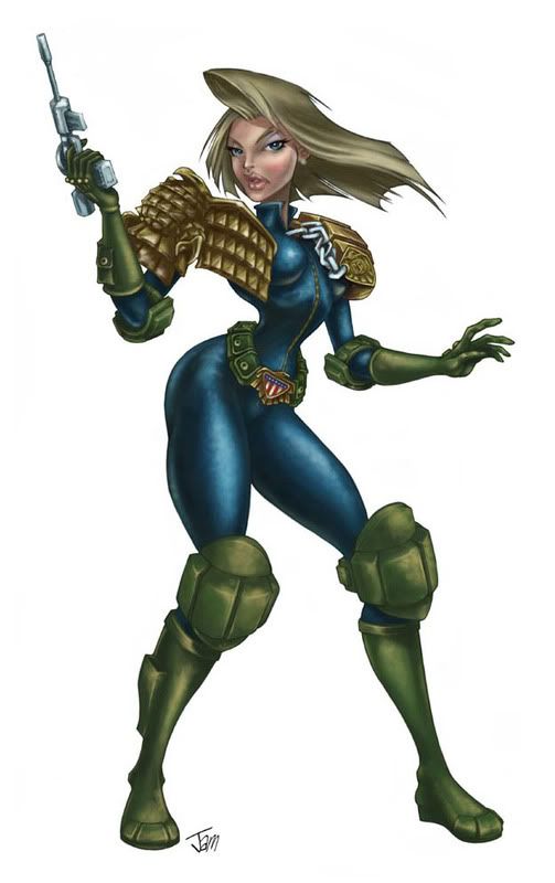
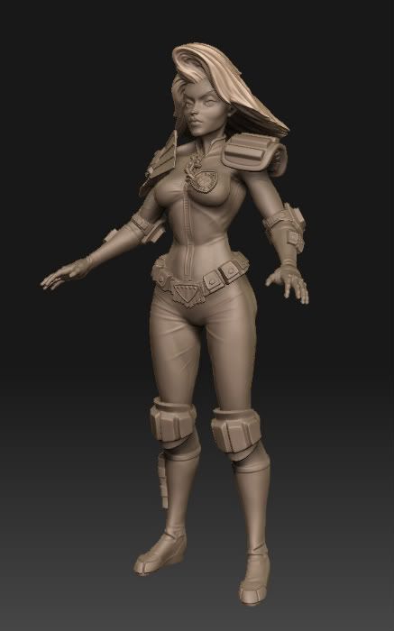
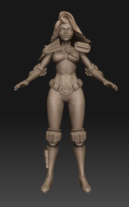
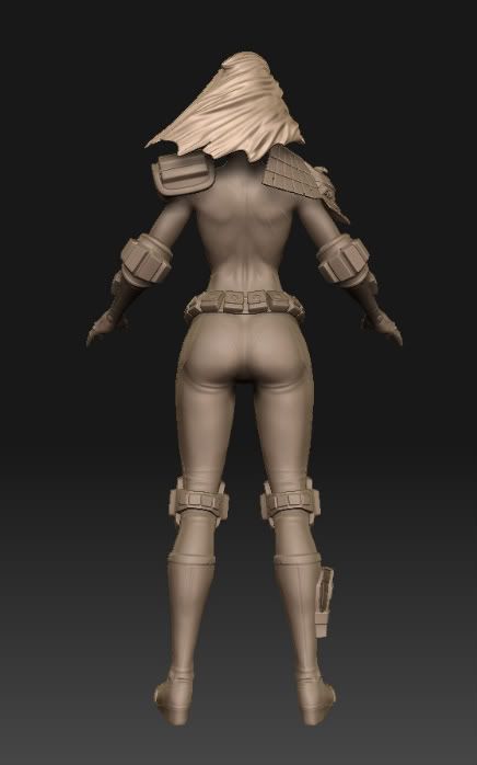
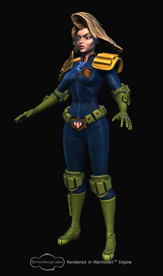
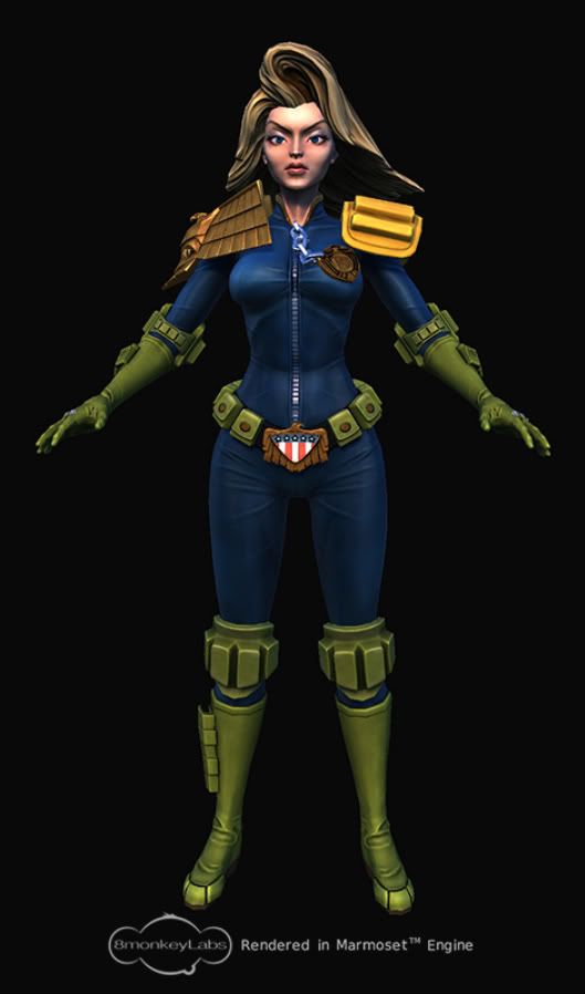
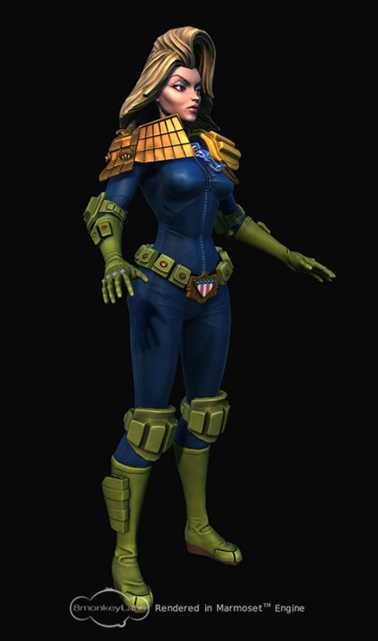
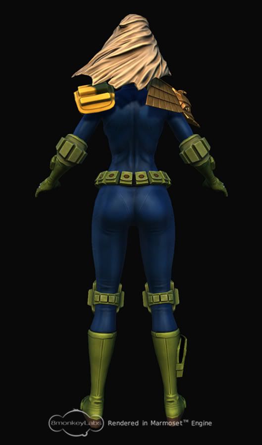
All comments welcome, I still have to get her gun/prop, rigging, pose and base finished alongside final texture balancing. The unoptimised model stands at around 12700 tris but this can be cut down if need be.


All comments welcome, I still have to get her gun/prop, rigging, pose and base finished alongside final texture balancing. The unoptimised model stands at around 12700 tris but this can be cut down if need be.
Replies
Is the badge chain normally silver or gold? don't suppose it matters that much really
you should post a bunch of your other concept stuff too man.
and Raider-Thanks, following yours and Ruz's suggestions I have had another look at her waist/thigh area on the low poly, I haven't pushed it too far as I dont want to distort the textures too much and I'm keen to get this gal finished...don't really want to start rebaking/texturing stuff again. May revisit the zb sculpt though, my original intention was to go for a Sideshow Toy/ Tim Bruckner kind of look, along the way I have moved away from that as I have been working on her.
TeriakiStyle- Many thanks for the crits and taking time out for a paintover. I have had another look at her maps, nothing finalised, just adding small details to help the figure pop a bit more (stitching, etc). As stated above I am wary of taking her too far down the realistic look as I want to retain some of the lighthearted/cartoony look the original sketch has, though some of that anatomy on that sketch makes me wince!
The hair has been a nightmare, its been revisisted time and time again on the sculpt and low poly and I'm still not 100% sold on it. The problem again is a balancing act between trying to capture that style and "swoosh" of the concept and using all the bells and whistles expected of a current gen 3d Model. I am looking at the alpha stuff now, and will post when I have made some progress.
Any more ideas/crits (especially suggestions on nailing that hair) are welcome.
Body shape tweaking-
Definitely looking better anyway. Perhaps the pose will help you exaggerate them more
(chidbearing hips and all:)
I think the fringe just needs to overlap itself a bit more if that makes any sense, style wise it's fine.