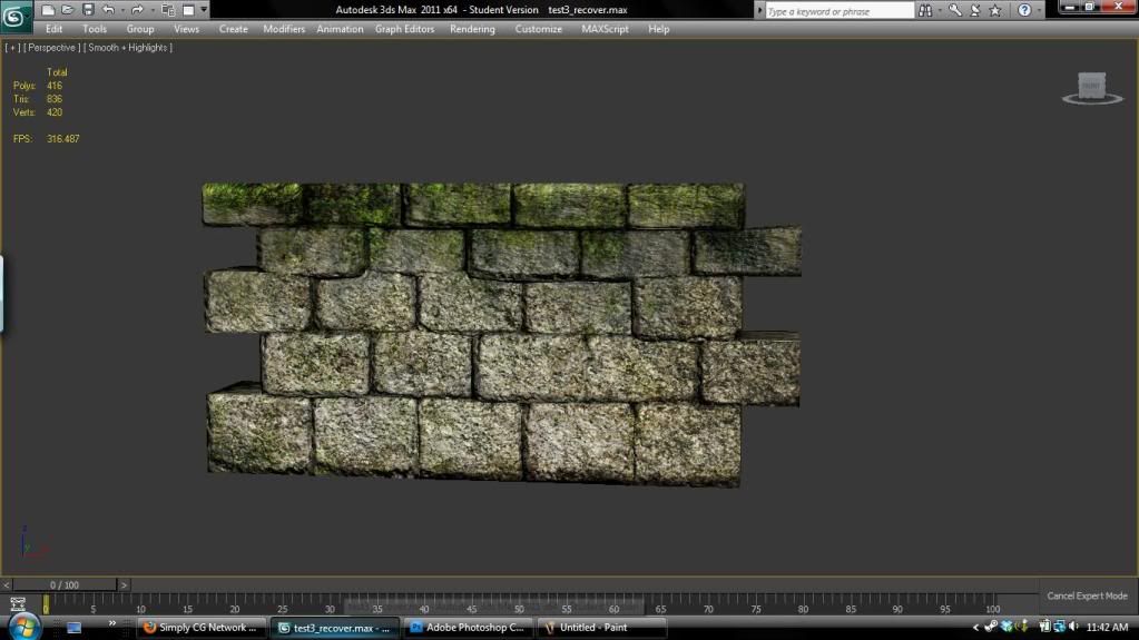
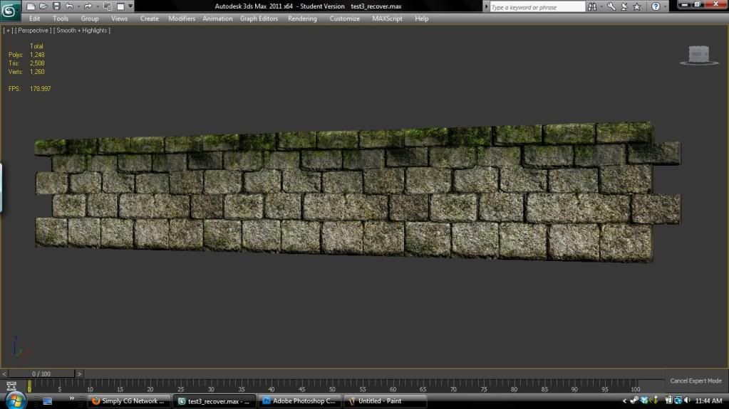
Ancient Modular Wall
Hey I am currently working on a project for my portfolio class. With this project I am trying to keep majority of things modular. I am new to this concept but I feel like I am starting to get the hang of it. I am new to texturing and kind of just went at it. I would like to refine that skill more. Please let me know what you think.


Replies
What's the texture resolution? What maps are you using, diffuse, spec and normal?
What kind of viewport shader are you using?
The moss or ivy seems to be over ridden by the normal map? Also there are some shadows that don't seem to make sense, I wonder if they're spots on the normal map?
The part that needs the most work is definitely the texture portion of it. The moss you added mostly seems like green slime that's been brushed on the top of the wall. The other thing that needs some work is definitely the entire shading of the bricks.
When dealing with these types of assets it's always best to spend a little bit of time refining a hand painted element to the texture which basically gives the texture some shading and visual relief from the flat surface it's on.
You'd be surprised at how adding a bit of light/shadowing to those bricks would do for the texture. Beyond that, it's carefully layering photo reference on top of your painted material, getting good reference for the moss, and then doing final touch ups. Seeing some of your texture flats along with any progress you make with them would really help if we're going to be giving you sound advice along the way.
Sorry for not adding the side view in the first post.
Well modular walls are usually really low poly, usually the reason you can bump them up is so that you can vertex paint on the surface to break up the tiling base with damange and dirt.
In terms of the UDK, you can do alot of tricks with modular bricks like this, it takes a bit of work to paint a heightmap in unless you've sculpted it, but you can push the flat illusion even more with a parallax map and detail maps, if It's for your folio' do it and get away with it! :P
I personally think it would be cool to get it in some sort of setting, with some lighting, it doesn't really sell as a single asset with a viewport shader, It's one of those things that make the base of an environment and are not so much hero or stand-alone props.
Mostly, I'd encourage you to press on with your scene as a whole. Modular stuff does tend to be a bit boring until its assembled. The lighting, and scene-building you do for this project will be key to getting something that is more than the sum of its parts. Thats not to say you can't throw a few interesting pieces into a modular set. A detailed gate piece, tower, or even just a crumbling section of wall can help break the flat expanse of your wall, and ideally also the flat line silhouette of the wall top.
So yeah.. press on, start getting your scene together. you can always go back and tweak textures later. You will probably want to anyway when you see the piece in its final lighting.
and post your texture maps. Its much easier to give crit on texturing that way.
Also I think you need to tone down your specular map, your bricks look wet right now. You could also give the moss a softer normal, to define the material better. Good luck...